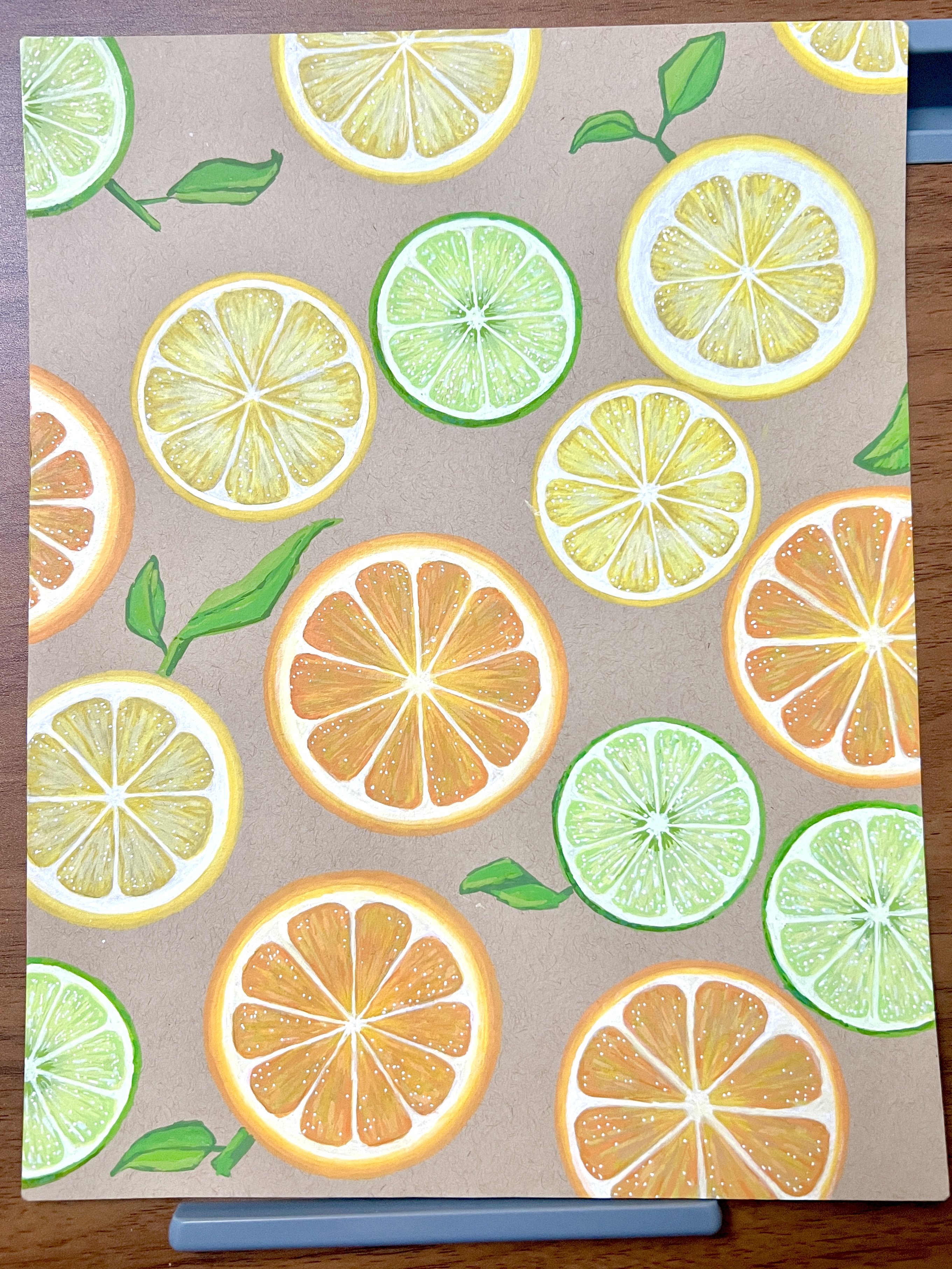
Citrus
06-02-2026 at 09:49 am
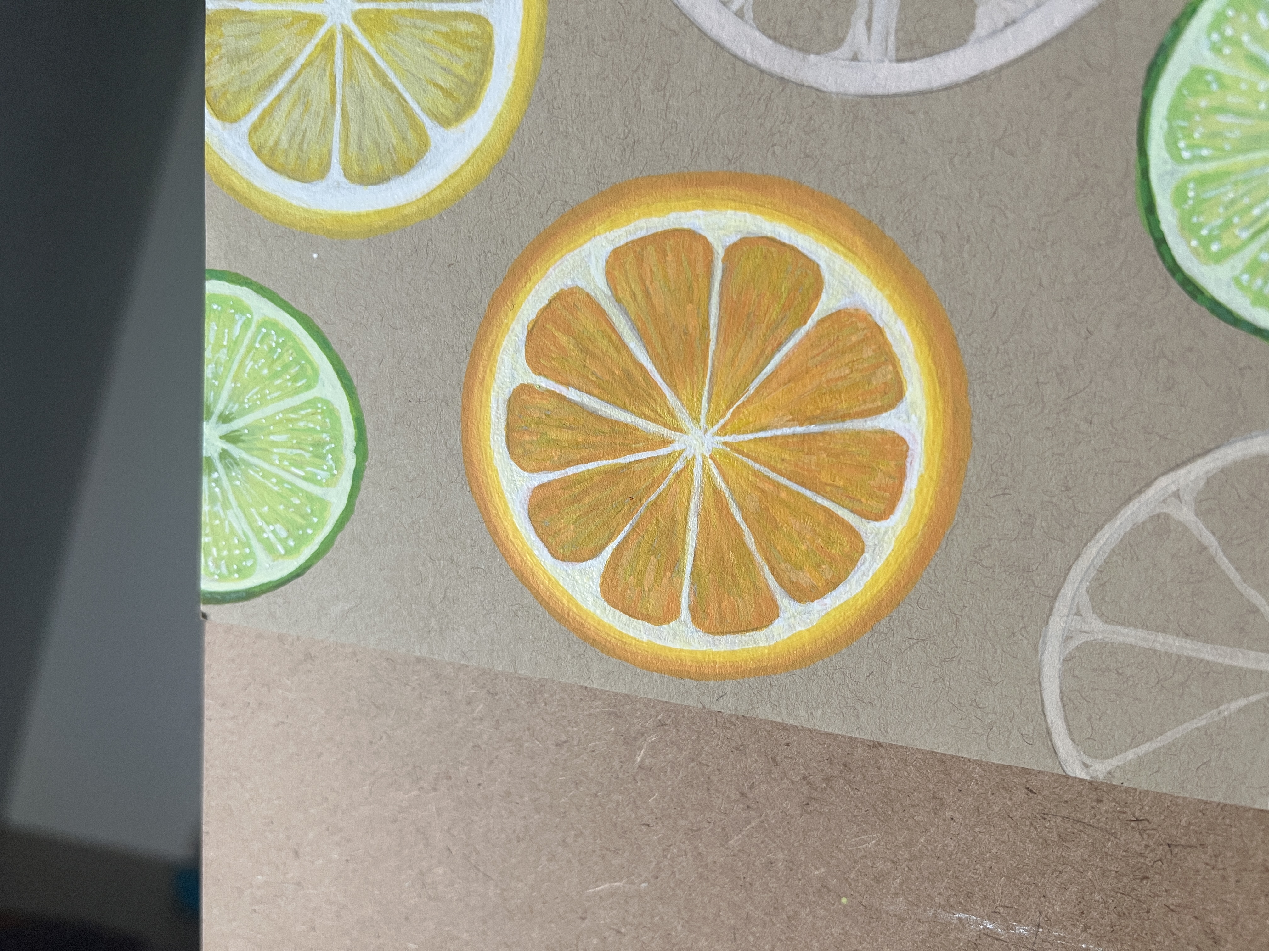
Summary: A painting of sliced limes, lemons, and oranges.
Lemon-Lime…and Orange
Meaning: I love citrus fruit. The cover of the presentation book I'm using is a lime green and it made me want the front page to be citrus fruit.
Sometimes meanings are direct.
Sometimes art is just doing fun, pretty things with no real meaning other than enjoyment of the process and results of the creation.
Creative Workbook
Just sliced citrus paintings in acrylic markers.
Started: 06/01/2026
Finished: 06/06/2026
Process Notes
✵ Steps ✵
Planning Notes
- 06/01/26 - I was planning on doing only lemons and lime ("lemon-lime") but I decided I wanted the piece to look more dyanmic so I decided to add oranges.
- Do I do a title? I should do a title, it's the first page. No...no. No title. Just fruit.
Progress Notes
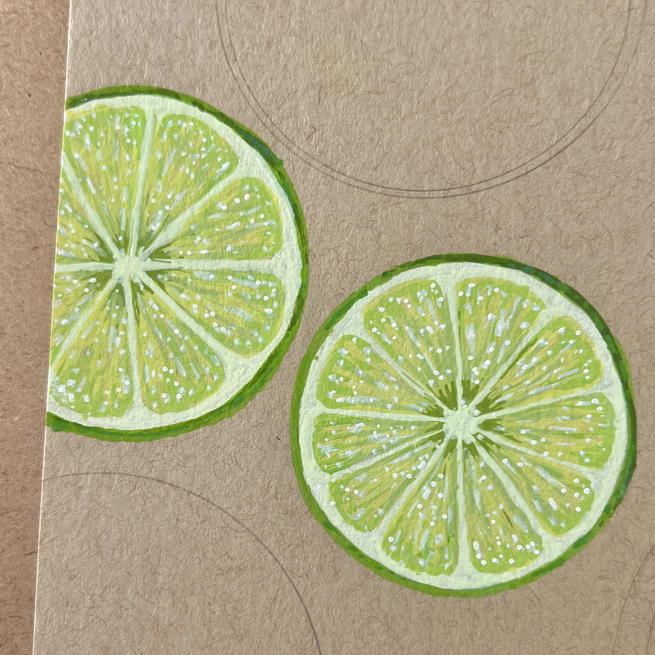
- 06/01/26 - I winged the limes. I found a process that seems to work well.
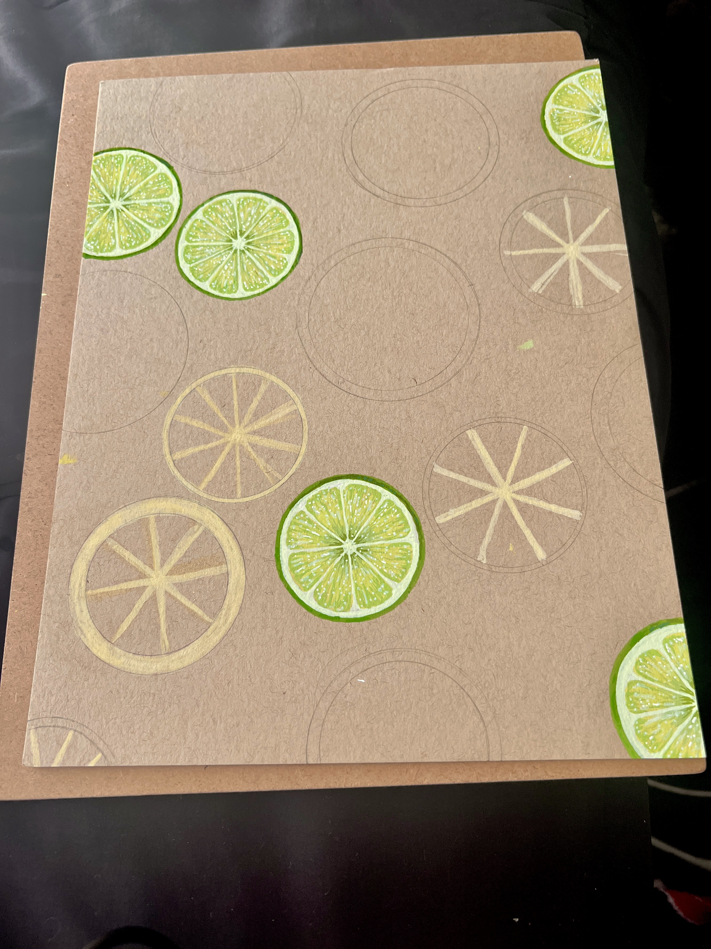
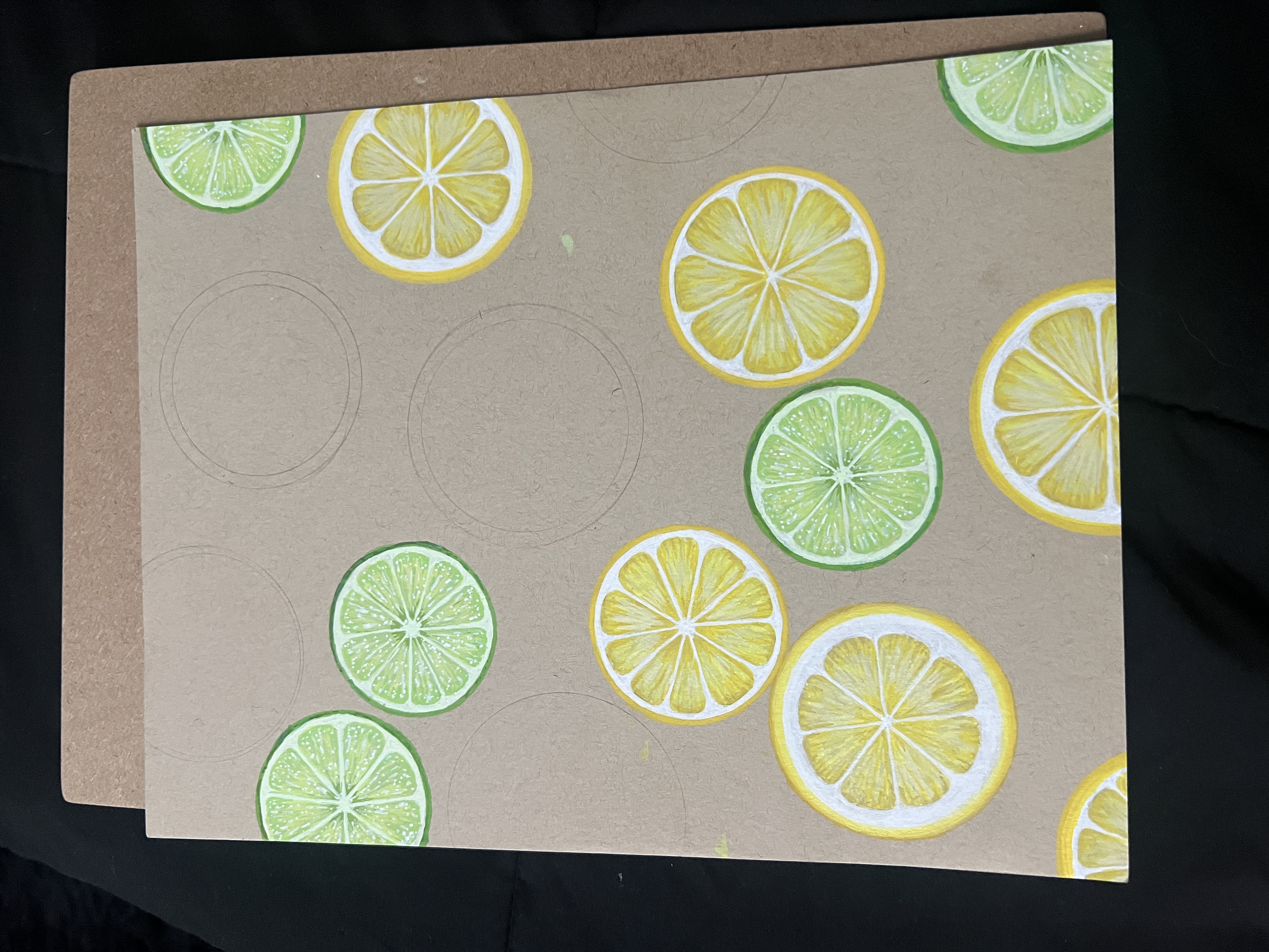
- 06/02/26 - Finished the lemons! By far, lemons were the easiest. I assume because there’s not much variation to yellow.
- 06/06/26 - Finally finished the oranges. Out of all the citrus, the oranges gave me the most issues. First of all, oranges are far more yellow than I realized. When I used actual orange colors, the product game out looking like a blood orange more than an orange orange. So, yellows in blank areas. The leaves really put the piece together.
Completion Notes
- 06/06/26 - Overall the whole piece came out really nice. I was able to figure out the colors as I went and they came out nice. Though I need better yellows.
Supplies
| Material | What I Used | Notes |
|---|---|---|
| Paper | Strathmore Toned Tan Mixed Media | The tan will help the citrus colors pop more. |
| Acrylic Markers | Grabie Acrylic Markers, ARTISTRO Acrylic Paint Markers, NICETY Acrylic Paint Markers | Grabie and ARTISTRO were the main brands used for the limes and oranges. I used the NICETY markers for the limes. The Grabie pen I used was white for highlights. |
Color Palette
Notes: The first of each fruit I did, I used pretty much every color I pulled. But the rest tended to have a much more limited palette. I literally halved the colors once I knew what i was doing. The first fruit always look a little different because of how many colors I use.
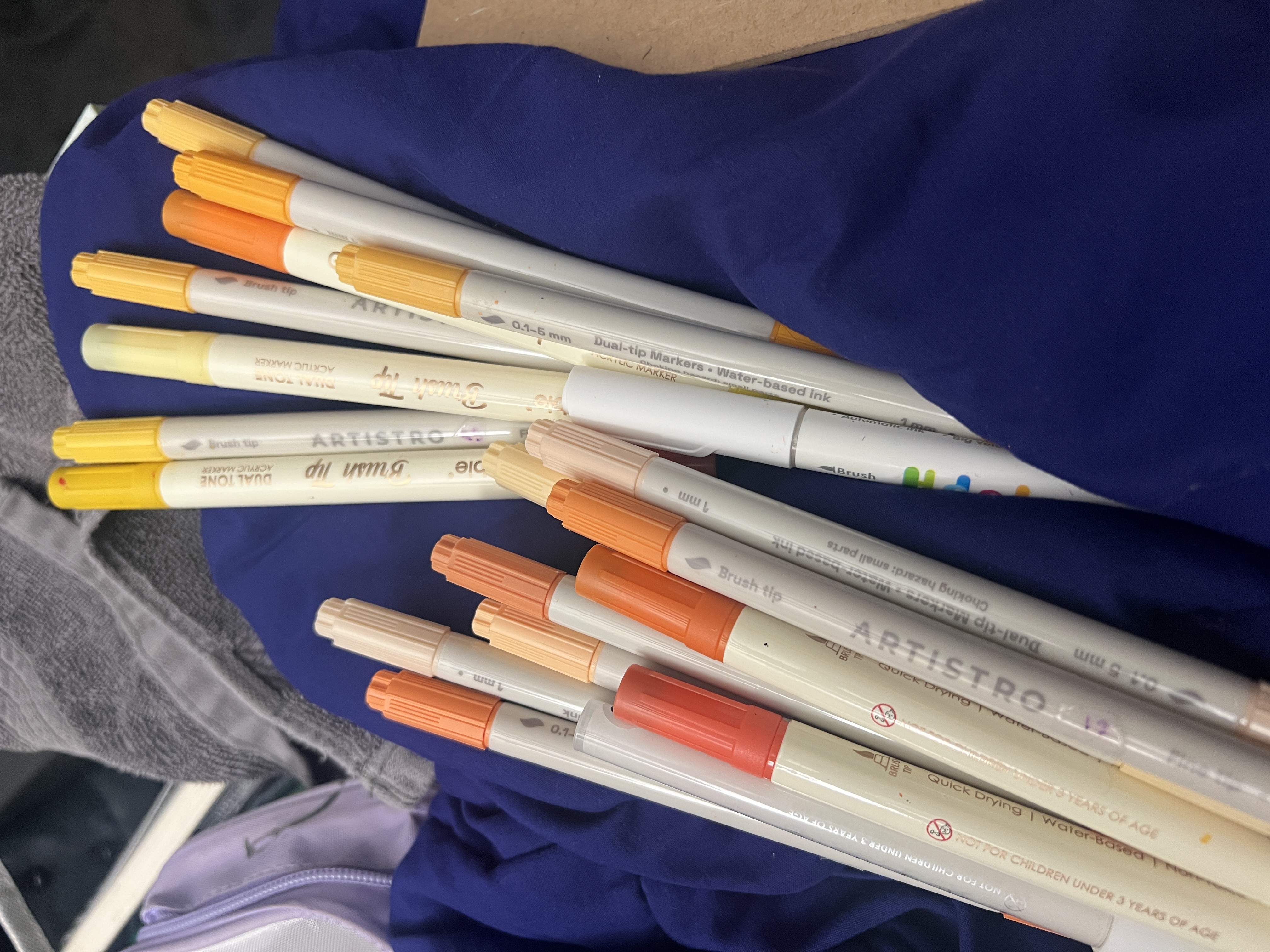
The left orange markers were the ones I decided not to use because they were too orange. The ones on the right are the colors I actually ended up using.