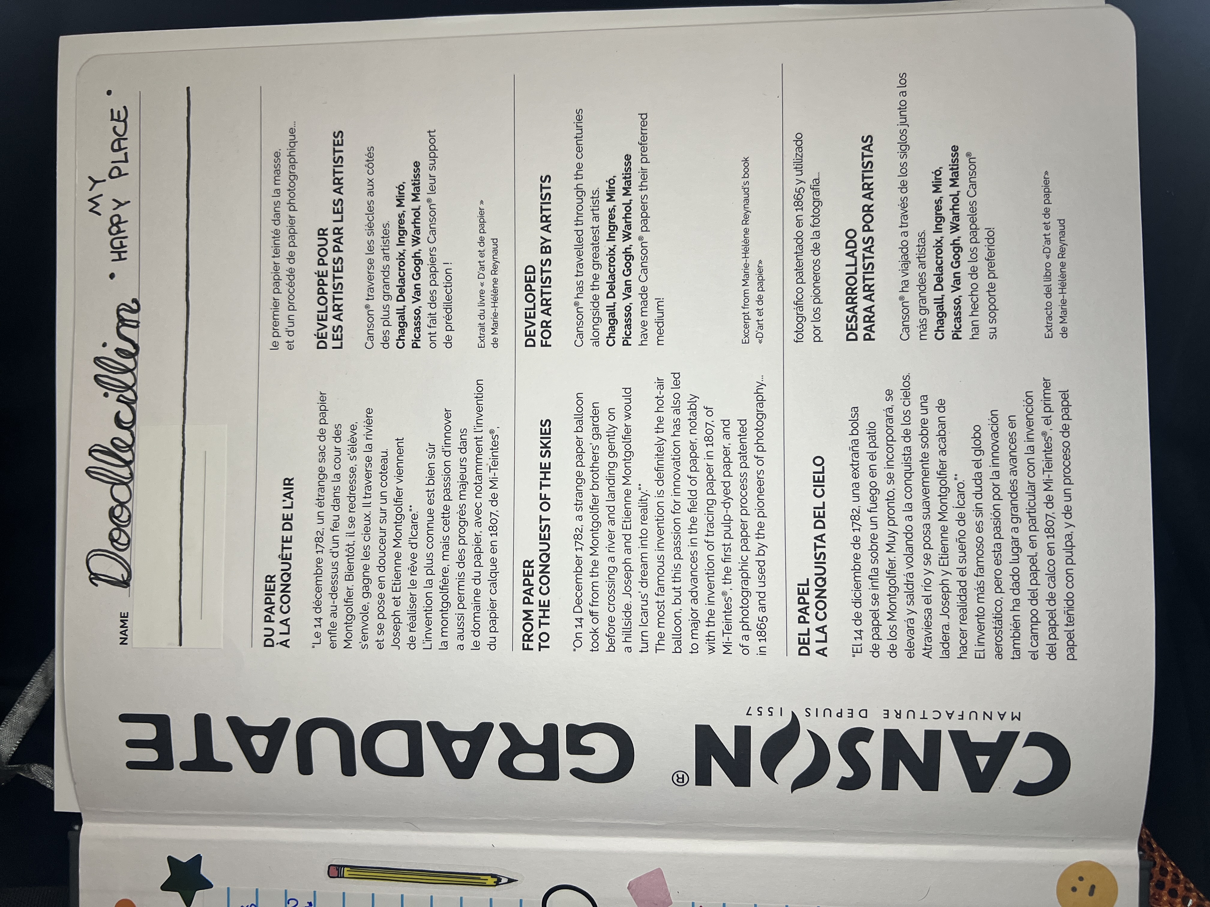
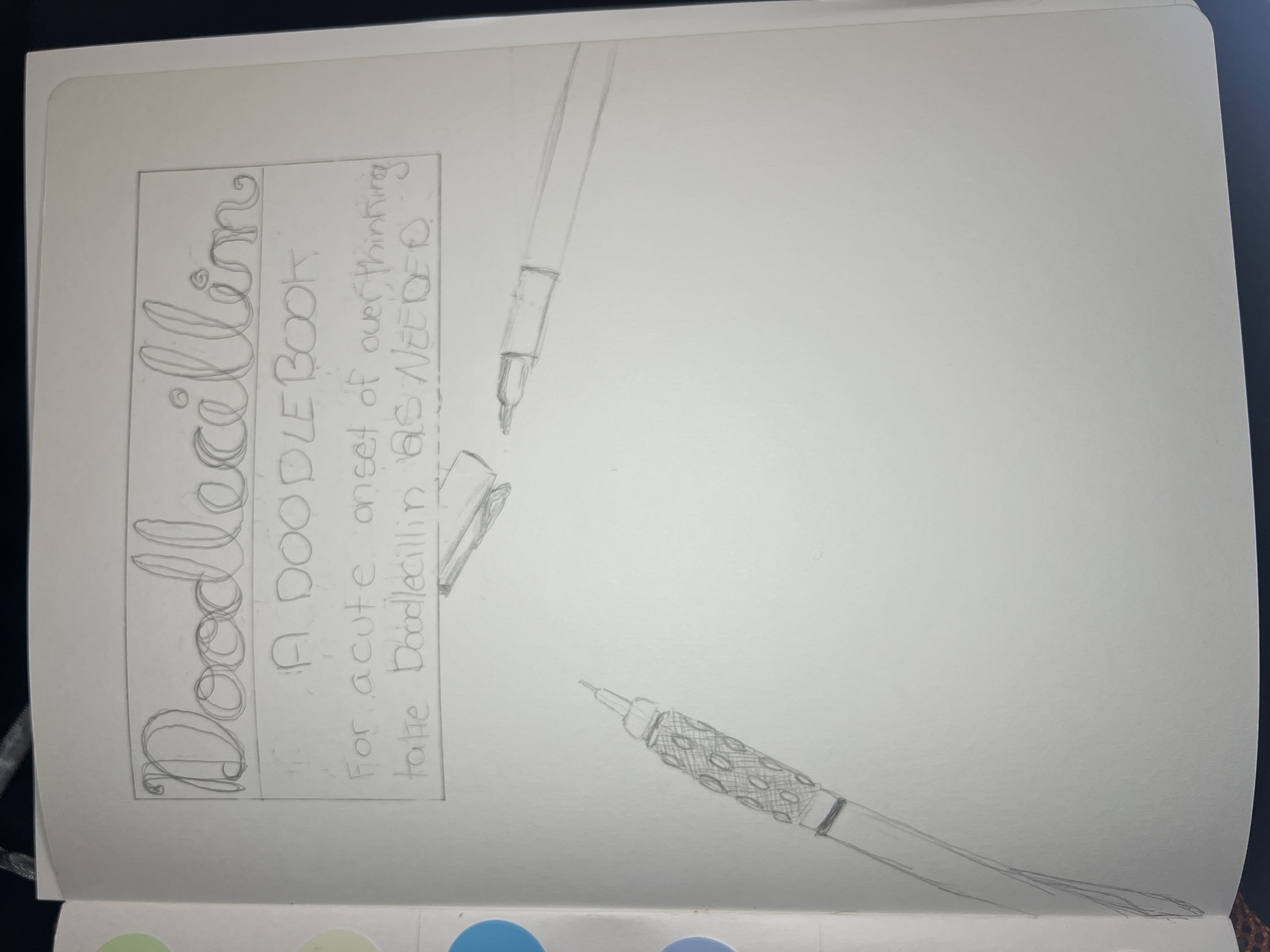
Doodlecillin
- This Sketchbook’s Workbook - The process of creating this sketchbook.
- Index of Used Art Supplies - Stats about the supplies used in this sketchbook.
- This Sketchbook’s History - How this sketchbook came to be.
Doctor of Doodleology
A quick look at Doodlecillin.

(placeholder image)
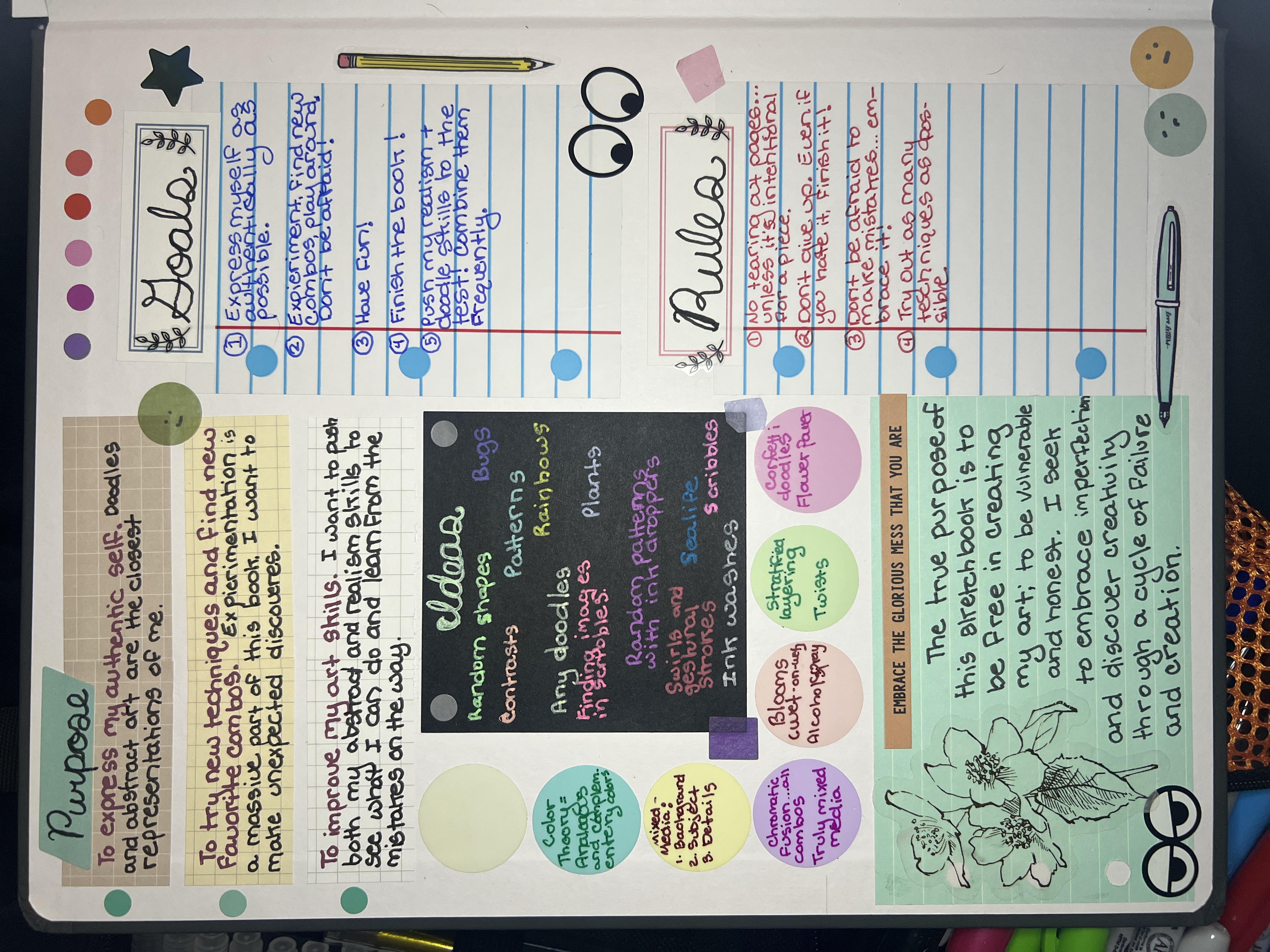
Purpose
This sketchbook is a celebration of my abstract and doodle art, which is the foundation of my entire art practice. When I doubted my realism, I had my doodles, and now that I have advanced my realism skills, I can advance my doodles.
Structure
- Each page is it’s own, self-composed art piece. Primarily single pieces but sometimes I’ll throw in a spread.
- I will have composed pieces that take a long time and easy pieces I can finish in one sitting.
- I will be experimenting and pushing my art skills to their limits to see how far I can go.
- Each sheet needs to fully match on medium. Meaning, if I draw doodles using nothing but fine liners on one side of the page, fine are the only thing I can do on the other side of the page. Essentially, I don’t want doodles on one side and paint on the other as the paint will main the page of doodles warp. And since it takes me awhile to complete doodle pages, I’ll either have to have a lot of foresight (not likely) or just reserve wet media on pages where wet media will be used on both side of the sheet.
My Brain
The “doodle confetti” pattern I do with my classic doodles is the representation of my brain. The tiny fine pieces that make the whole, chaotically thrown into piles and piles of hard-to-distinguish pieces.
Abstract vs Realism
Abstract has been my main form of art for most of my art history. I have dabbled in realism through it but it wasn’t until relatevely recently that I was able to bring my realism skill enough to enjoy drawing realism. I’ve been drawing realism for some time now.
I missed doing my doodle art and abstract pieces. I touch on abstract concepts in my Home Page, but never as far as my doodles could go. So I finally came back to doodles in Doodle Anatomy and eventually here in Doodlecillin, and feel such a great connection that I took for granted before.
I question the meaning of my art and why I create what I create. I have felt lost, believing myself to not have meaning in my art. But the abstract stuff is my meaningful art. The realism is just fun, pretty things I like to draw. But the abstract and doodle art is where my soul is. It’s the reflections of who I am. Abstract art communicates who I am.
Sketchbook Goals
- Express myself as authentically as possible. My doodles and abstract art are the truest versions of me.
- Make things that make people do double-takes. I want very visually busy spreads.
- Have fun! Let loose and let go.
- Finish. I need to finish my sketchbooks.
Sketchbook Rules
- No tearing out pages. Let be what will be…unless tearing out pages (or pieces of pages) is part of the art piece. Then it’s ok.
- Experiment with abstract art. Do things I haven’t tried before. Combine abstract art with doodles to see where I can push my skills.
- Be truly mixed media. This is part of the experimentation. I have a lot of art supplies, I should use them.
- Learn from mistakes, don’t dwell on them.
List Of Stuff I Like Drawing or Using
(Also a list of art block breakers!)
| Subject | Description |
|---|---|
| Ink Dropper | I like using the ink dropper to draw and splatter. Makes interesting shapes. |
| Stratified Layering | A very nice technique to sooth the mind. |
| Doodle Pattern Library | Ideas for when I need them of my doodles. |
| Bricks | I like drawing bricks. And stone. And plants to juxtapose it. |
| Patterns | Just fun to have patterns. Visually nice. |
| Zentangling | A classic. |
| Plants and Flowers | Some of my favorite stuff to draw. |
| Abstract Realism | I like scribbing random lines using pens and markers (and the ink droppers) on the page and then finding realistic images within the scribbles. |
| Contrast | Love having contrast in color, shape, size, everything. |
| Meditative Practices | I like relaxing to things like maing repetative marks or patterns on a page. Like the same shape over and over, or in using colored pencils to make gradients, or using acrylic markers to make cool swooping shapes. |
Creative Workbook
Strikethrough indicates idea is officially planned as a spread.
- Torn pages.
- Yin Yang related
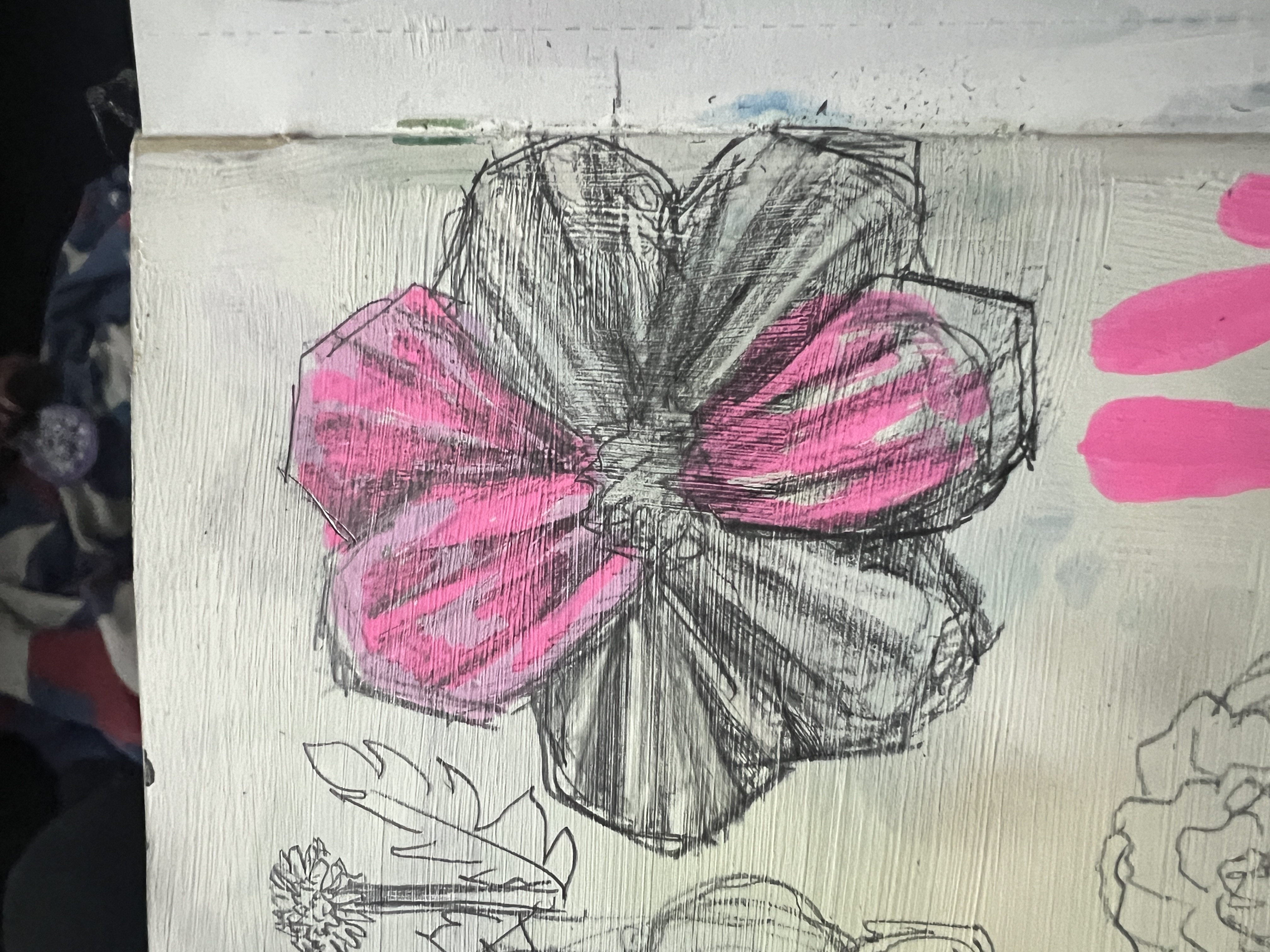
- The original flower doodles “Flower Power”
- Stratified layering in colored pencil (but like the phoenix)
- Gellyroll (06) doodles
- A maze
- That alien looking design
- Actual Zentangle piece
- Using the dropper as the only source of drawing
- Using my glass dip pen to do my confetti doodles
- Lungs that are doodled on one side and mystic and colorful
- Something like this with paint randomly done in abstract flowers and reverse color them.
Description
Started: 04/22/26
Finished: In-Progress
A book of doodles and abstract art, experiments and fun.
Process Notes
Planning Notes
- 4/22/26 - I’ve been pondering the connection that Doodlecillian has to the Doodle Anatomy Sketchbook. I’m essentially starting the project over and I keep feeling like that means redoing everything exactly the same and having the exact same expectations but that doesn’t work. This is a new book, so it should be it’s own thing, and evolve in it’s own way. I copy/pasted the purpose and goals from Doodle Anatomy but I think I should start over. I think I should at least edit the purpose and rules to fit this new projecct and just dedicate this book to it’s own journey. For example, I want to do more realism than I initially planned but still with the focus of abstract art.
- I want to actually add my purpose and goals and ideas and etc to the front cover and early pages. The normal random sheet of a different paper quality is glued to the front and it creates a page of facts about the sketchbook from the company. IT’s also the page where you can write your name and phone number but I covered that with a sticker because I’m not putting my phone number in the book and want to use the space for something else. I’ll also use the first page as a title page.
- 4/23/26 - A thought just occurred to me as I started going through and edited the table of “spread” to make it into “pages”: I was planning to just do a lot of the spreads over as pages including the names, but the names already exist for other files and that means I wouldn’t be able to link the pages correctly…so then why would I keep the same names?? So I should have unique names for pieces in Doodlecillian.
- I’m going to change the name rule I had or Doodle Anatomy where I was only using single words for the spreads. In Doodlecillian I will open it up to include more words per title. Still short, but not restricted.
Progress Notes
- Finally started the book by doing the static front cover info along with a planning page for ideas and a title page.
- 4/25/26 - I want to do pages in here that are just meditative in nature. “Guilty pleasure” doodles, ones that are fun to do, even if simple. I really like the Synaptic Weave technique whether it’s in ink, pen, colored, pencil, or markers. I could see myself doing more of that.
Completion Notes
- CONTENT
Pages & Planning
Table of Contents
| # | Title | Description & Planning | Inspo |
|---|---|---|---|
| 1 | Doodlecillin | Title page with catalog-style illustrations of all main tools used in the book new and ready to use. | |
| 2 | [The Us]] | Using tempura paints, I want to paint The They while vibing to dubstep. | [The They.jpg |
| 3 | DE Abandoned | A mix of organic and geometric shapes filled with designs and patterns. The shapes are about the same size and about the same line weight to have a uniform look while still feeling like a large mix of confetti. The “confetti doodles.” | |
| 4 | |||
| 5 | My Pretty | Abstract leaves where the bright colors are over pink and the grayscale colors are over white. | |
| 6 | Hex Code | Black gesso base with grid of rounded square tiles. Each tile colored with acrylic marker like pixelated hex color selector. Black "grout" remains. | |
| 7 | Pinnae | Stratified Layering technique creating the ripples and layers made by a boat cutting through a still lake, or like cutting through tall grass. May also take the form of wings. Start in center and go out (top down). Some will be doodled. | Raccoon |
| 8 | Unfocus | Soft crayon gradients blended seamlessly across both pages. Soft shapes and colors. | |
| 9 | Focus | Fleshy, alien-esque wall of undulating folds. Dozens of eyes with various pupils (human, cat, lizard) looking in different directions. Bright saturated colors. | |
| 10 | Bendable | Twisted ribbons starting lower left moving to upper right. Various sizes, colors, directions, intertwining. White background. | |
| 11 | Wired | String doodles and geometric doodles combined to look like a big knot of cables held in place and surrounded by strands of doodles. | |
| 12 | Doodlemorph | Gradient from organic/floral doodles (lower left) to geometric/angular doodles (upper right). Seamless transition with hybrid forms in middle. Black fineliner only. | |
| 13 | Cracked | Thick cracked cobblestone lines in India ink. Cracks inlaid with gold and red ink/acrylic markers. Blank "rock" spaces filled with confetti doodles. | |
| 14 | Old Growth | My old “flower power” doodles but with the skills I have now. Possibly using my glass dip pen specifically. | |
| 15 | Tangled | Classic, old school zentangling patterns. | |
| 16 | Faceted | Geometric India ink lines shaped like cracked glass filled with patterns done in acrylic pens. | |
| 17 | Spectral | Poured ink best friend chose for the piece: Magenta, yellow deep, Hooker’s green, cerulean blue hue, and carbon black in Liquitex Acrylic Inks. She picked the colors I’m going to use. | |
| 18 | Bee Plus | Cutsy cartoons of bumblebees with one real bee in the mix. Page will be filled with bees and bees only, on light blue background. Cutsy bees should have happyf aces or various expressions. | |
| 19 | Home Sweet | Layers to look like hills in front of a blue (ink) sky. | Layered Pattern Hills |
| 20 | Tetris | Blocks of acrylic marker with patterns or something like that. Maybe buildings. | Doodle Town |
| 21 | Don’t Spiral | Thick India ink spiral starting center moving counter-clockwise. Maybe include a bunch of lines and shapes and stuff also spiraling along. | |
| 22 | Make Waves | Mandala-esque patterns. Cirlces and concentric rings of various colors and media filling up the whole page to ultimately look like a mandala. | Mandala Egg |
| 23 | Mandala | A fine liner mandala. |
Planned Pages
| Pages | Title | Description & Planning | Inspo |
|---|---|---|---|
| Undone | Black gesso painted over whole spread. White gel pen for bottom left corner and as it goes up towards the upper right corner, the doodles transform from gel pen to dip pen to dropper, creating an effect of the doodles coming undone. | ||
| 💭 💭 | 💭 💭 💭 💭 | 💭 Ideas 💭 | |
| No Exaggeration | Brown eyes (my eyes) in the center with a perspective tunnel of boxes all painted with different things (mostly patterns). | ||
| Candy Wrapper Confetti | Doodle Confetti but all shapes are candy-related (wrappers, gumdrops, lollipop swirls, chocolate squares). Bright colors either colored in or the doodles themselves. | ||
| Asthma | The two pages of the spread are each a lung (left page = left lung). Trachea in the middle and realistic. One side is confetti doodles, other side is some sort of colorful chaos. | ||
| Grounded | Realistic tree trunk and branches above soil line. Below soil, roots transition from realistic to confetti doodles. | ||
| Explosive | Splattered and gestural black acrylic ink with contrasting color and white. Paint some gold stuff on it. | ||
| Multiple, black acrylic ink lines from each edge creating distorted checkerboard. Don’t know what else to do with this. | |||
| Black gesso on left, of page white gesso on right. Gellyroll pens of the same colors on both sides making circles with swirls in them cover the page like the very first types of doodles I used to do. Don’t know what colors. | |||
| An entire pattern made of metallic doodles (acrylic marker). Don’t know what pattern. | |||
| The supplies drawn on the front page but now empty and used. | |||
| Geological cross-section with horizontal layers in different media and patterns. Irregular like real rock strata. Each layer represents a different "part" of self. Black and white doodles and patterns at the bottom, color slowly added by top. | |||
| A disorienting maze. Outlined in fineliner, colored with colored pencil and/or acrylic markers. The maze has the follow properties: • Paths that change size from broad to narrow, or random curves. • Random traps • “Some of the arrows lie” |
|||
| Graphite Circles | |||
| Doodle Layered Leaves | |||
| Boxes & Flowers | |||
| Rainbow Leaves | |||
| Agate | |||
| Doodle Leaves | |||
| Negative Painting |
Index of Art Supplies
✵ Steps ✵
✵ Steps ✵
CONTENT
Cycle of Creation & Destruction
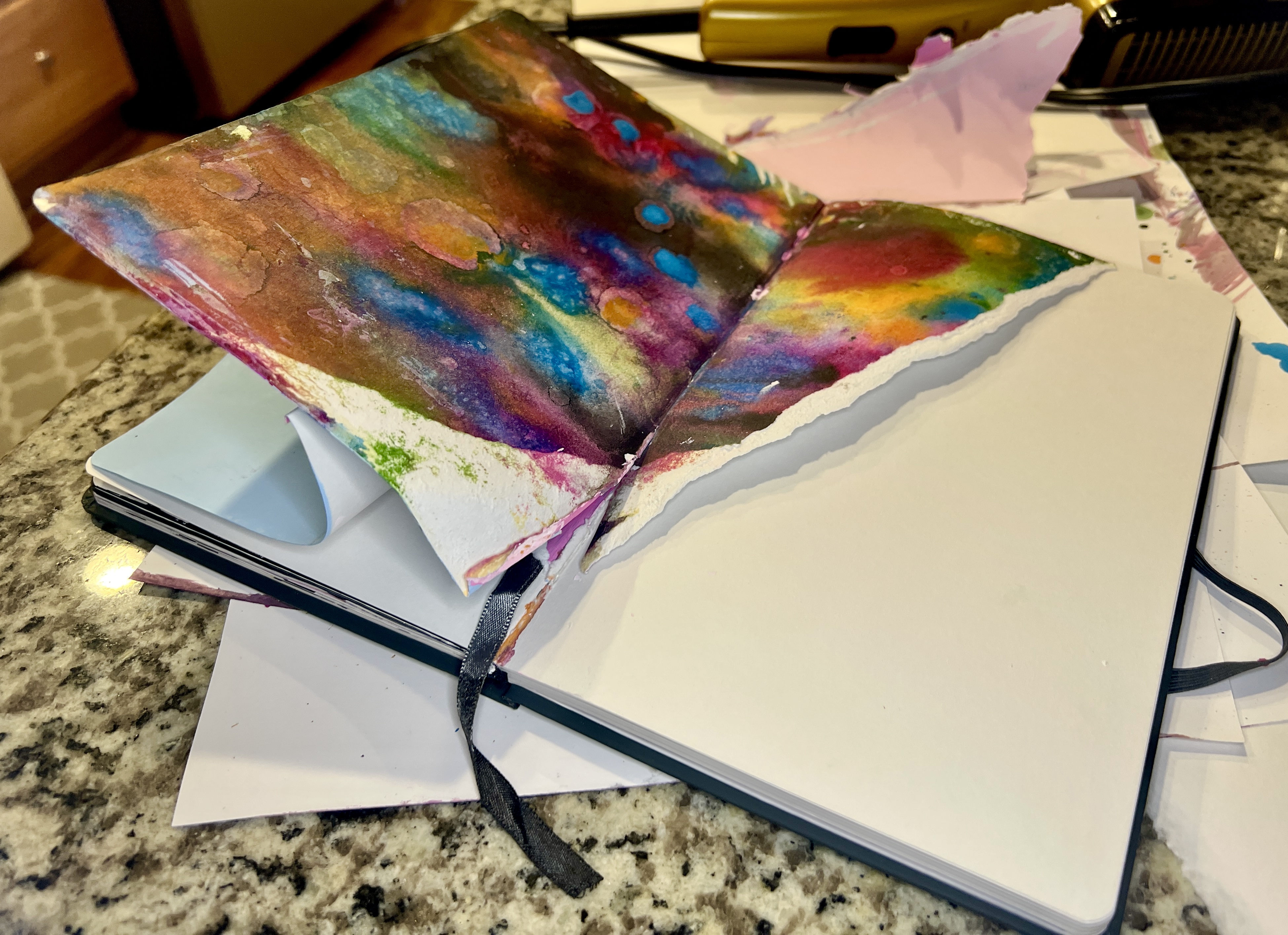
04/20/26 - Today is the birth of the idea for this sketchbook. It came after I completely destroy my original Doodle Anatomy Sketchbook. I used too much water, ink, and gesso without properly drying or prepping the book before hand. I was too hard on it for too long and my impatience caused me to accidentally tear the book…and with it, my heart 💔
But every failure is a chance to learn, so what did I learn?
We Learn From Our Mistakes
Lesson 1
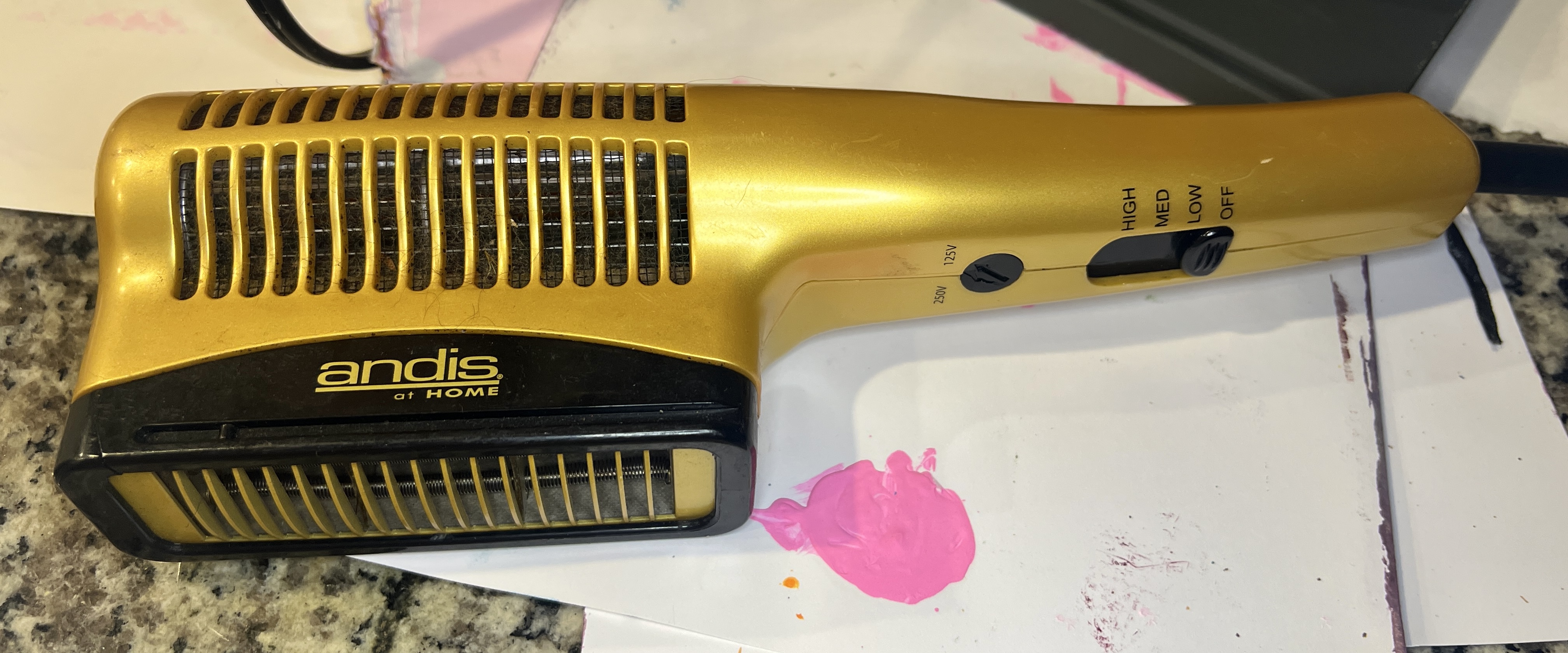
I am far too impatient with wet media like ink and standard paints. It’s why I love acrylic markers so much…they dry so fast! A few years ago I bought an air dryer that used batteries and was thus, portable, but it didn’t get hot. It literally just blew room temp air. It worked to speed drying but not by much.
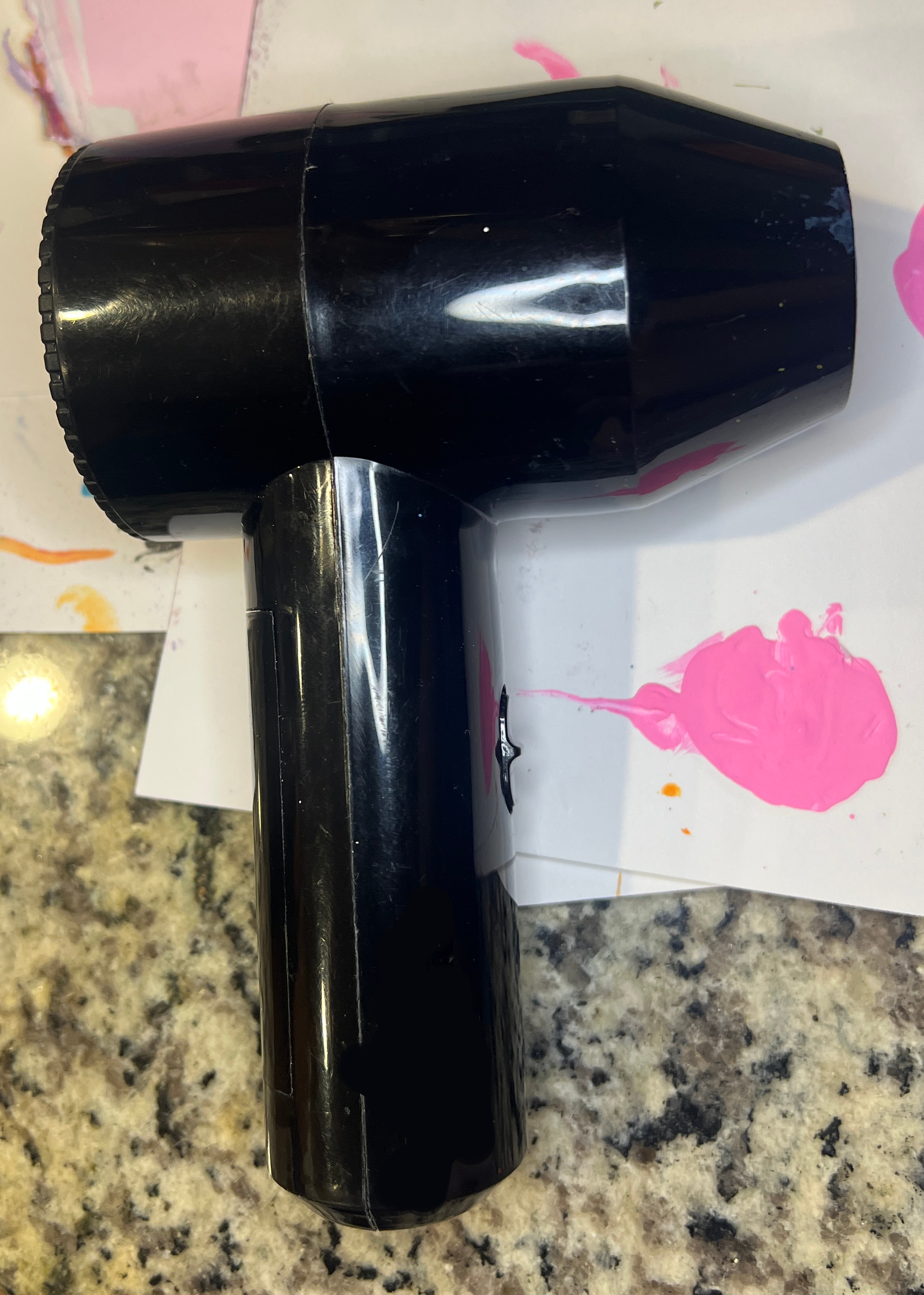
Luckily, Hubby found an old hair dryer under the sink! I liked having a portable dryer but now that I have something that actually blows heat, I can dry my wet media much faster.
Lesson 2
The credit card technique (using credit card to spread instead of paint brush) works but requires too much gesso for an opaque layer (as it takes multiple). Makes the book more unstable for when I need to be intricate with my doodles. The paint brush gives too much texture, but the credit card creates too much mess.
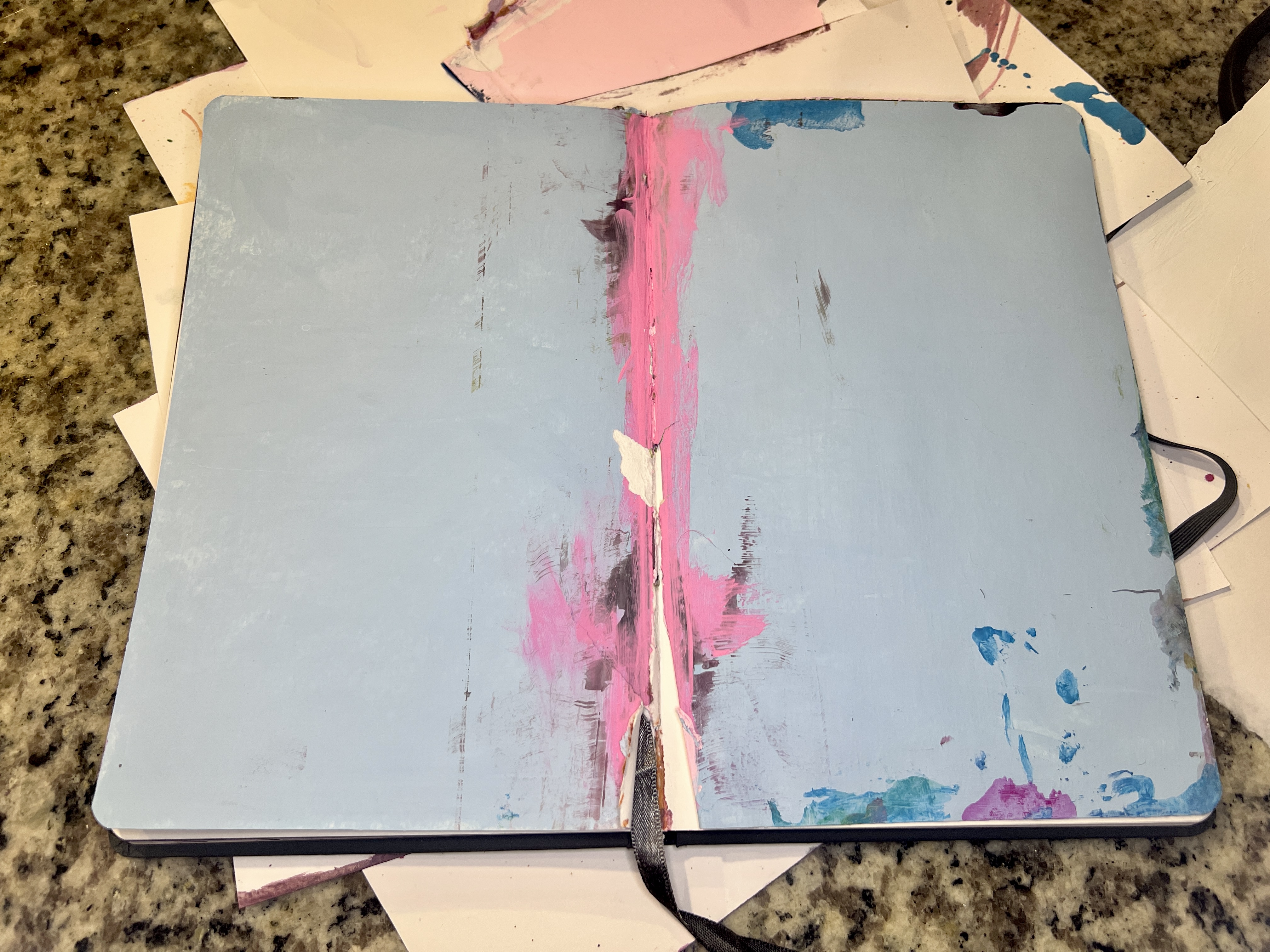
I started using the credit card technique to try and get a smoother finish with the gesso. But it creates such a big mess that ends up seeping between the pages and into the spine.
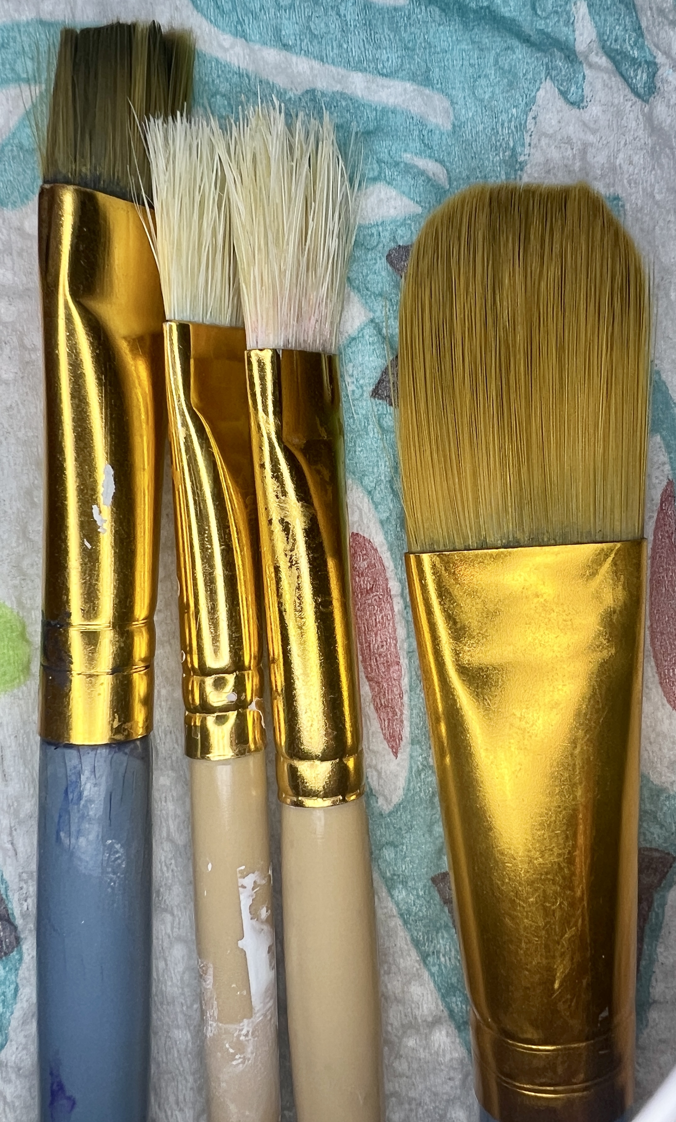
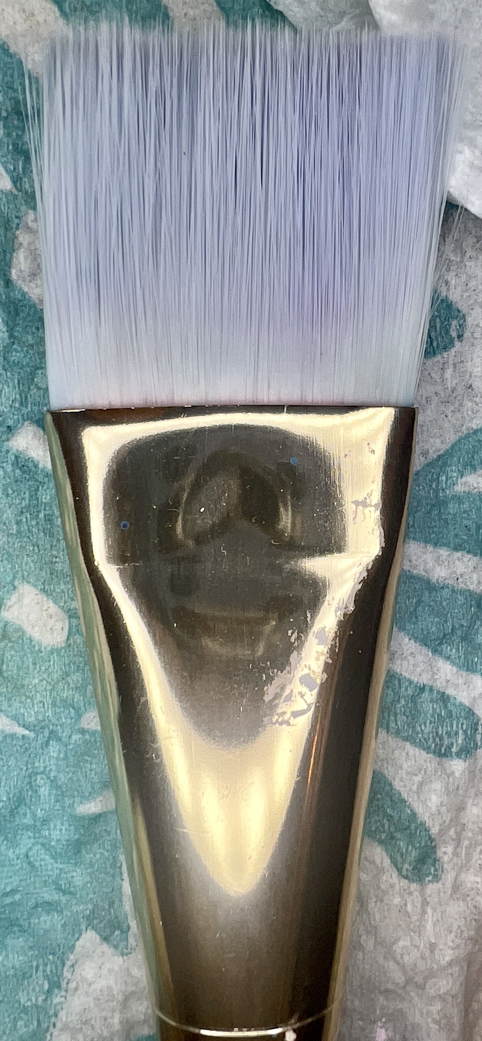
I went to the credit card technique because the brushes I was using (left) weren’t giving me as smooth of finish as I wanted. I’m going to try a softer, wider brush (right) and see what happens.
Lesson 3
Double page spreads are cool visually but much harder to work with practically. Wet media messes with the seams and thread, either weakening it or making it harder to close and busting out pages. There’s probably ways I could have prevented this but I don’t think my artistic process and workflow are conducive to being that level of meticulous. That’s too much linear thinking for me.
I also liked working in letter size (A5 double-page spread) as did my husband, so I decided to buy the same brand of sketchbook as Doodle Anatomy Sketchbook (i.e., the Canson Graduate Mixed Media Paper) but in the larger letter size (8.5 x 11). I’ve also decided to work on individual pages instead of an entire spread, effectively doubling the amount of art I intend to create in the book.
Shifting the Process
After some thought, the new “doodle book” (titled: Doodlecillian) is NOT a second edition or iteration of the original Doodle Anatomy Sketchbook, but a separate project. And although I’ve decided to keep most of the same goals, purposes, and planned spreads (I’m redoing ones I completed in Doodle Anatomy), I’m going to treat this sketchbook as it’s own thing, and evolve in its own way.