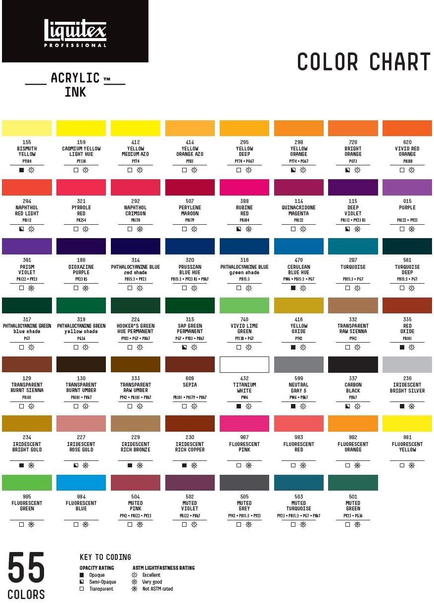
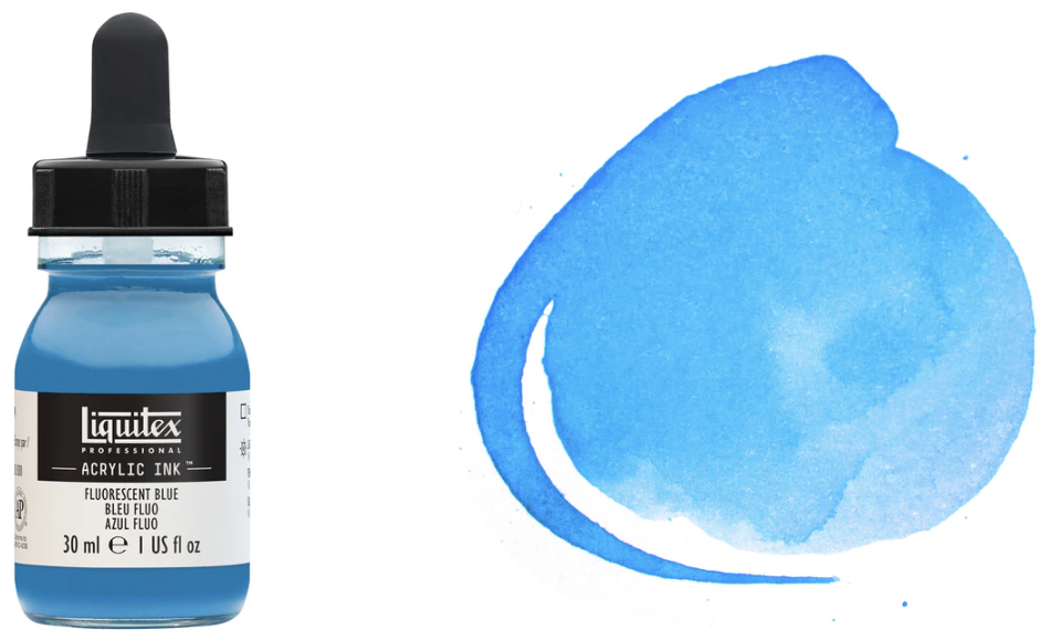
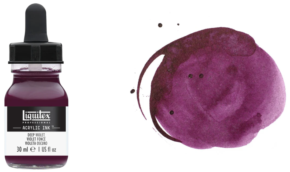
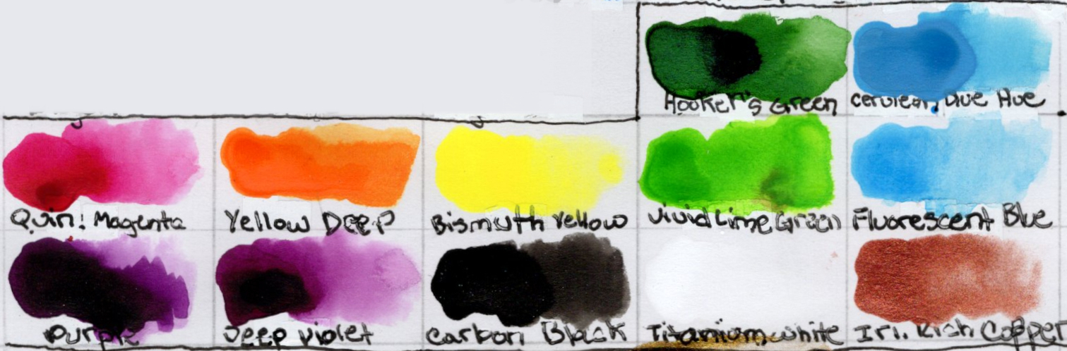
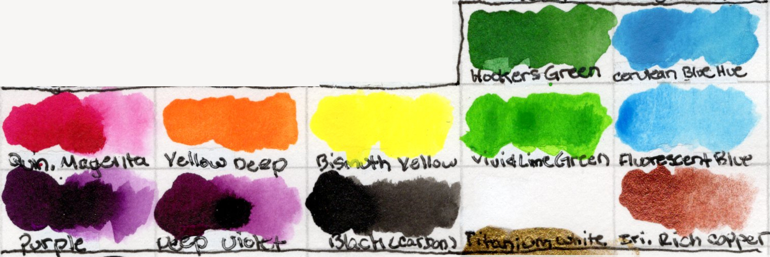
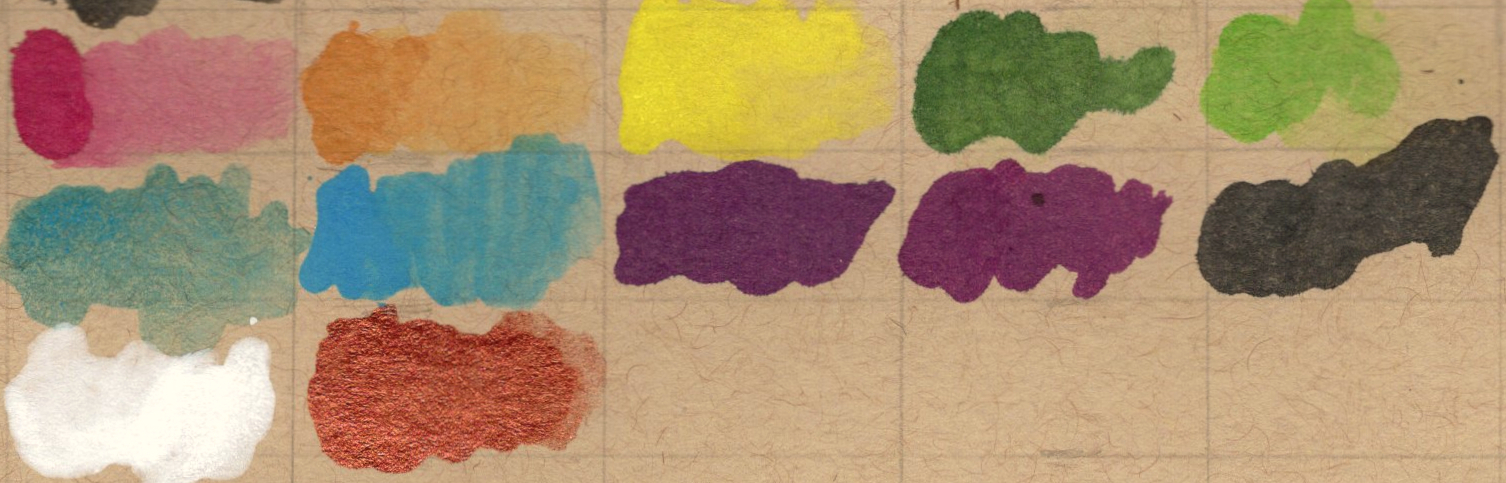
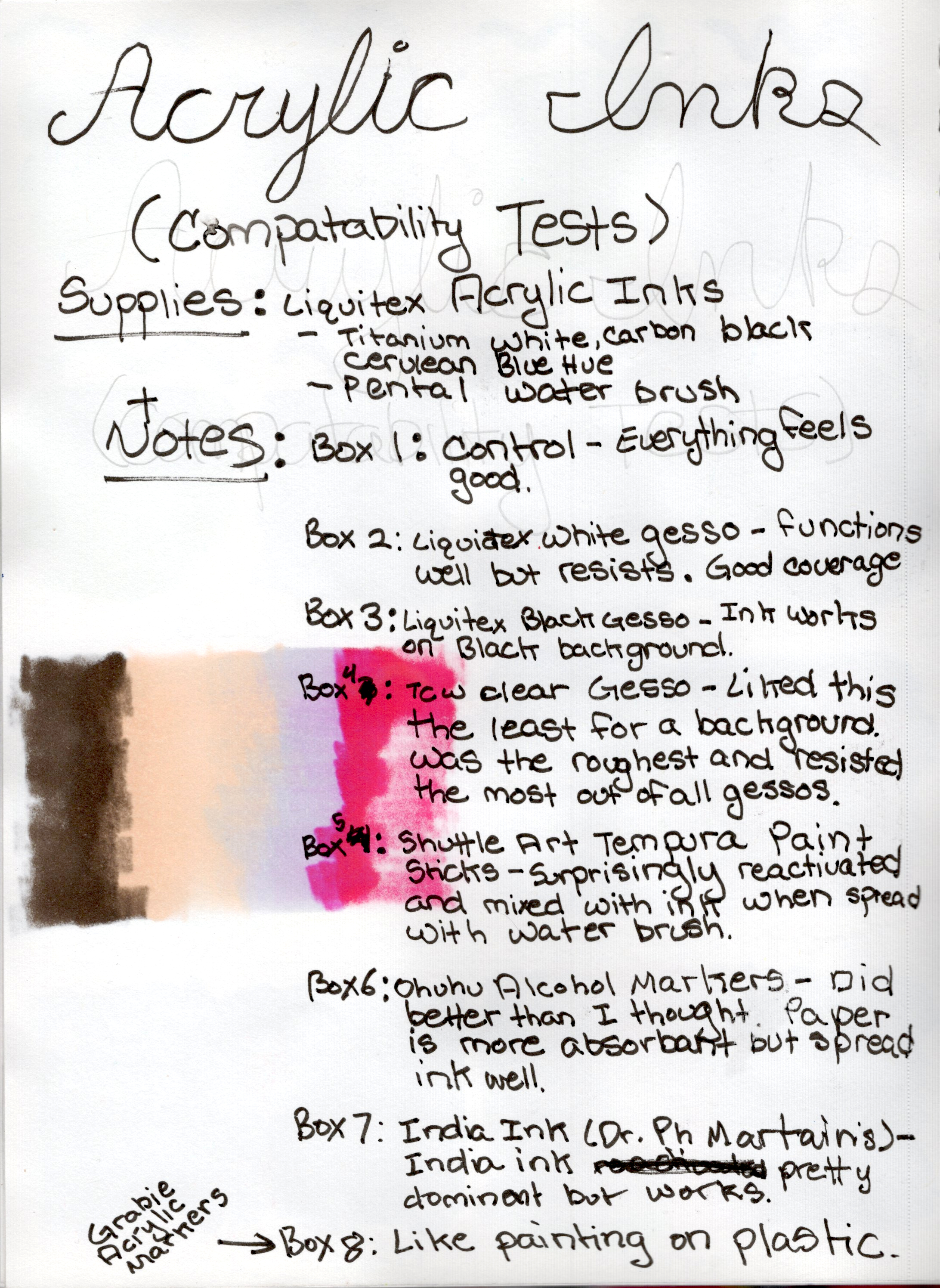
Type: All (works as base, top, or reactant-thinner) Application: Dropper bottle with precision tip / Dip pens / Technical pens / Airbrush / Brush Set Size: 12 bottles Colors Owned: Quinacridone Magenta, Yellow Deep, Bismuth Yellow, Vivid Lime Green, Hooker's Green, Cerulean Blue Hue, Fluorescent Blue, Purple, Deep Violet, Carbon Black, Titanium White, Iridescent Rich Copper Purchase Info:Link | Purchased: [Date] | Price: [Amount]
Additional Specs for Reference
Based on manufacturer information.
Property
Details
Consistency
Ultra-fluid, no need to dilute
Finish
Satin
Drying Time
Fast-drying
Water Resistance
Permanent / water-resistant once dry
Pigment Type
Fine art pigments (not dyes)
Lightfastness
ASTM I (Excellent) for standard colors; metallics/fluorescents naturally less lightfast
Intermixability
Fully mixable with all Liquitex acrylic paints and mediums
Non-clogging
Yes, suitable for airbrushes and technical pens
Color Gallery
My Bottles
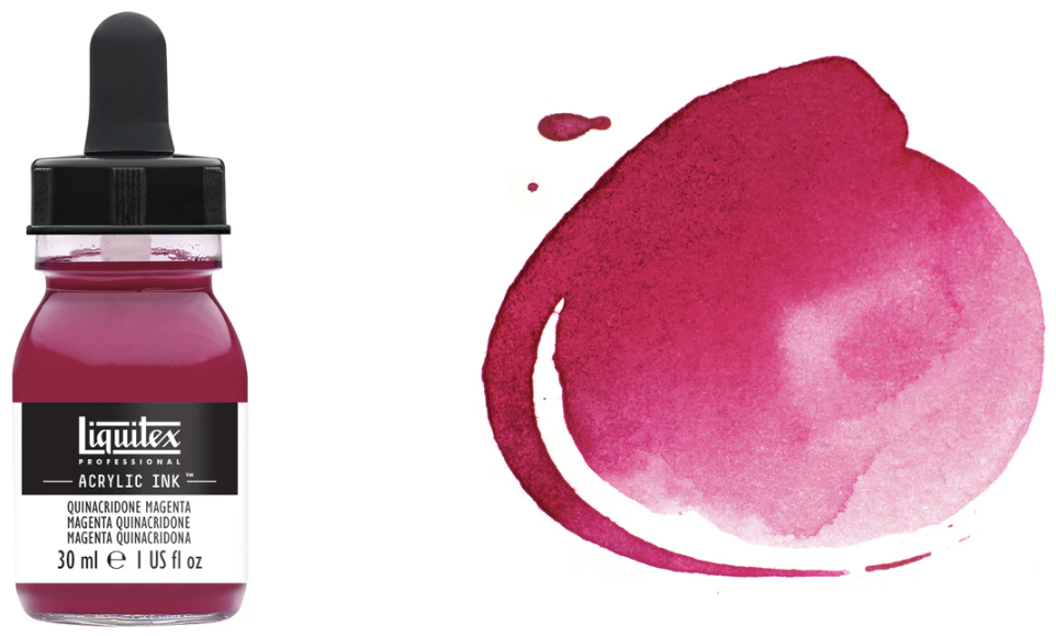
Quinacridone Magenta
Official Liquitex Description: “A rich deep violet-red single pigment color, which is highly transparent. Quinacridone is a high performance organic pigment with exceptional longevity. The name magenta comes from a lake color named in 1859 after the battle in Magenta, Italy.”
Color Code: 114 Color Family: Pink Pigment: PR122 Opacity Rating: Transparent ASTM Lightfastness Rating: Excellent Finish: Satin
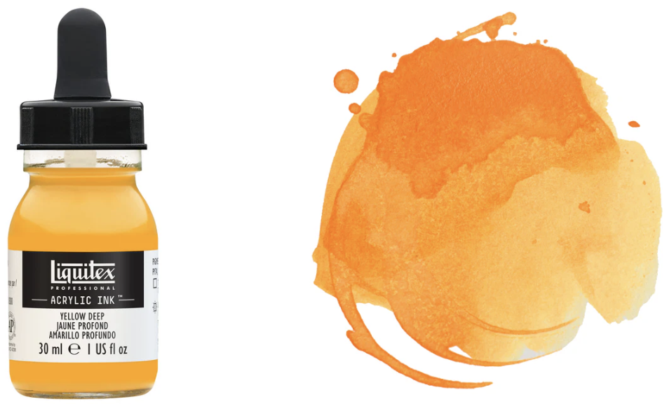
Yellow Deep
Official Liquitex Description: “A rich, warm transparent yellow which dilutes/granulates to reveal a bright, lighter ‘sunset yellow’.”
Color Code: 295 Color Family: Yellow Pigment: PY 74, PO67 Opacity Rating: Transparent ASTM Lightfastness Rating: Excellent Finish: Satin
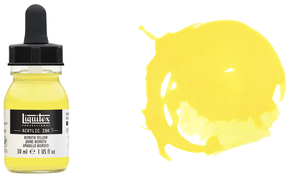
Bismuth Yellow
Official Liquitex Description: “An iconic color known well from watercolor. A bright, opaque, cool lemon yellow good for mixing clean, bright greens.*”
Color Code: 155 Color Family: Yellow Pigment: PY184 Opacity Rating: Opaque ASTM Lightfastness Rating: Excellent Finish: Satin
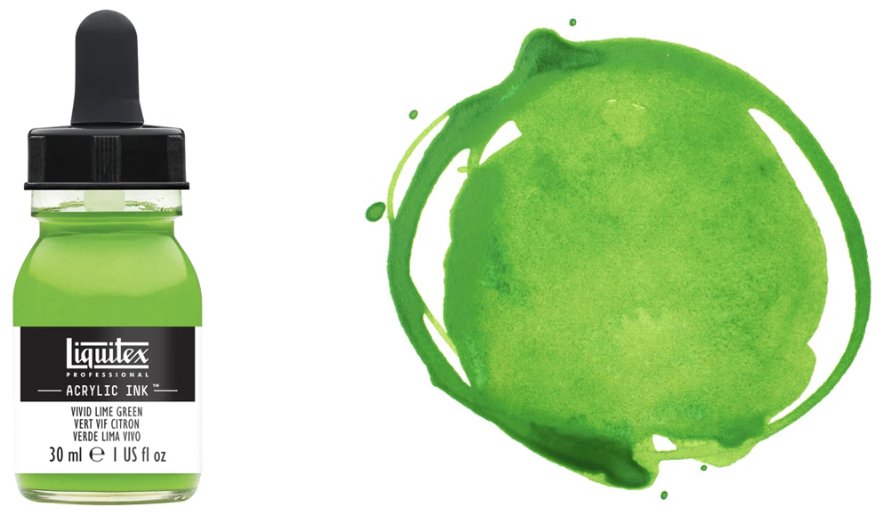
Vivid Lime Green
Official Liquitex Description: “A light and vivid yellow-green transparent color, made up of a blend of pigments including phthalocyanine.”
Color Code: 740 Color Family: Green Pigment: PY138, PG7 Opacity Rating: Transparent ASTM Lightfastness Rating: Excellent Finish: Satin
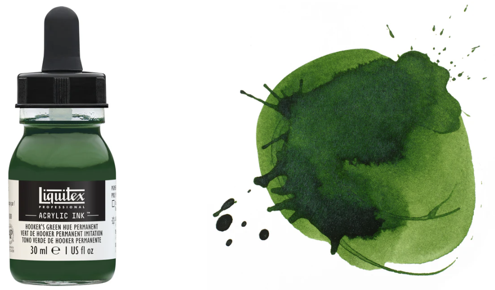
Hooker's Green Hue Permanent
Official Liquitex Description: “A beautiful, subtle, deep green named for 19th century English botanical painter William Hooker.”
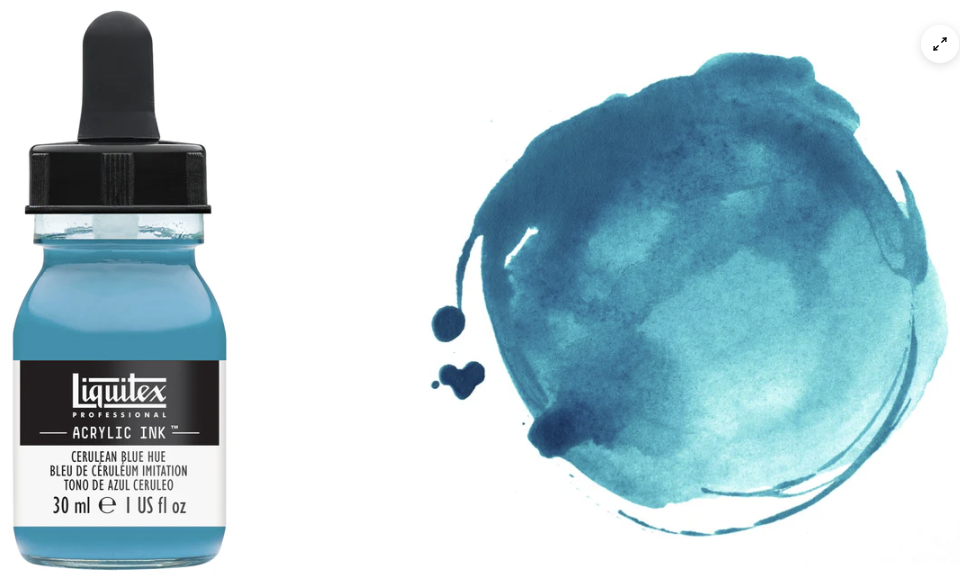
Official Liquitex Description: “This is a rich blue opaque color with green undertones. Its name derives from the Latin caeruleum meaning sky-blue pigment, and is a careful combination of pigments closely resembling genuine cerulean blue”
Color Code: 470 Color Family: Blue Pigment: PW6, PB15:3, PG7 Opacity Rating: Opaque ASTM Lightfastness Rating: Excellent Finish: Satin
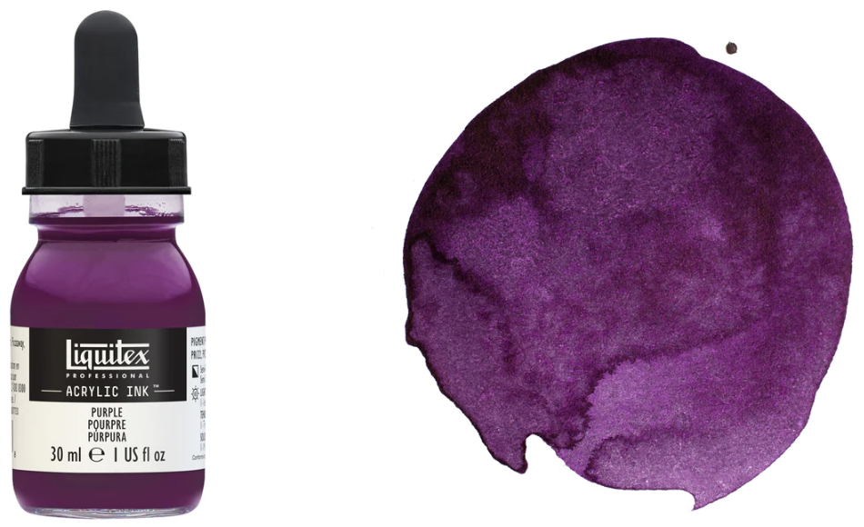
Color Code: 115 Color Family: Purple Pigment: PR122, PV23RS Opacity Rating: Semi-Opaque ASTM Lightfastness Rating: Very Good Finish: Satin
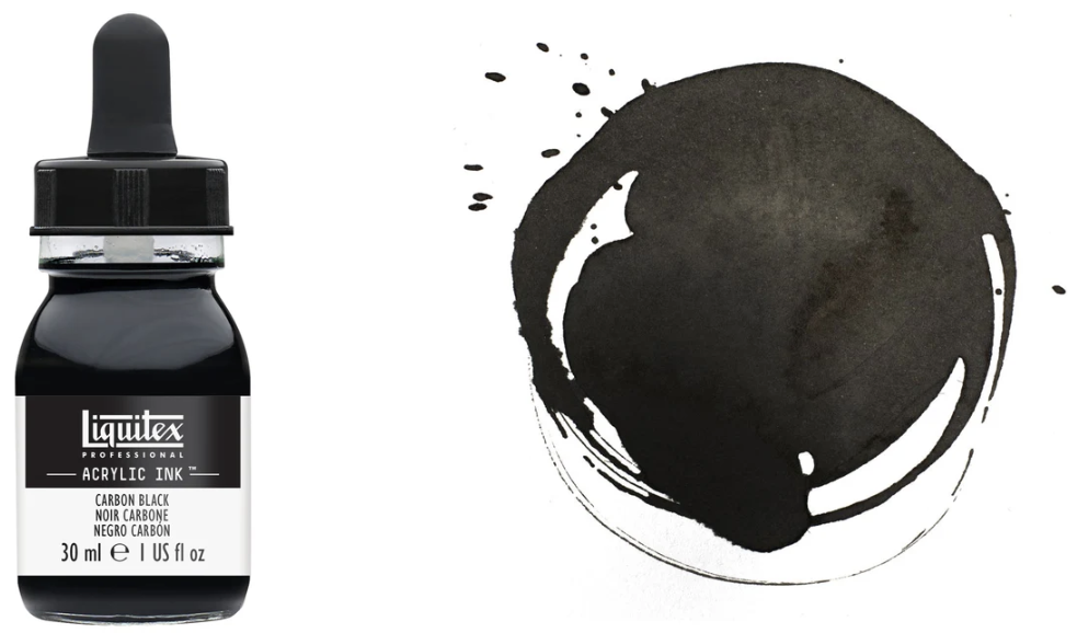
Carbon Black
Official Liquitex Description: “A single pigment, semi-opaque deep black color. Also called lamp black and ivory black, the pigment was traditionally produced from charring organic materials such as wood or bone.”
Color Code: 337 Color Family: Black Pigment: PBk7 Opacity Rating: Semi-Opaque ASTM Lightfastness Rating: Excellent Finish: Satin / Matte
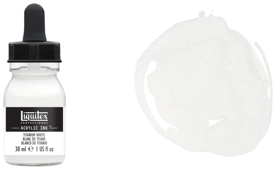
Titanium White
Official Liquitex Description: “A brilliant white single pigment color, which offers the strongest, most opaque of all whites. Titanium white is an inorganic pigment introduced in the early 1900s from titanium dioxide and is named after Titan. It's still the world's primary pigment for whiteness, brightness and opacity.”
Color Code: 432 Color Family: White Pigment: PW6 Opacity Rating: Opaque ASTM Lightfastness Rating: Excellent Finish: Satin
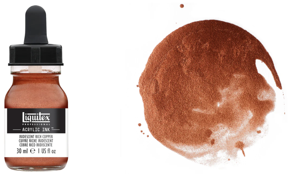
Iridescent Rich Copper
Official Description: “A deep metallic copper with brown-orange tones. Highly opaque, the color gives an iridescent lustre resembling that of burnished copper metal.”
Color Code: 230 Color Family: Iridescent Pigment: Mica Opacity Rating: Opaque ASTM Lightfastness Rating: Not ASTM Rated Finish: Satin / Metallic
Top Effect: Black ink splattered and dropper dragged.
No real bloom but ink seems to naturally spread through water. Tended to pool, easier to accidentally splatter.
*Note: The handwritten label says “W/O Gesso” and that is incorrect, there IS gesso.
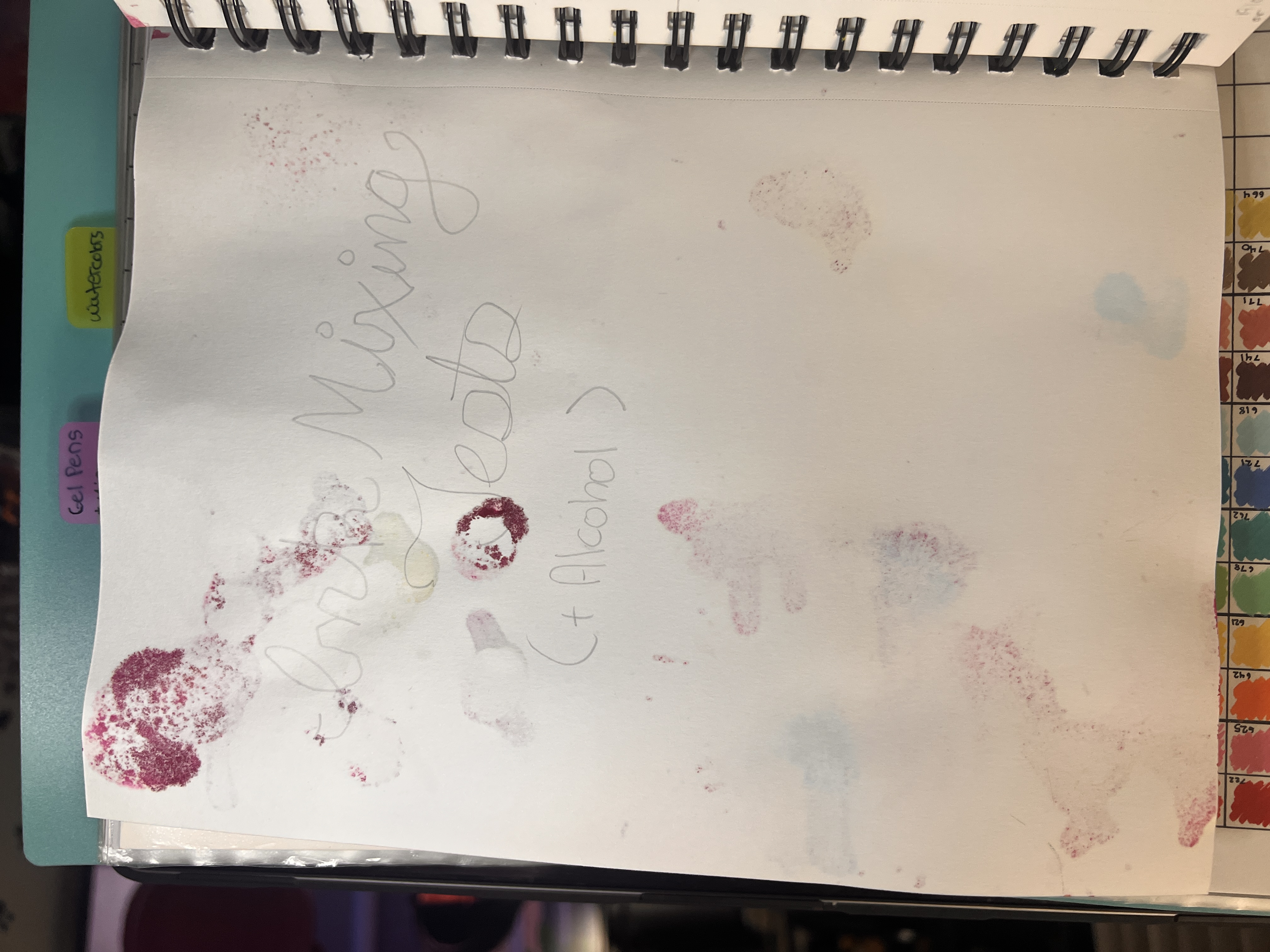
Test Summary
More Thoughts on Blooms
Time after time, I realize I don’t like water on gesso for the acrylic inks.
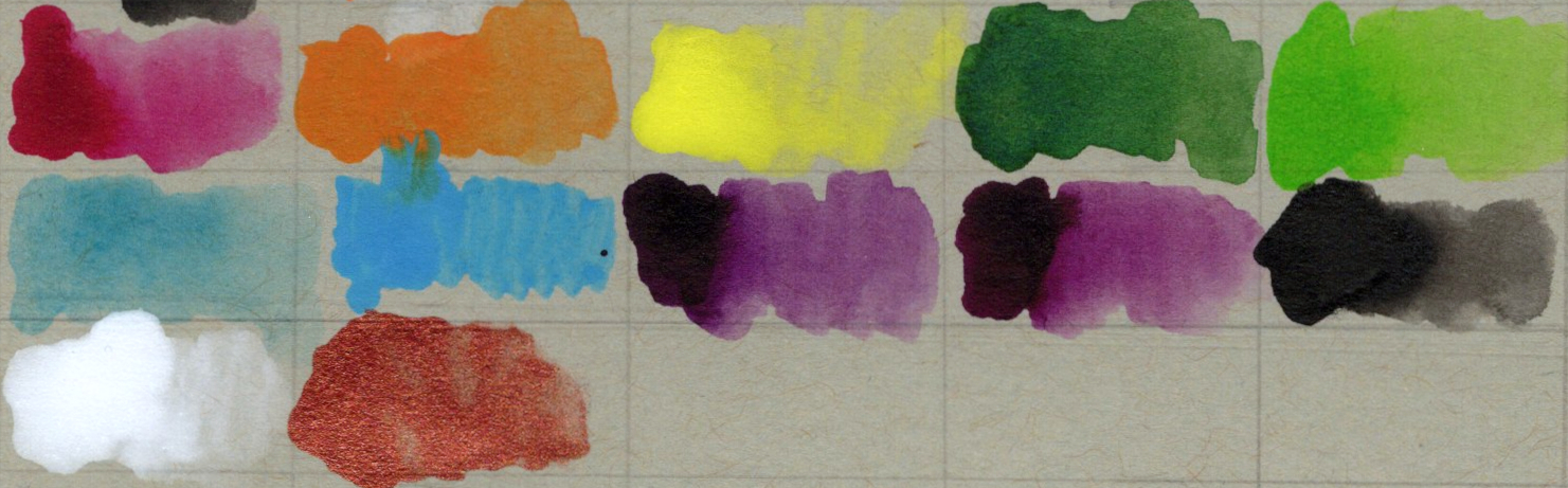
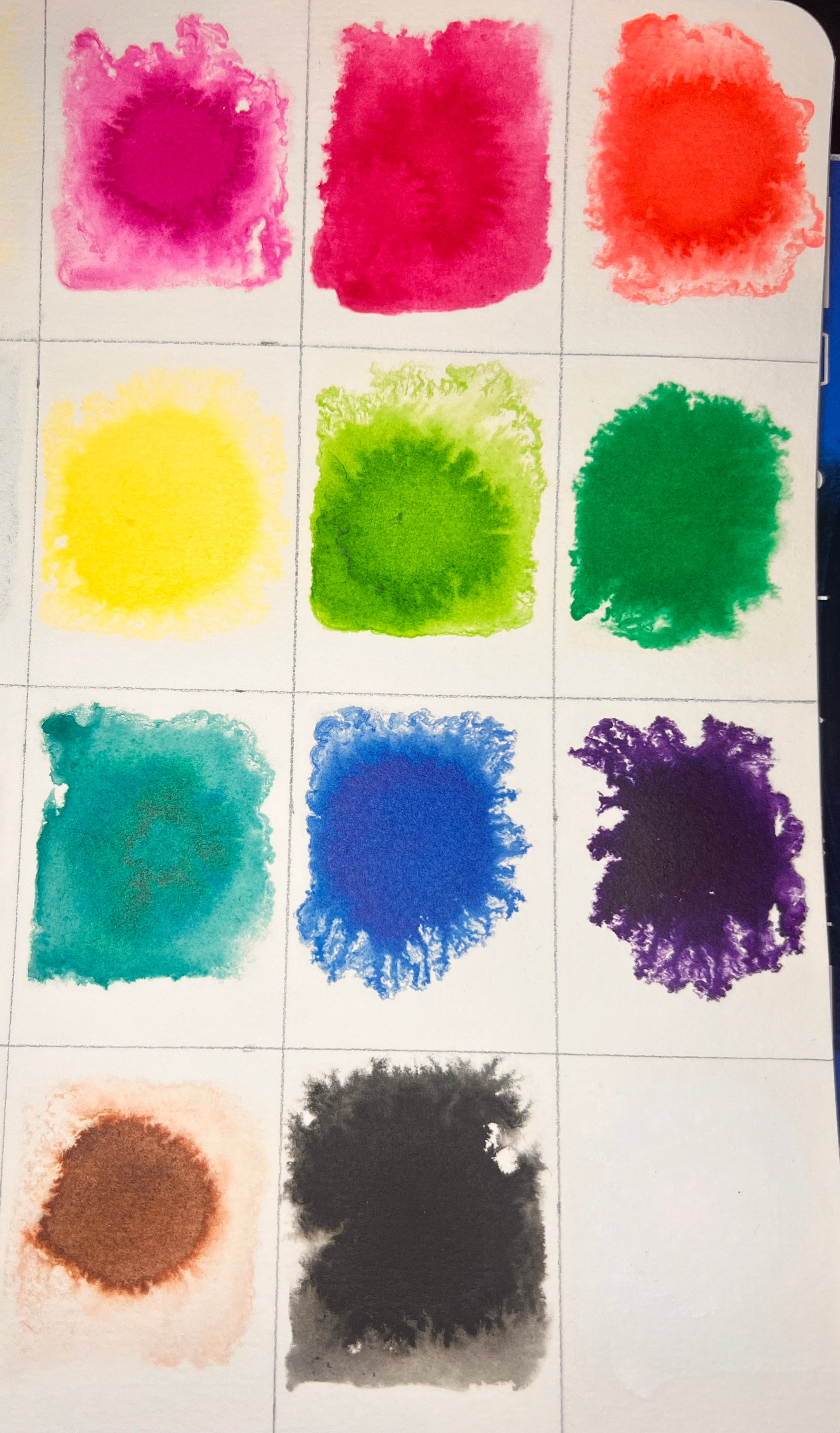
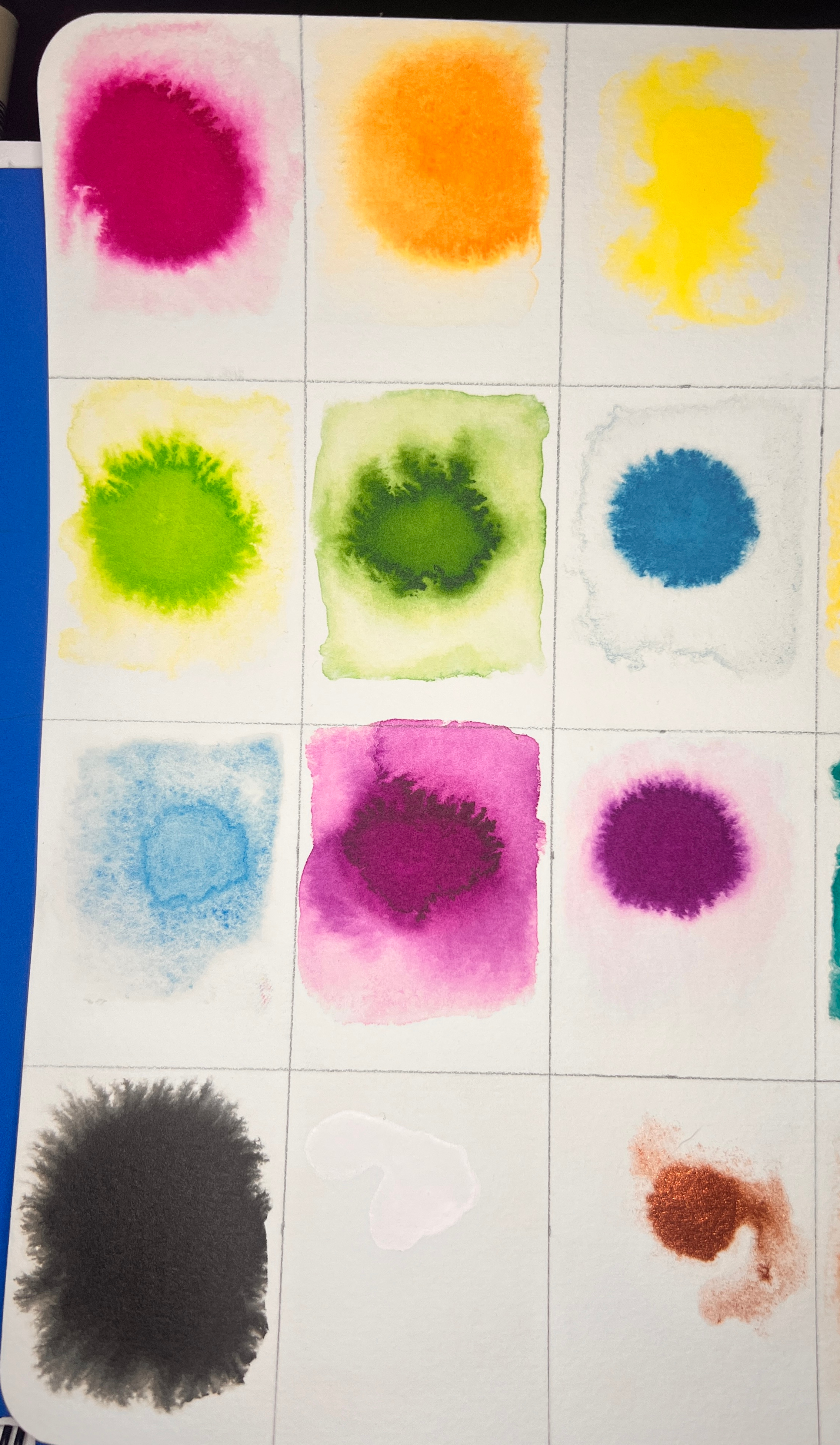
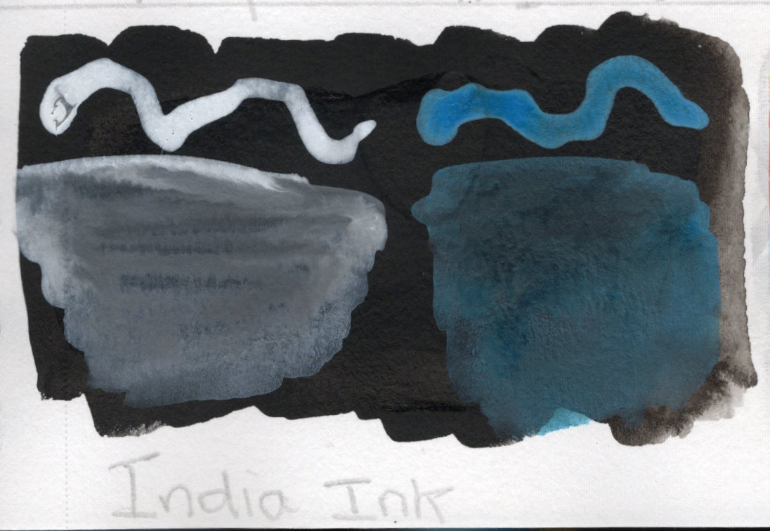
I did a swatch card with all the inks I have and did so by wetting the paper and then dropping the ink right in the center to see how it blooms. This was using Meedan Watercolor Paper.
Results: There was some good reaction and blooming that happened but some of the colors bloom better than others, and the blooms don’t go very far, though the fractaling effect is pretty cool.
The acrylic inks (right) don’t bloom as well as the India inks (left).
Common Media Bases
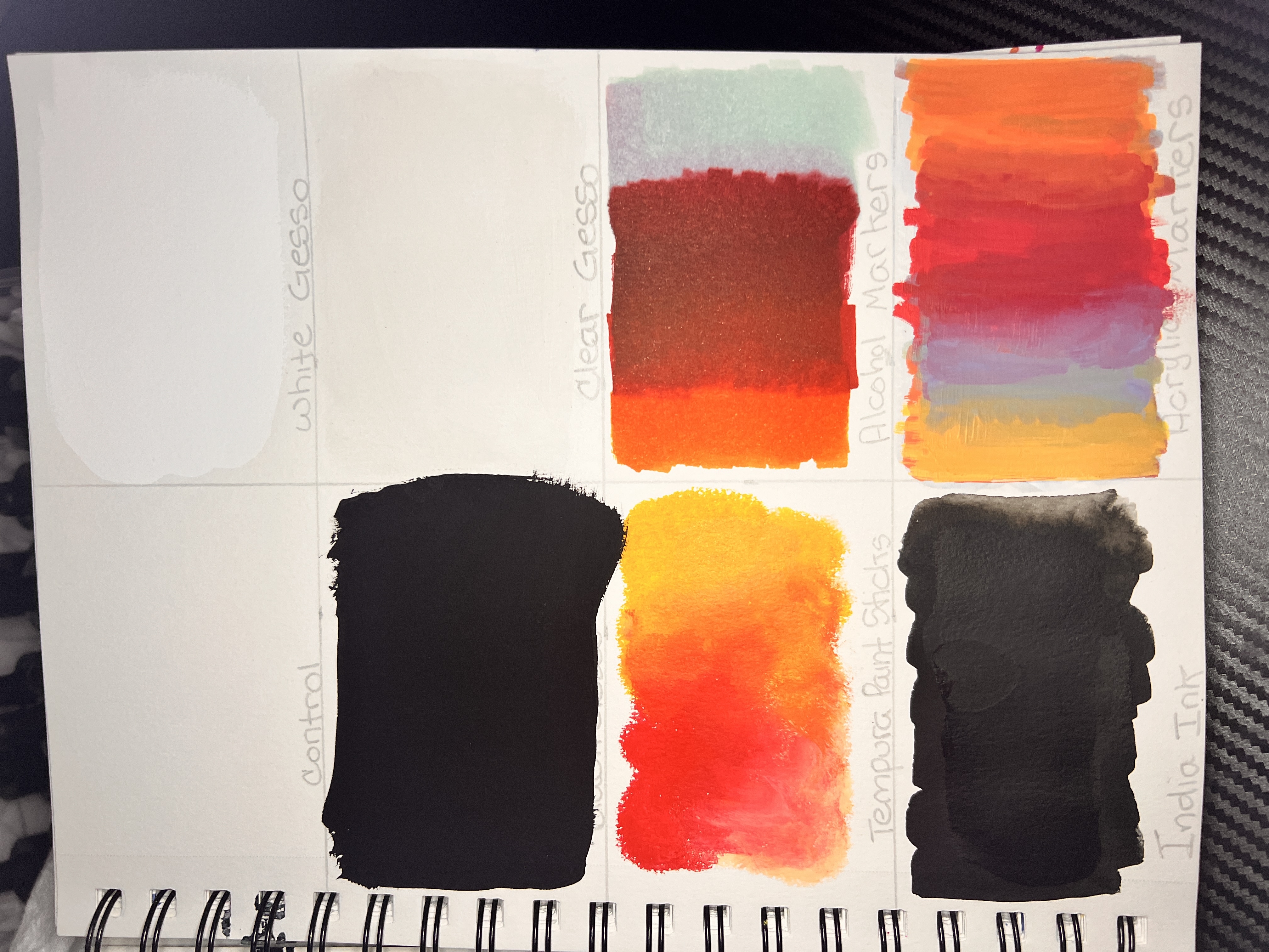
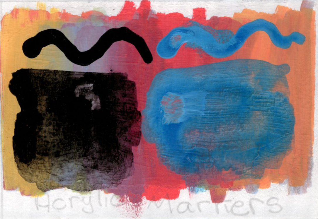
Test Goal: To see how India inks work on top of other media.
Methods
Drew 8 rectangle grid.
Painted 7 different media in 7 of the squares (white gesso, black gesso, clear gesso, tempura paint sticks, alcohol markers, India ink, and acrylic markers. Allowed to fully dry.
Blank one is the control.
Three different colors:
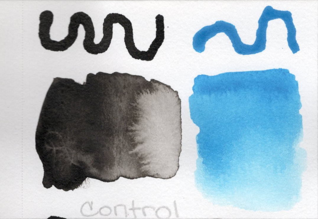
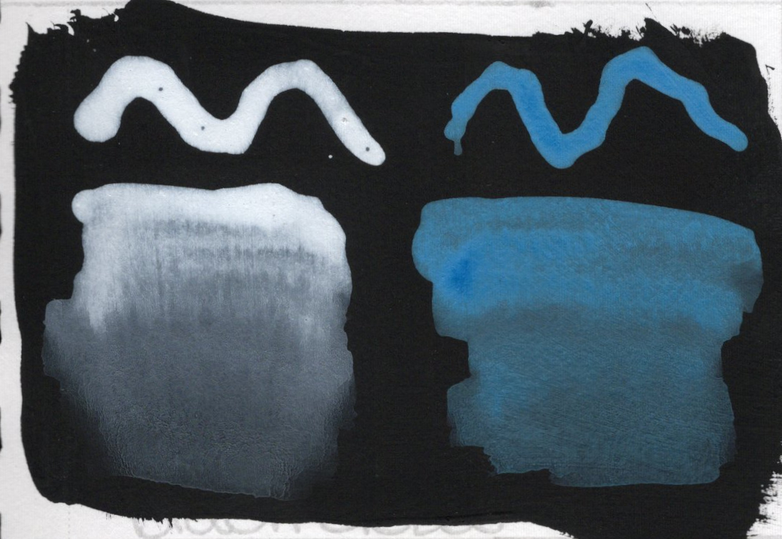
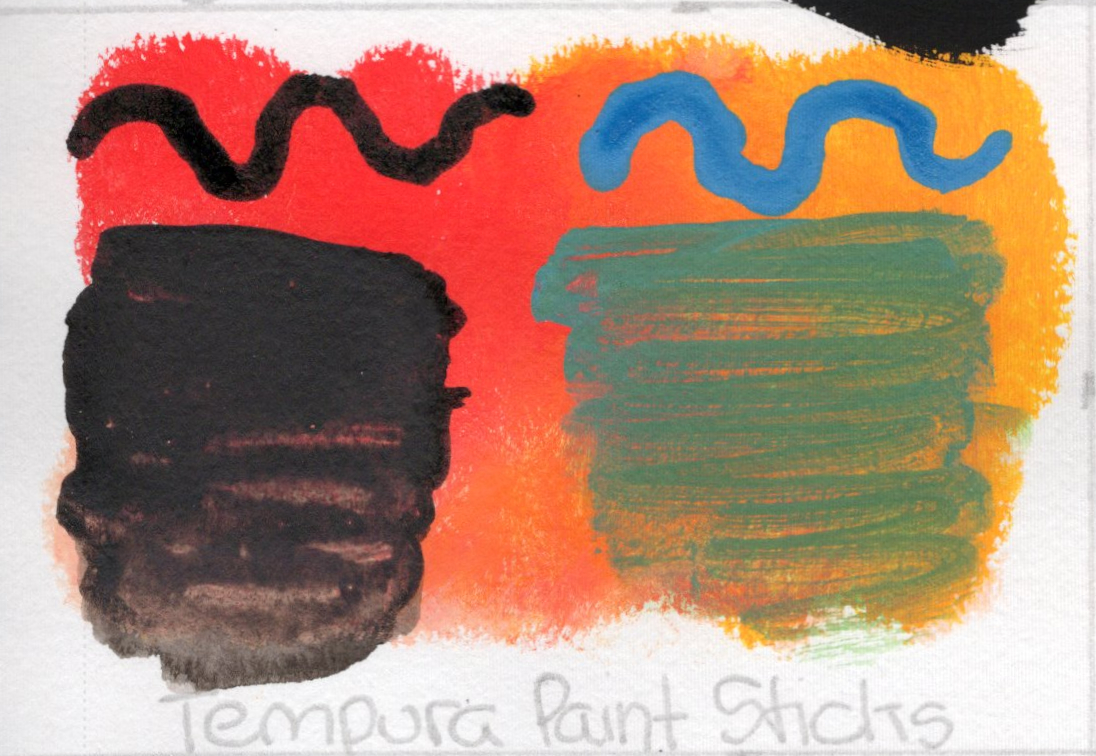
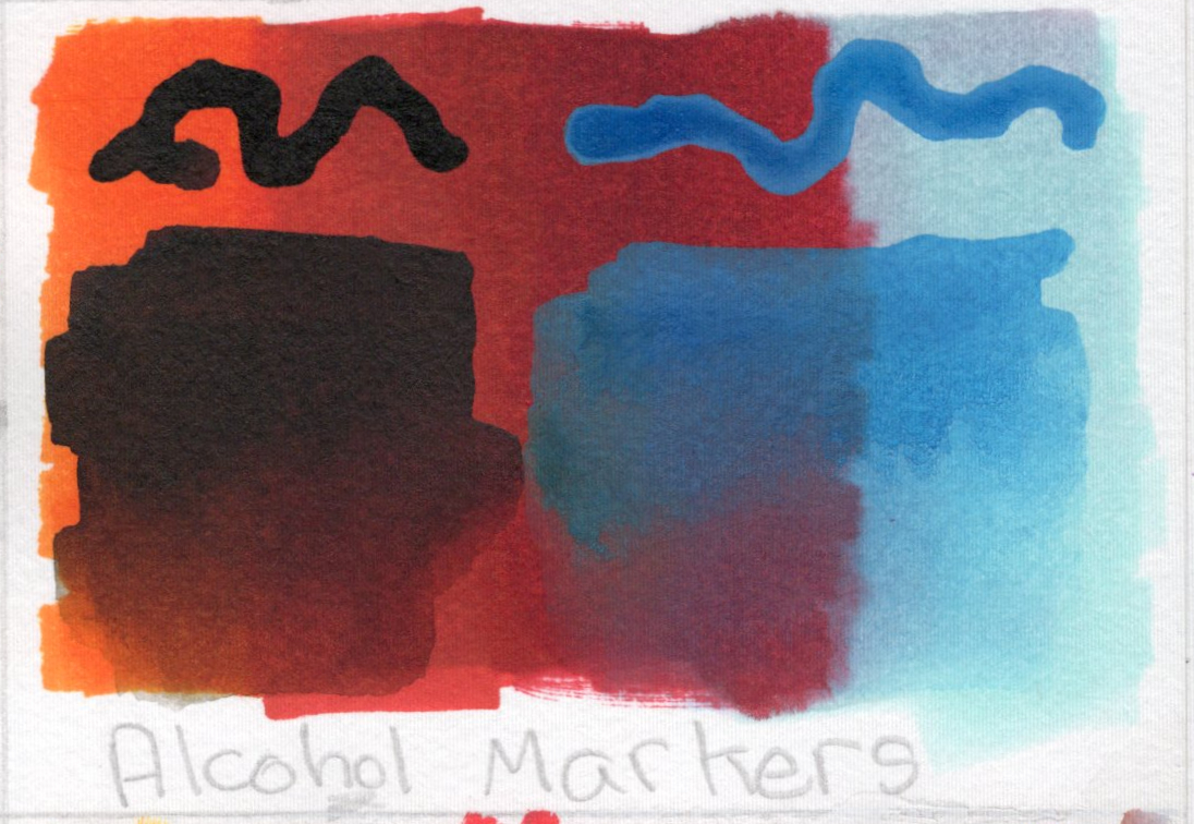
Carbon Black ink for control, white gesso, clear gesso, tempura paint sticks, alcohol markers, and acrylic markers
Painted black ink or white ink (depending on base color) on left side and blue ink on right. Squiggled with dropper then some ink to spread with water brush…so there are 4 different marks on each square.
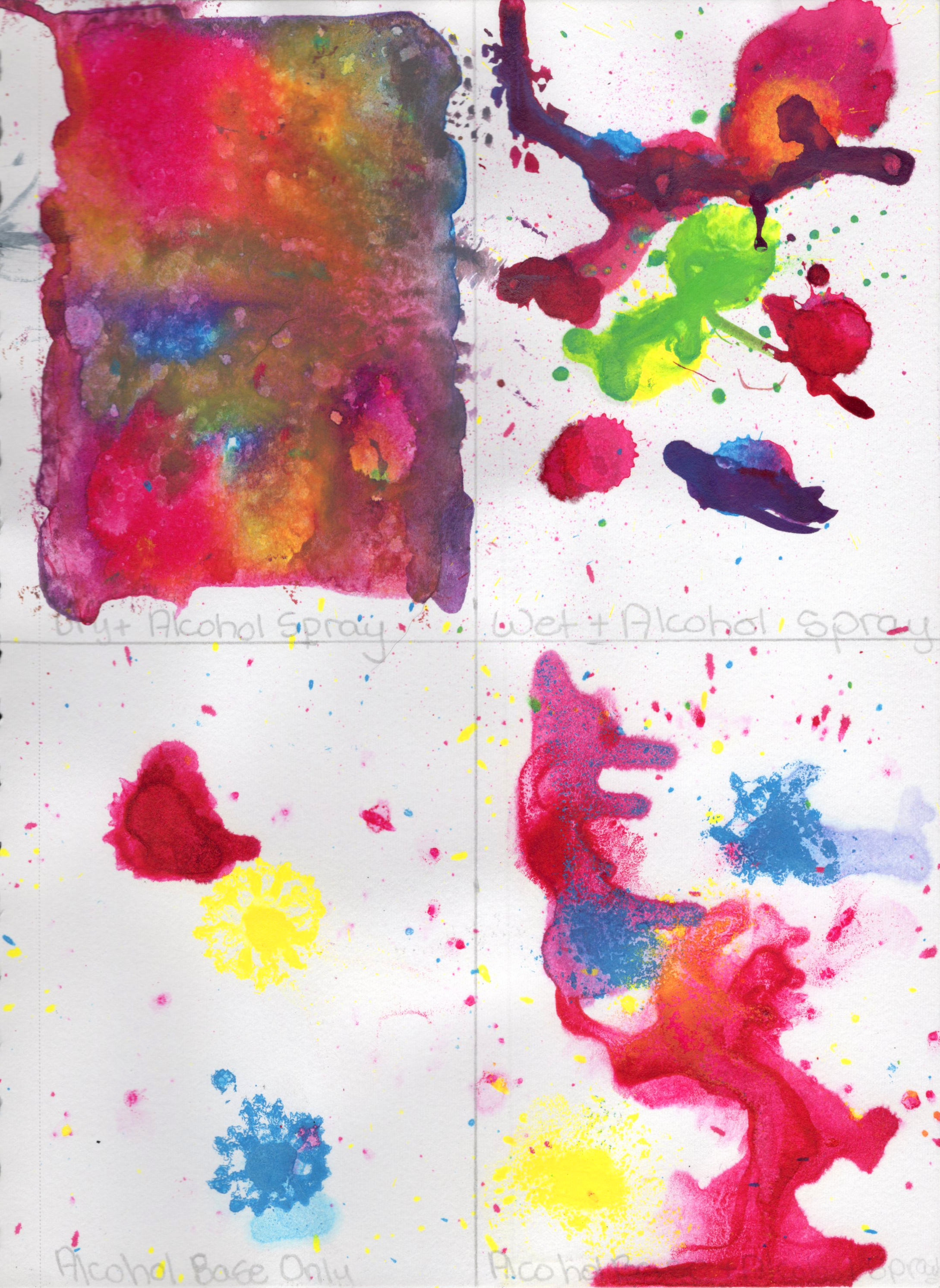
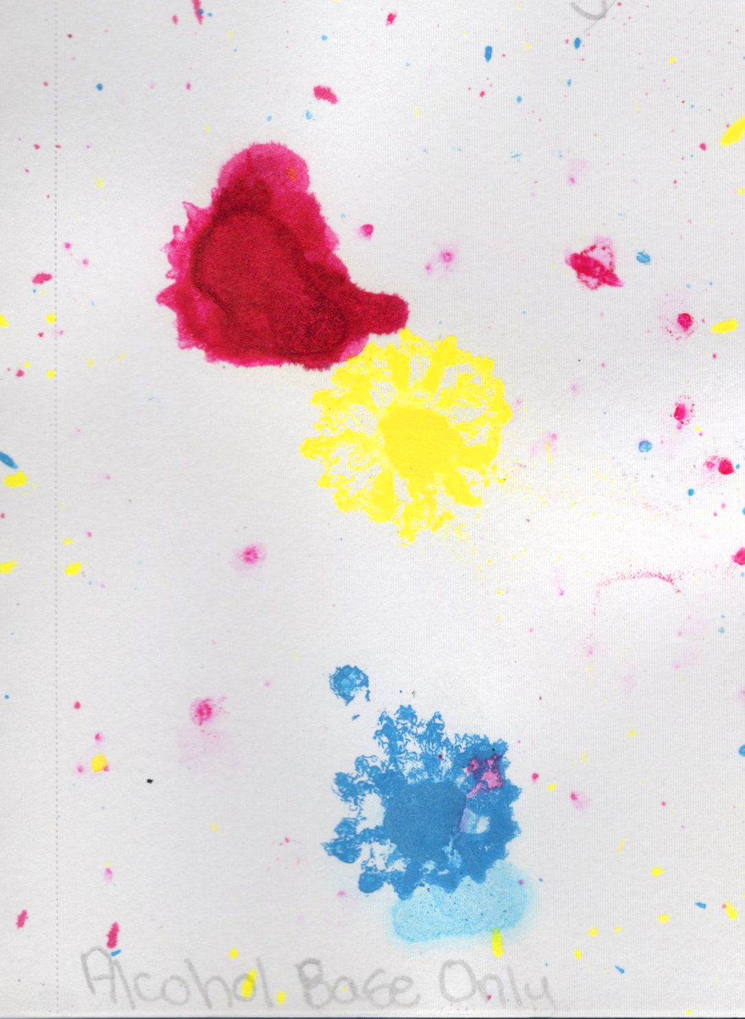
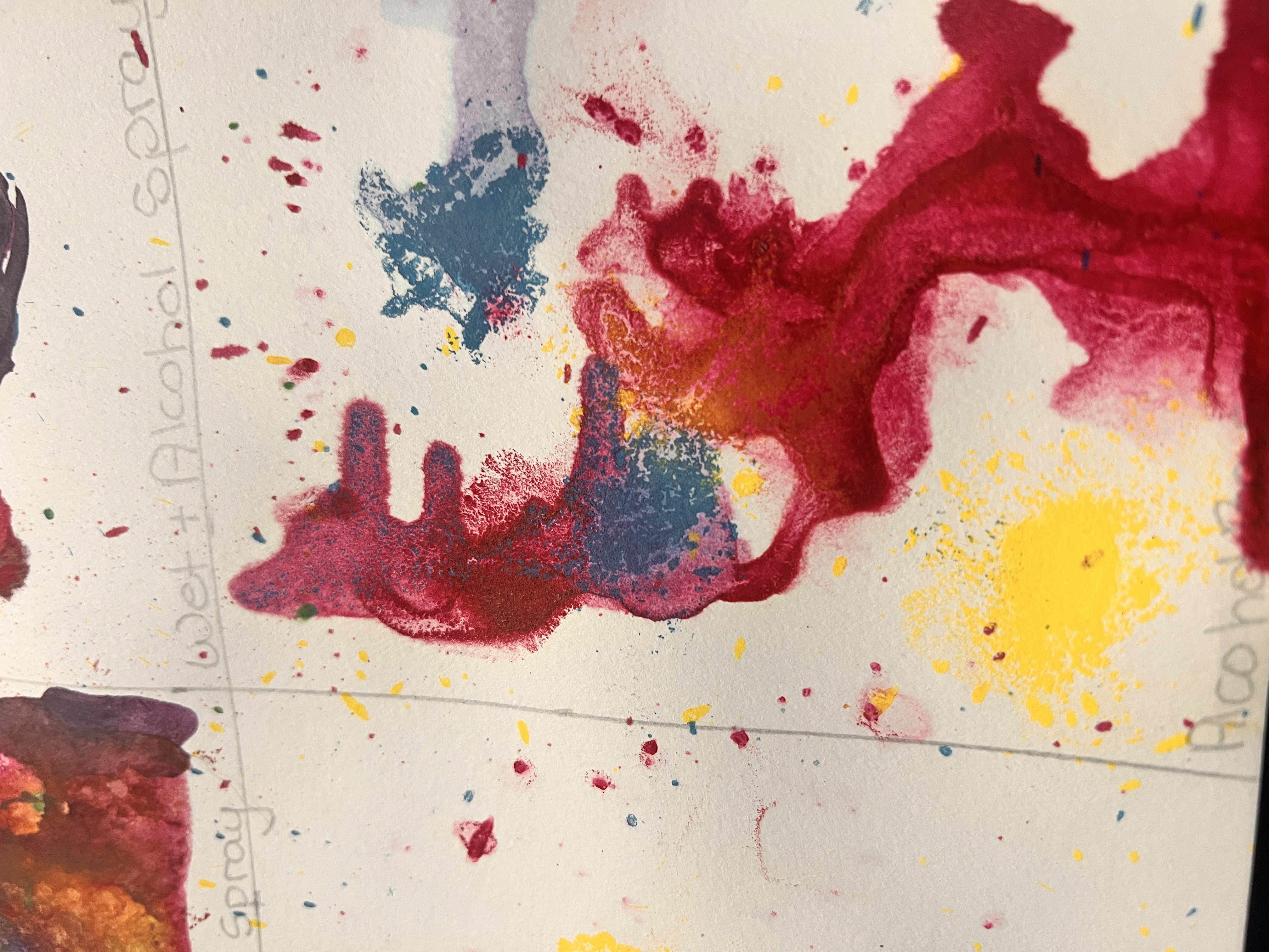
Alcohol base was crazy! The ink explode the moment it touched the alcohol and splattered far. It’s like the alcohol resists the ink so much that the ink just bounces right off.
Any ink that actually stays on the paper pools and sits on top until dry.
The ink did this really interesting fractal looking thing.
Color combo was closer to CMY and created vibrant, saturated colors. When mixed, they created a muddy brown.
The alcohol definitely makes the inks bleed through but the best result came from the water base and alcohol spray. That had the least amount of page seepage. Acrylic inks seem to have less bleed through with alcohol than India inks.
Separate thought from above, but I used India inks for the first three bullet points in my notes, with the bottom bullet being written in Sakura Micron (1). The India ink started reacting with the alcohol from the other side and spread. Good to know.
The Alcohol makes the ink run pretty badly, especially on the dry or alcohol base applications. This technique can really only be used with the water base and alcohol spray.
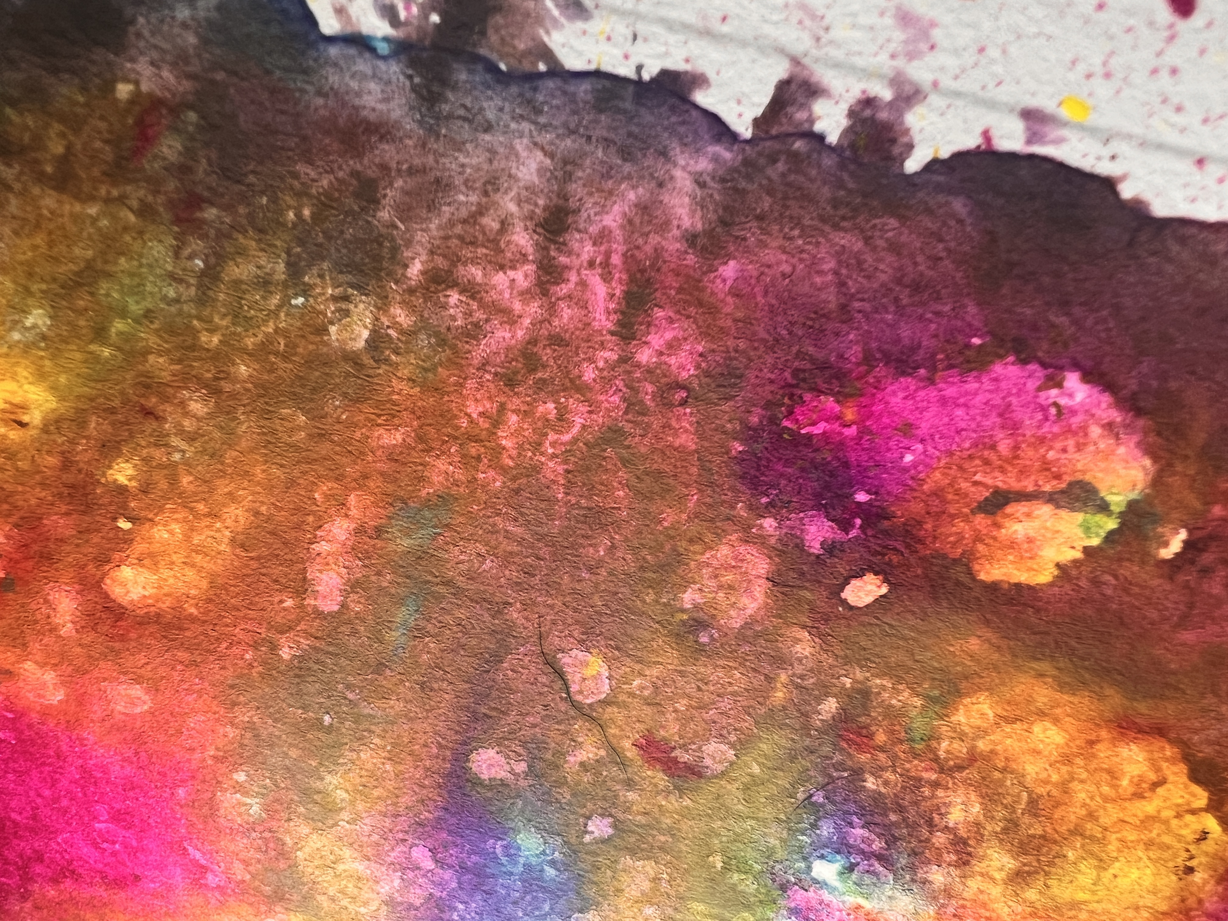
Speaking of reactions…the granulating/separating reaction of the dry base/alcohol spray combo is really interesting.
Spray should happen after some drying. Try not to have pools of ink and most things should be wet. Once dry, the ink doesn’t react with the alcohol.
Overall Strengths & Weaknesses
Rating:4.7★★★★★
What I Like
It’s waterproof and does well with anything that’s wet or dry.
Moves like ink, and can be watered down to look like watercolor.