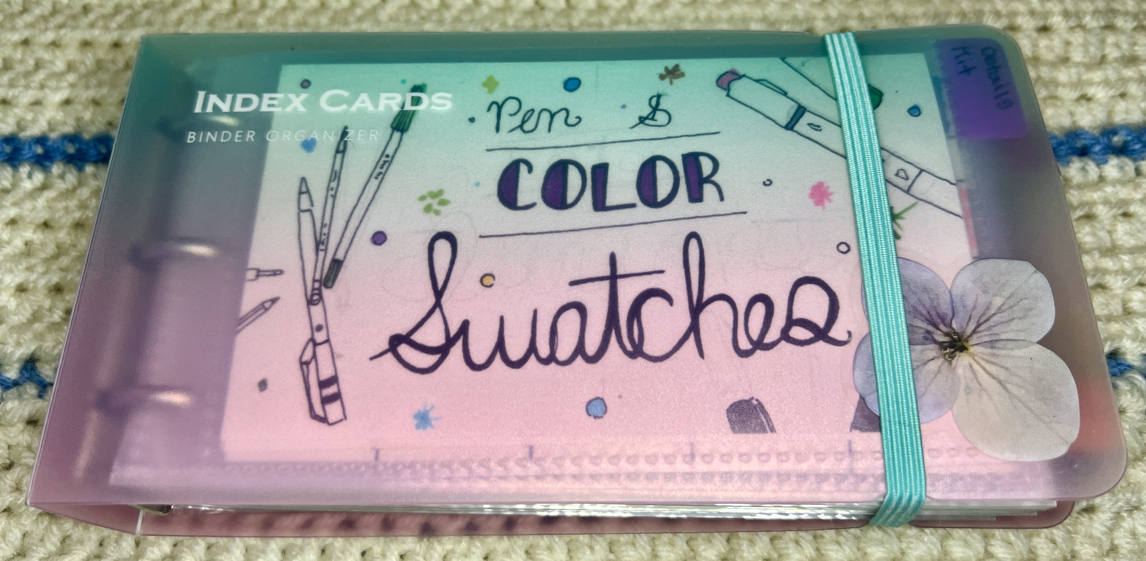
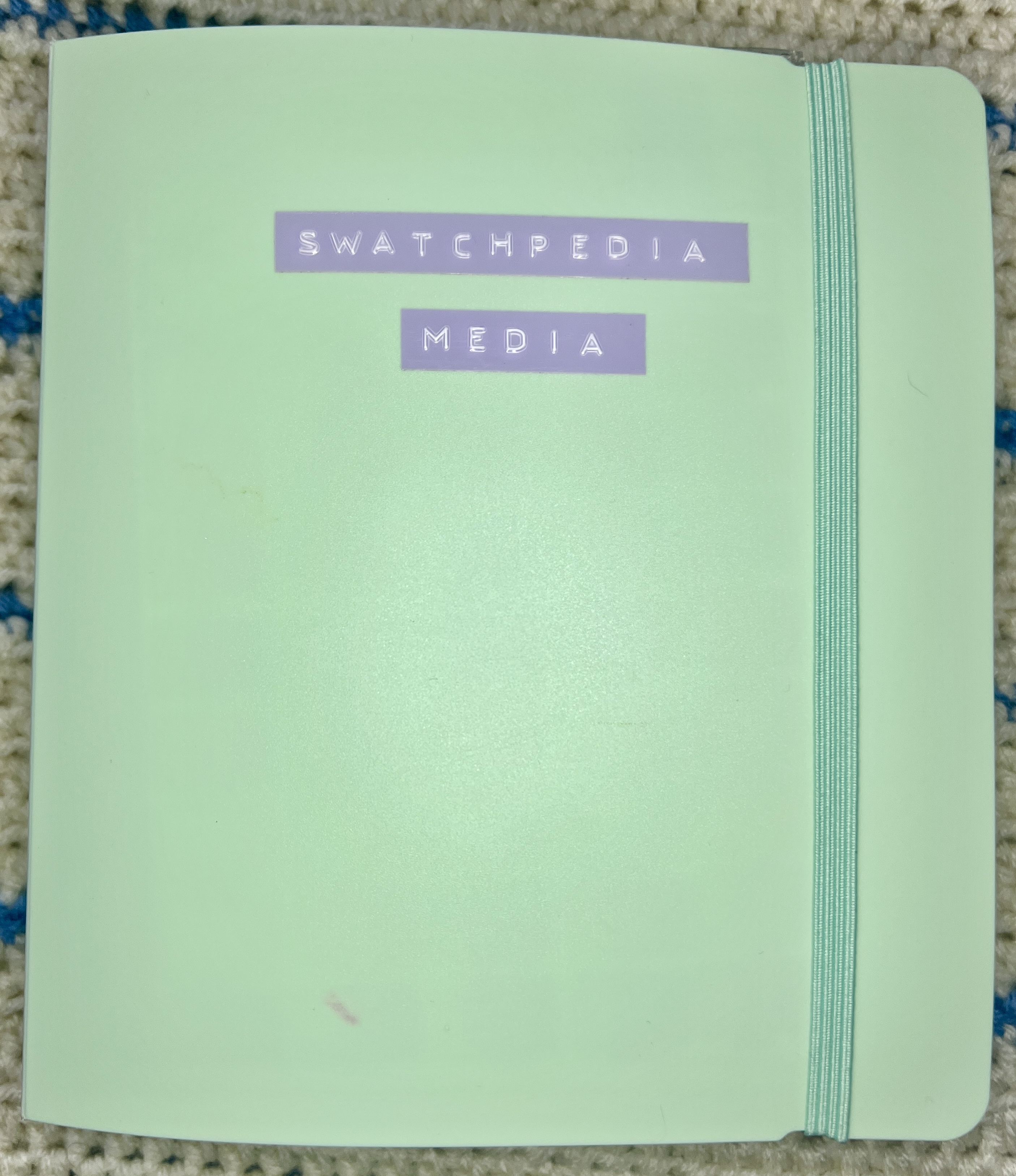
Swatchpedia
This is my working swatch book of all the mediums I use
Ultimate Organization
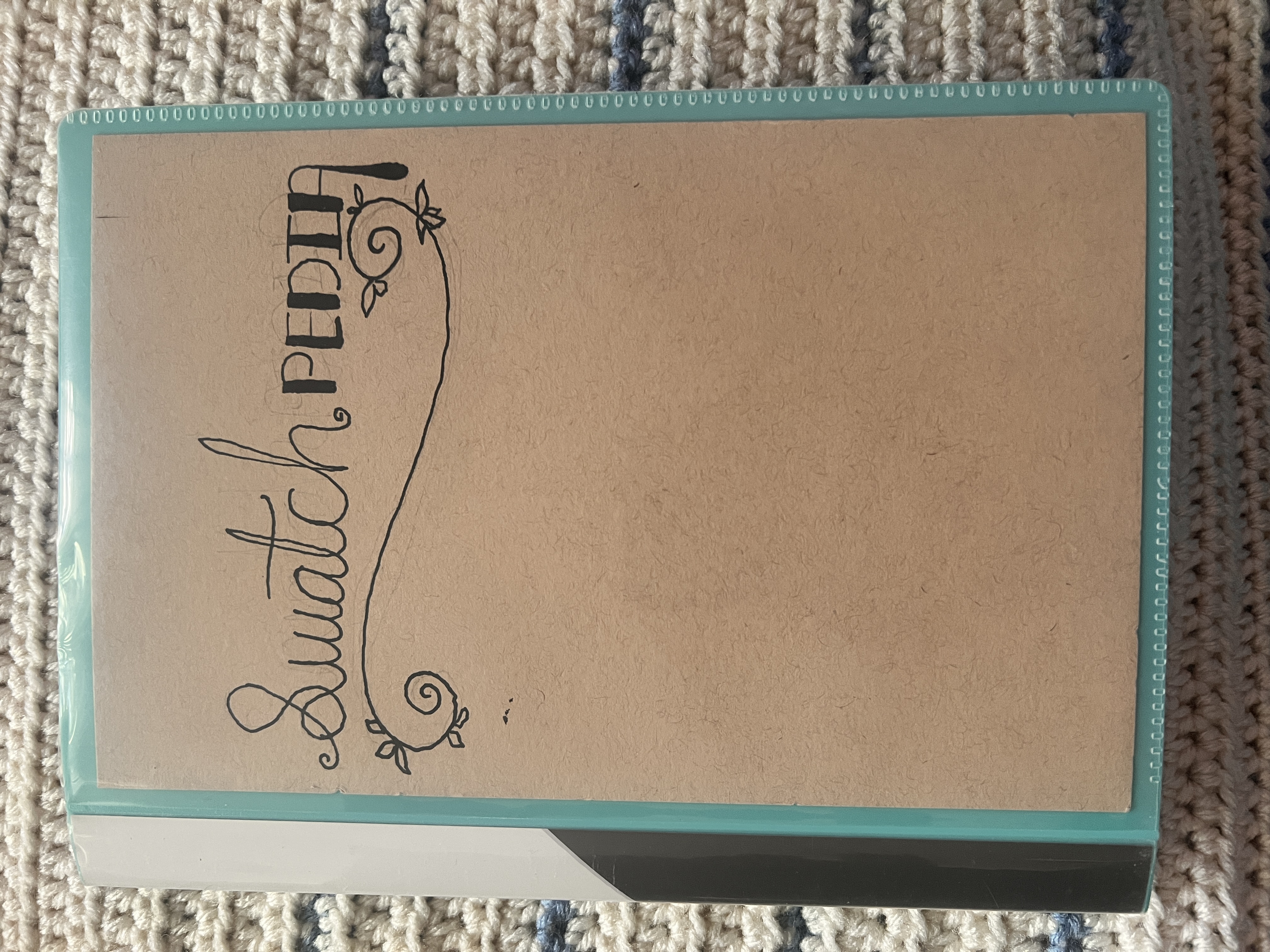
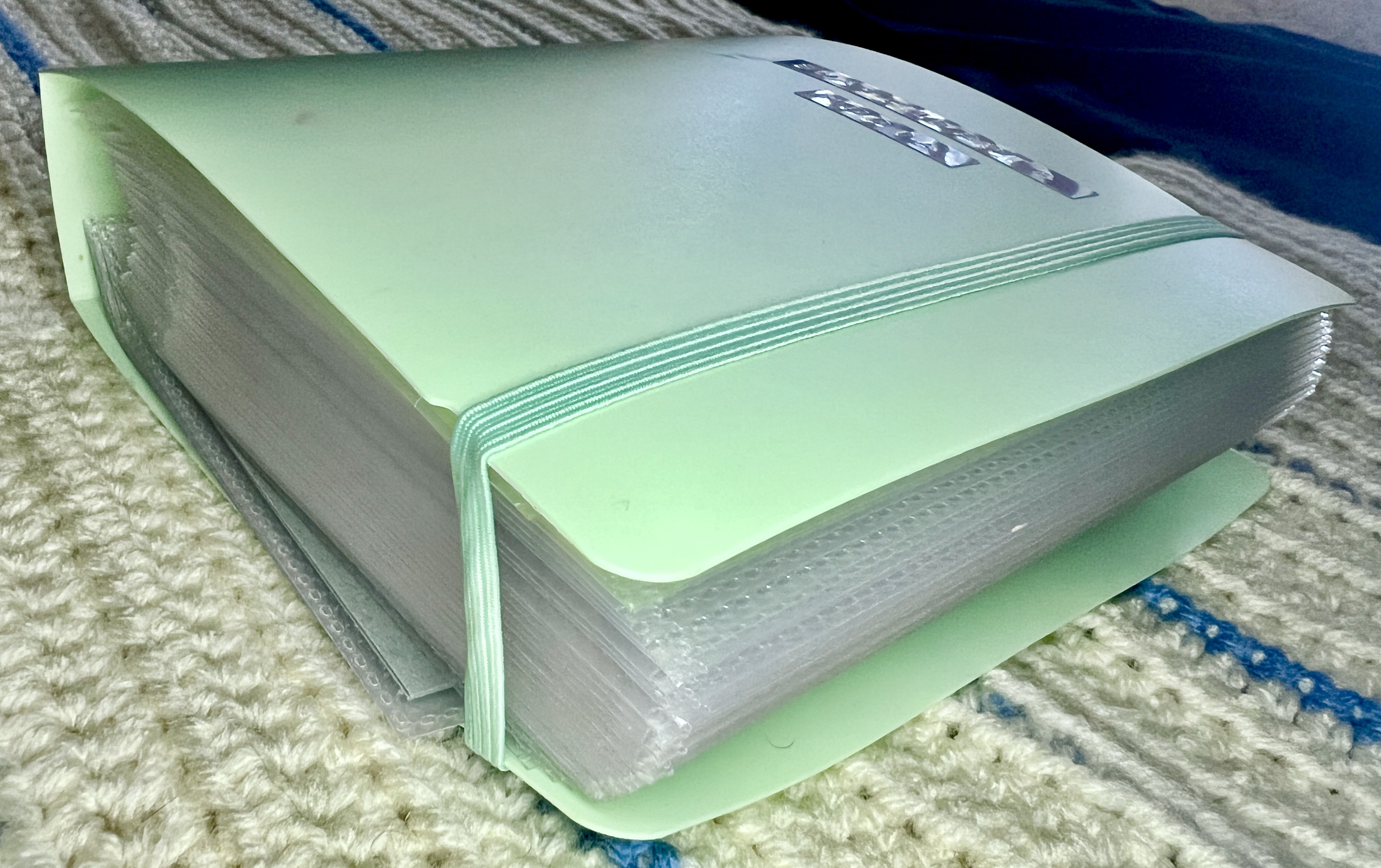
This book uses the Dunwell Presentation Book, with a cover sheet cut from Strathmore Toned Tan Mixed Media paper. It’s a top-loading album with clear sheet protectors.
Current Swatch Gallery
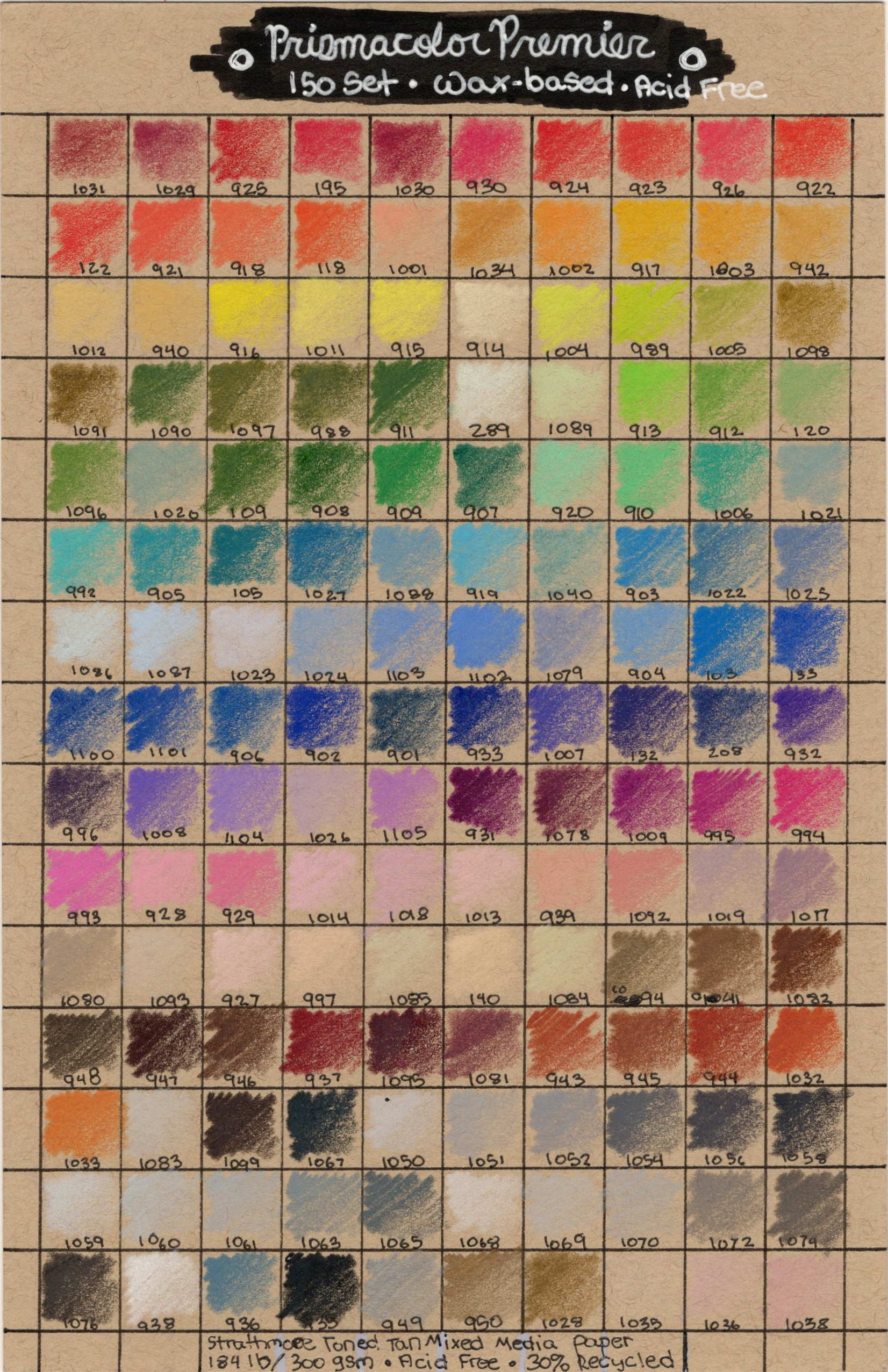
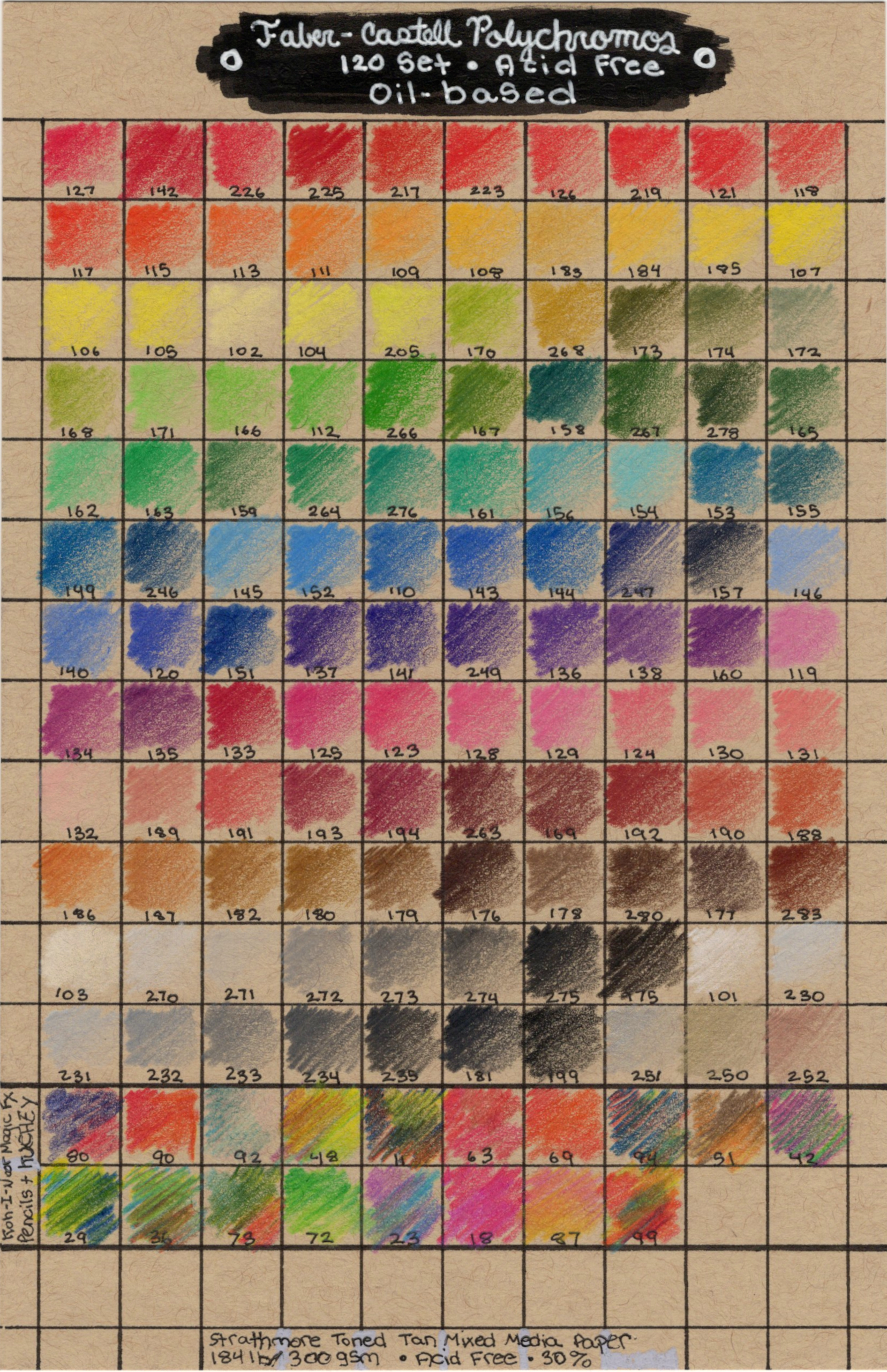
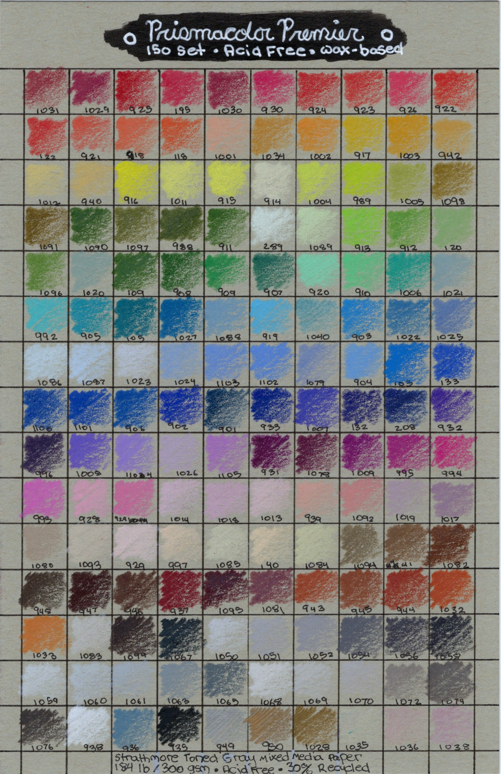
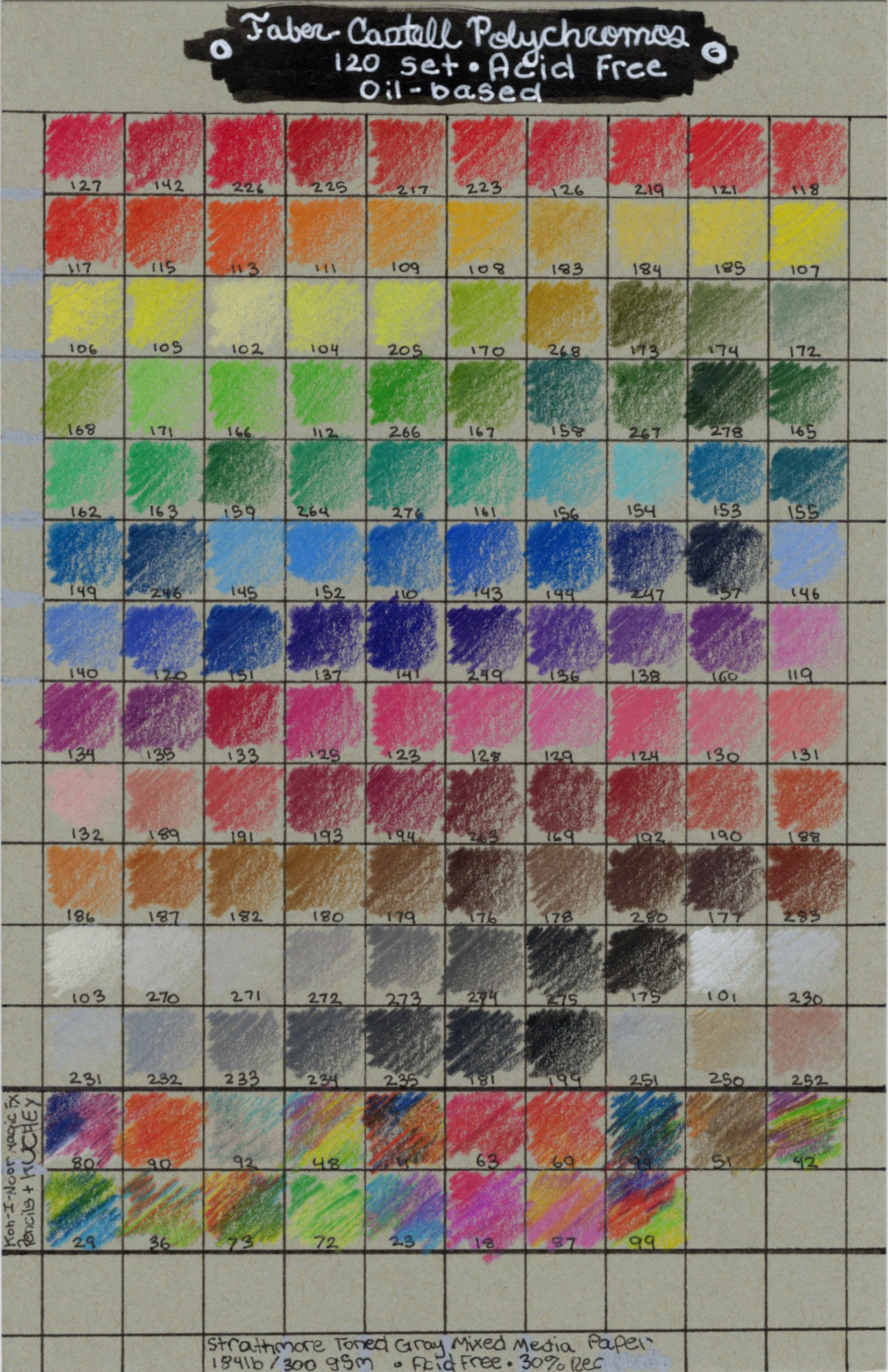
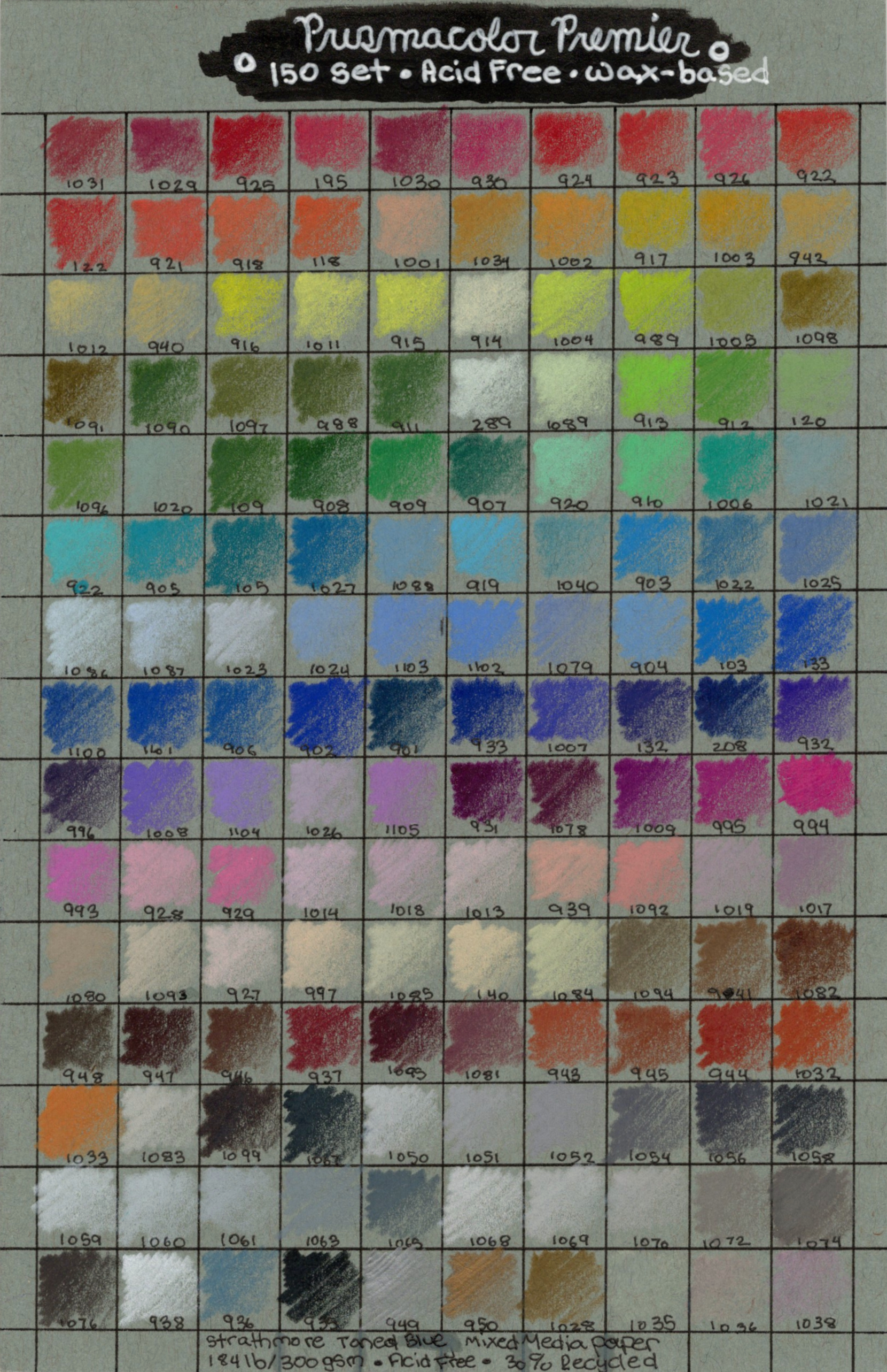
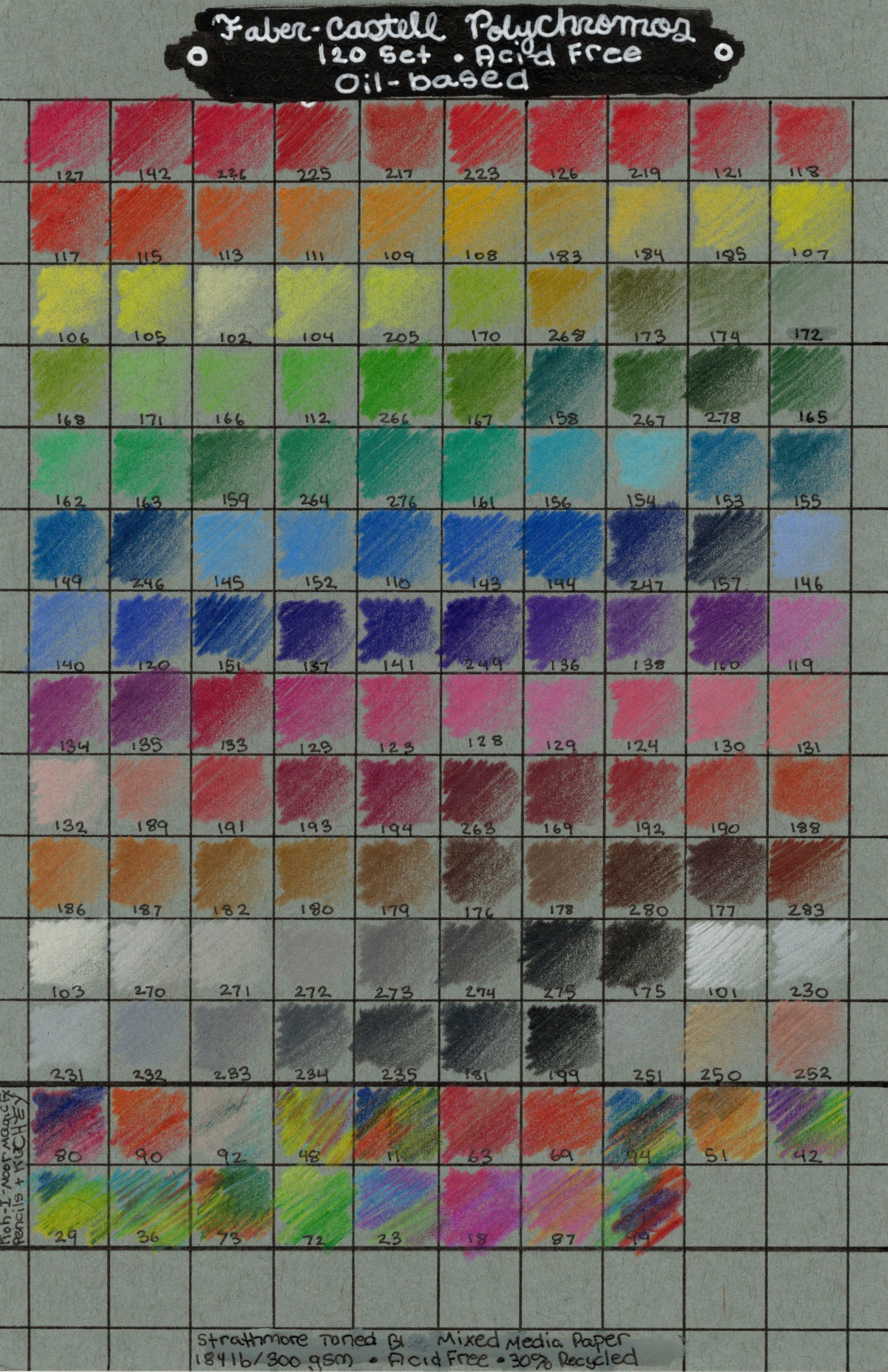
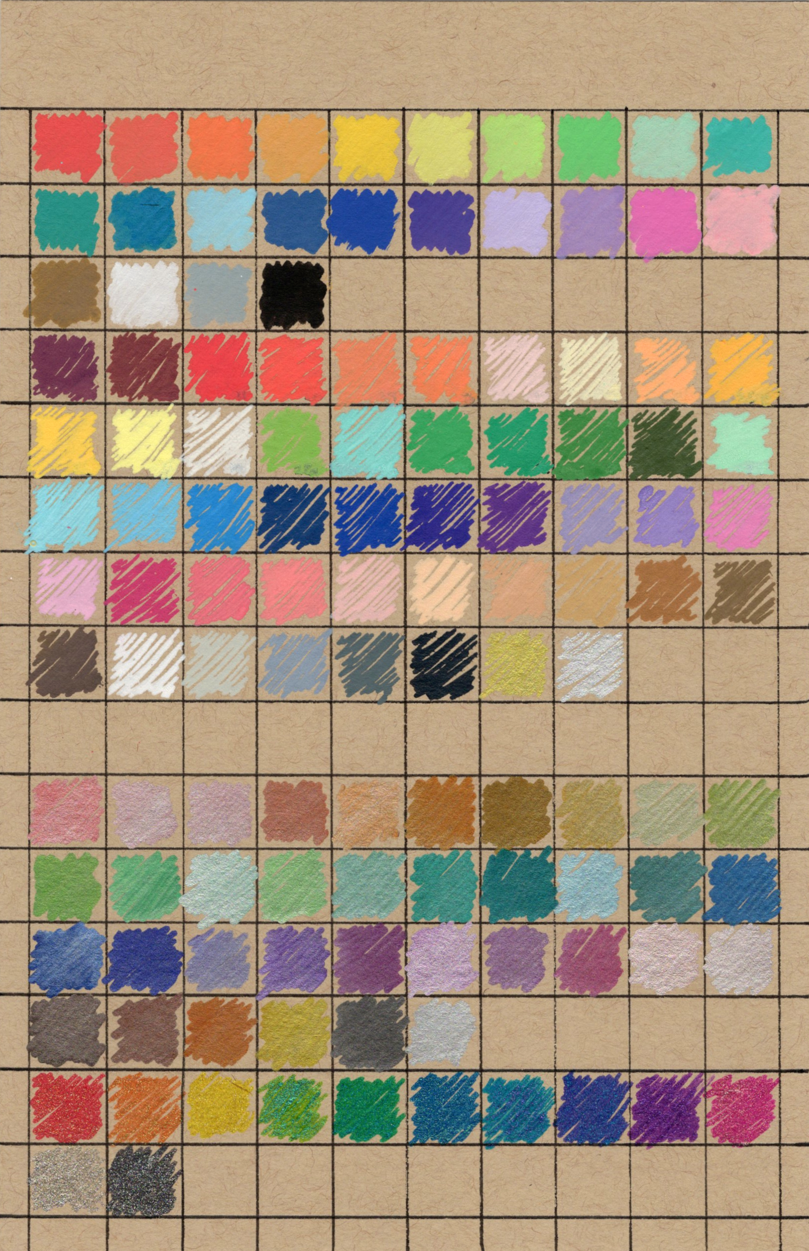
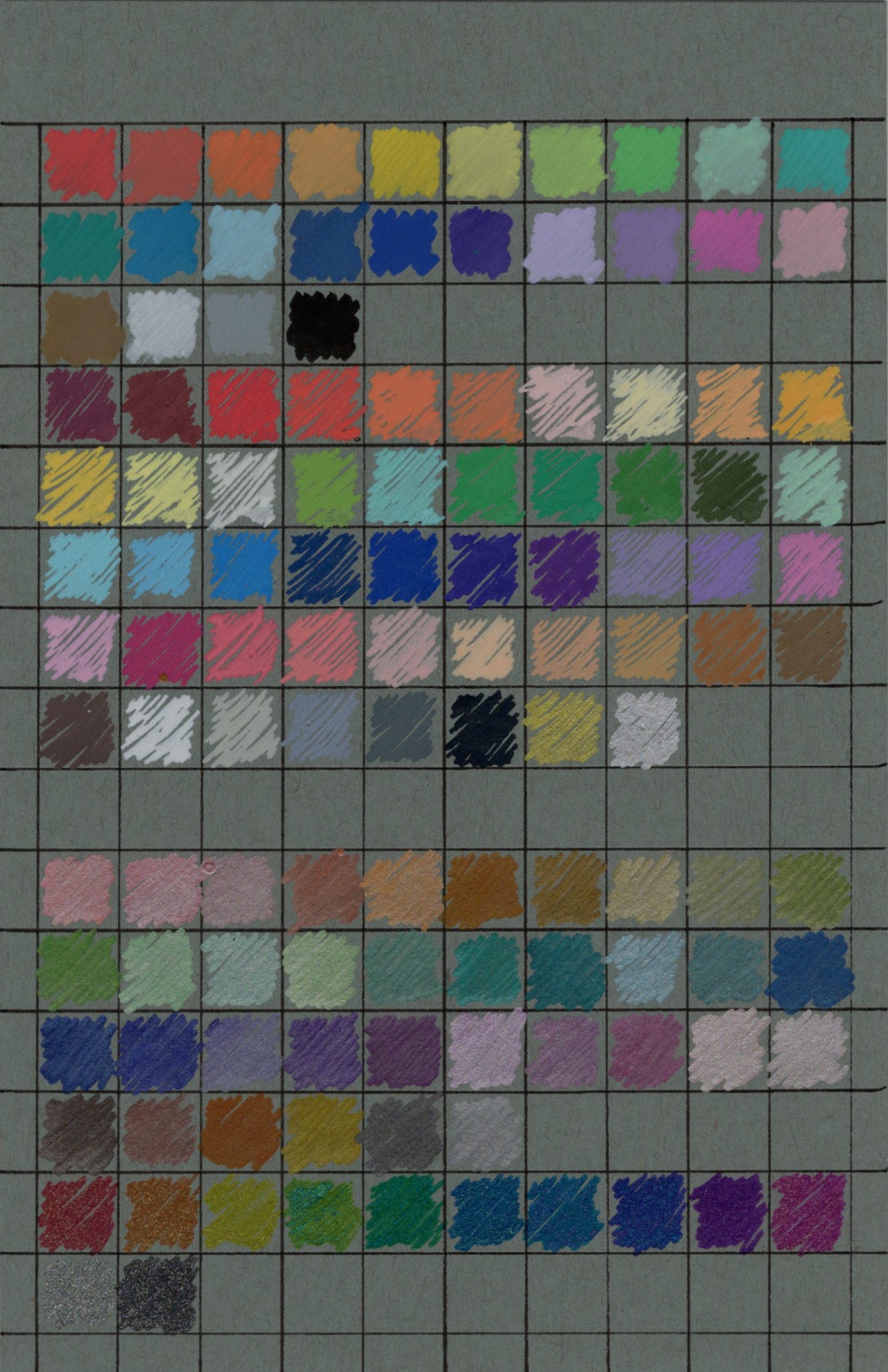
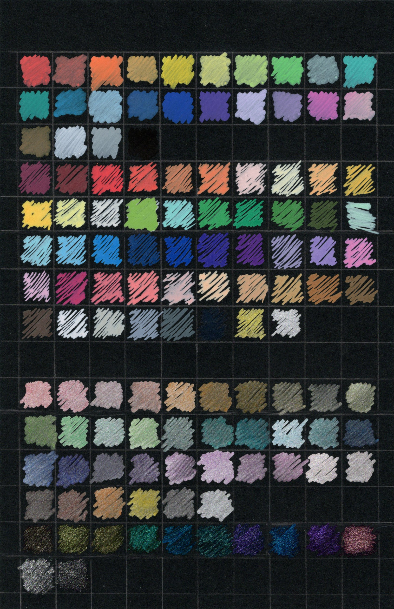
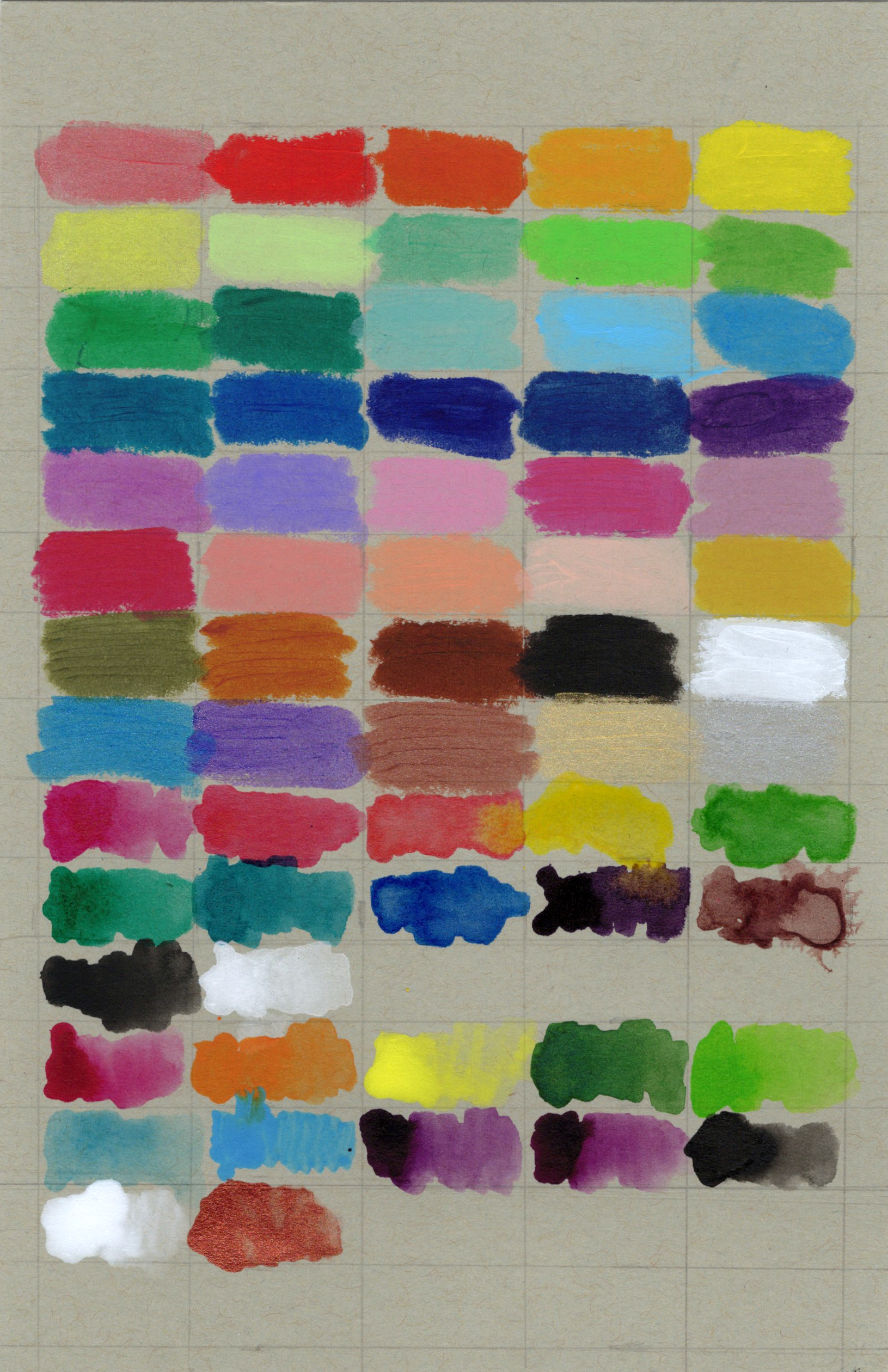
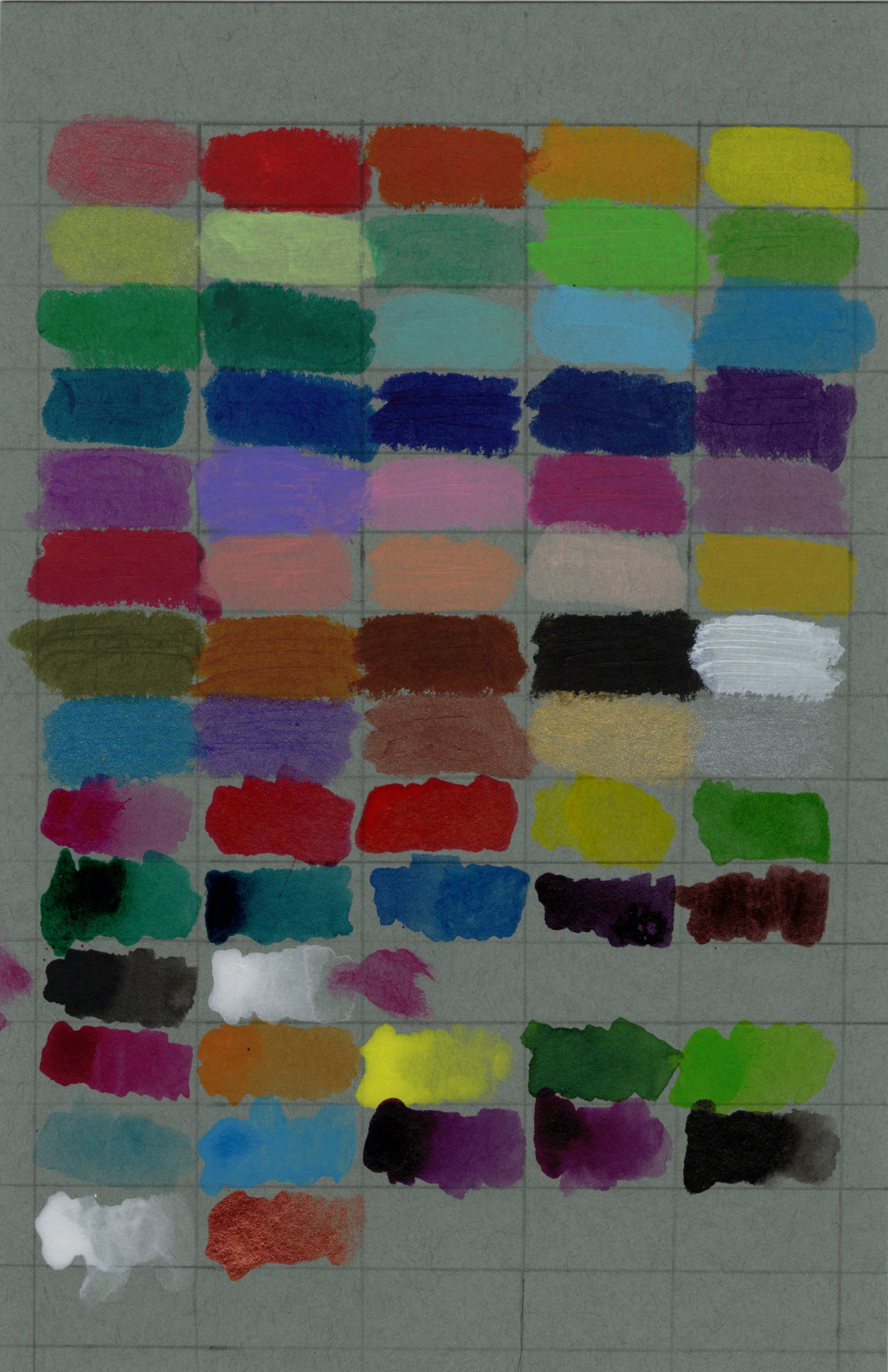
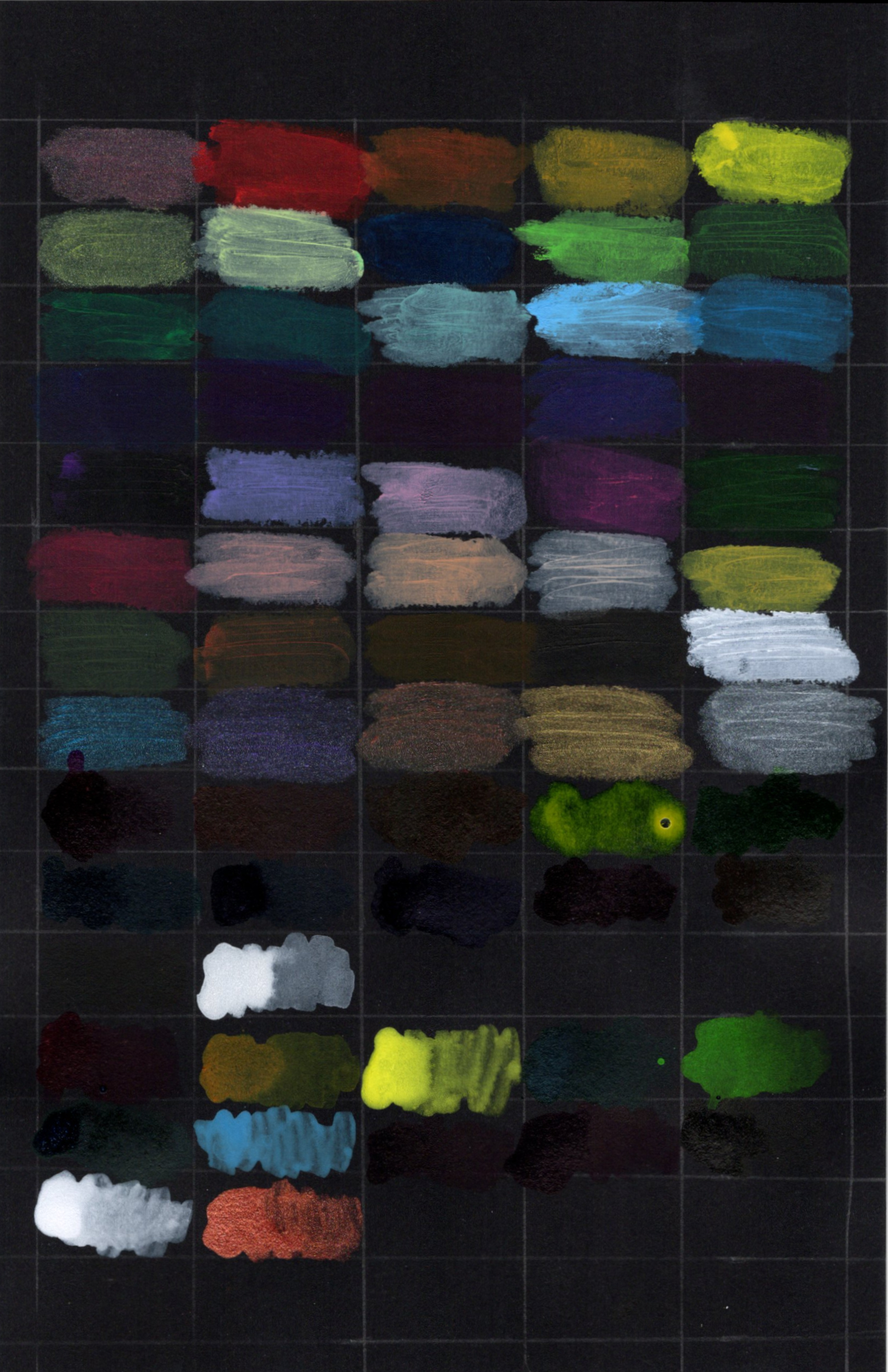
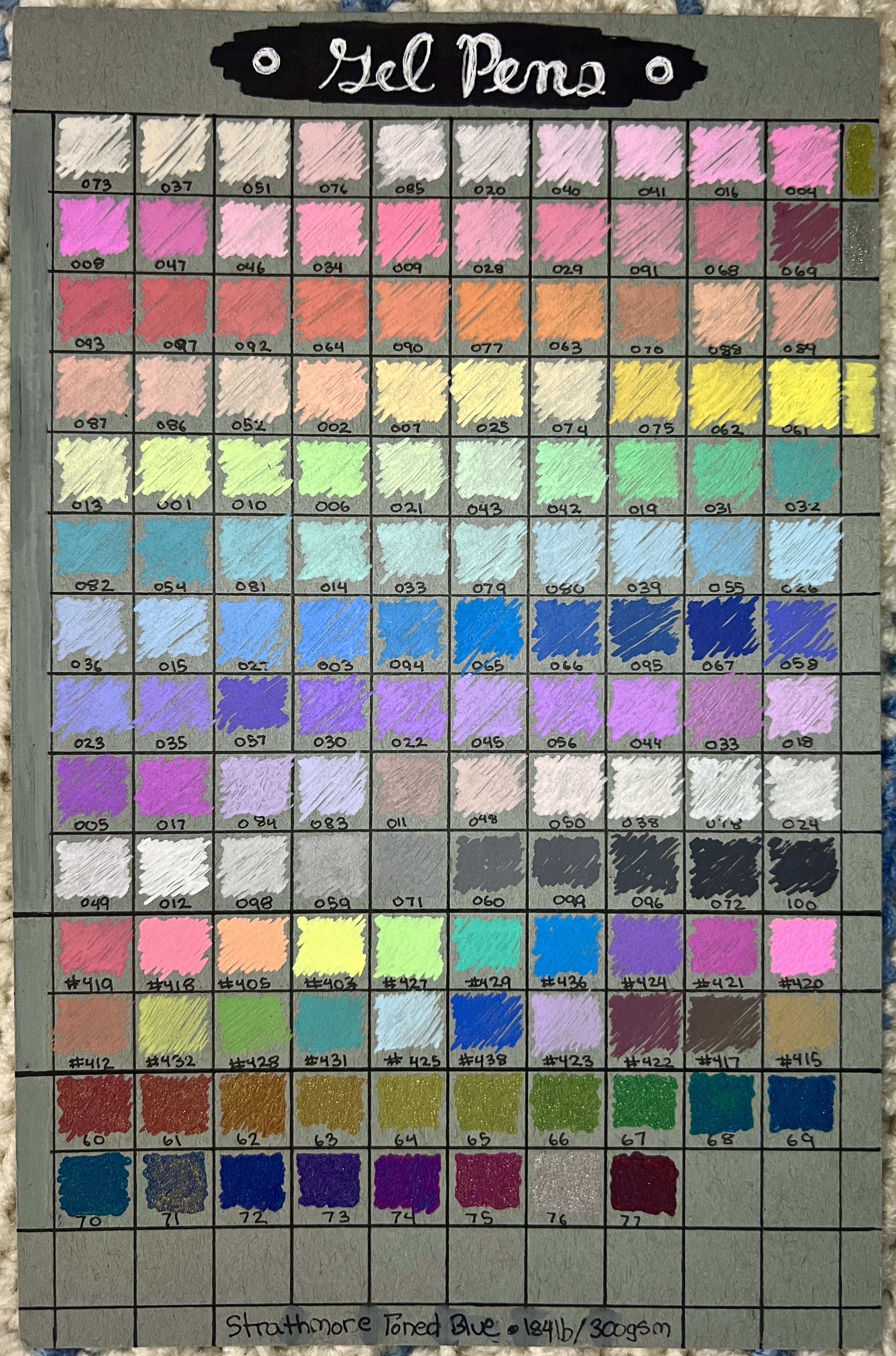
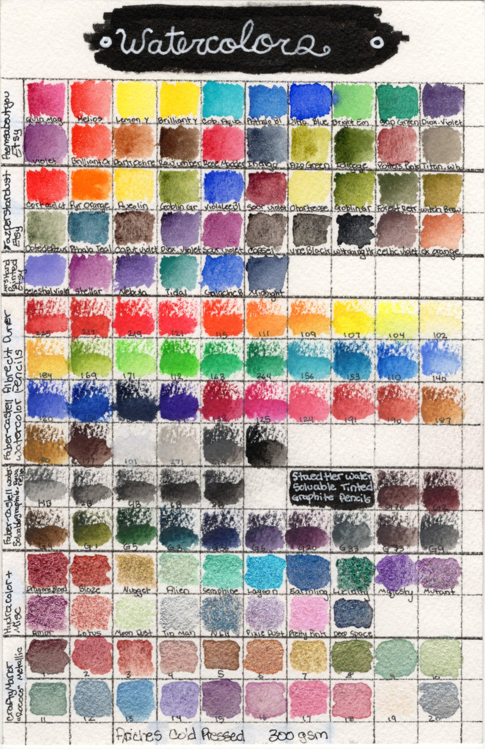
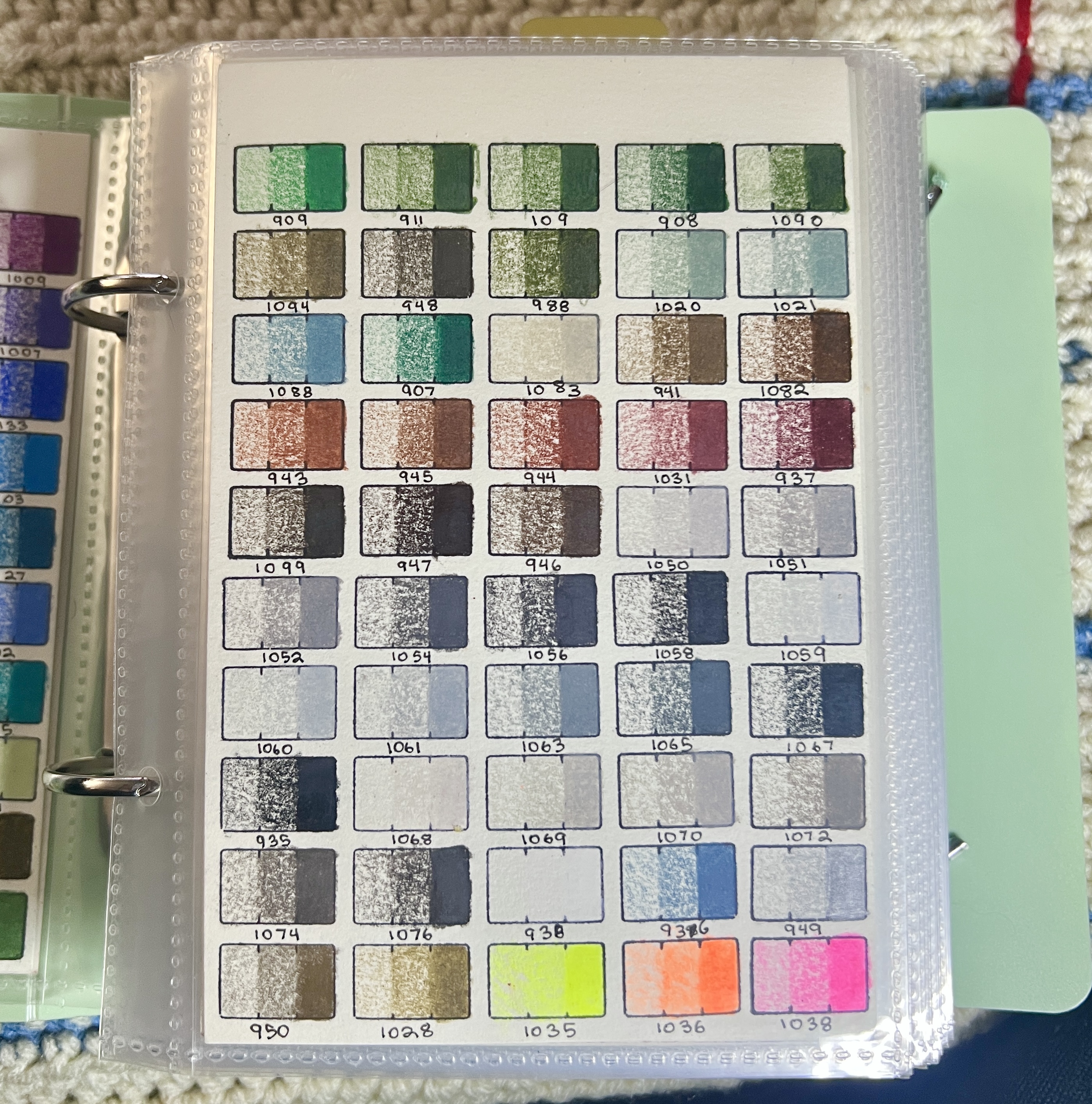
Photos are in order as they appear in the presentation book, organized by tabbed section.Colored Pencils
Supplies Shown
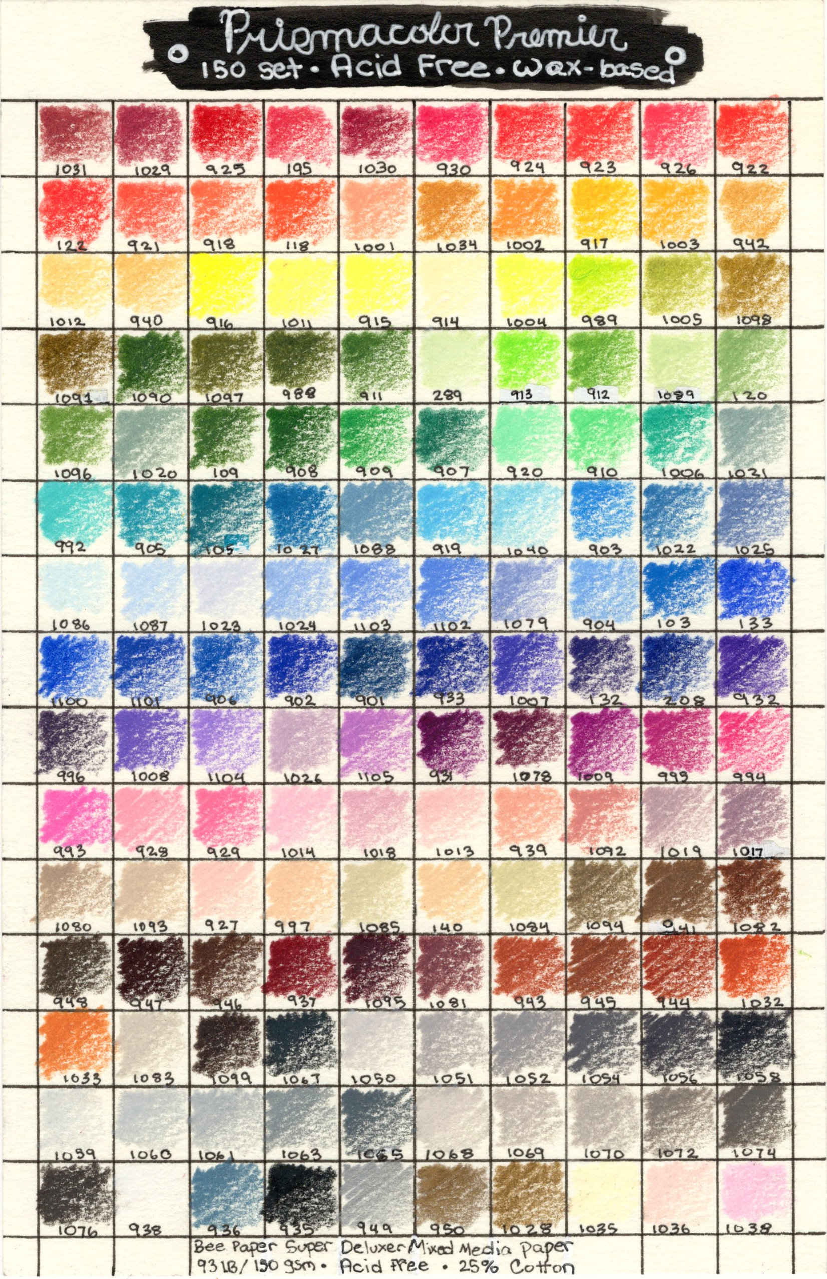
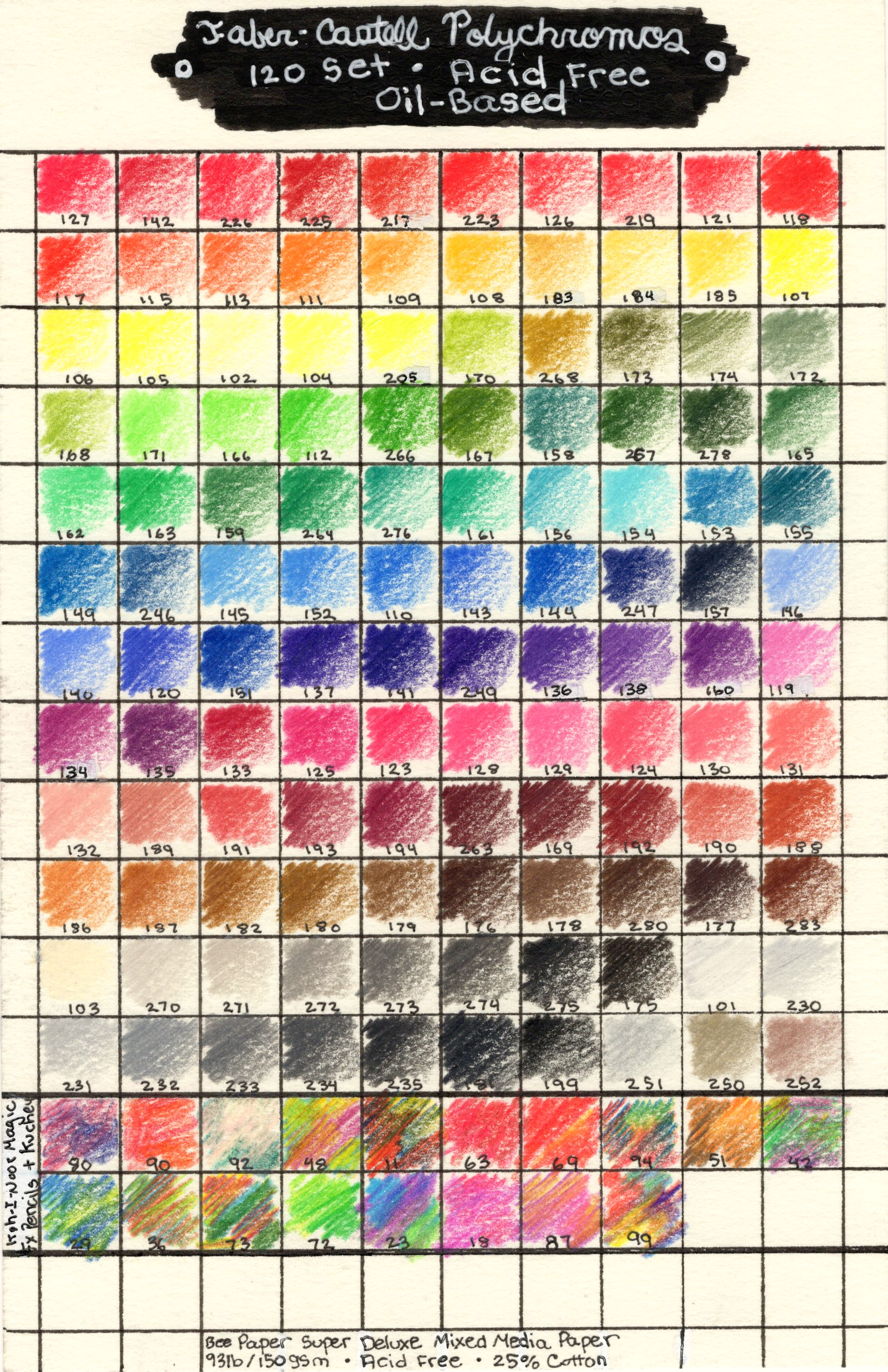
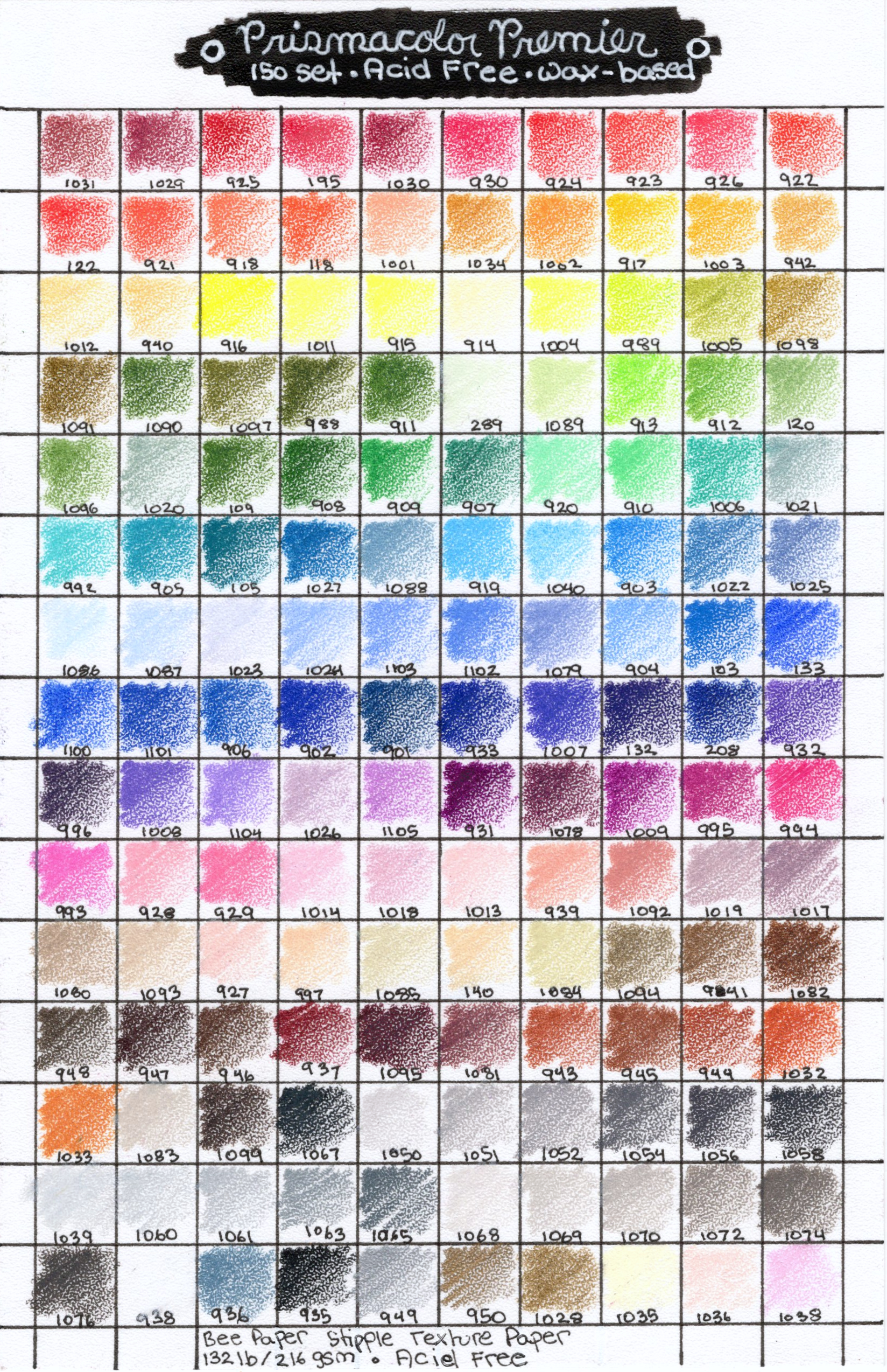
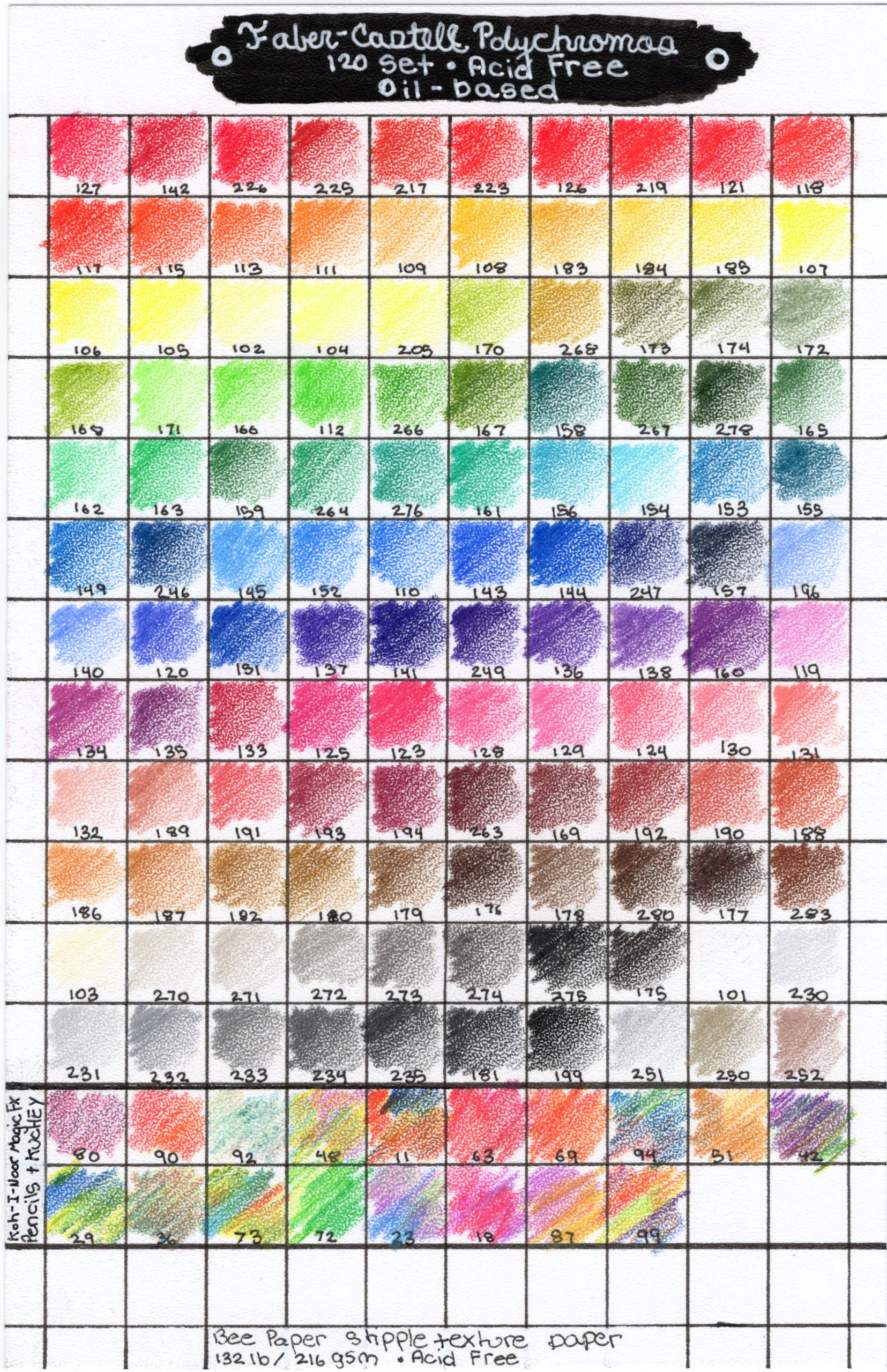
Strathmore Toned Tan Mixed Media
Strathmore Toned Gray Mixed Media
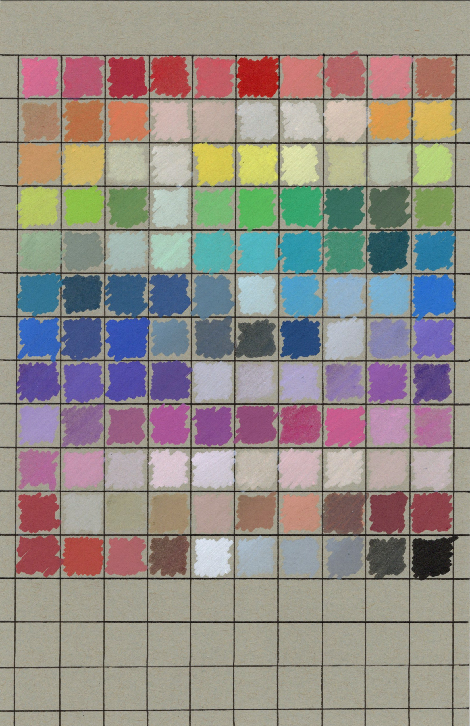
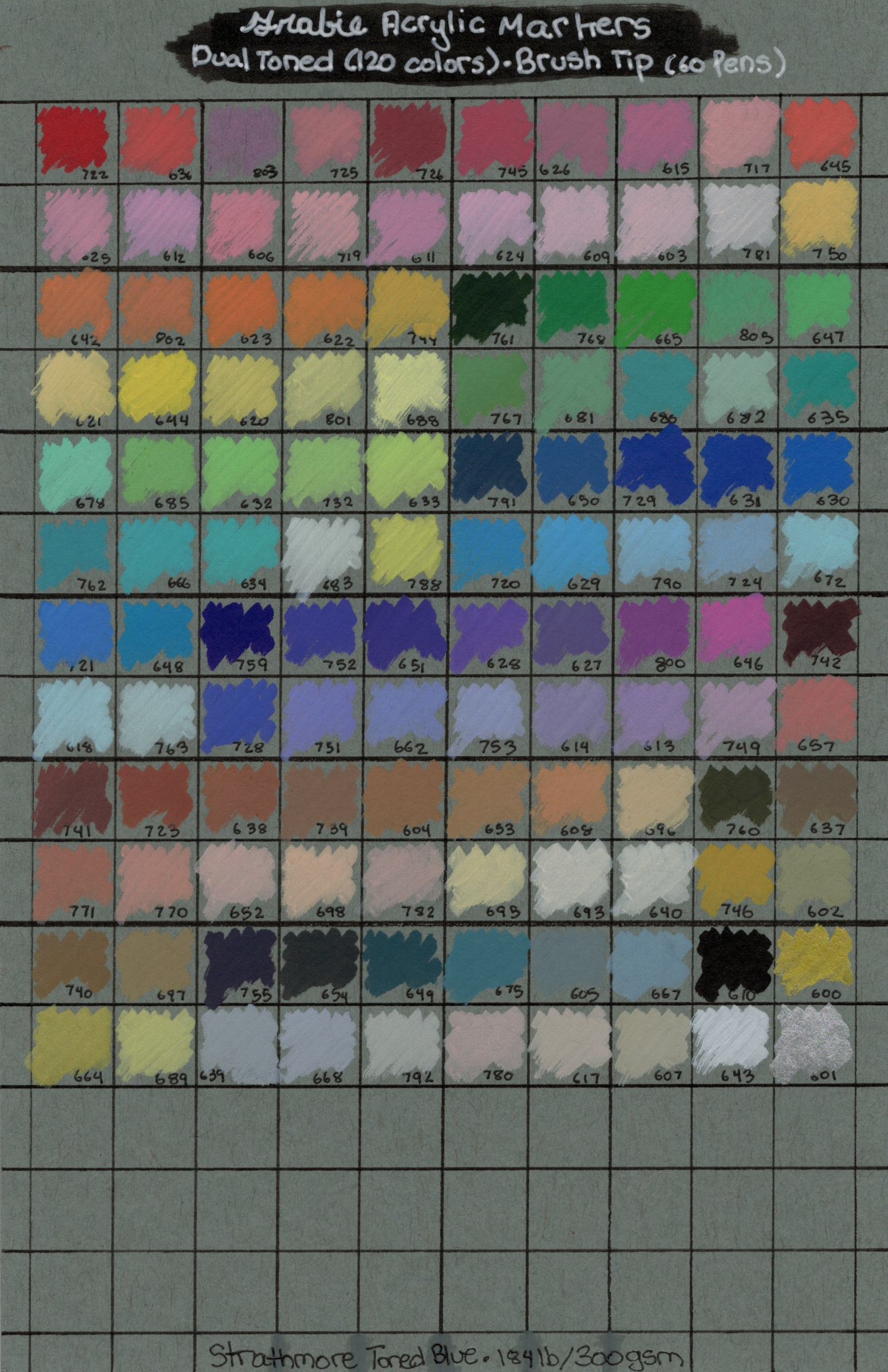
Strathmore Toned Blue Mixed Media
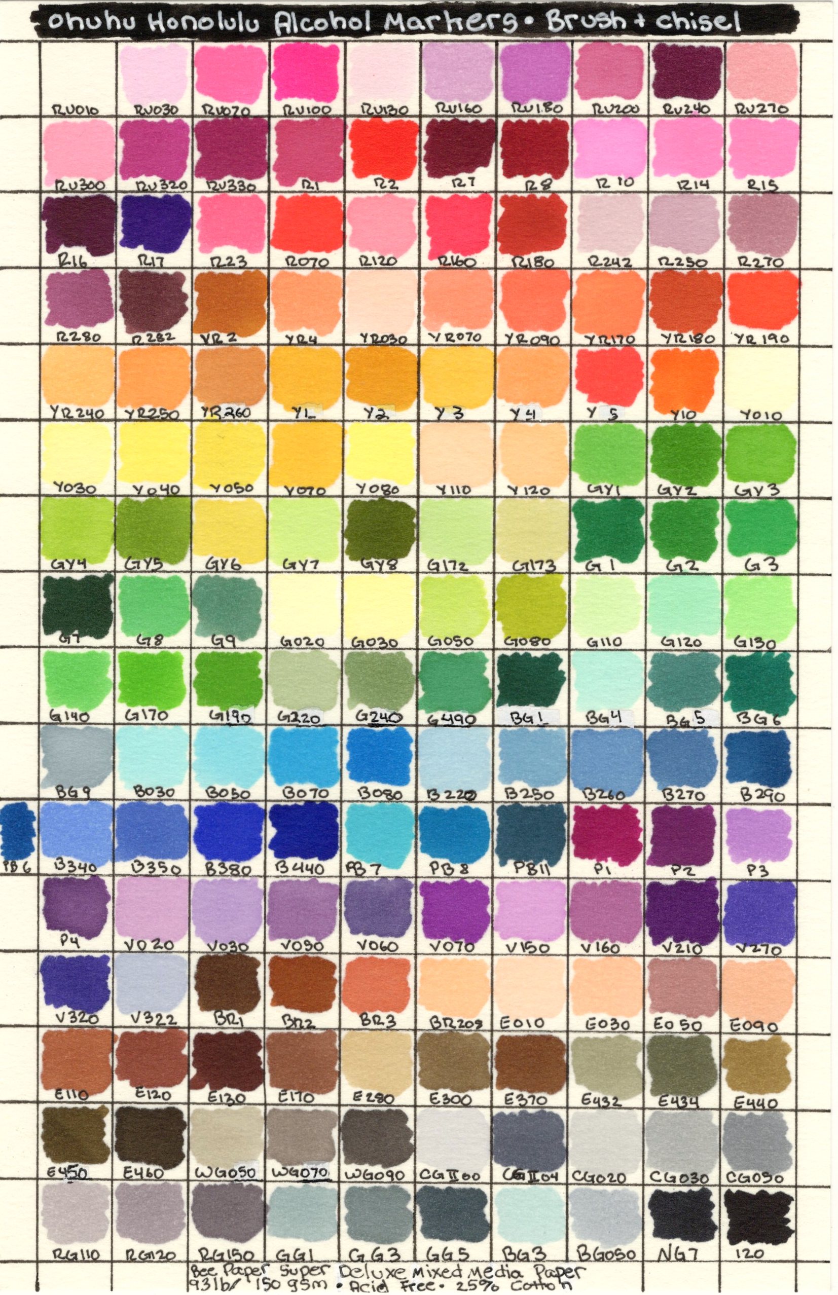
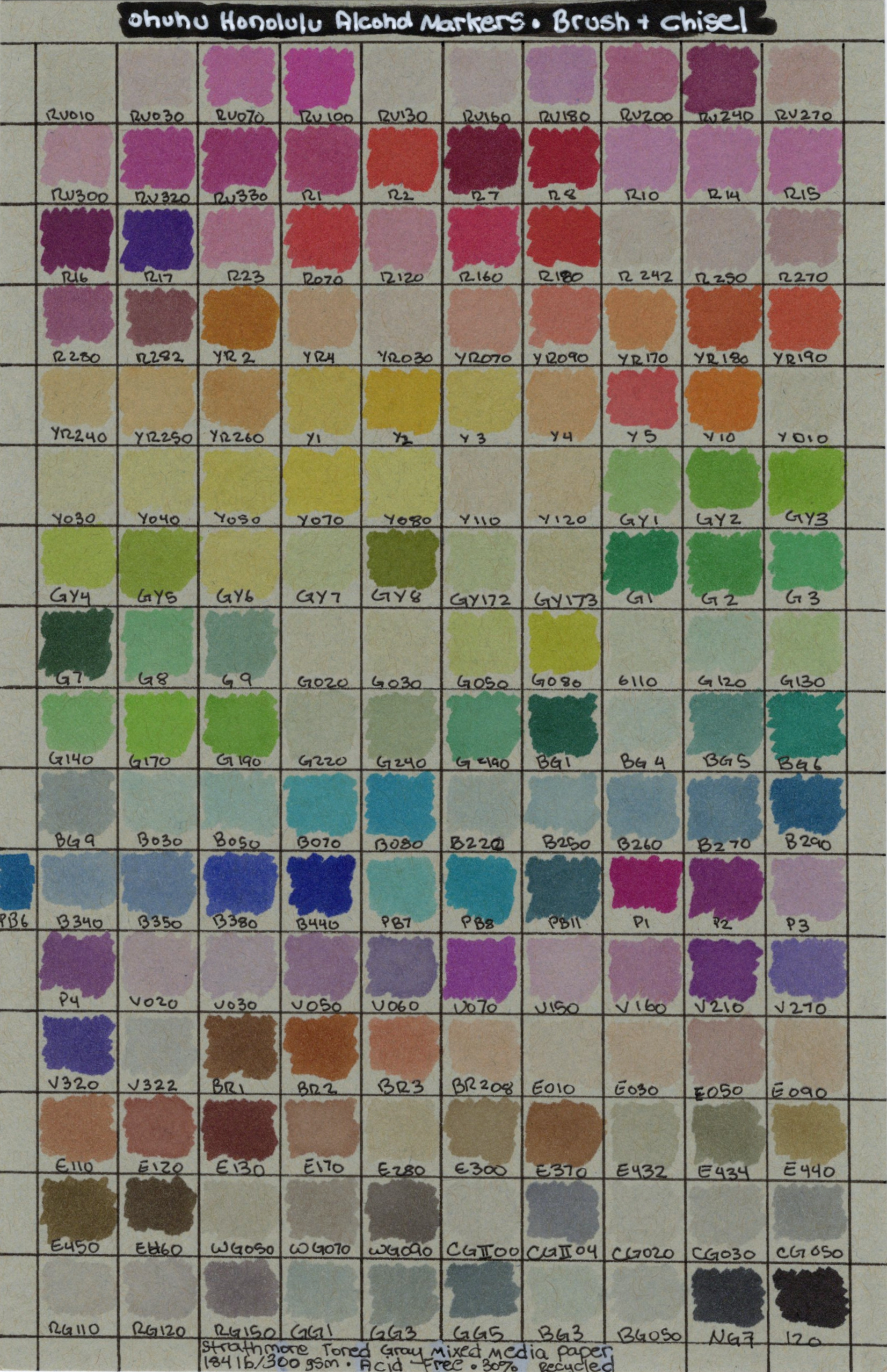
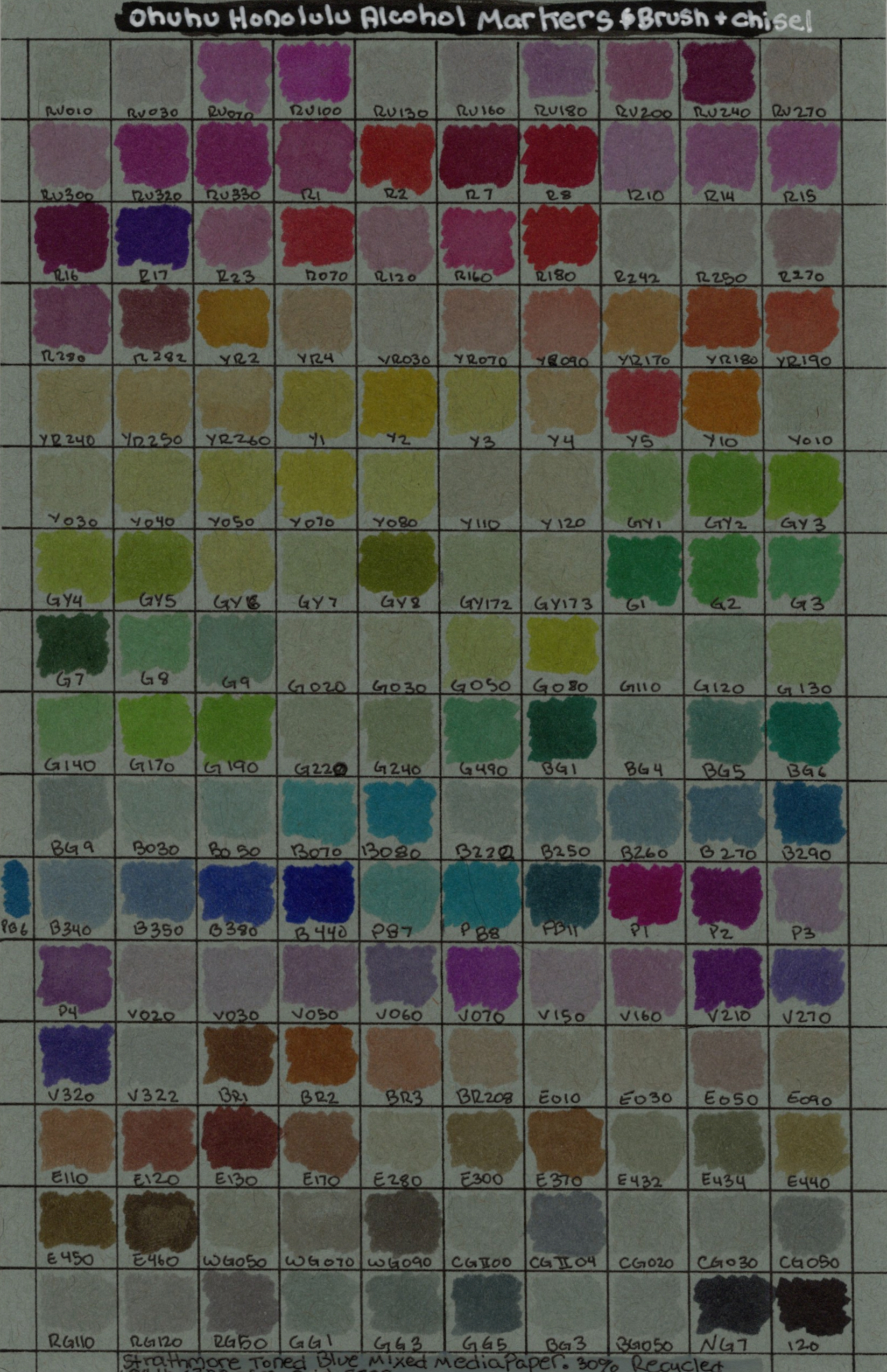
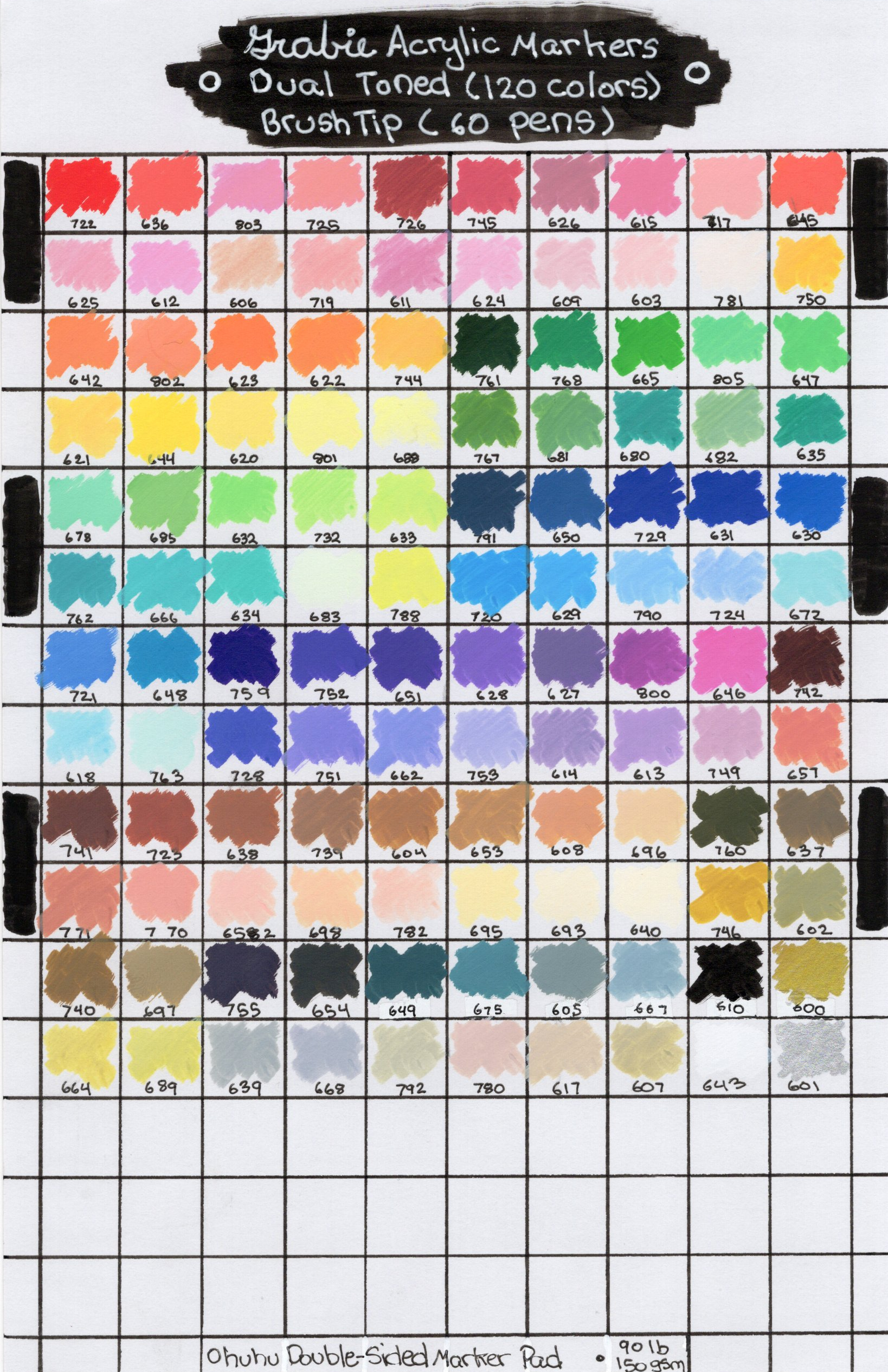
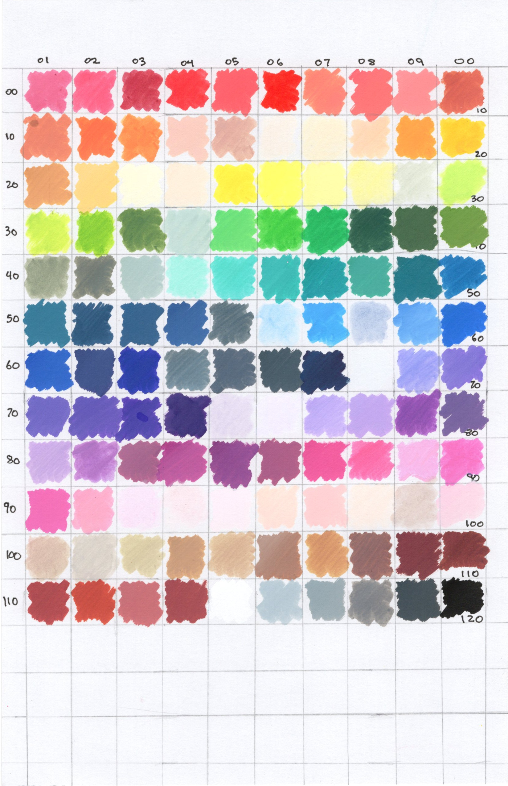
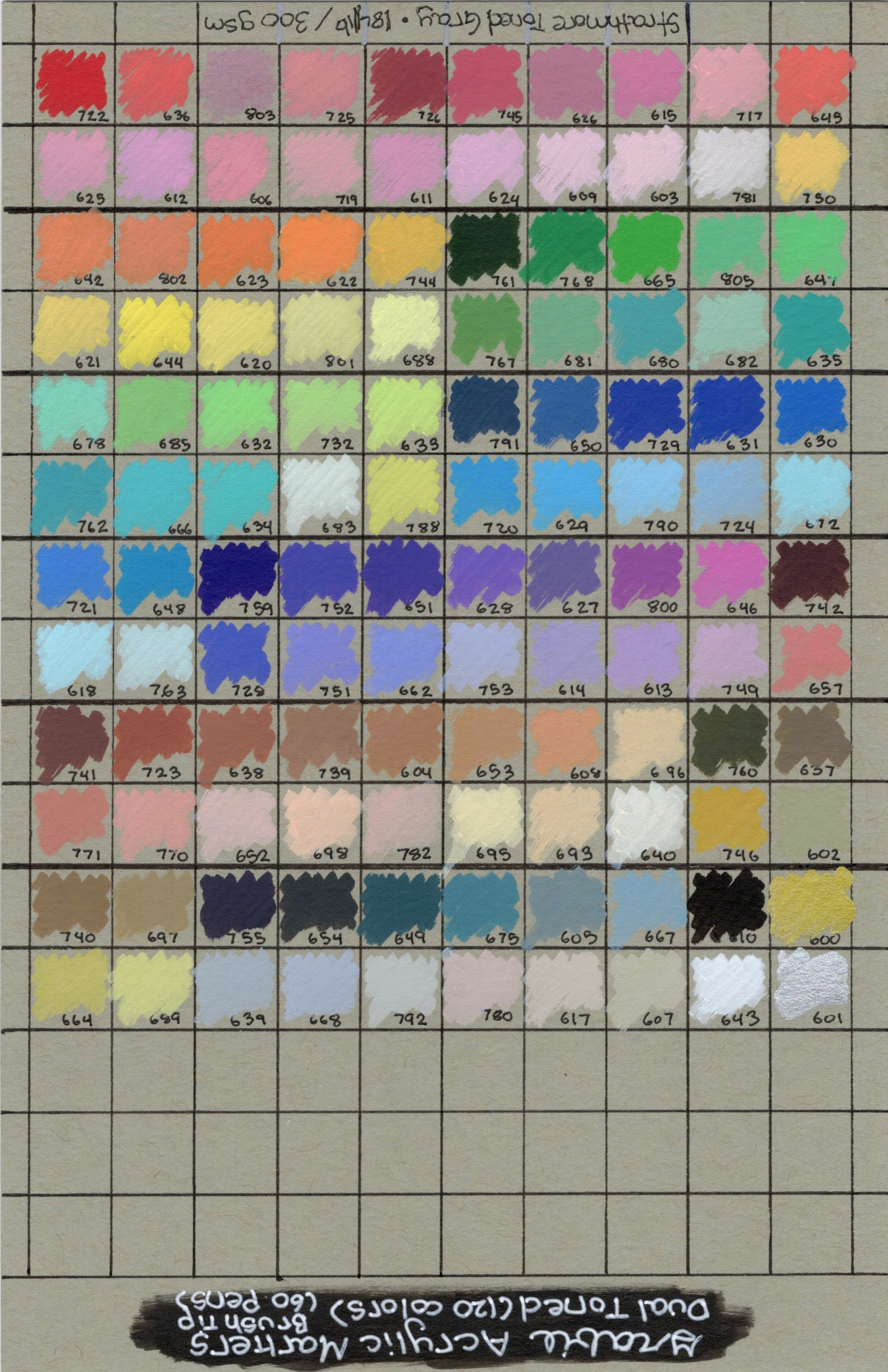
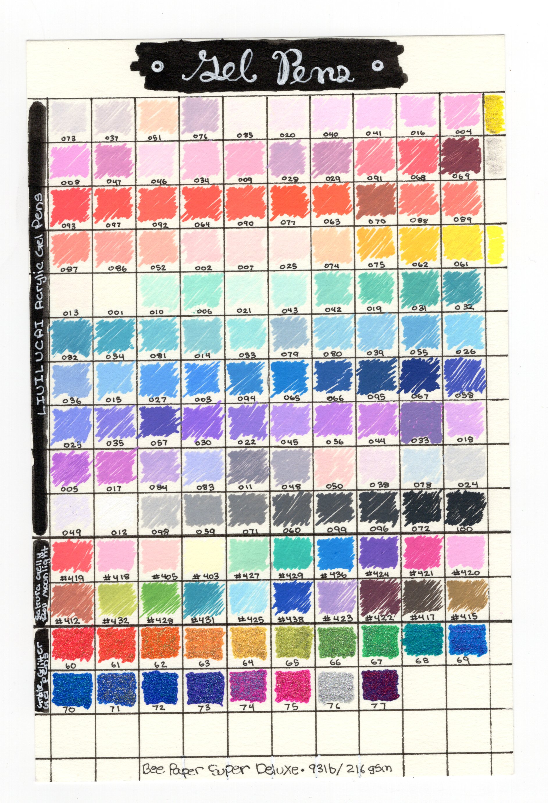
Alcohol Markers
Supplies Shown
Ohuhu Double-Sided Marker Paper
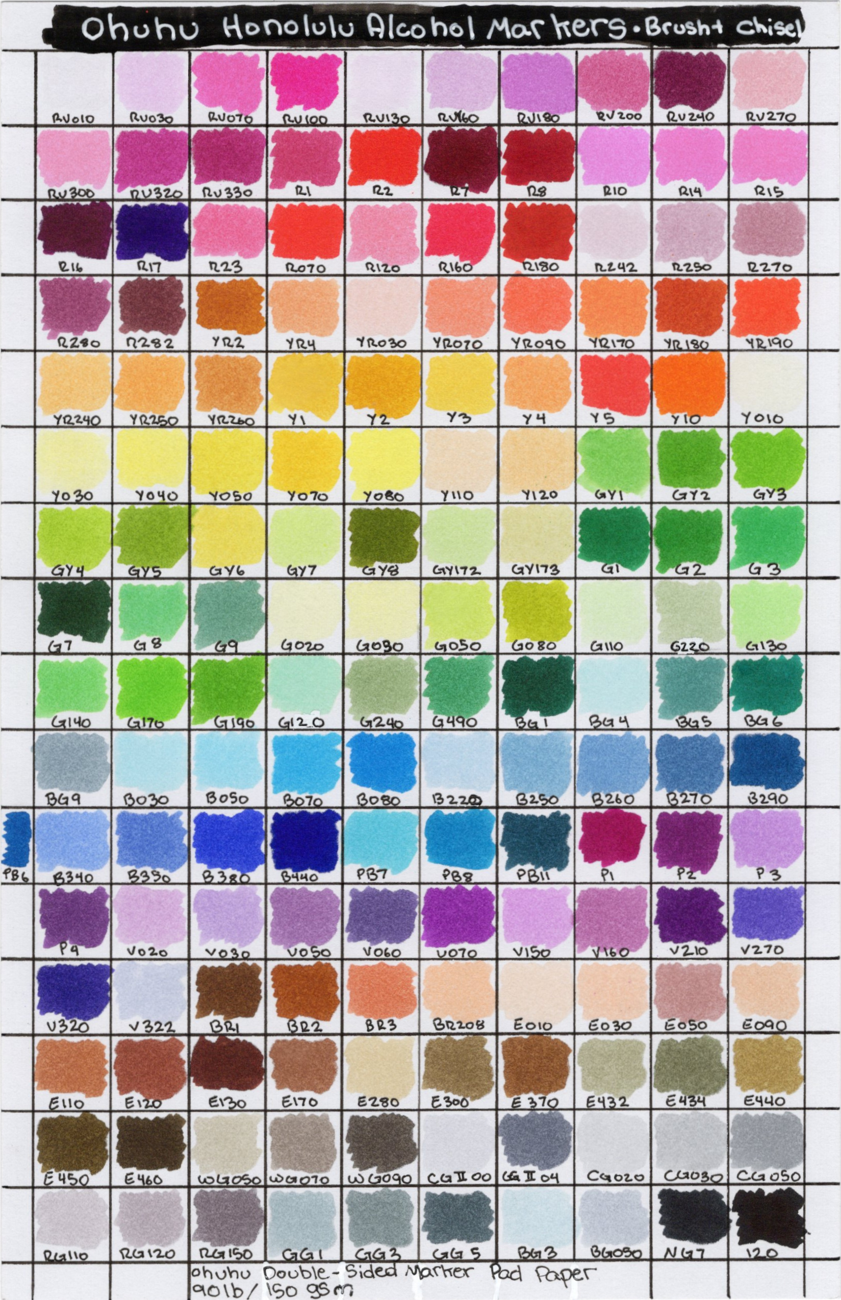
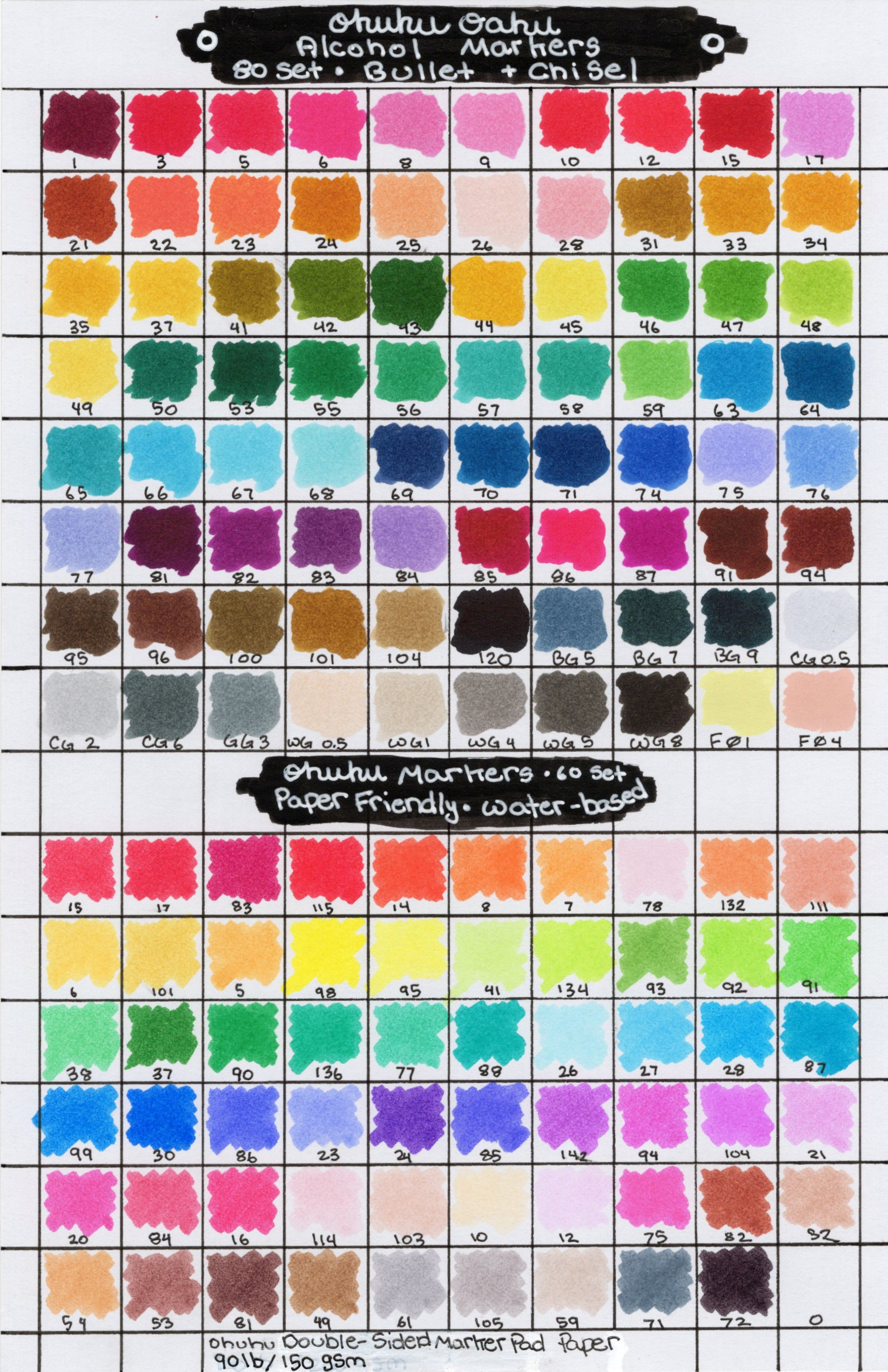
(These pages also include the Ohuhu Paper-Friendly Markers)
(Left): Bee Paper Super Deluxe Paper
(Right): Strathmore Toned Tan Mixed Media
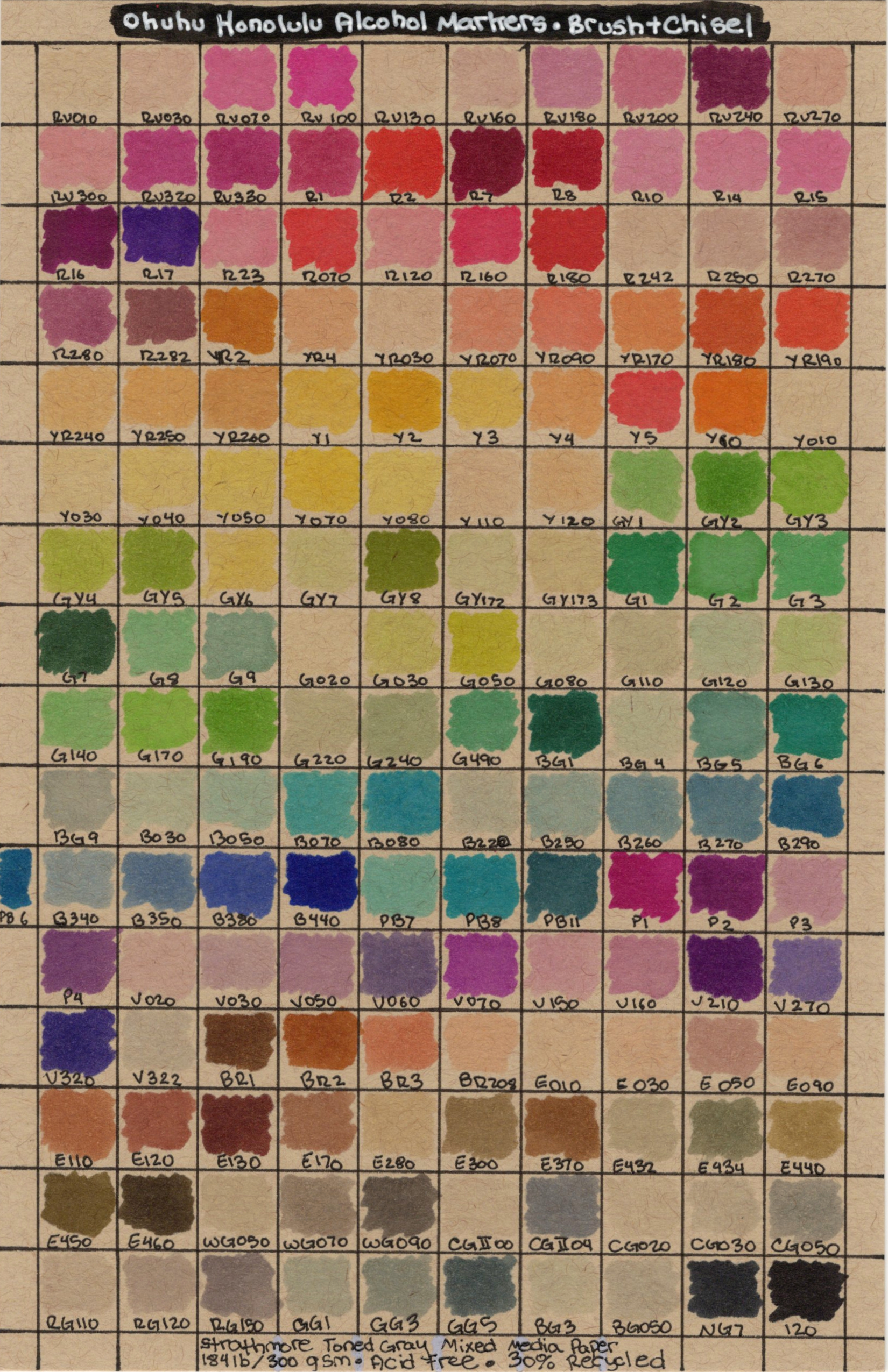
(Left): Strathmore Toned Gray Mixed Media
(Right): Strathmore Toned Blue Mixed Media
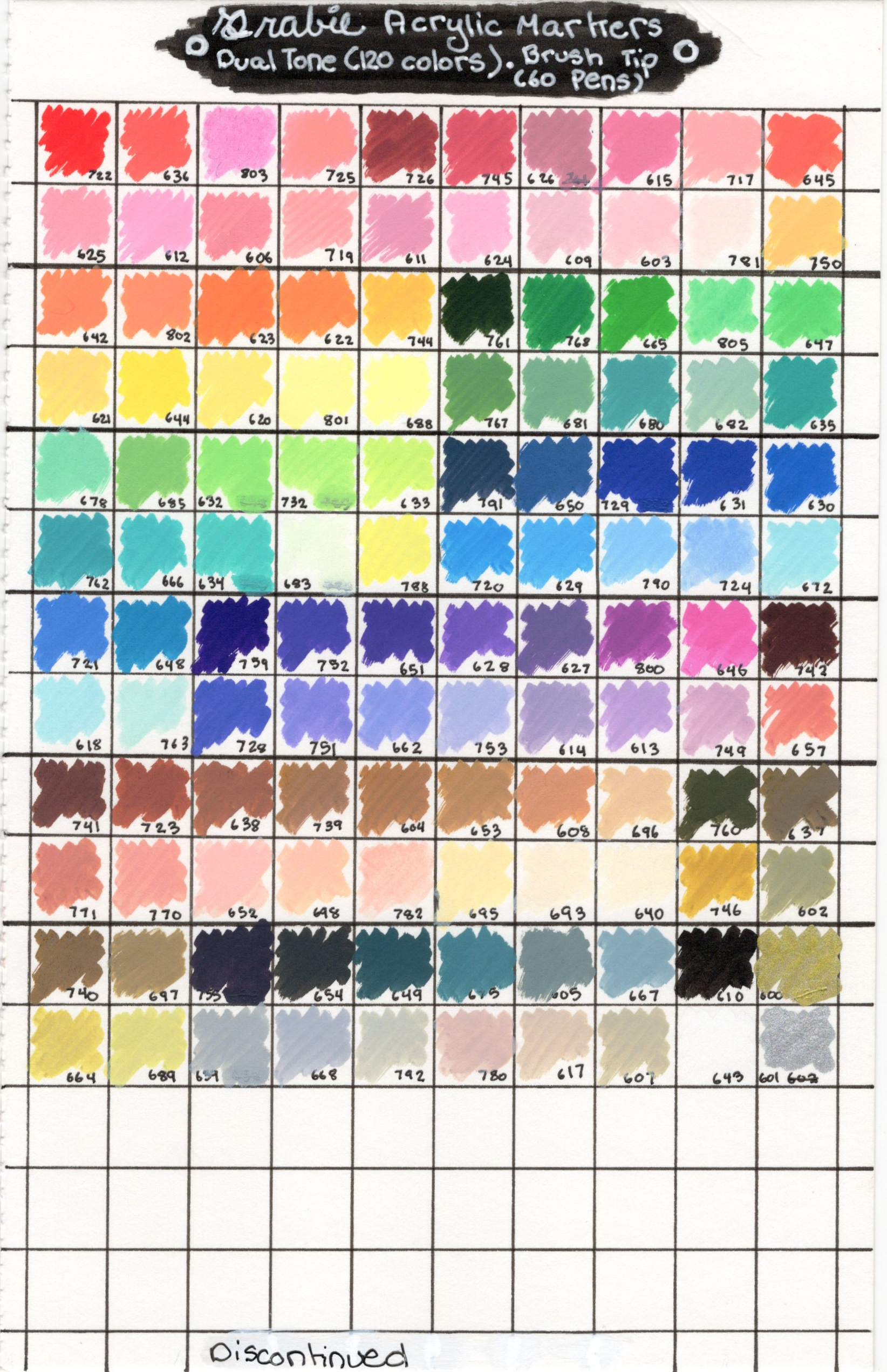
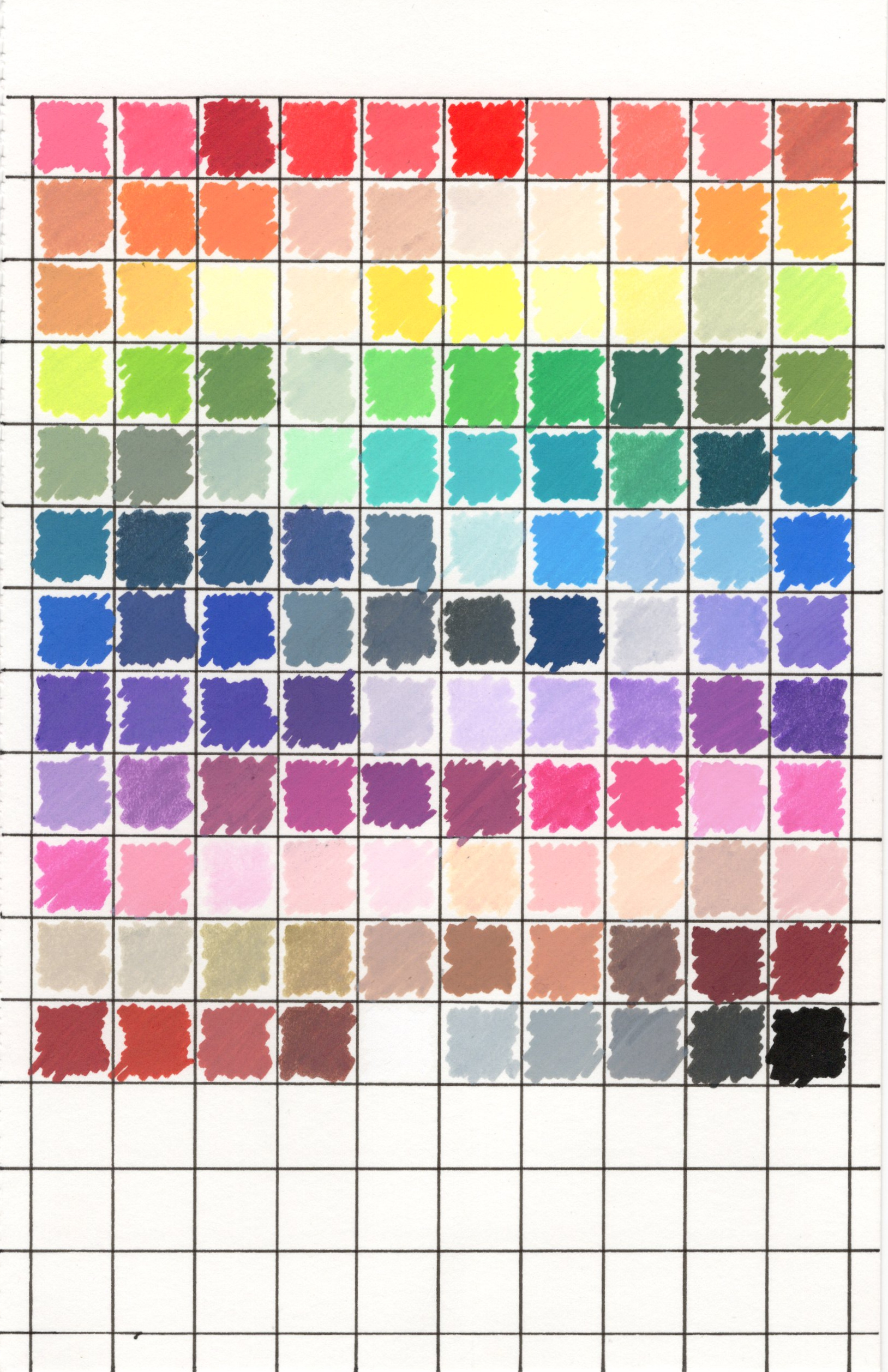
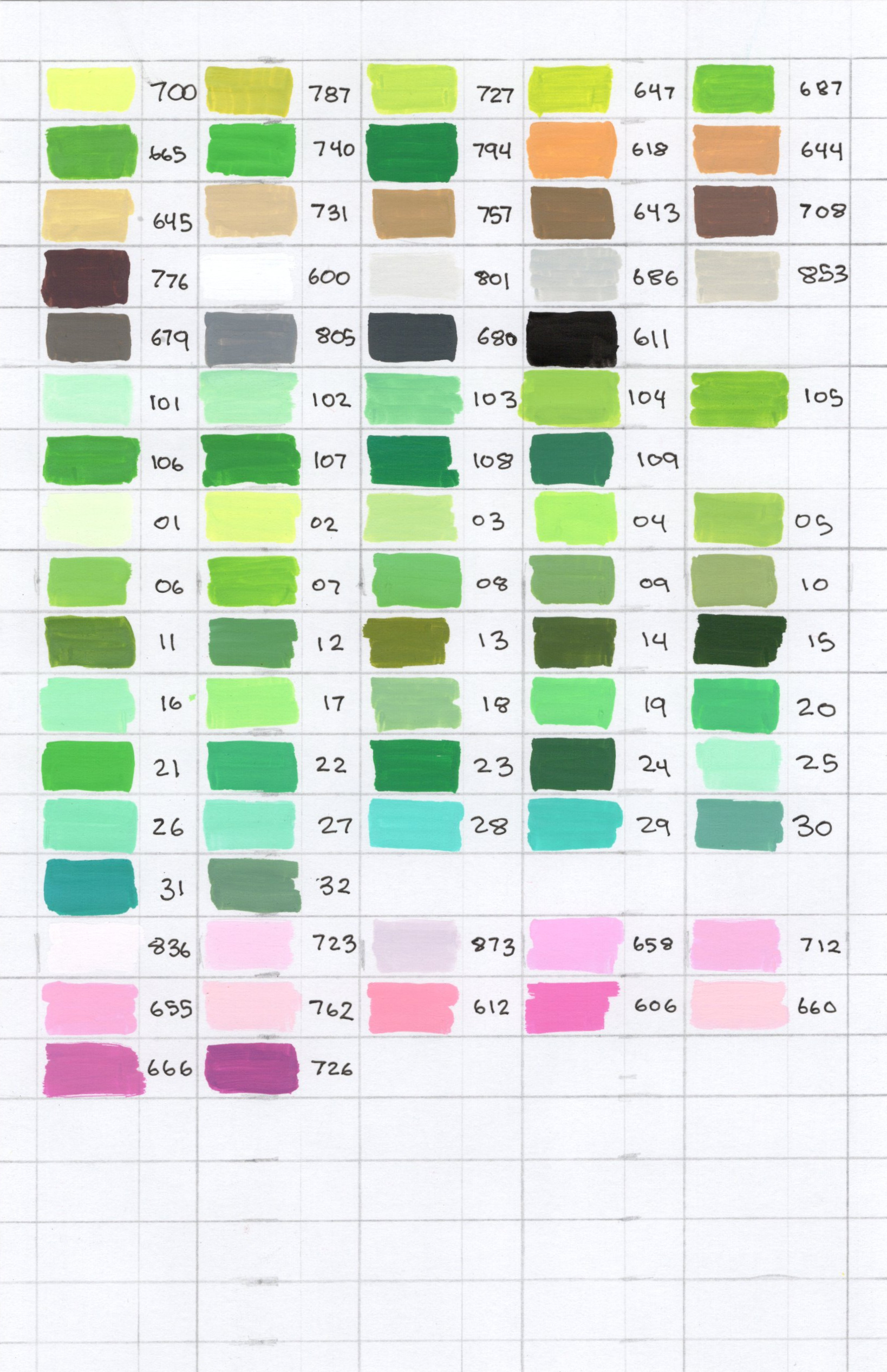
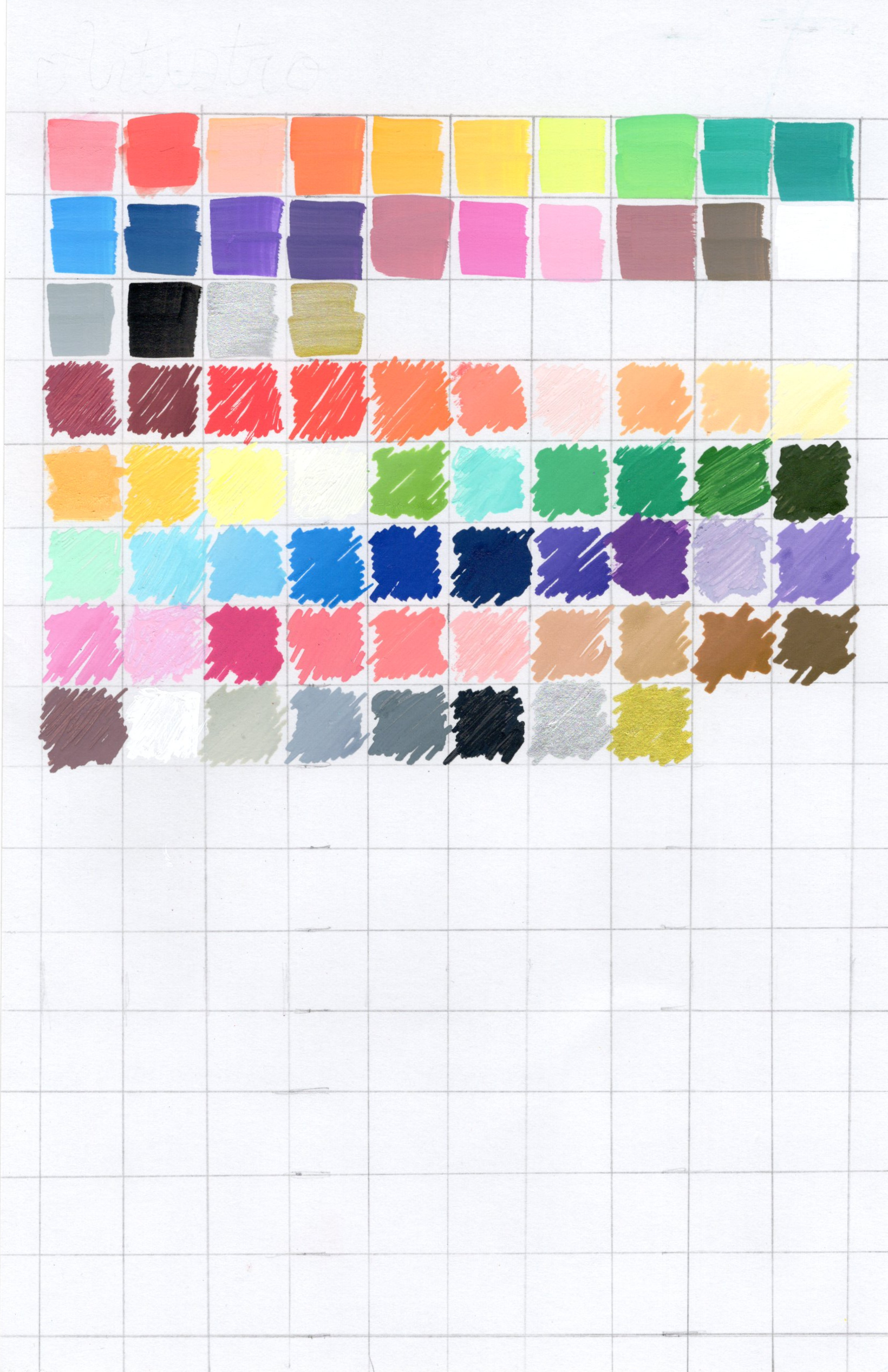
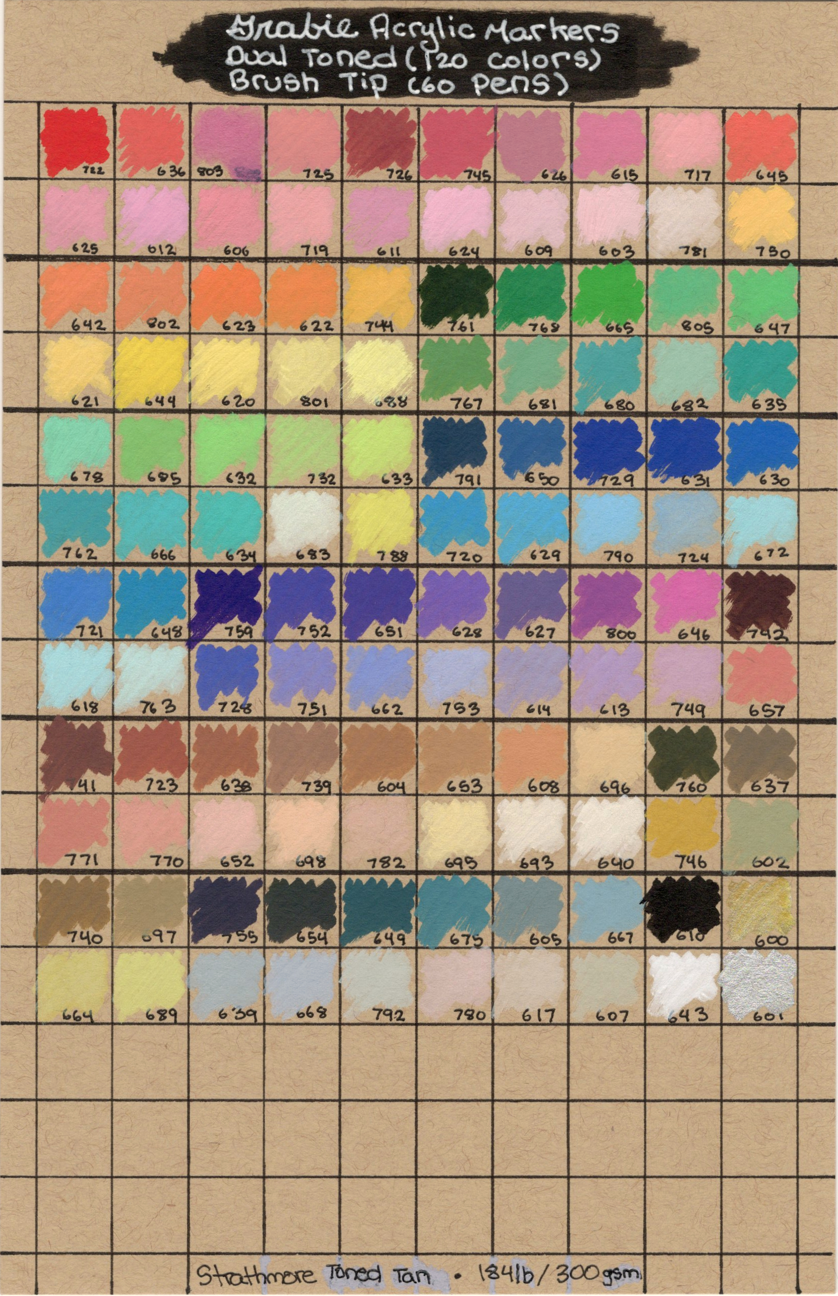
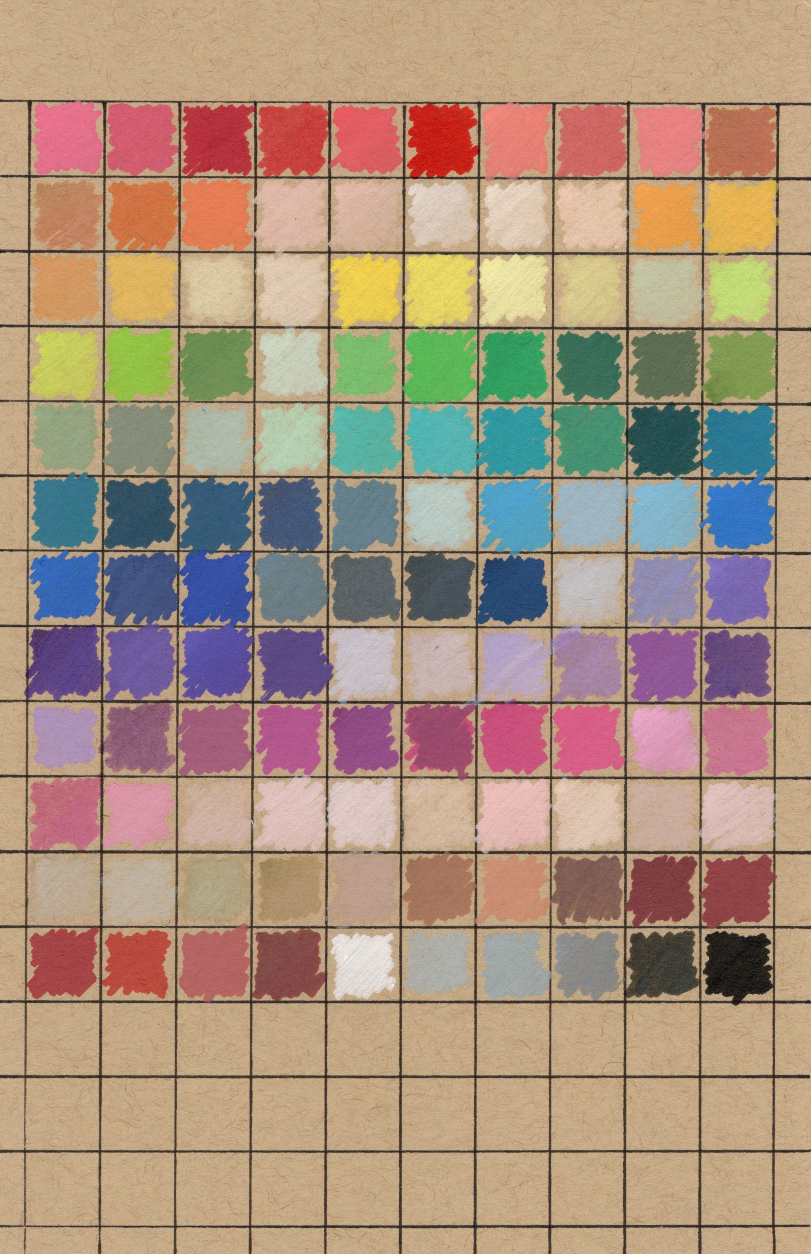
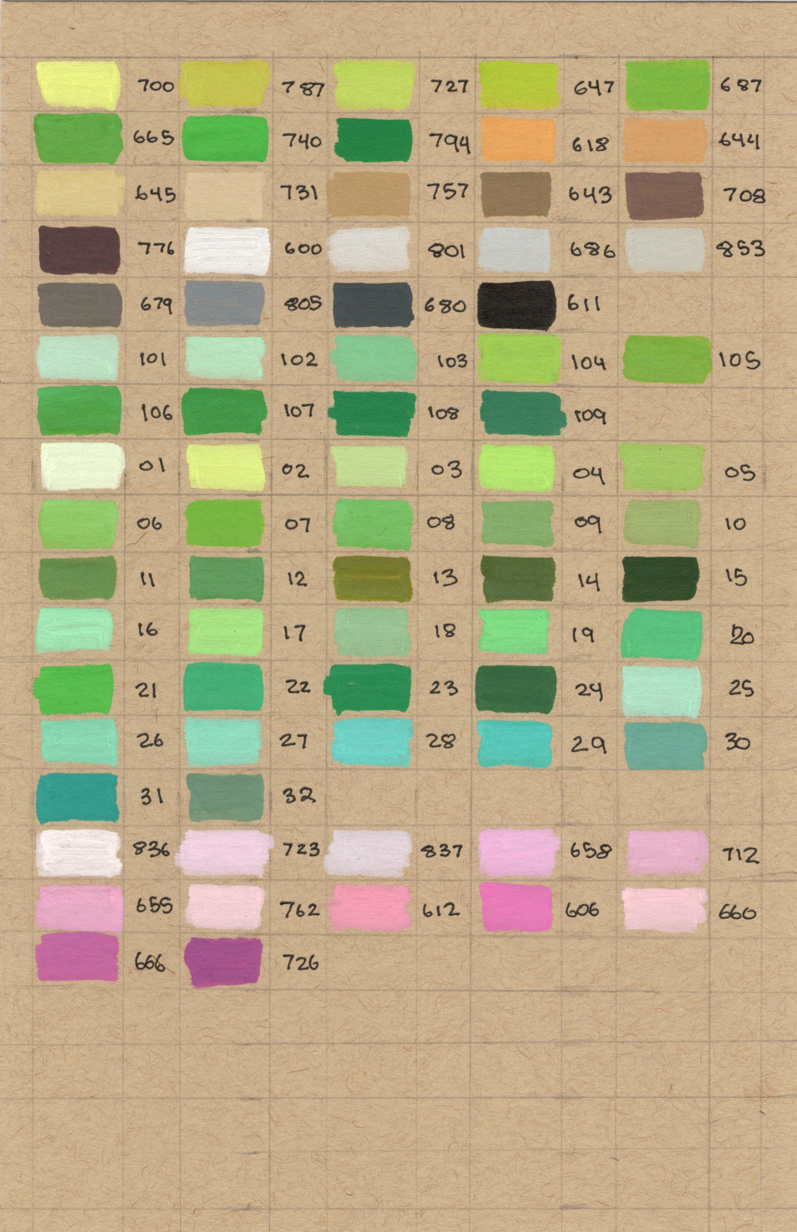
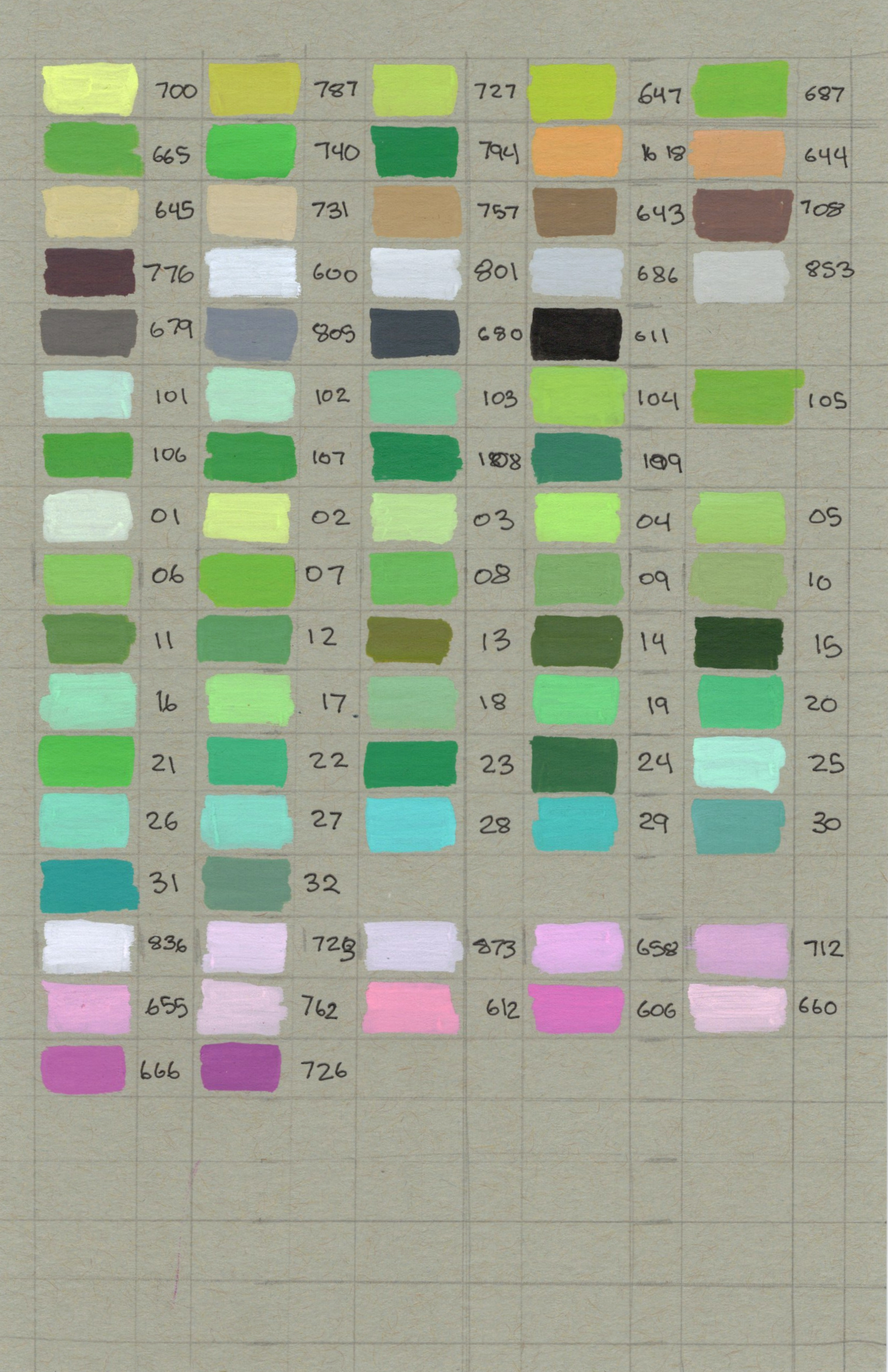
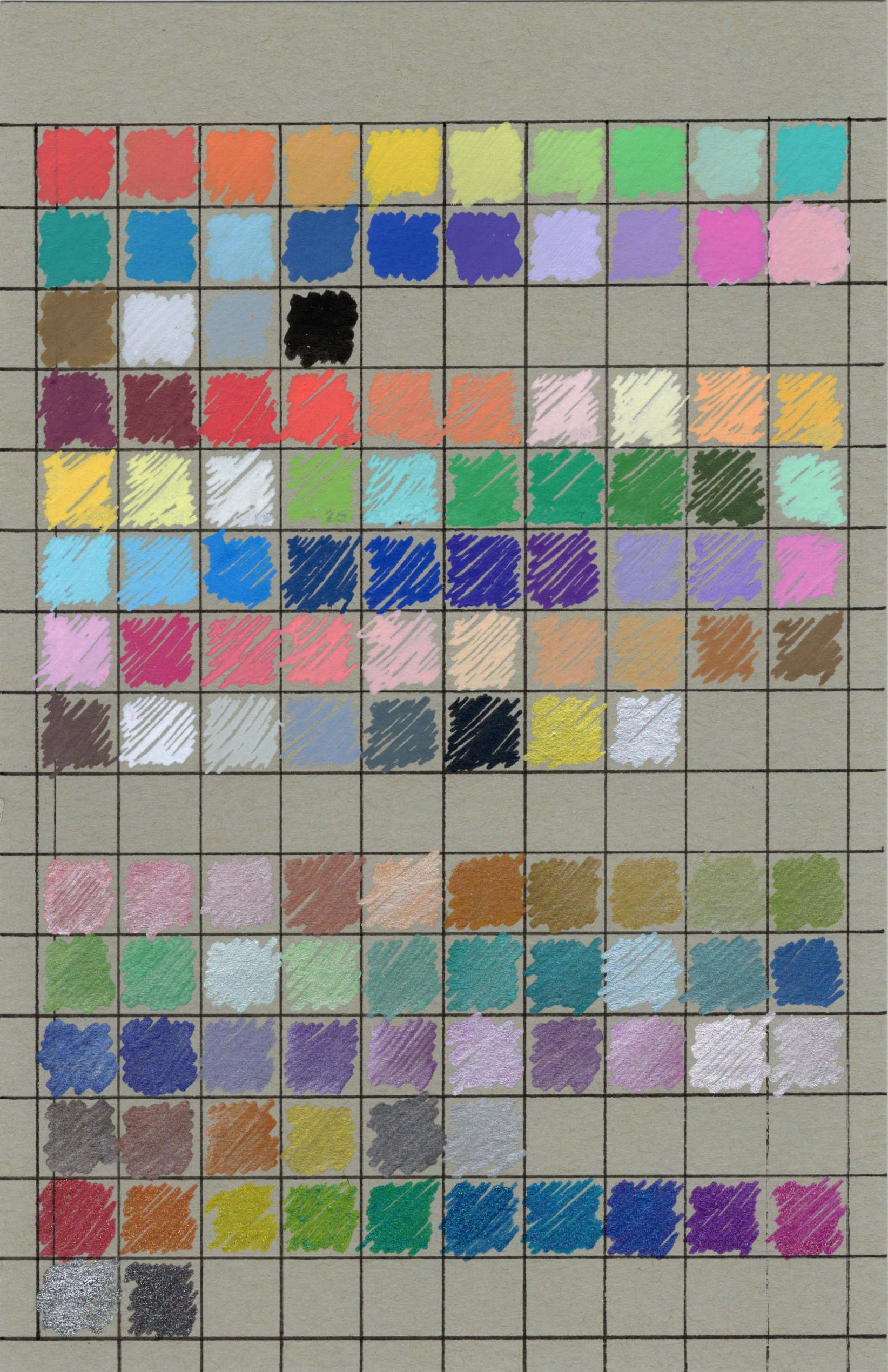
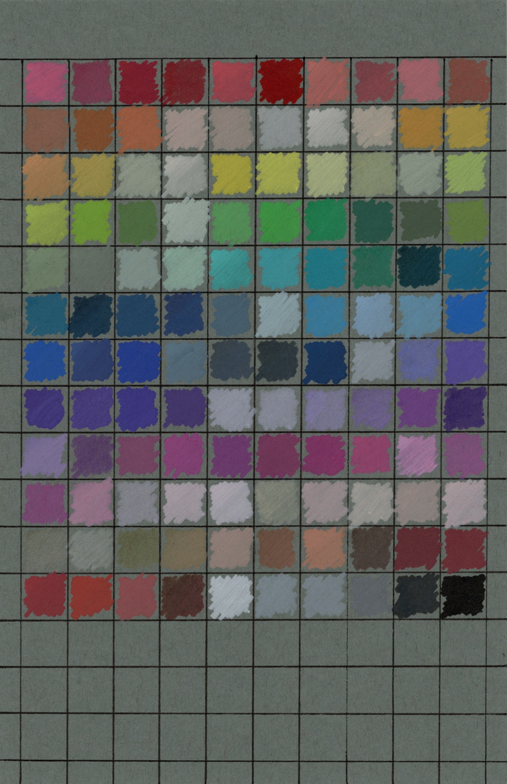
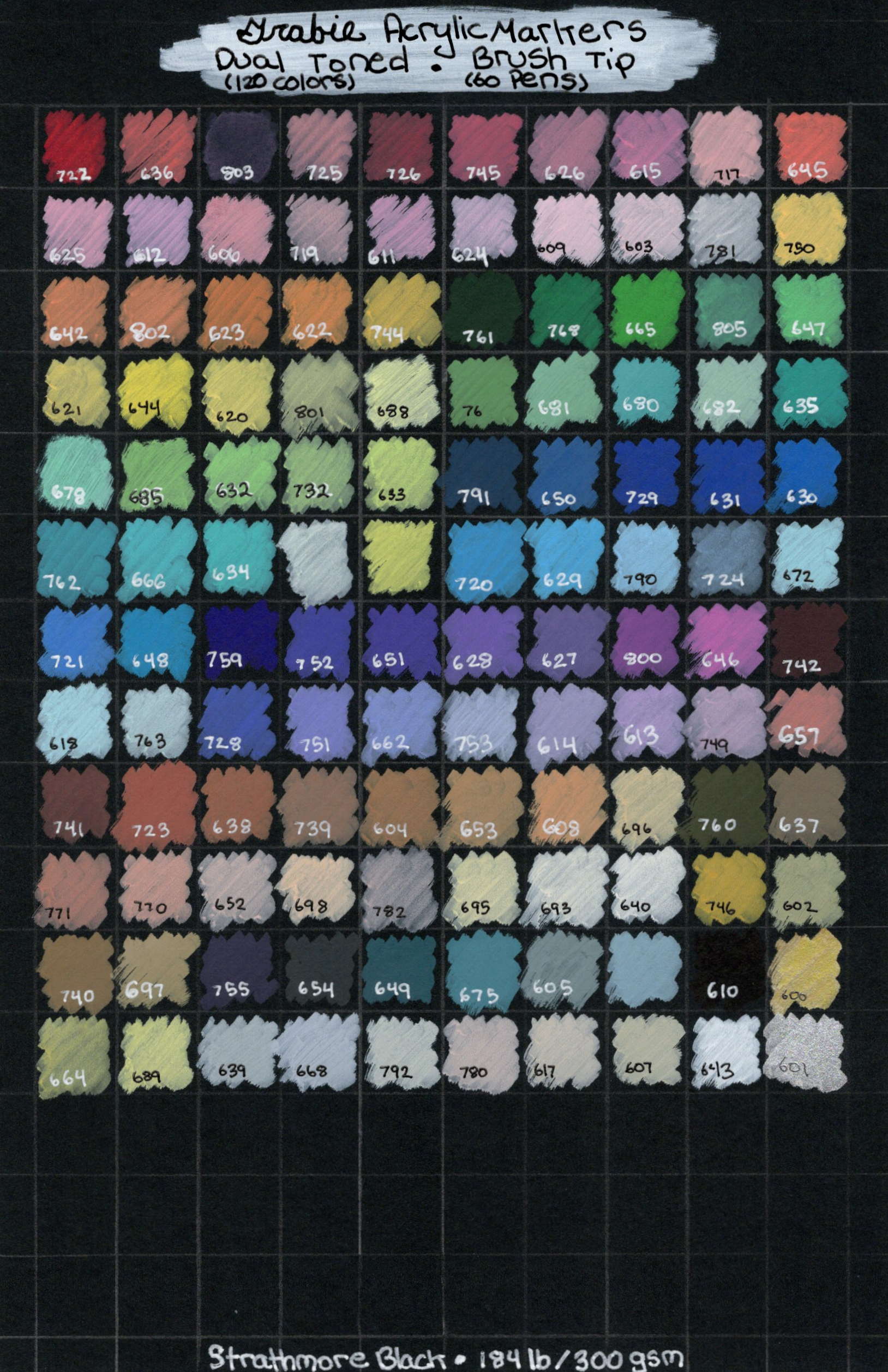
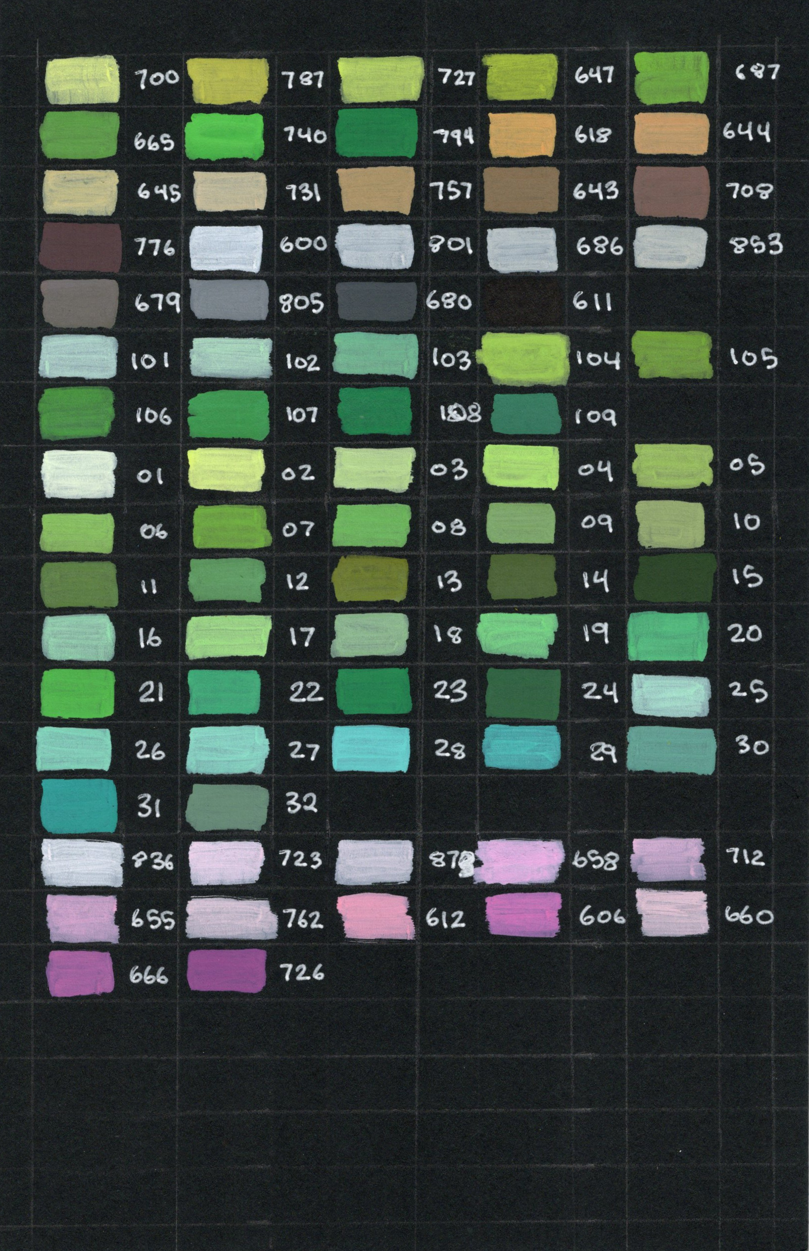
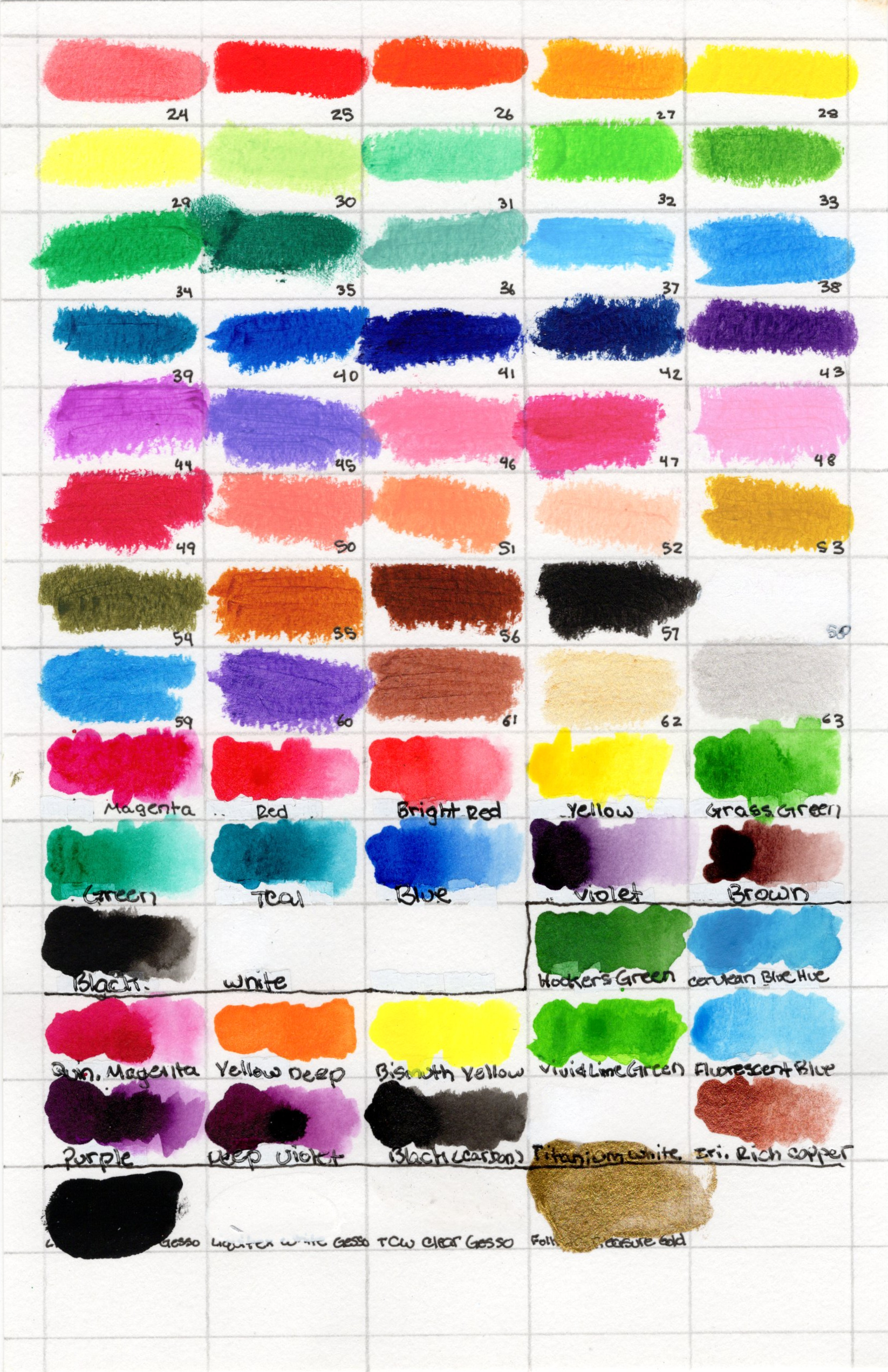
Acrylic Markers
Paper Shown
- Pp. 1, 2, & 4 = Discontinued paper
- Pg. 3 = Canson XL Mixed Media Paper
Supplies Shown
- Left: Grabie Acrylic Markers
- Right: ARTISTRO Acrylic Paint Markers
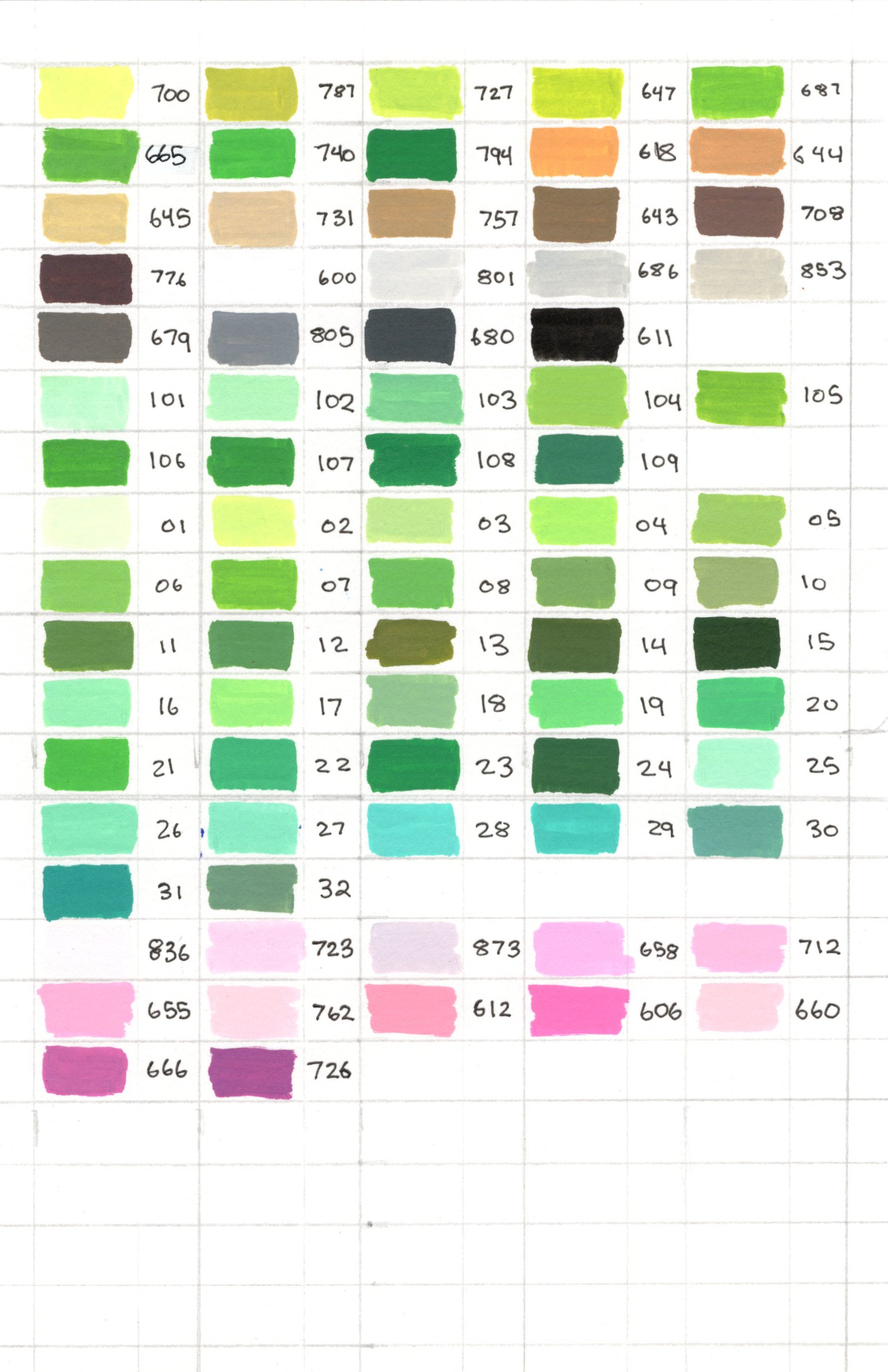
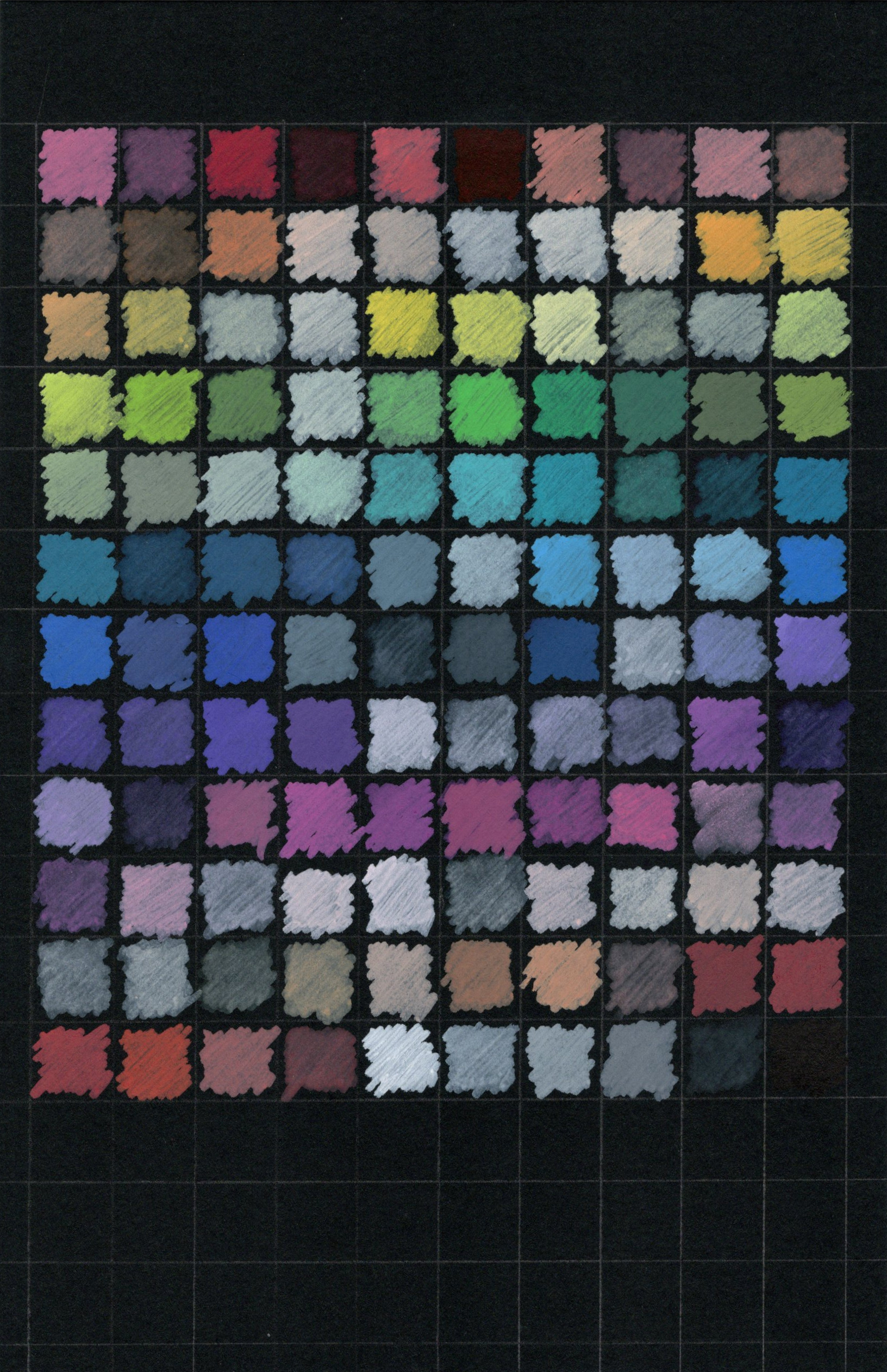
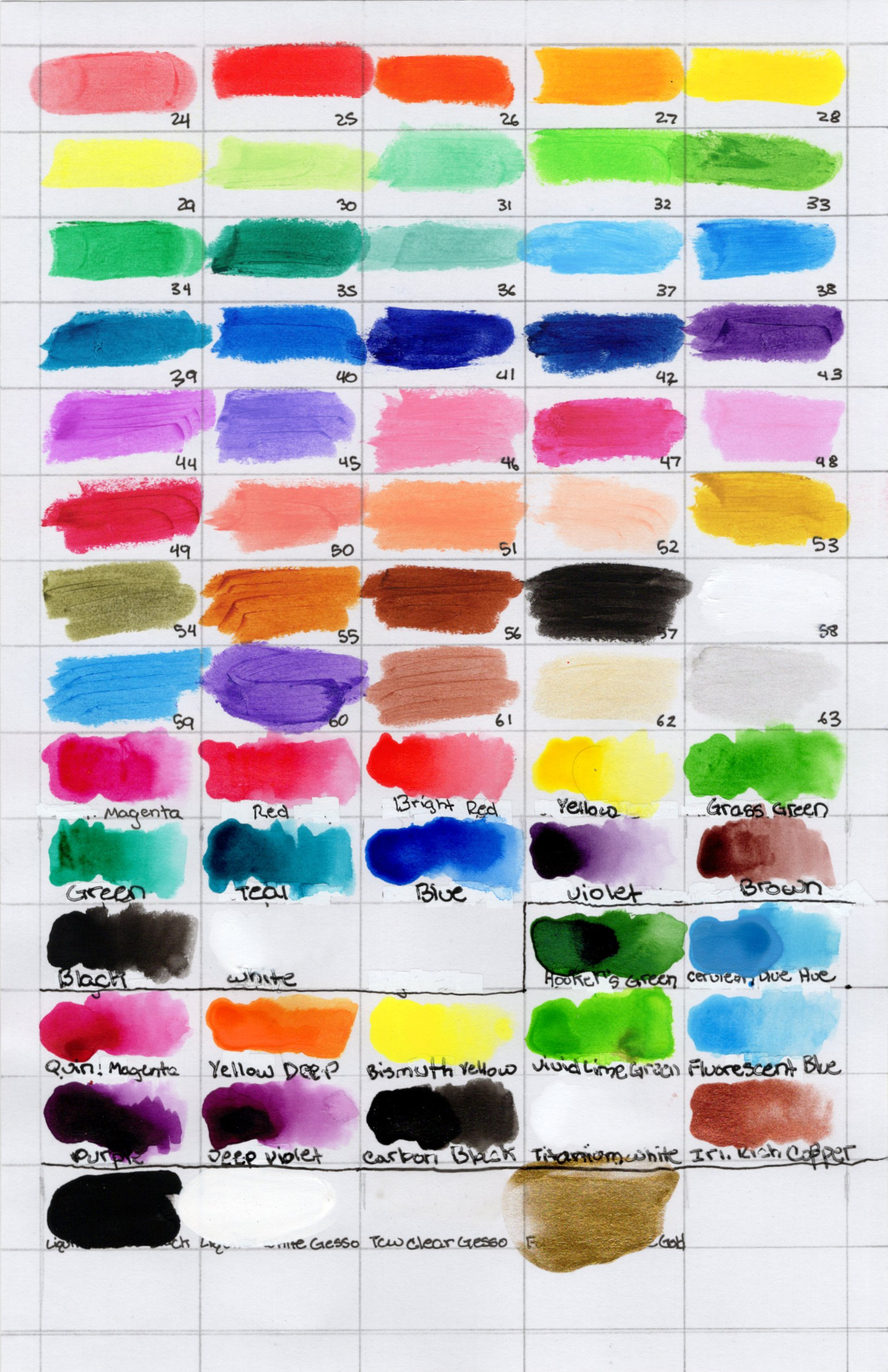
Supplies Shown
- Left (top-to-bottom): Guangna Acrylic Paint Markers | NICETY Acrylic Paint Markers | Yolaka Water Based Acrylic Paint Markers | Kander Duel Tip Acrylic Paint Markers
- Right (top-to-bottom): TRANSON Acrylic Paint Markers | Grabie Acrylic Paint Pens | ARTISTRO Metallic Markers | Ohuhu Glitter Marker Pens
Paper Shown
Supplies Shown
- Left: Grabie Acrylic Markers
- Right: ARTISTRO Acrylic Paint Markers
Supplies Shown
- Left (top-to-bottom): Guangna Acrylic Paint Markers | NICETY Acrylic Paint Markers | Yolaka Water Based Acrylic Paint Markers | Kander Duel Tip Acrylic Paint Markers
- Right (top-to-bottom): TRANSON Acrylic Paint Markers | Grabie Acrylic Paint Pens | ARTISTRO Metallic Markers | Ohuhu Glitter Marker Pens
Tempura & Ink
Supplies Shown (top-to-bottom):
(Left): Canson XL Mixed Media Paper
(Right): Ohuhu Double-Sided Marker Paper
(Left): Strathmore Toned Tan Mixed Media
(Right): Strathmore Toned Gray Mixed Media
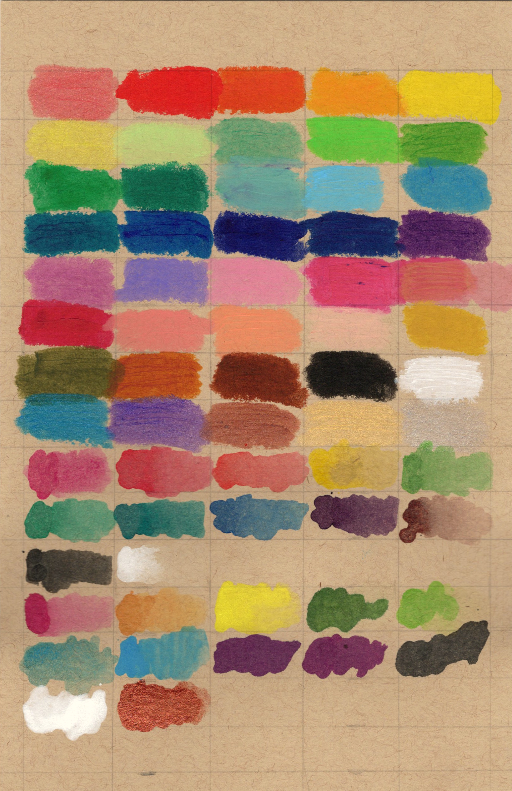
(Left): Strathmore Toned Blue Mixed Media
(Right): Strathmore Black Mixed Media Paper
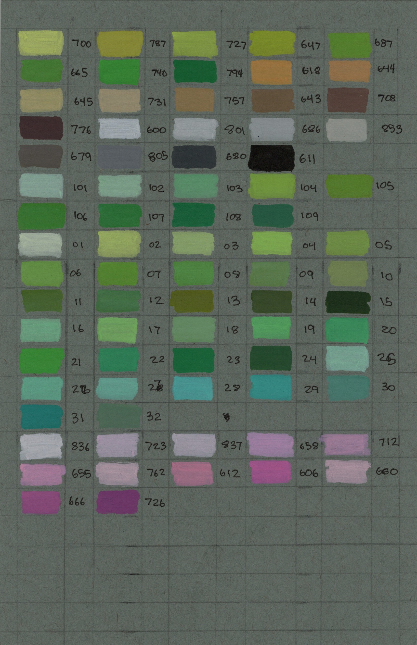
Other Swatches
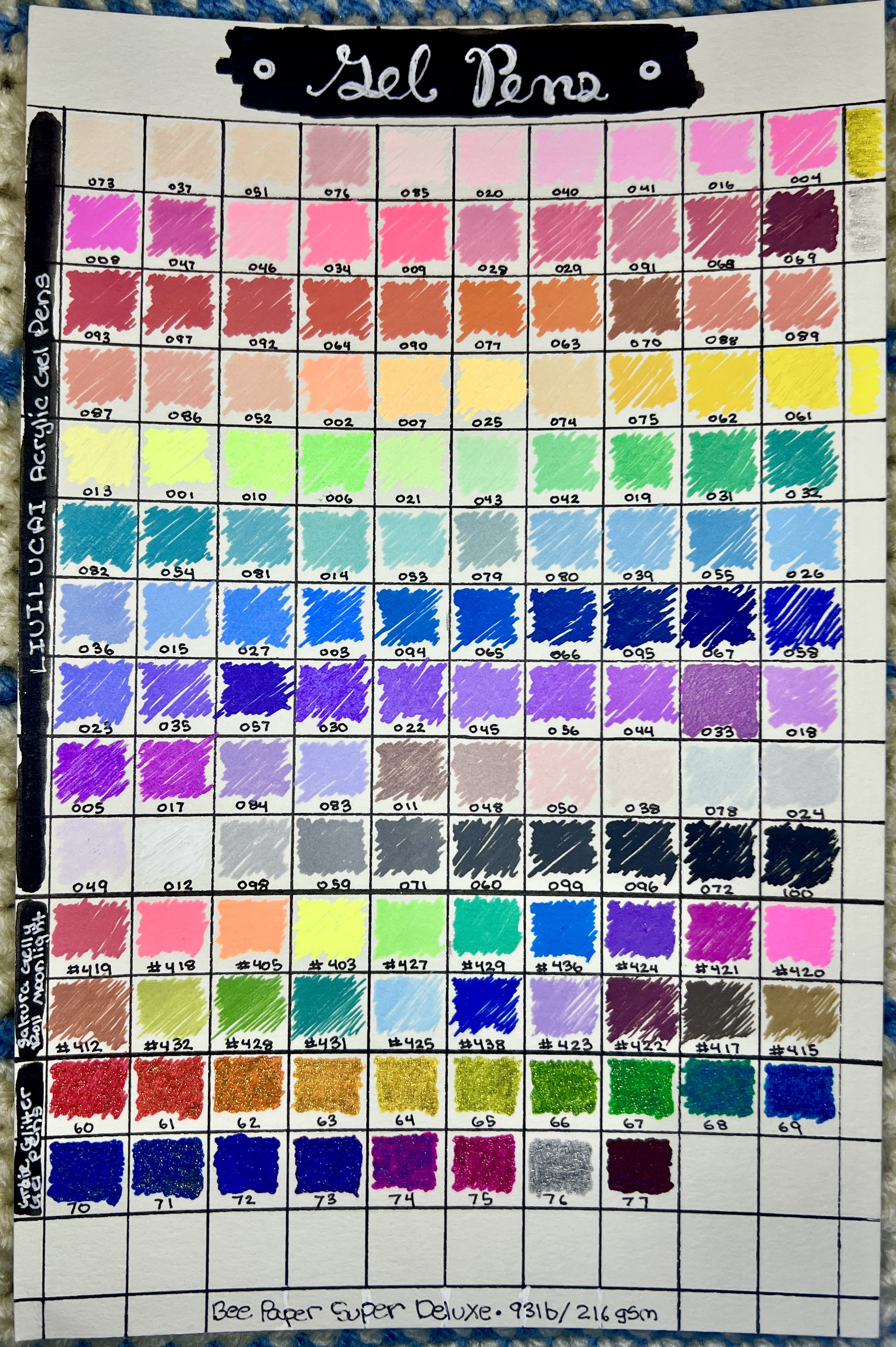
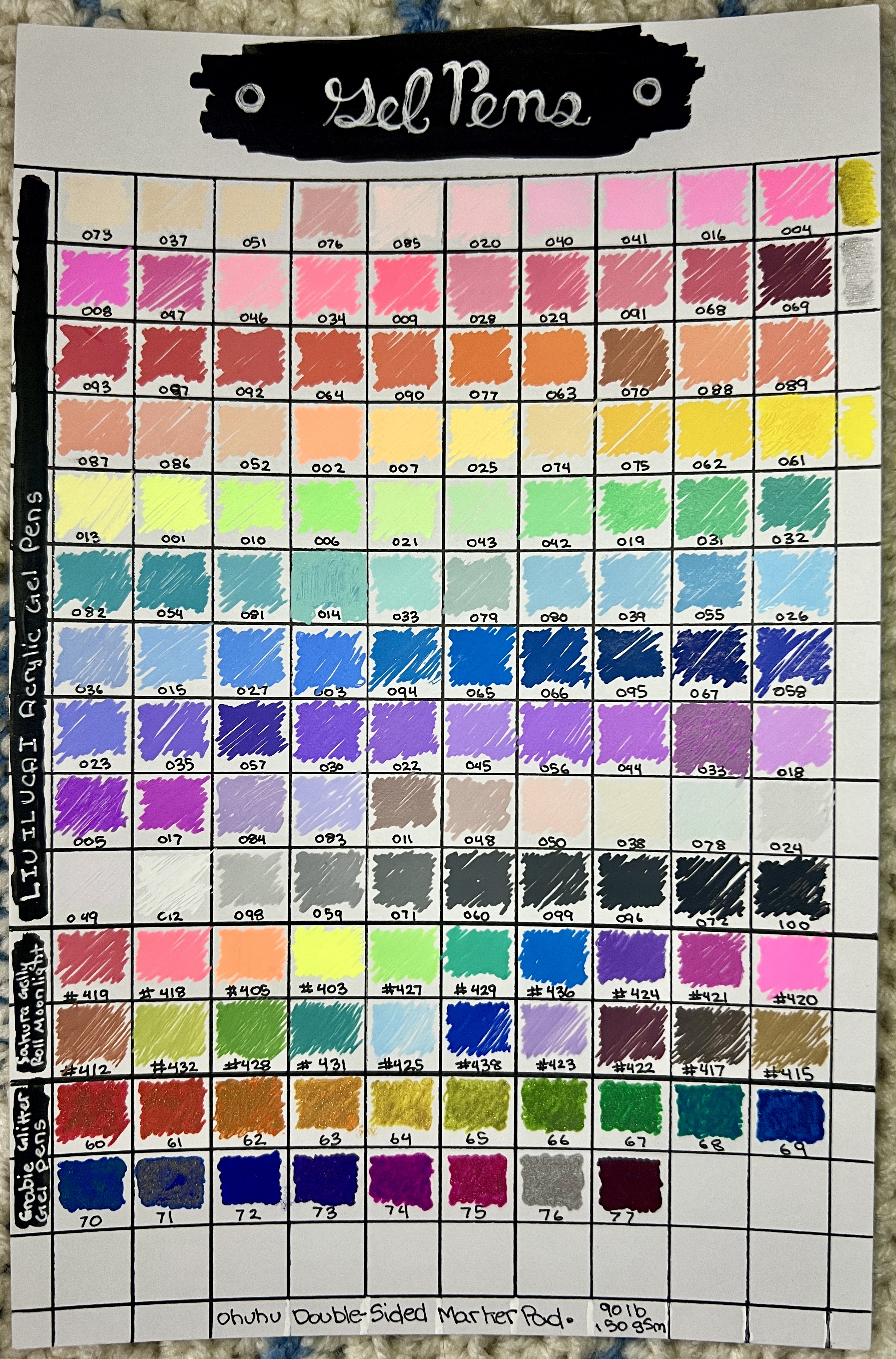
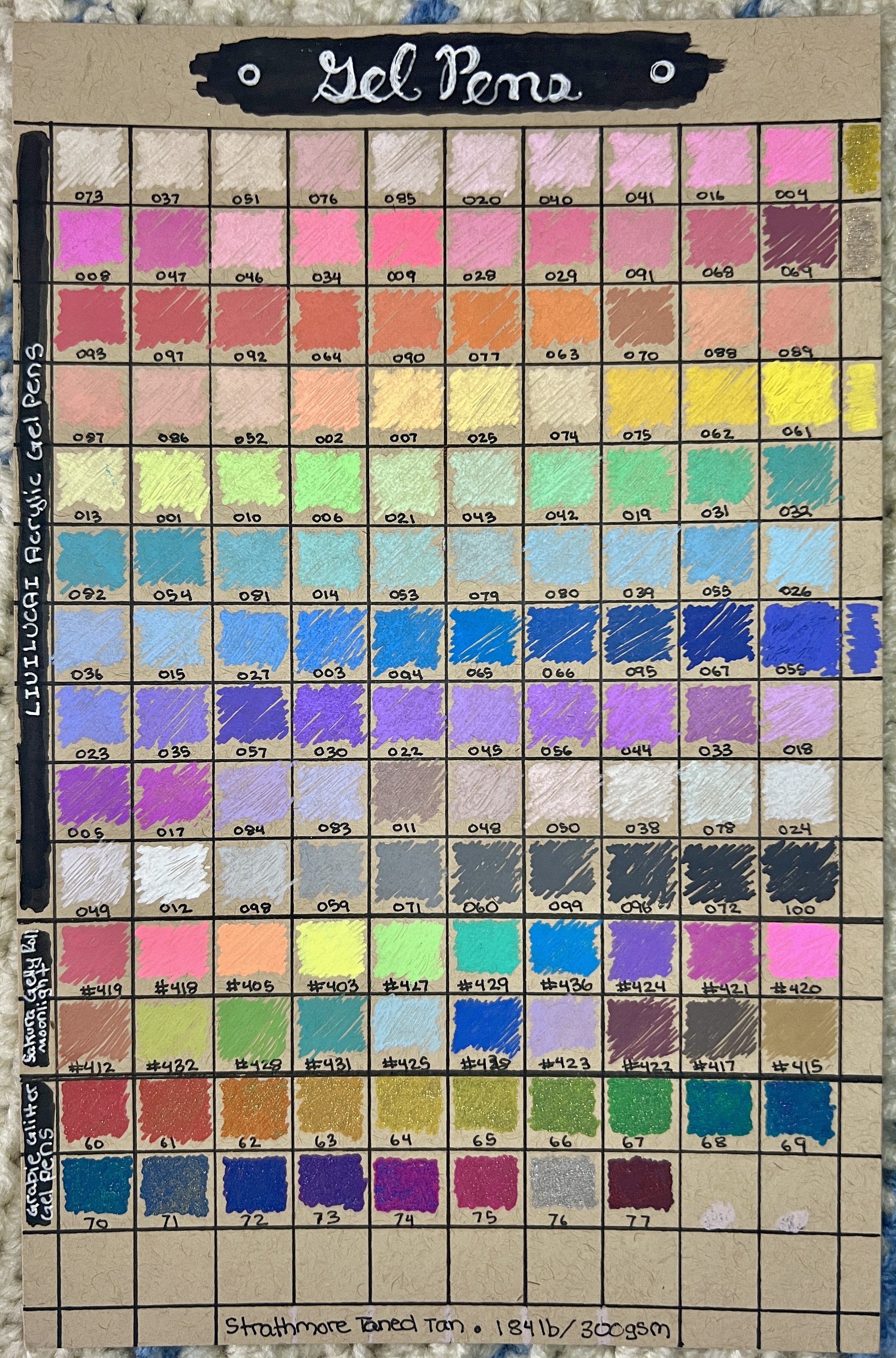
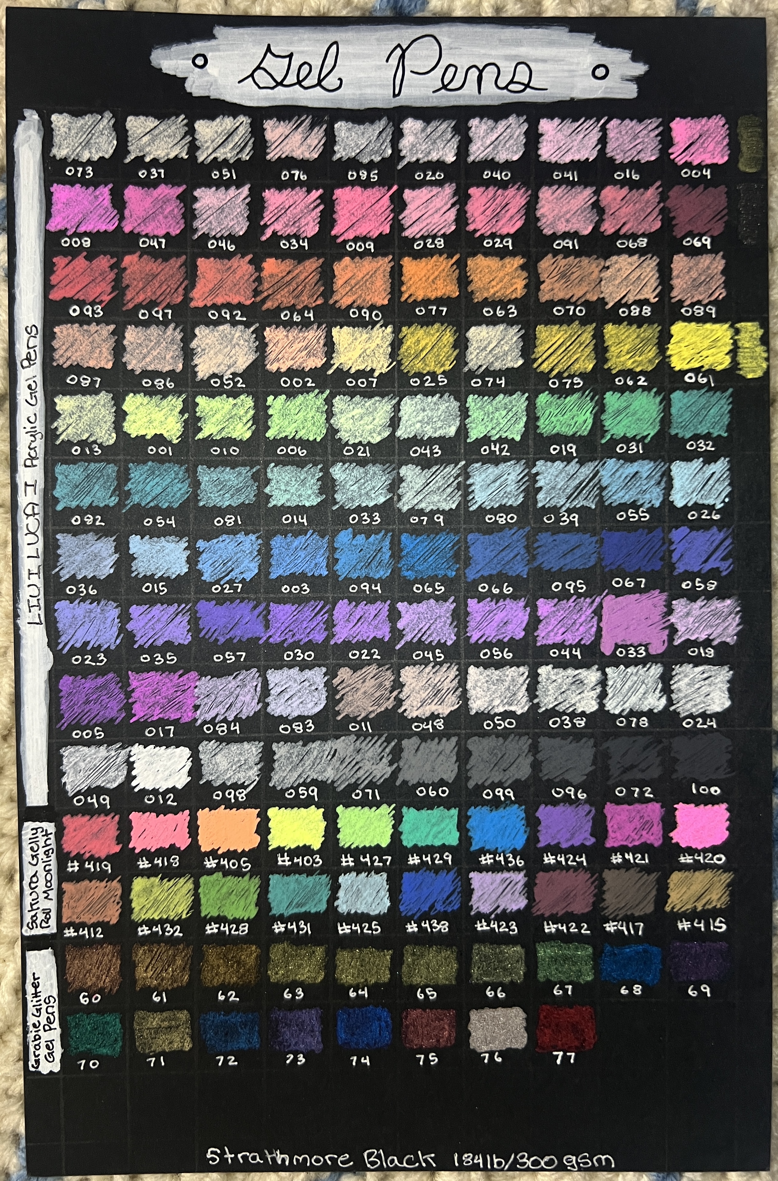
> These are swatch cards I’ve made but that aren’t currently in my *Swatchpedia.* I may rotate them with my current cards depending on the media I’m using. These cards are in a different album from the same brand (*ref.* Dunwell Presentation Book)Gel Pens
The photos below aren’t scanned, they’re just pictures I took with my phone. Gel-pens are frequently neon or fluorescent and scanners don’t translate that well.
Ex:
Supplies Shown:
(Left): Bee Paper Super Deluxe Paper
(Right): Ohuhu Double-Sided Marker Paper
(Left): Strathmore Toned Tan Mixed Media
(Right): Strathmore Toned Gray Mixed Media
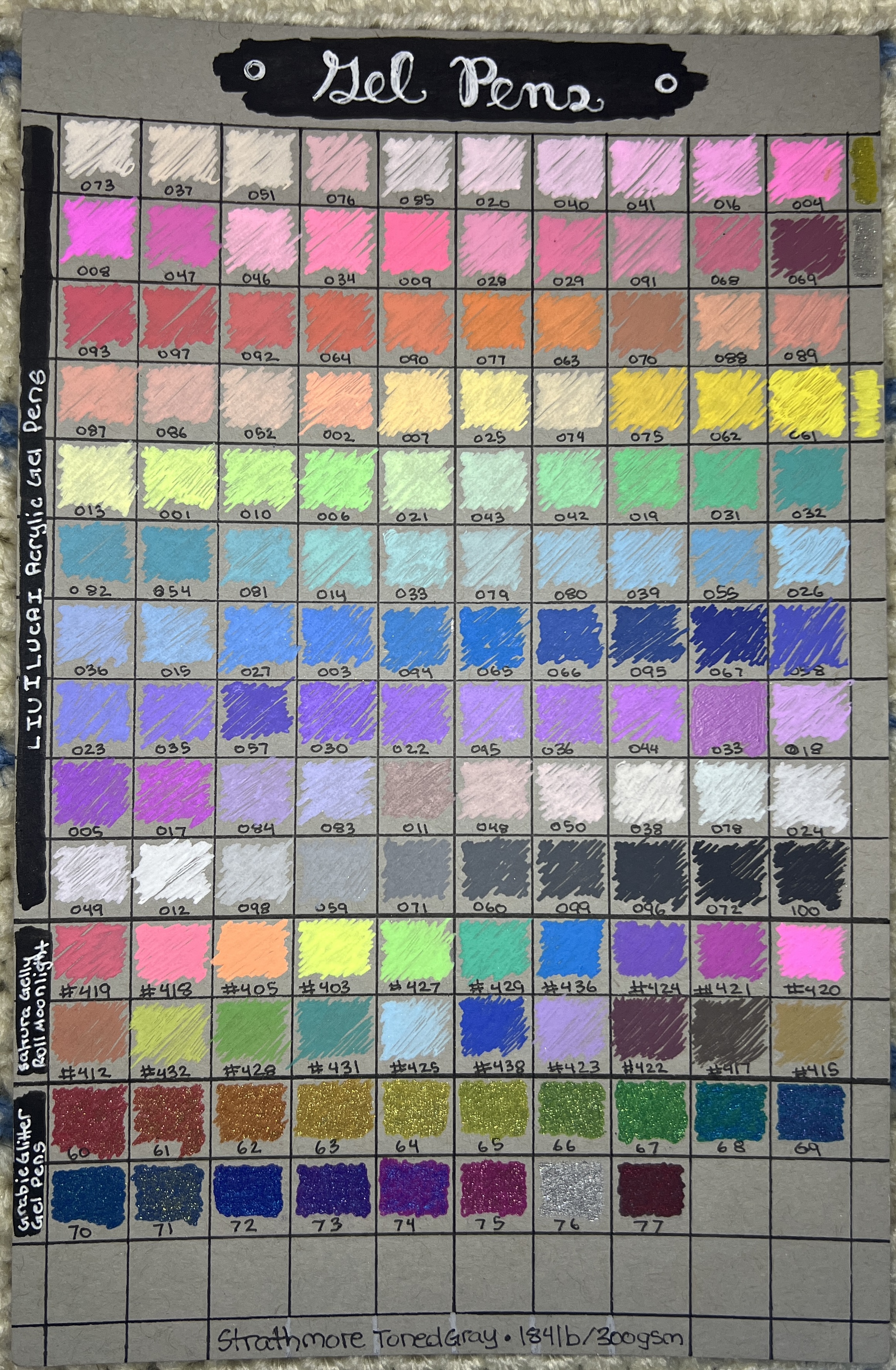
(Left): Strathmore Toned Blue Mixed Media
(Right): Strathmore Black Mixed Media Paper
Misc Misc
Evolution
I have gone through several iterations of Swatchpedias. Each was important in teaching me what to prioritize, how to conserve space, and what supplies were important to swatch.Swatchpedia 1: Pen & Color Swatches
The first was a 3x5 index card three ring binder with sheet protectors. I wanted a small size for portability, without sacrificing space for swatches.
MANWU Index Card Organizer 3x5, Bought 01/2025 ($14.99), Link
I wanted to personalize the front and take advantage of that see-through cover. I didn’t officially name this book, but simply described it’s function.
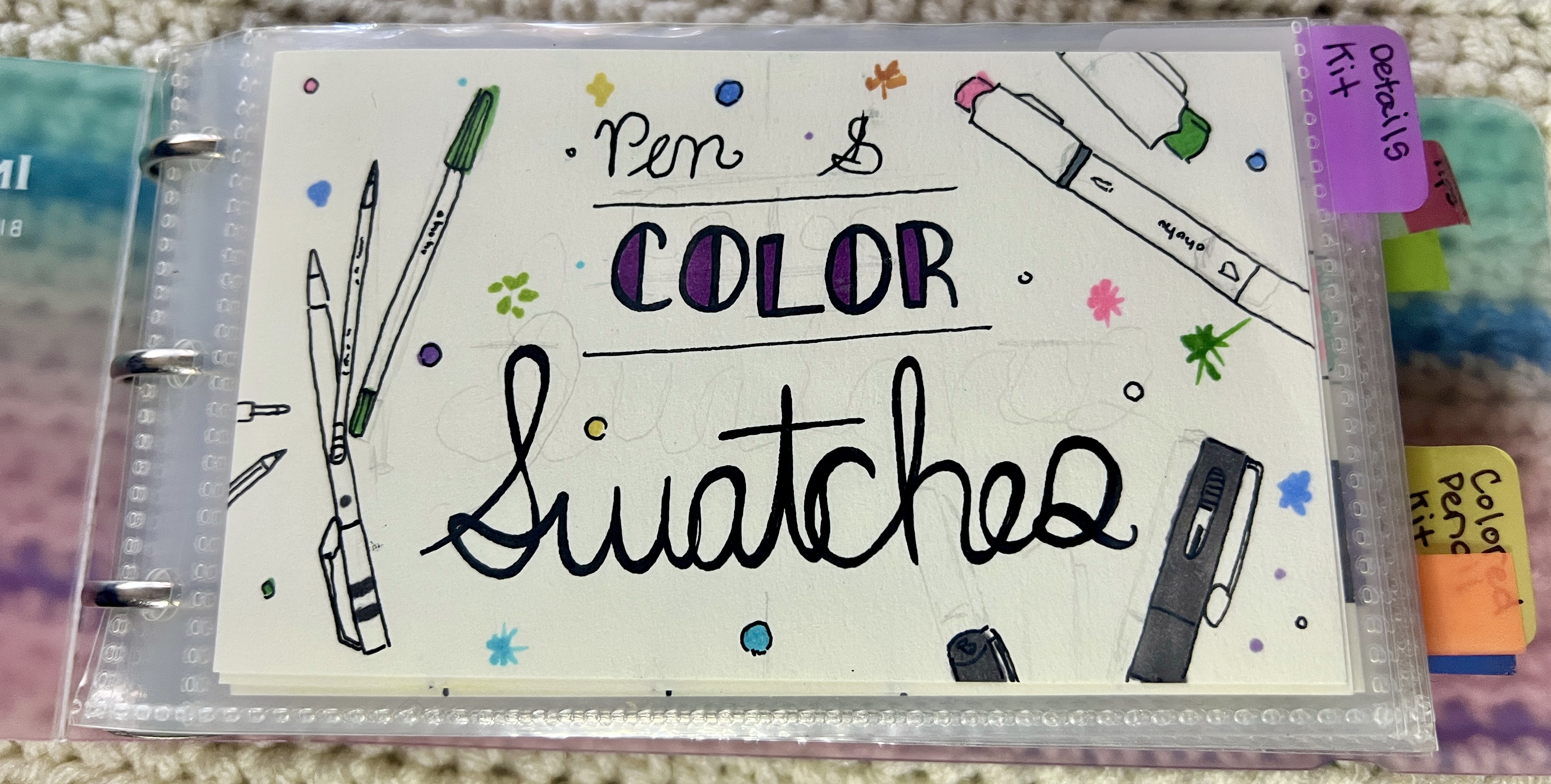
The sheet protectors were nice and thick, and could fit thick pages. I organized the swatches by location in my organization. I use cases to hold my supplies and organized the tabs by case.
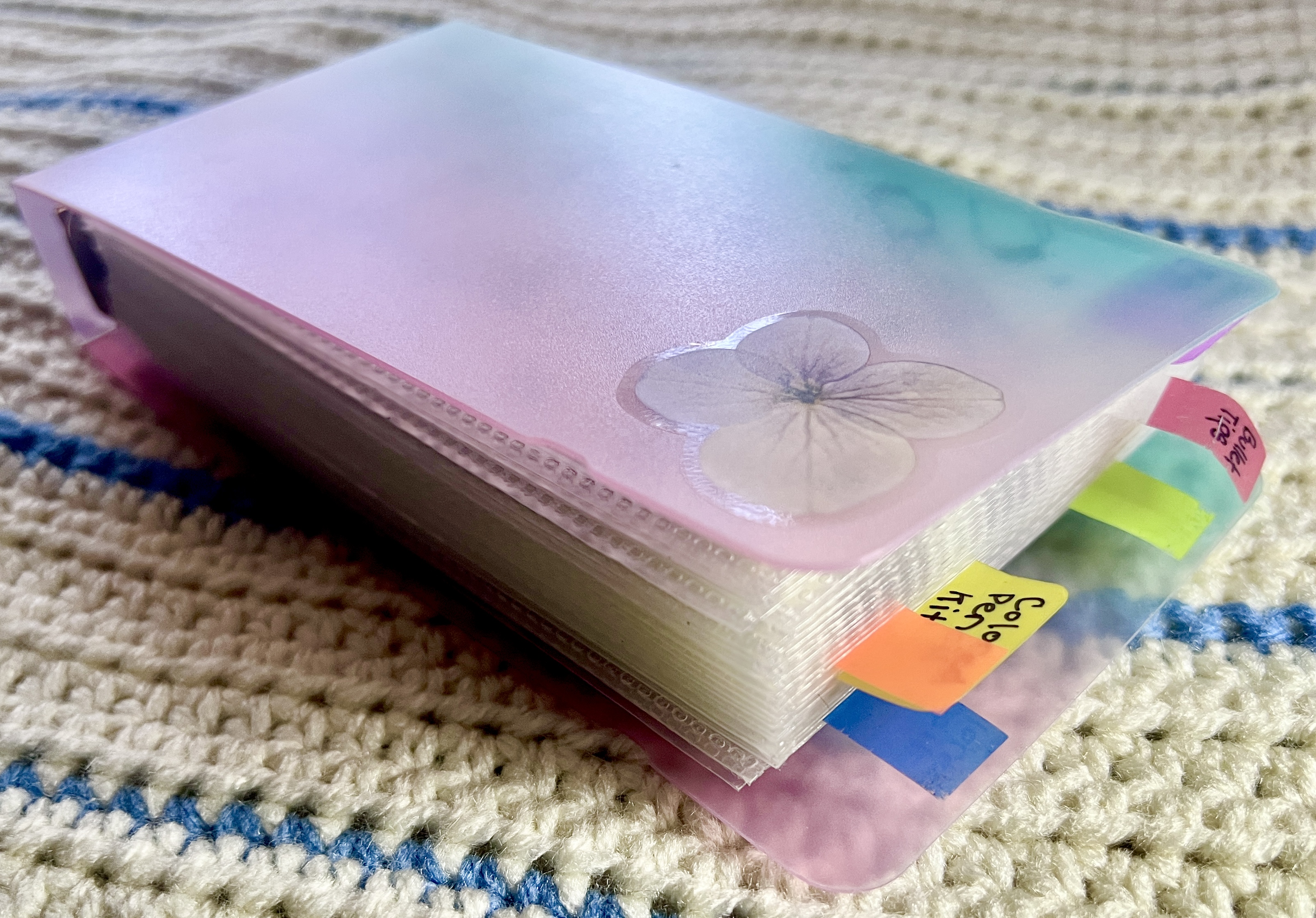
Thick. Held a lot of pages, and I definitely overstuffed it.
I primarily used Bee Paper Super Deluxe Paper paper for all the mediums. The first time I started testing out other paper colors, I deviated from my original template to fit more pens. The building blocks of my current process started early.
What I learned
It functioned really well and was small enough to carry around everywhere. But small pages means more pages means more clutter and mess. I also realized I should have fit more swatches on each page…at least double.
Functional, cute, but ultimately couldn’t hold everything I needed.
Swatchpedia 2: Swatchpedia Media
This was the first version that used the name “Swatchpedia.”
MANWU Index Card Organizer 4x6, Bought 10/2025 ($12.99), Link
This binder was made by the same company that made the first Swatchpedia, but in a 4x6 size. This allowed me to have even more swatches and pages, and more importantly, fit more swatches on each page.
Even thicker binder for holding more pages. That little elastic closure was holding on for dear life.
Speaking of pages, the swatch organization changed for this book. Since I had more space, I also wanted to make each swatch smaller. Drawing out the lines in the first Swatchpedia was really annoying, and I decided to buy swatch stamps.
CRASPIRE Color Swatches, Bought 10/2025 ($5.19), Link
Ranger Archival Ink Pad, Bought 10/2025 ($12.44), Link
These swatch stamps were great. I bought a large stamp pad with permanent ink, used some old blocks I already had, and got to stamping. The dimensions fit 5 x 11 perfection, with some space for labels. But since the stamp was only 4 x 5 square big, this meant maneuvering the stamp to perfectly align it to fit all 55 squares. This would prove to be a much more difficult method than just drawing out lines.
I messed up A LOT. Which meant a lot of wasted paper. But I persisted, aiming to get perfectly placed swatches.
The effect it took to get usable pages made me eventually got over this method, so I wanted to do swatches a different way. I abandoned whatever pages I had left and switched to an A5 album, hoping to only have to use one page per supply.
That’s how we got the current Swatchpedia.
What I Learned
Trying to make less work for myself made more work for myself. When successful, the swatch grids looked great. But it took so much work to make it like that and I wasted a lot of paper. Abandoned.
Swatchpedia 3: Swatchpedia
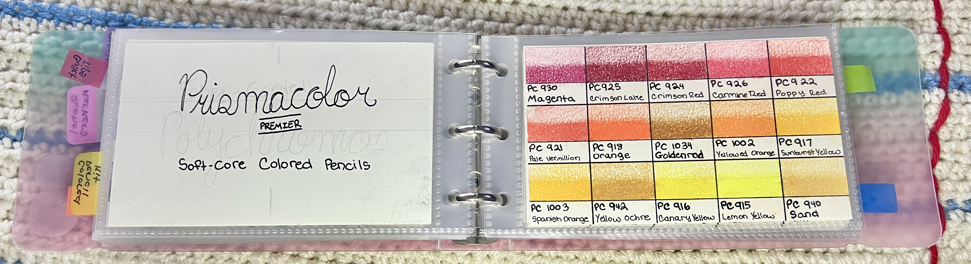
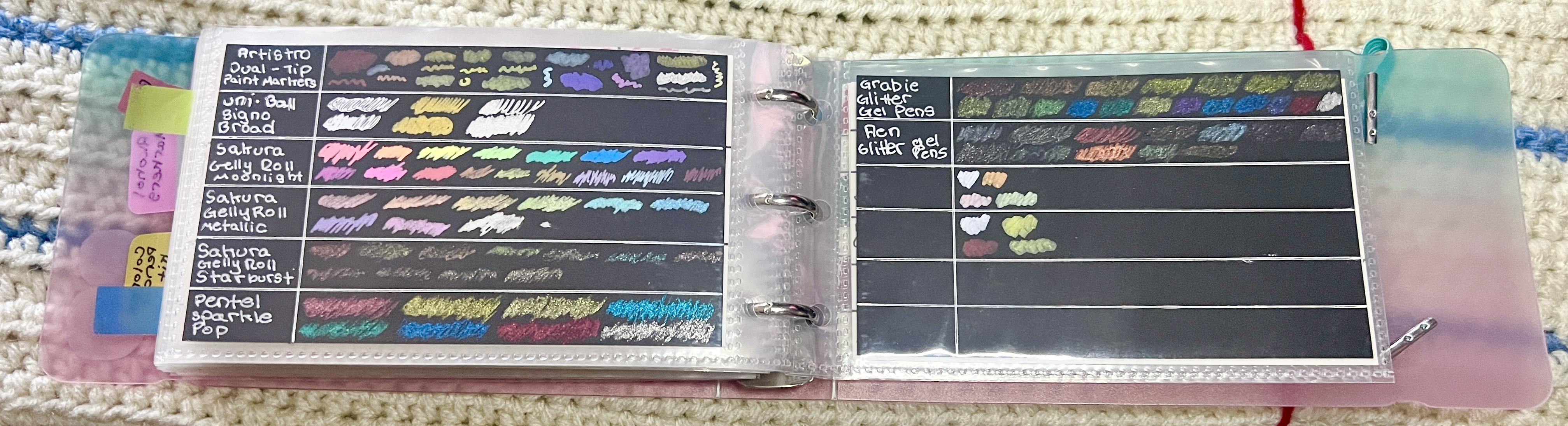
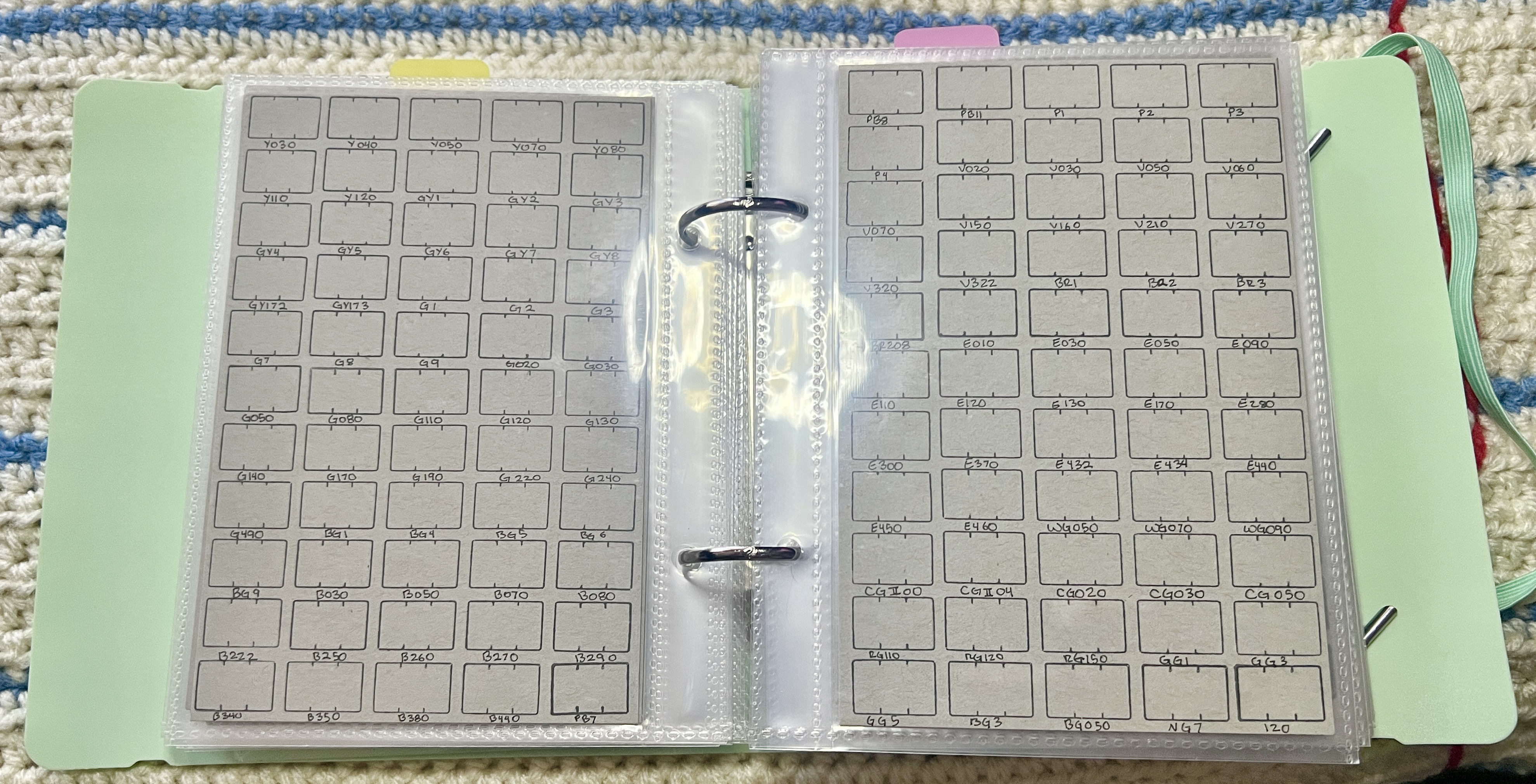
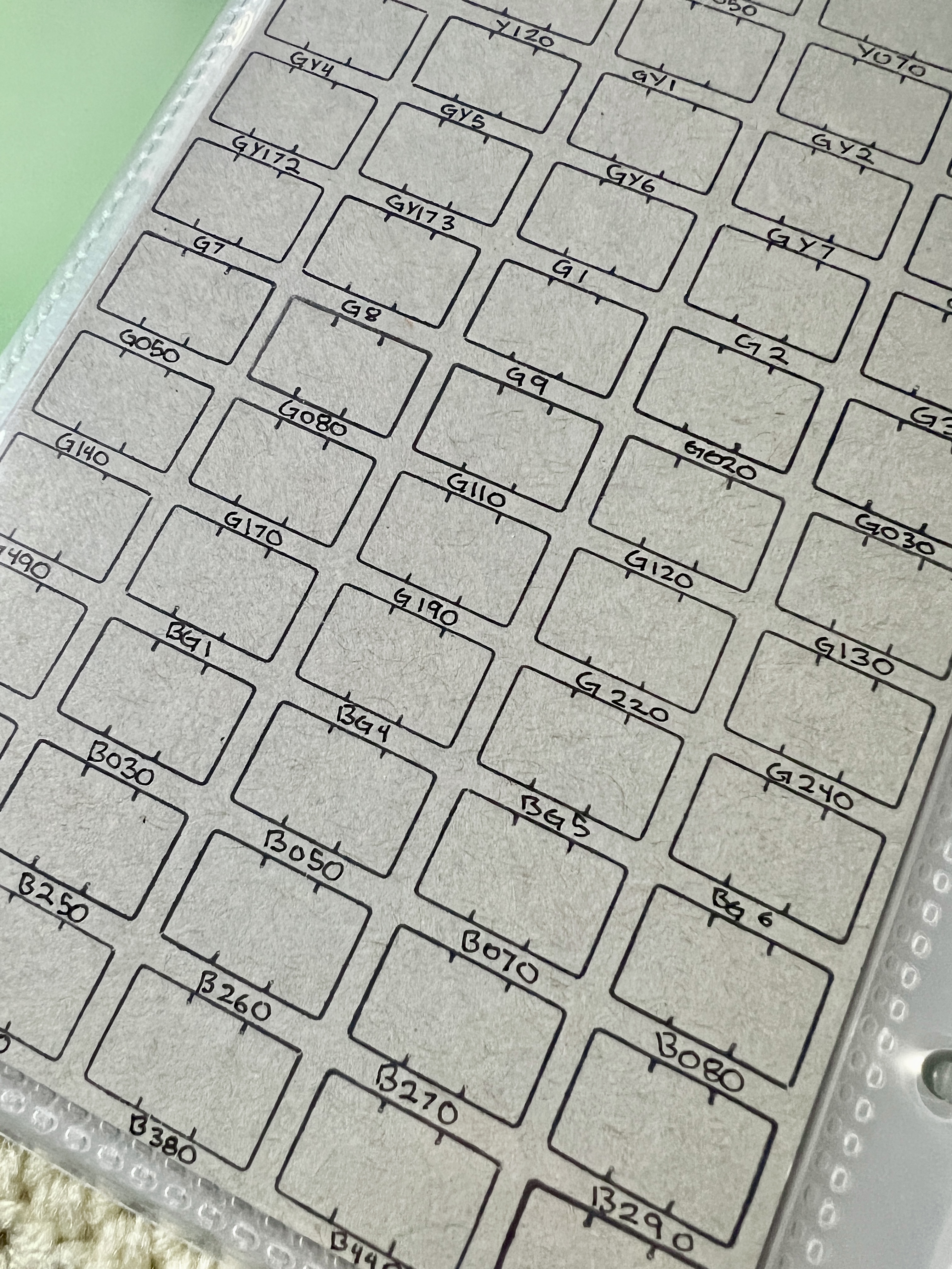
Swatchpedia 3 had the benefit of all I’d learn from the first two Swatchpedias. I needed it to be big enough to hold all of a medium’s swatches on one page, but small enough to be portable. A5 was that perfect fit.
Every medium is on a single page of each paper type, though some pages have multiple mediums. I tend to include mediums I’m using together on the same page if they fit.
In order to fit everything, I made each swatch square 0.5 in. This mean drawing a ton of perfectly measured lines. Each page holds up to 160 swatches.
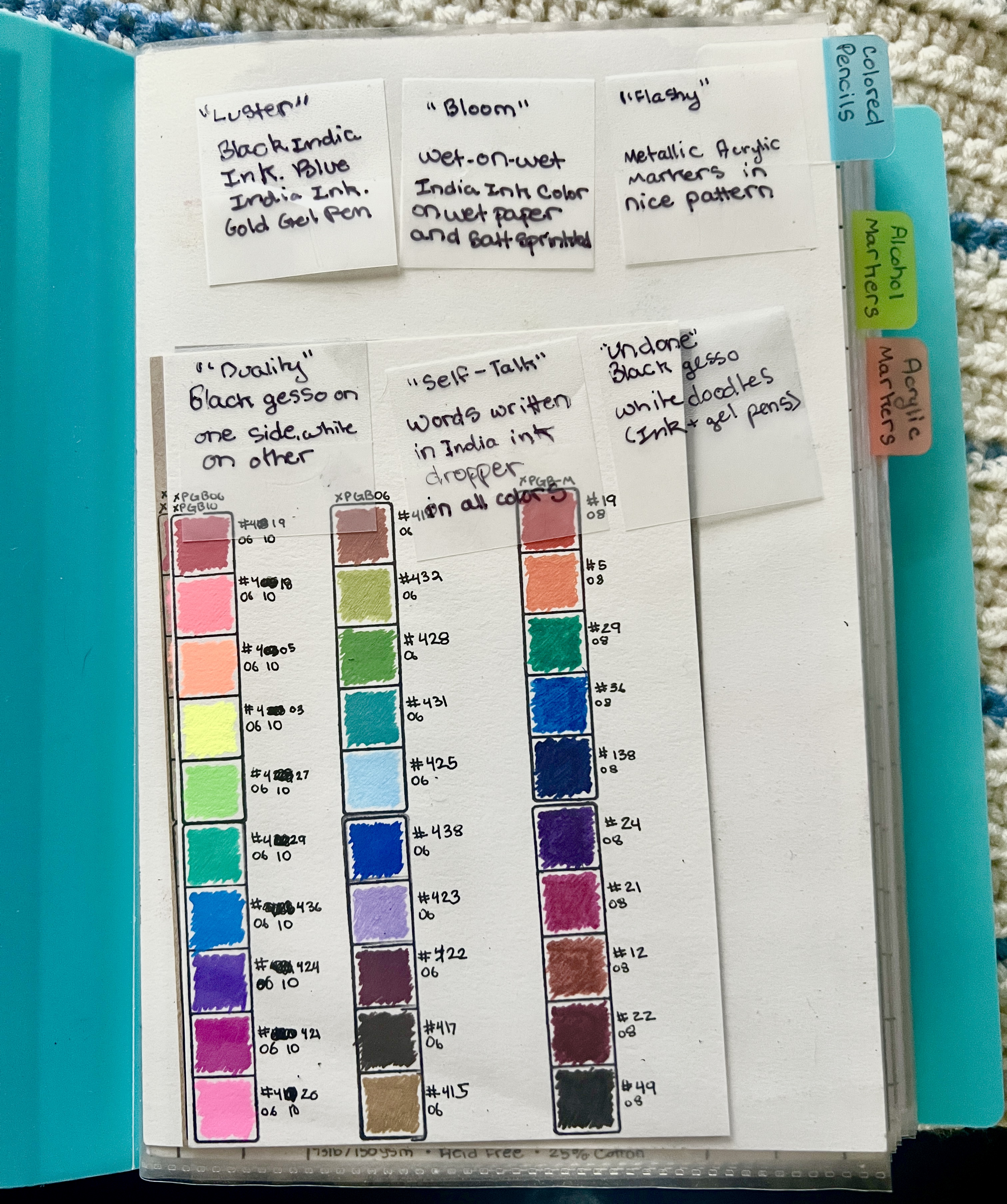
I often use my Swatchpedia to hold ideas and other swatch cards that may be useful.
Lessons So Far…
I’ve had two major lessons while working in my current Swatchpedia.
- Ink lines are annoying. I went back to drawing out lines and I had to wait between lines for the ink to dry or else it would smudge. So I would work on multiple pages at once and switch between them. But recently, I’ve realized I could just use pencil instead of ink lines. Pencil can be erased, so mistakes don’t matter as much, and I don’t have to wait for drying. Win-win!
- Boxes don’t have to be 0.5 in. There’s no reason I have to stick to the same formatting and structure for each page. Maybe some pages don’t need that. many boxes? Maybe I need more space? I need to break free from the rigid idea that every page must look the same.