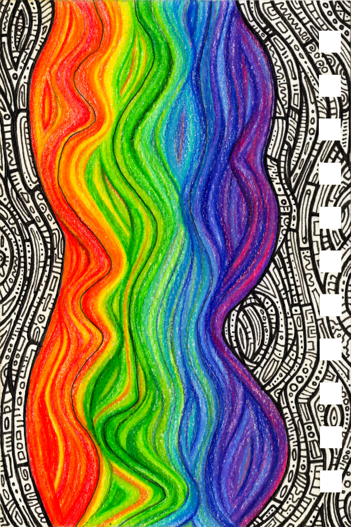
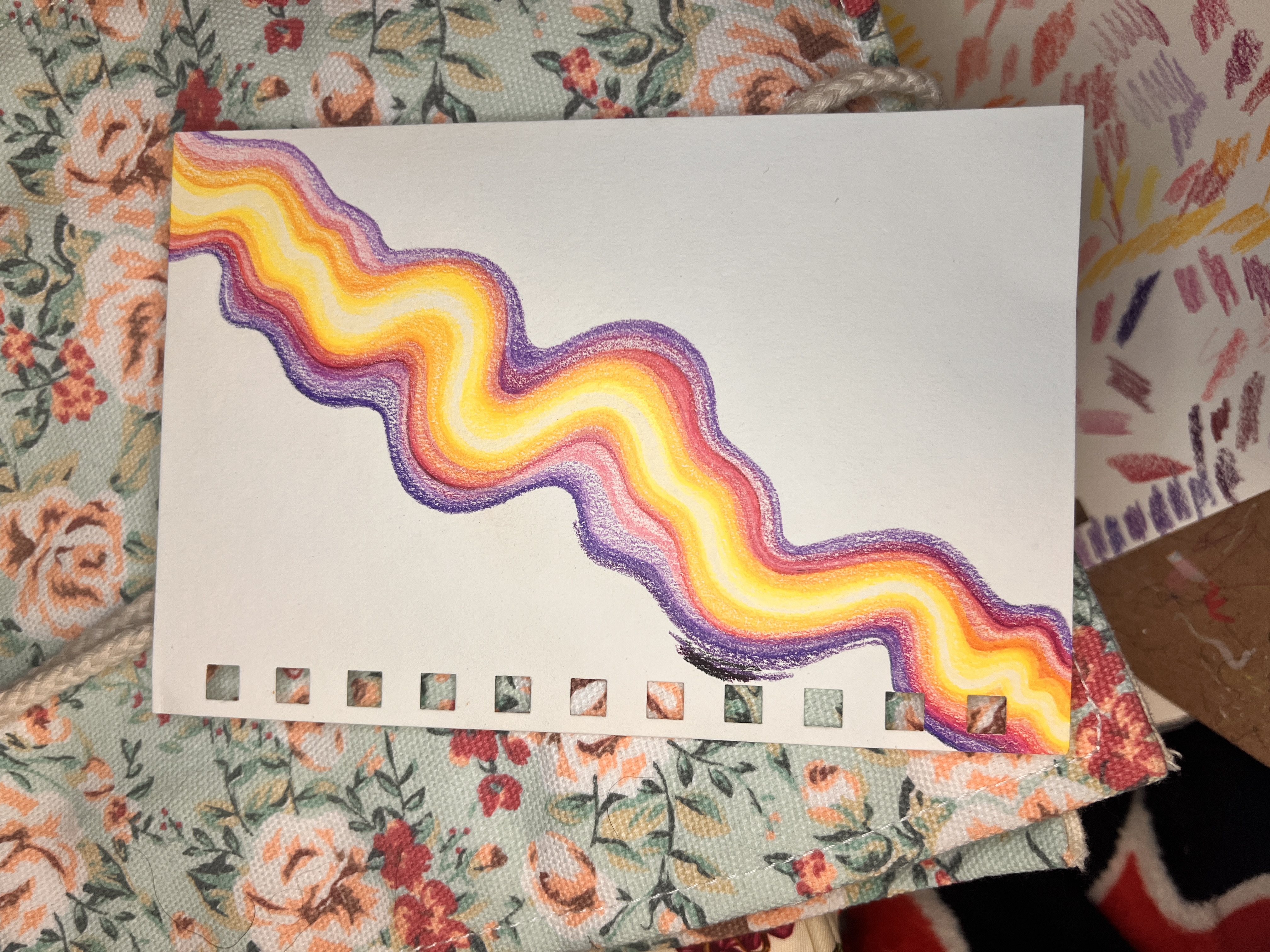
Sunset
Meaning: This is how I think peace feels. Bright and dark, undulating rhythms.
Thoughts: No matter how hard I try to plan things, no matter how many times I start and stop, the piece will do what the piece wants to do. Struggling against it makes things harder.
Lessons: Trust the process. Let the piece evolve.
🎨 Related Pieces
Part of the same artistic series but independent works.
| Piece | Status | Paper Type | Notes |
|---|---|---|---|
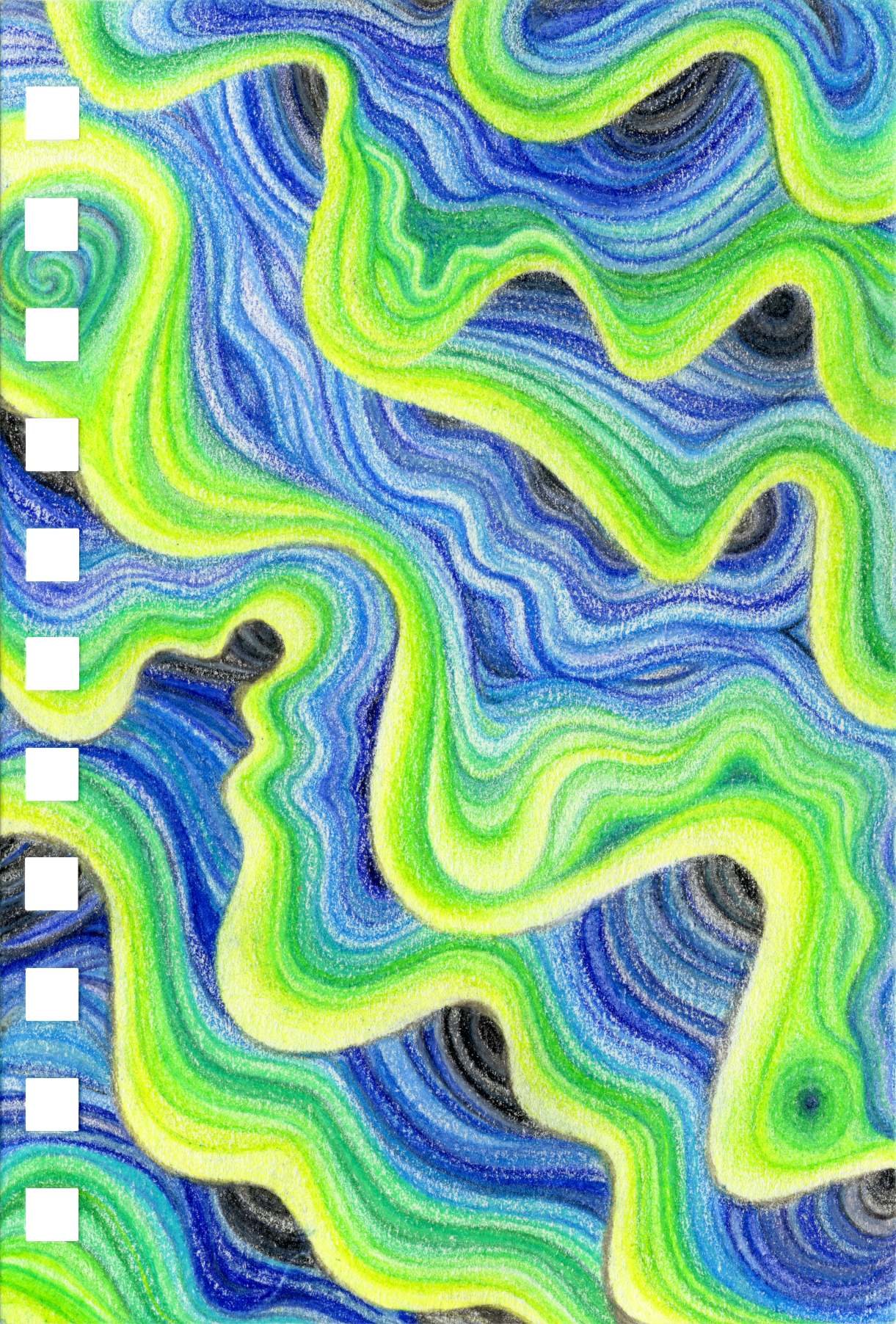
| Underwater Currents | ✅ Complete | Bee Paper Super Deluxe Paper | Stratified Layering, 3rd iteration. |
Creative Workbook
## Description
Started: 10/19/2025
Finished: 11/4/2025
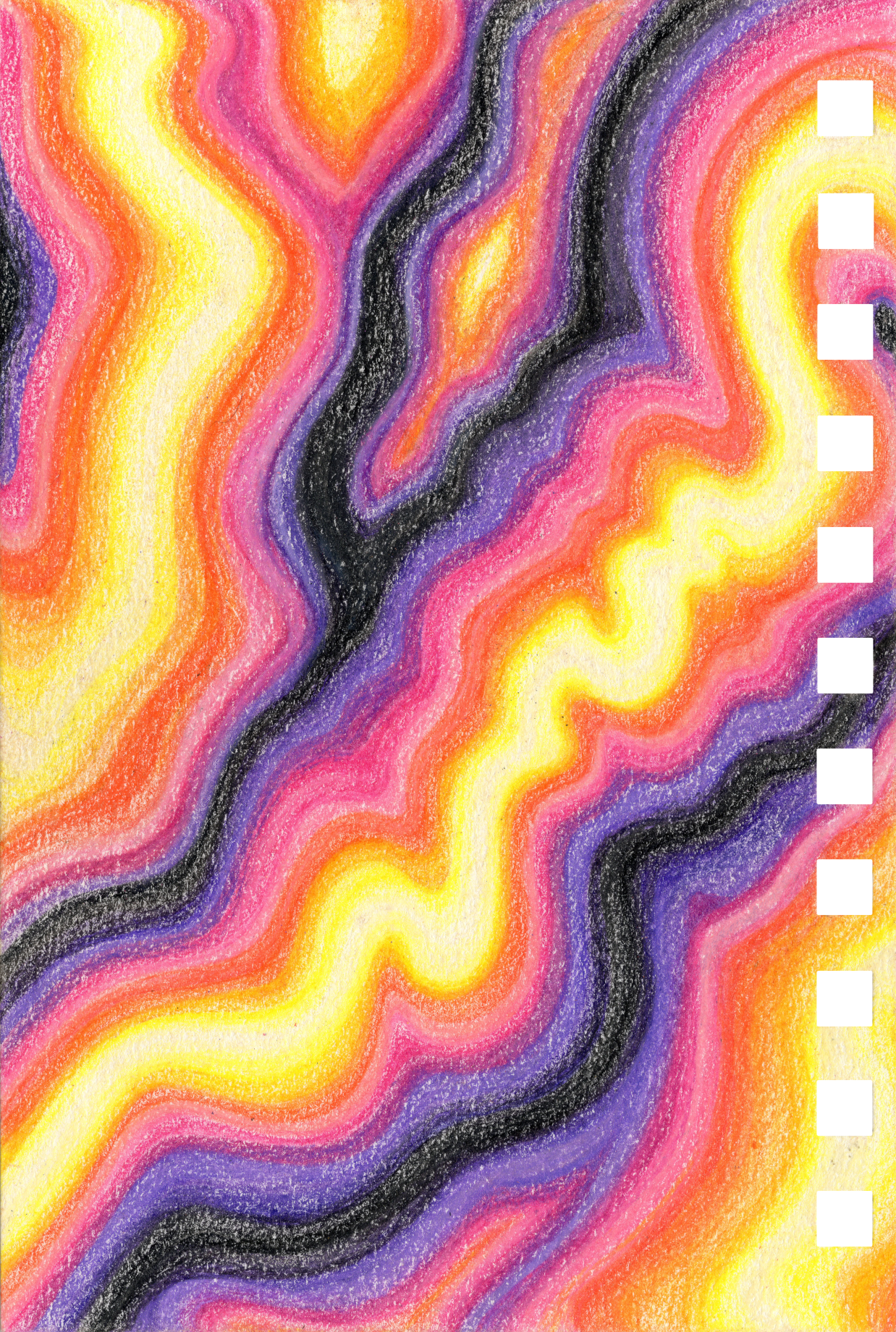
This piece is going to lean far more into the undulation and depth effect. Instead of each layer on Underwater Currents. going in the same direciton (light-to-dark, light-to-dark), creating a layered effect, I'll be going in opposite directions (light-to-dark, dark-to-light), to create a buldging effect.
Planning Notes
- Companion piece to Underwater Currents with opposite diagonal direction.
- This piece will be more like mounds or tubes vs the shell/layered look of Underwater Currents.
- Pulled the colors. The original palette was more limited, so of course I added more colors. I added to each color (yellow, purple, and pink) but also added orange as a range between pink and yellow.
- How many levels do I include? I also don’t know how wavy or curvy to make the lines. Do I start in the middle and just go with the flow without planning out the lines? Or do I plan them out like I did the last piece? (Note: The last piece actually stayed with the guidelines until the last two or so layers, when I abandoned the guide lines).
Progress Notes
- Husband kept suggesting I should start over after I told him I did the wrong color choices/had too many colors. But I really liked how the piece was turning out overall, even though the colors were off.
- Across the two brands (Prismacolor Premier, Polychromos), I have 3-5 yellow-oranges that all look the same.
- I haven’t been adding any deviations to the lines. I should. So…what am I afraid of?
- I just realized I’m not doing the lines the same as the companion piece, Underwater Currents. In Underwater Currents, the lines have more of a 3D effect because of how I shaded. I really liked the texturing that gave. This current iteration is more of a gradient I’m burnishing the lines far more than Underwater Currents, and I have a much more cohesive blend. I’m hoping the colors themselves will provide a 3D effect overall.
- 11/2/25 - I continue to question the current iteration. The lines are much less independent and do a lot more blending between them. I also keep removing any of the cool bends and curves as they inevitably straighten out. I miss the 3D effect of each line and the chaos I had in them. But that doesn’t mean this is a bad piece or that it won’t look good. It’s just not what I planned. I’m trying to finish it but I’m struggling. I need to remember that my pieces like to evolve on their own. I can only suggest where to go, but the final result depends on what the piece wants to be.
- 11/3/25 - It’s agate now. I decided to try and add some random parts and now I’m liking it better. It’s evolving better. I can see a clear path to finish.
Completion Notes
- At some point, I tend to just give up on precision and go for finishing. I can tell when it happens in the piece. It can be frustrating but it gets the job done.
- The final piece looks really. nice, and seems to glow. Though I didn’t end up getting the 3D effect Iw as hoping for since I made everything about the same depth.
✵ Steps ✵
Supplies
| Material | Brand | Product | Specs |
|---|---|---|---|
| Paper | Bee Paper | Super Deluxe | Mixed media, 98lb, cream |
| Colored Pencils | Prismacolor | Priemer | Soft-core wax |
| Colored Pencils | Faber-Castell | Polychromos | Oil-based |
Color Palette: Amethyst Sunset
*Based on the Amethyst Dream palette.*| Color | Name | Hex | RGB | Brand |
|---|---|---|---|---|
| 199 Black | #171819 |
23, 24, 25 |
Polychromos | |
| PC935 Black | #27292c |
39, 41, 44 |
Prismacolor | |
| PC931 Dark Purple | #3e2a3f |
62, 42, 63 |
Prismacolor | |
| 249 Mauve | #43206d |
67, 32, 109 |
Polychromos | |
| PC932 Violet | #4c2e7d |
76, 46, 125 |
Prismacolor | |
| 136 Purple Violet | #562c6c |
86, 44, 108 |
Polychromos | |
| PC1007 Imperial Violet | #4d3594 |
77, 53, 148 |
Prismacolor | |
| PC1008 Parma Violet | #7550b5 |
117, 80, 181 |
Prismacolor | |
| PC995 Mulberry | #8c3da0 |
140, 61, 160 |
Prismacolor | |
| PC1104 Amethyst Violet | #9d76d0 |
157, 118, 208 |
Prismacolor | |
| PC994 Process Red | #e43dc3 |
228, 61, 195 |
Prismacolor | |
| 133 Magenta | #6e172c |
110, 23, 44 |
Polychromos | |
| PC930 Magenta | #bb4b7a |
187, 75, 122 |
Prismacolor | |
| 125 Middle Purple Pink | #e32f79 |
227, 47, 121 |
Polychromos | |
| 129 Pink Madder | #fb839d |
251, 131, 157 |
Polychromos | |
| PC928 Blush Pink | #f39abe |
243, 154, 190 |
Prismacolor | |
| PC929 Pink | #ec7aa9 |
236, 122, 169 |
Prismacolor | |
| PC926 Carmine Red | #f05a6f |
240, 90, 111 |
Prismacolor | |
| 124 Rose Carmine | #fa6666 |
250, 102, 102 |
Polychromos | |
| 131 Coral | #f9705b |
249, 112, 91 |
Polychromos | |
| 111 Cadmium Orange | #ff8b23 |
255, 139, 35 |
Polychromos | |
| PC1002 Yellowed Orange | #f5943d |
245, 148, 61 |
Prismacolor | |
| 109 Dark Chrome Yellow | #ffb533 |
255, 181, 51 |
Polychromos | |
| PC917 Sunburst Yellow | #ffbc37 |
255, 188, 55 |
Prismacolor | |
| PC1003 Spanish Orange | #ffbb28 |
255, 187, 40 |
Prismacolor | |
| 107 Cadmium Yellow | #ffd324 |
255, 211, 36 |
Polychromos | |
| PC916 Canary Yellow | #ffe333 |
255, 227, 51 |
Prismacolor | |
| 105 Light Cadmium Yellow | #ffe237 |
255, 226, 55 |
Polychromos | |
| 102 Cream | #ffda78 |
255, 218, 120 |
Polychromos | |
| PC914 Cream | #fdf2ac |
253, 242, 172 |
Prismacolor | |
| 101 White | #fdfcf6 |
253, 252, 246 |
Polychromos | |
| PC938 White | #fefdf6 |
254, 253, 246 |
Prismacolor |
Project Iterations
## Iteration 1:
General Thoughts: Was looking cool but the color gradient wasn’t doing what I wanted. I have too many colors, some don’t work well or are out of place.
Status: ❌ Abandoned
✵ Analysis ✵
- What I Like: It looks cool, the line work and shading, the plending, the curves. It works well. The technique is good.
- What I Don’t Like: The color choices. They don’t blend as well as I’d want. If my goal is to get progressively darker, I’ve failed.
- I also don’t like how the entire thing flows in the same way, instead of adding more collisions and imperfections.
- What I Learned: Too many colors confuses the piece. Be choosier with the palette.
I’ve updated the palette. I removed some reds, added some oranges, and reorganized the colors by actually testing them on a practice sheet. I’ve got my new order, and hopefully a more cohesive palette.
Inspiration & References
## Technique Iterations