Underwater Currents
Finished Piece
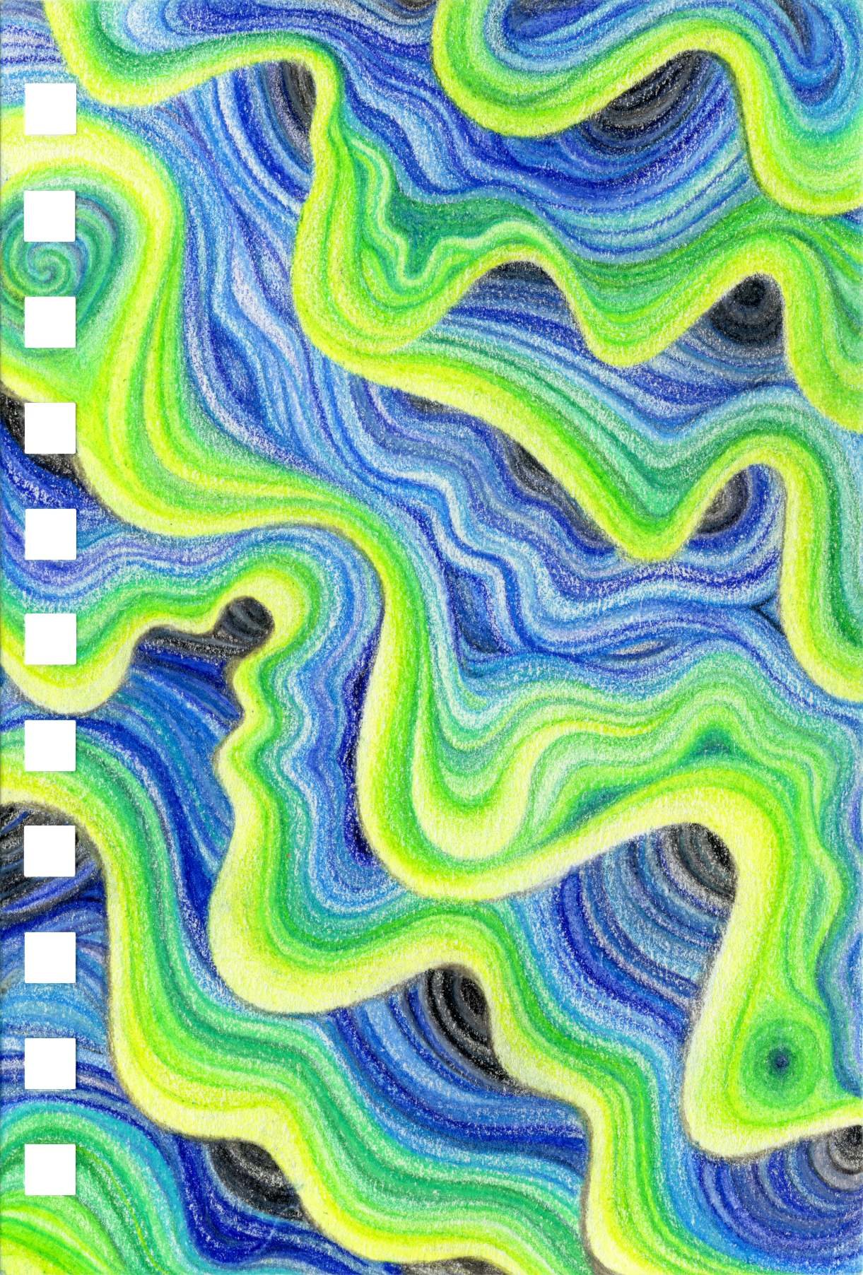
Meaning: The fluid, yet turbulent nature of peace. Influenced by agate, giant clams, and coral. The name comes from the colors and the movement I tried to convey in the piece.
Thoughts: This piece exemplifies my struggle with planning and spontaneity. I actually tried to start it multiple times and have abandoned multiple sketches. I couldn’t’ get the lines right, the curves, the movement. After I finally had the sketch, I still struggled with where to add variation and how.
Lessons: Let the process take you where it wants to go. Don’t be stuck to made-up parameters. The piece evolves on it’s own. Trying something new doesn’t always work, but’s it’s always a teaching moment.
🎨 Related Pieces
Part of the same artistic series but independent works.
| Piece | Status | Paper Type | Notes |
|---|---|---|---|
| Sunset | ✅ Complete | Bee Paper Super Deluxe Paper | Stratified Layering, 4th iteration. Flat color. |
🎨 Related Pieces
Part of the same artistic series but independent works.
| Piece | Status | Paper Type | Notes |
|---|---|---|---|
| Sunset | ✅ Complete | Bee Paper Super Deluxe Paper | Stratified Layering, 4th iteration. Flat color. |
Creative Workbook
Description
Started: Sept 21st, 2025
Finished: Oct 19th, 2025
Fluid lines that resemble agate layers flowing in waves across the page. Think currents of water or shell and coral style patterns. Colors should resemble the ocean or similar. Deep ocean blues, teals, merky greens, etc. The point of the piece is movement. I want the eye to flow through the curves and bumps. I want there to be depth and overlapping.
Planning Notes
- When I did the Raccoon’s background, it came out very different to the Rainbow River that I had created before it. The technique was an accident, and I became too precise with the lines. Comparing the two, the lines of the river are thicker.
- I also couldn’t replicate the overlapping or wave/clam like patterns I’d created in the river. I’m going to try and replicate it.
- I’ve started and stopped this project multiple times, not liking how the guide lines looked. I think the best way to do it is to not plan the lines ahead of time (unlike what I’ve done before) to try and resolve the problem.
- I need to recognize that the very light and very dark colors will make this look 3D, how can I control that?
- Do I layer randomly or in some sort of order? Decided to have an order for this one.
Progress Notes
- I’m really liking the process but it is certainly about to take awhile to complete. The smoothness and texture looks really nice.
- I prefer hard lines between gradients to help block out shapes. Having only gradients don’t seem to work for what I’m trying to do.
- This technique takes a long time.
- I am struggling to keep a clean dividing line between the black and green transition. Should I try to erase it and have a soft white border or try to tighten it with shading? How do I stop this from happening in the future? I won’t have to worry about it with tumy sunset piece.
- Colored-pencil smudges like graphite, but also erases like graphite. Don’t forget the sheet of paper to protect what’s already done. I like the process of making these lines a lot. I like it better than the other two iterations of this technique.
Completion Notes
- I struggled because of how long this took. I ended up speeding through the last two layers and I can see it’s a little different from the other layers. The other layers are lighter, less saturated (though part of that is probably from rubbing).
- I also ended up flipping the entire piece because it looked better in the opposite direction. It’s more interesting.
- I tried to do a little shading and I wasn’t liking it. The piece needs to have that shading incorporated already, not added after the fact.
✵ Steps ✵
Supplies
Tags
#medium/coloredpencils , #paper/mixedmedia , #brand/prismacolor/premier , #brand/fabercastell/polychromos , #brand/beepaper/superdeluxe , #color/scheme/cool
Materials
| Material | Brand | Product | Specs | Details |
|---|---|---|---|---|
| Paper | Bee Paper | Super Deluxe | Mixed media, | 98lb, cream |
| Colored Pencils | Faber-Castell | Polychromos | Oil-based | 205, 171, 112, 163, 264, 158, 156, 153, 140, 120, 149, 110, 151, 246, 247, 157, 101, 271, 199, |
| Colored Pencils | Prismacolor | Priemer | Soft-core wax | PC989, PC913, PC909, PC910, PC1006, PC992, PC905, PC904, PC903, PC906, PC902, PC933, PC938, PC1051, PC935, PC1023 |
Color Palette: Surf & Turf
*Based on the Electric Current palette.*| Color | Pic | Name | Hex Code | RGB | Brand |
|---|---|---|---|---|---|
| !20 | 101 White | #fdfcf6 |
253, 252, 246 |
Polychromos | |
| !20 | PC938 White | #fefdf6 |
254, 253, 246 |
Prismacolor | |
| !20 | 205 Light Cadmium Lemon | #fff433 |
255, 244, 51 |
Polychromos | |
| !20 | PC989 Chartreuse | #b8e61f |
184, 230, 31 |
Prismacolor | |
| !20 | PC913 Spring Green | #83e537 |
131, 229, 55 |
Prismacolor | |
| !20 | 171 Light Green | #9eea65 |
158, 234, 101 |
Polychromos | |
| !20 | 112 Leaf Green | #63b93d |
99, 185, 61 |
Polychromos | |
| !20 | PC910 True Green | #58db7f |
88, 219, 127 |
Prismacolor | |
| !20 | 163 Emerald Green | #019c54 |
1, 156, 84 |
Polychromos | |
| !20 | PC909 Grass Green | #135438 |
19, 84, 56 |
Prismacolor | |
| !20 | 264 Dark Phthalo Green | #276c51 |
39, 108, 81 |
Polychromos | |
| !20 | PC1006 Parrot Green | #166253 |
22, 98, 83 |
Prismacolor | |
| !20 | 158 Deep Cobalt Green | #225957 |
34, 89, 87 |
Polychromos | |
| !20 | 156 Cobalt Green | #3dc1b3 |
61, 193, 179 |
Polychromos | |
| !20 | PC992 Light Aqua | #02b7b9 |
2, 183, 185 |
Prismacolor | |
| !20 | PC905 Aquamarine | #00626e |
0, 98, 110 |
Prismacolor | |
| !20 | 153 Cobalt Turquoise | #008aa5 |
0, 138, 165 |
Polychromos | |
| !20 | 149 Bluish Turquoise | #004c7a |
0, 76, 122 |
Polychromos | |
| !20 | PC1023 Cloud Blue | #bec7e0 |
190, 199, 224 |
Prismacolor | |
| !20 | 140 Light Ultramarine | #77a1f9 |
119, 161, 249 |
Polychromos | |
| !20 | PC904 Light Cerulean Blue | #5973c8 |
89, 115, 200 |
Prismacolor | |
| !20 | PC903 True Blue | #28539c |
40, 83, 156 |
Prismacolor | |
| !20 | 110 Phthalo Blue | #0161b4 |
1, 97, 180 |
Polychromos | |
| !20 | 151 Helioblue Reddish | #004b90 |
0, 75, 144 |
Polychromos | |
| !20 | PC902 Ultramarine | #213088 |
33, 48, 136 |
Prismacolor | |
| !20 | 120 Ultramarine | #33386f |
51, 56, 111 |
Polychromos | |
| !20 | PC933 Violet Blue | #3a2a84 |
58, 42, 132 |
Prismacolor | |
| !20 | PC906 Copenhagen Blue | #182a4f |
24, 42, 79 |
Prismacolor | |
| !20 | 246 Prussian Blue | #1e4153 |
30, 65, 83 |
Polychromos | |
| !20 | 247 Indanthrene Blue | #24284f |
36, 40, 79 |
Polychromos | |
| !20 | 157 Dark Indigo | #393a41 |
57, 58, 65 |
Polychromos | |
| !20 | 271 Warm Grey II | #b6ada3 |
182, 173, 163 |
Polychromos | |
| !20 | PC1051 20% Warm Grey | #a09ca1 |
160, 156, 161 |
Prismacolor | |
| !20 | 274 Warm Grey V | #444242 |
68, 66, 66 |
Polychromos | |
| !20 | 199 Black | #171819 |
23, 24, 25 |
Polychromos | |
| !20 | PC935 Black | #27292c |
39, 41, 44 |
Prismacolor |
Inspiration & References
Technique Iterations
References
path: Photos/Art Projects/Underwater Currents/References
type: horizontal