Sketchbook 2
Practice Makes Perfect
Purpose
The purpose of this sketchbook is to practice my realism and improving my drawing and sketching skills.
Why this sketchbook?
I already had an Ohuhu Double-Sided Marker Paper pad. So I was able to test out my supplies. The draw was the double-sided nature of the pages, which stopped all supplies from bleeding through, including alcohol markers! Felt good to draw on, paint on, and color on, so I went for it.
I also liked the square size and the fact that it was smaller than A5.
Why is it called Sketchbook 2?
Once I completed my first sketchbook (not yet included on this site) this was the second sketchbook I bought after doing a lot of research. I decided to official name this sketchbook “Sketchbook 2.”
Sketchbook Goals
- Overcome perfectionism. It stops creativity.
- Get better at perspective. One of the harder things I’m learning.
- Get better at shading. Always been a struggle.
Sketchbook Rules
- No tearing out pages. All pages lead to better skills, even when I hate the outcome.
- Try to finish as many pieces as possible. Abandon pieces are expected but finishing is the goal.
- If I hate something, reflect on why. And learn from my mistakes.
List Of Subjects I Like Drawing
(Also a list of art block breakers and things to practice!)
| Subject | Description |
|---|---|
| Bugs | Butterflies, moths, spiders, and beetles in particular. |
| Flowers | All flowers. |
| Plants | All kinds of plants but I tend to lean towards leafy greens plants. Trees, vines, bushes are common. |
| Sea Life | I have discovered a particular fondness for drawing fish and marine mammals, as well as marine plants. |
| Birds | All birds, though I’m not very good at it. |
| Stones | And rocks, stone buildings, stone paths, but especially when it’s mixed with plants and flowers. |
| Buildings | Especially when pared with flora. |
- What would stone architecture look like underwater and overrun by coral and sea life?
Sketch Gallery
I don’t include every page because not every page is worth the trouble of scanning and editing. I have included all my favorite pages and the ones I find interesting.
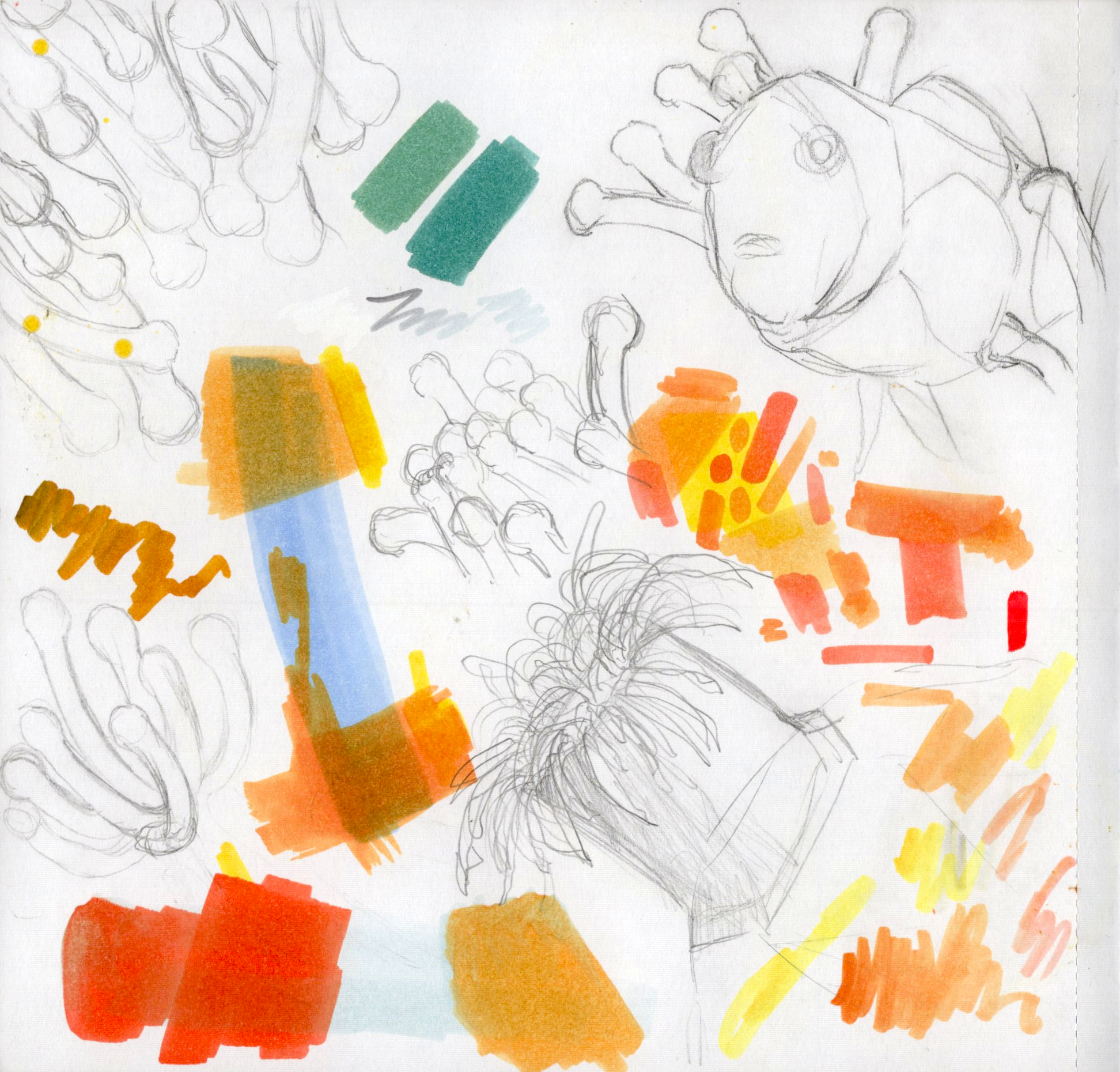
Pp. 4-5
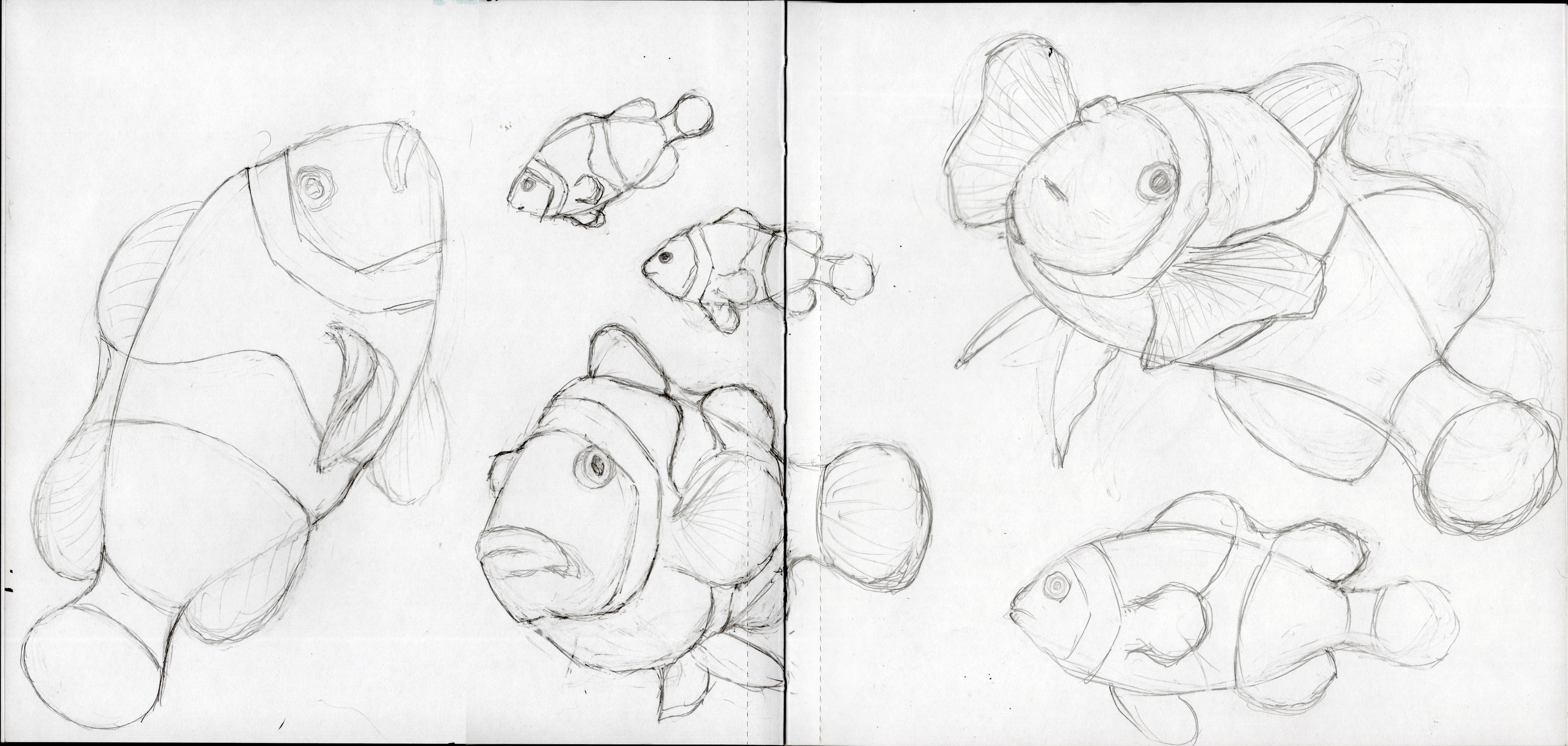
Getting a hang of clownfish.
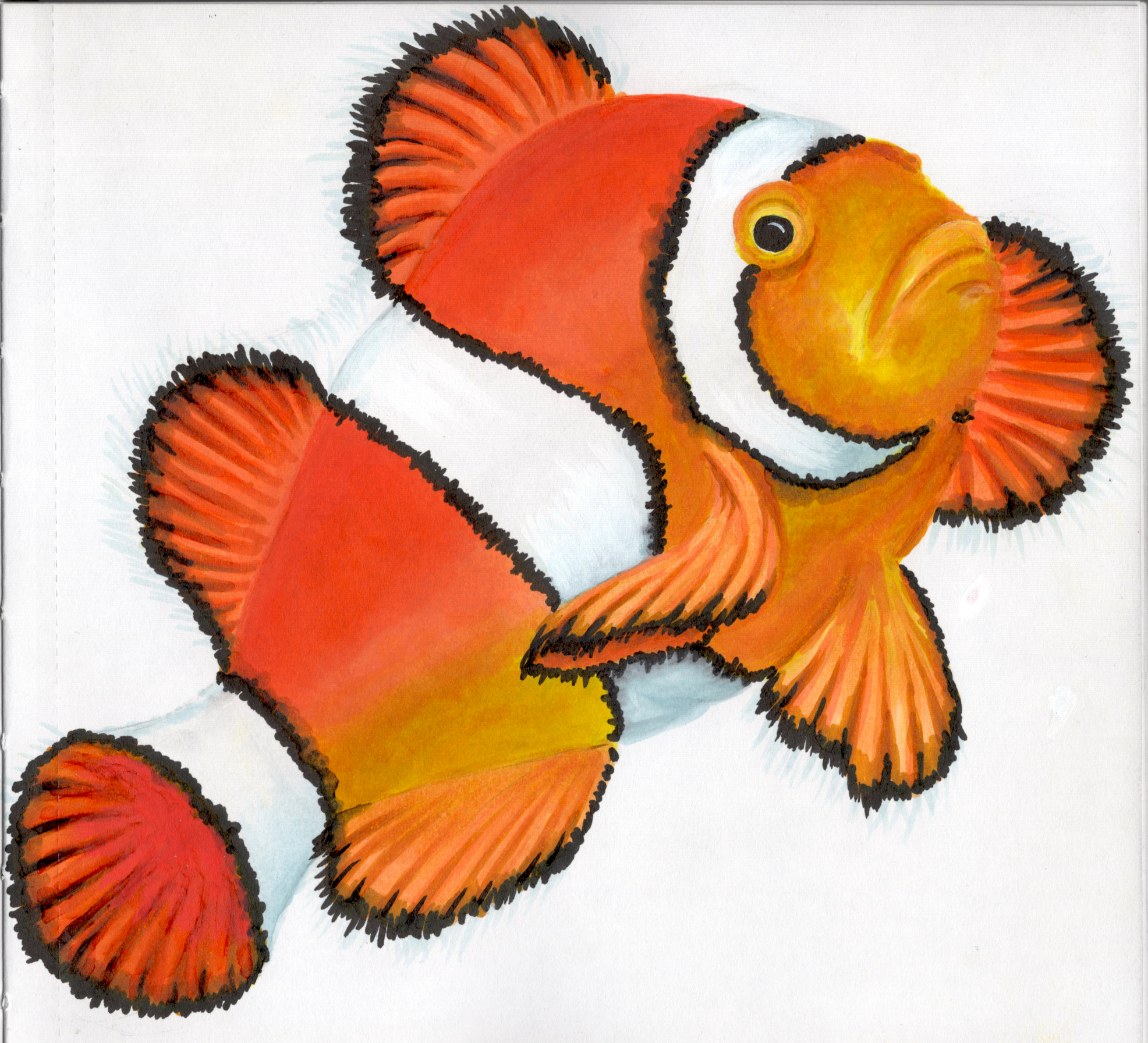
Pp. 6-7
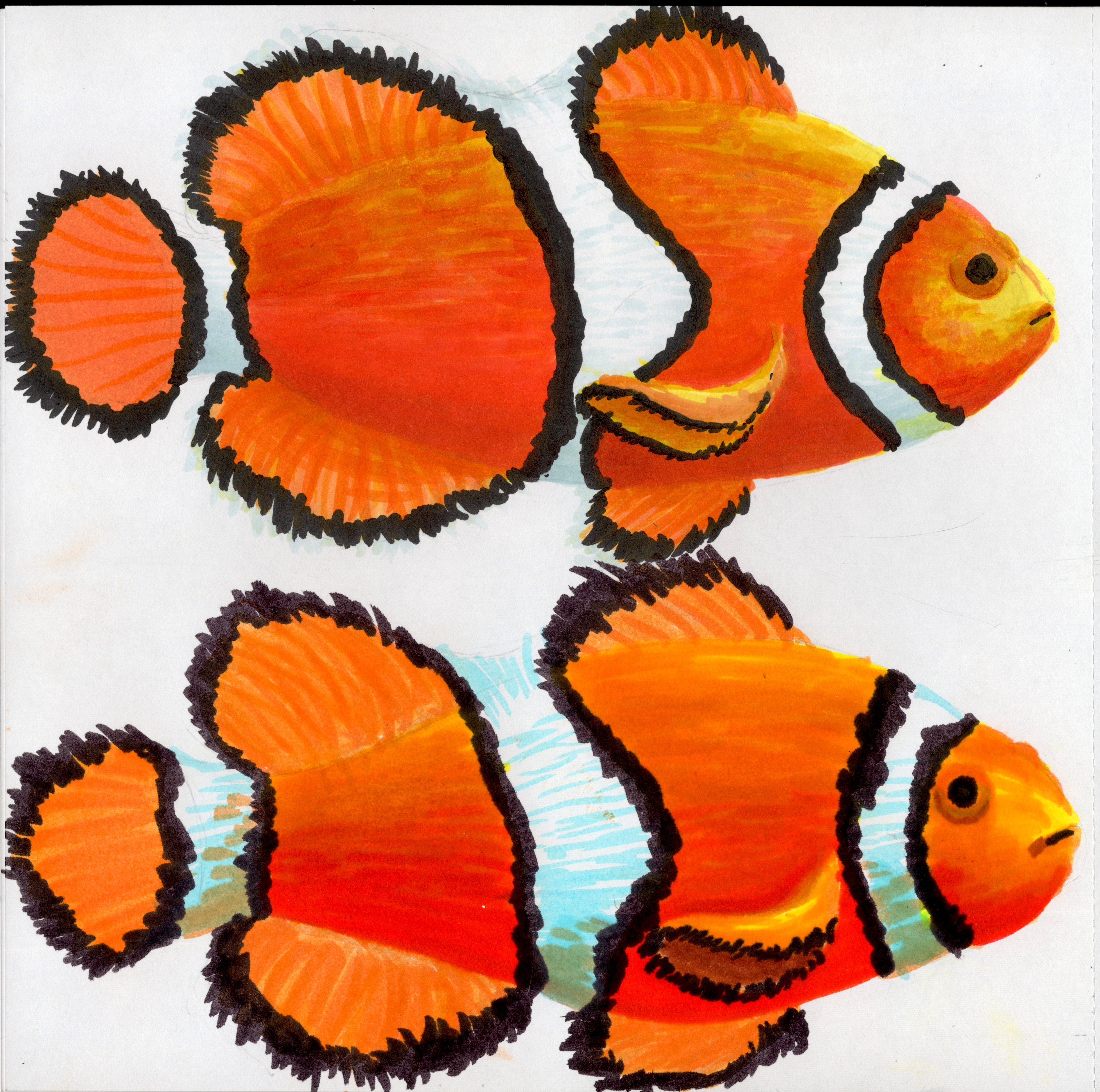
Practicing more clownfish by comparing various mediums. I used alcohol marker on the top fish and water-based markers on the bottom.
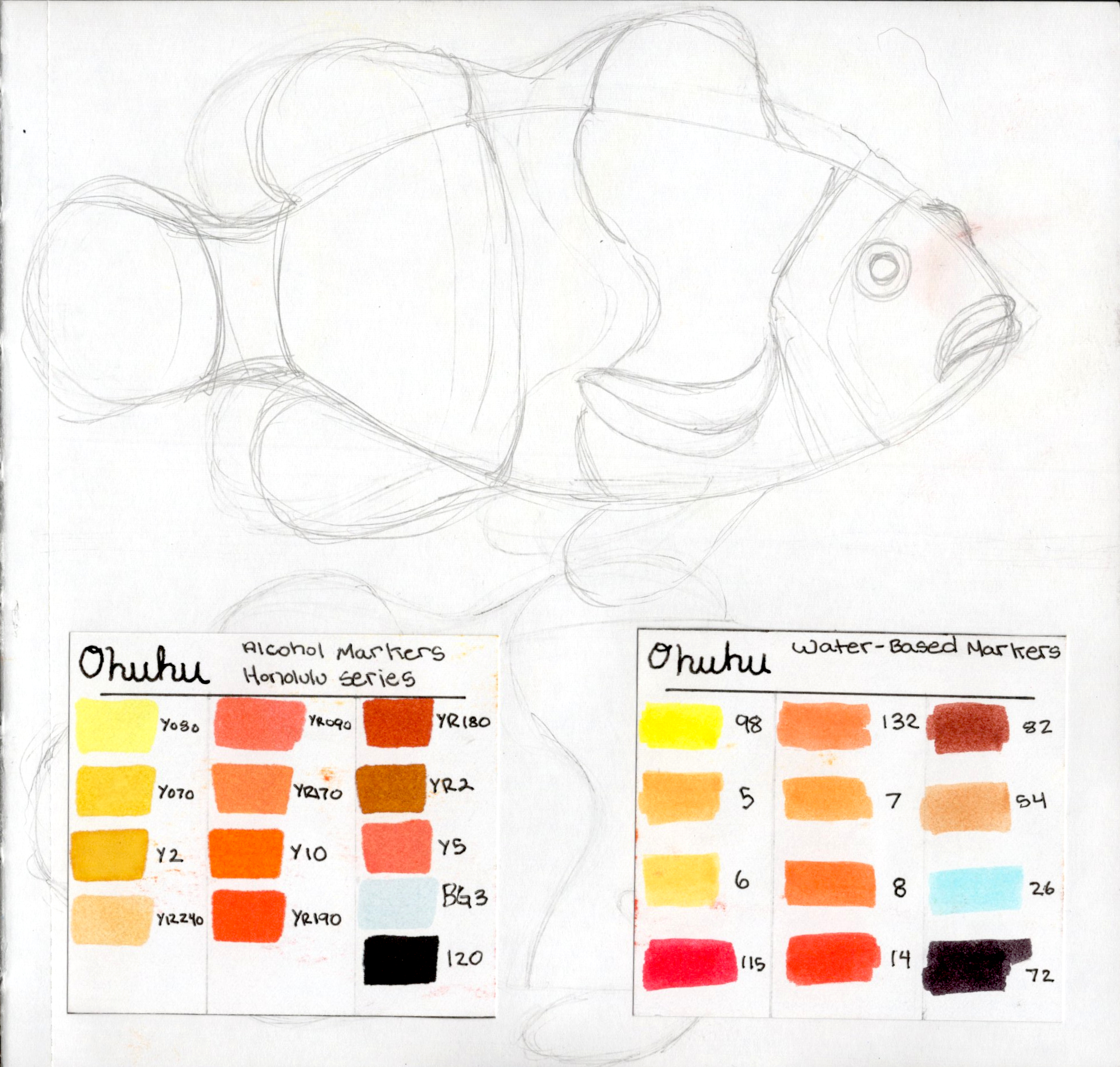
P. 8
Practicing anemones. Also, that guy in the top right corner is one of my favorites.
P. 9
Really flexing my realism skills while also practicing with alcohol markers. I love the way they look and function but I find myself frustrated more often than not. Especially in this sketchbook.
Pp. 10-11
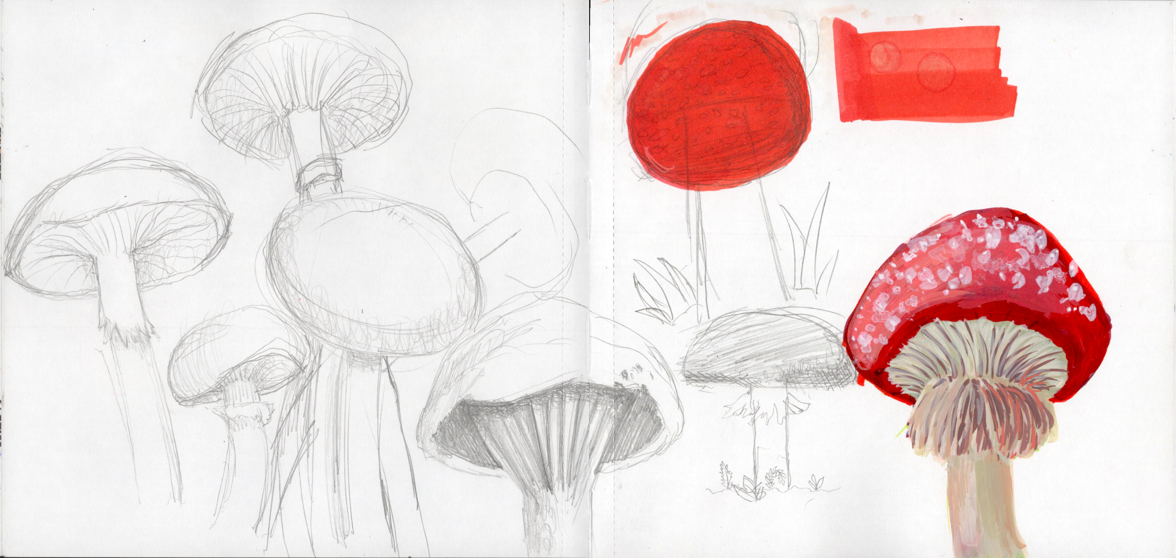
Wanted to practice some ‘shrooms.
Pp. 12-13
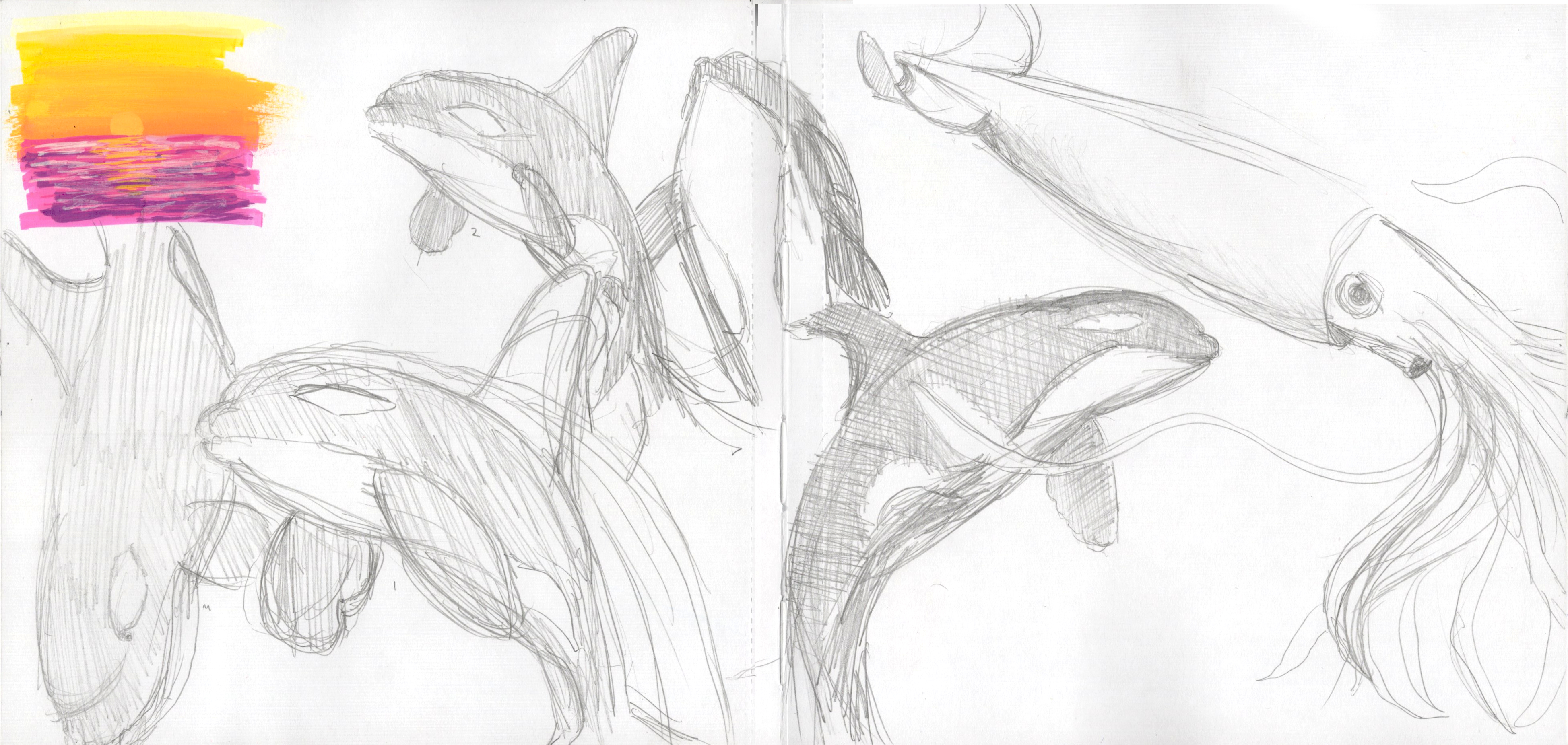
Orcas seemed like a fun project. Along with a giant squid. My lines are too hesitant, I need better line control.
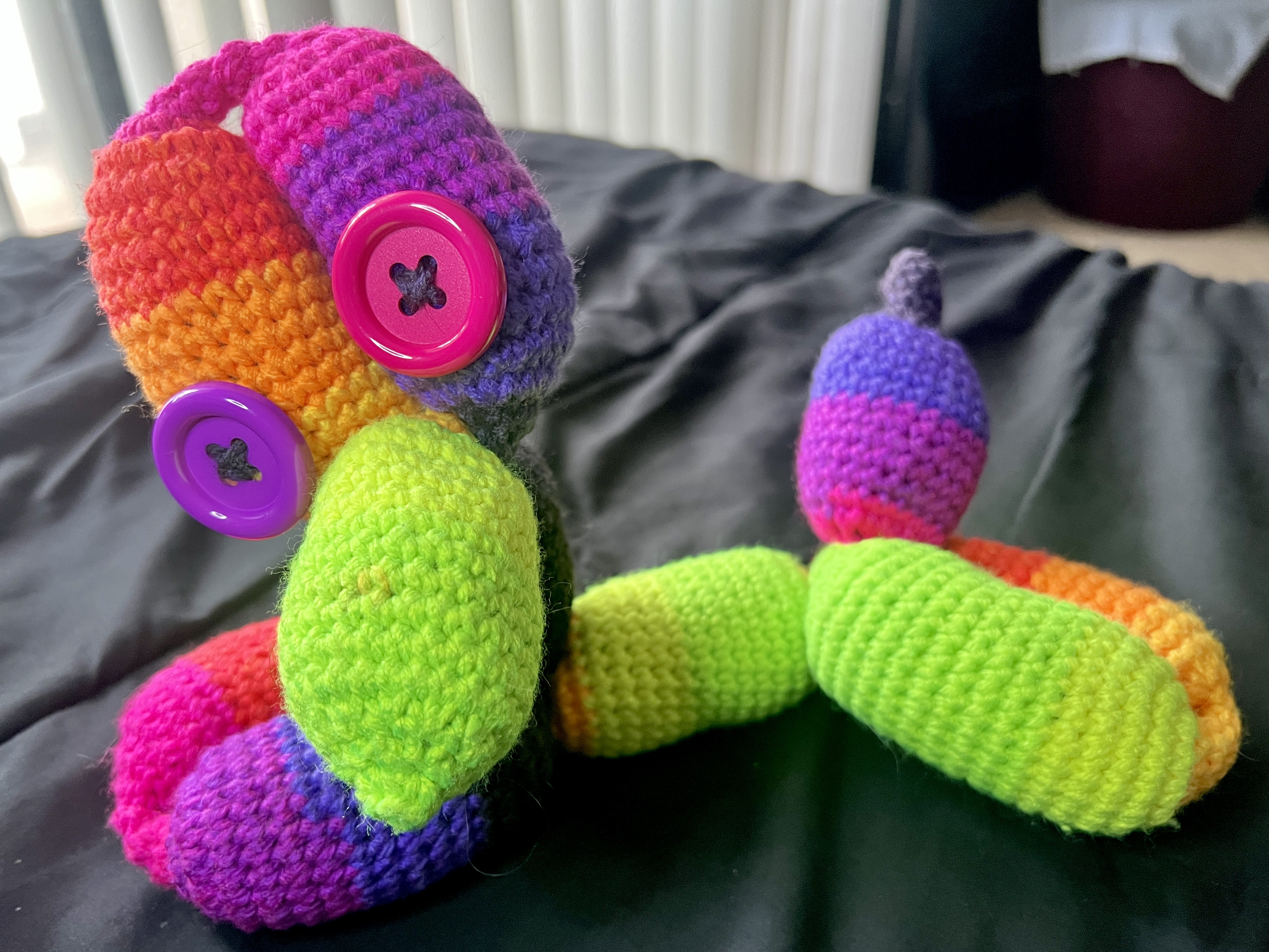
P. 15
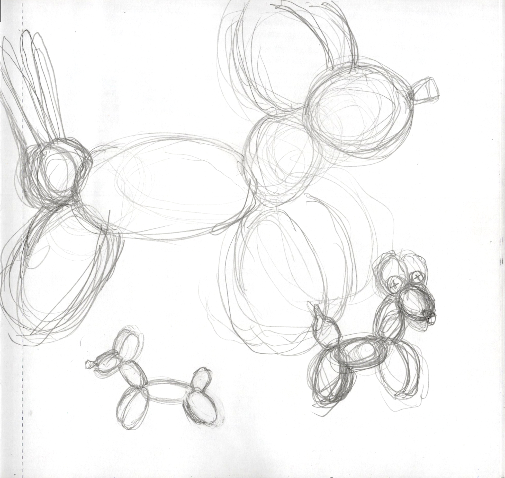
My mom made me a little crochet balloon dog in commemoration of my dog when he passed. I wanted to draw it.
P. 16
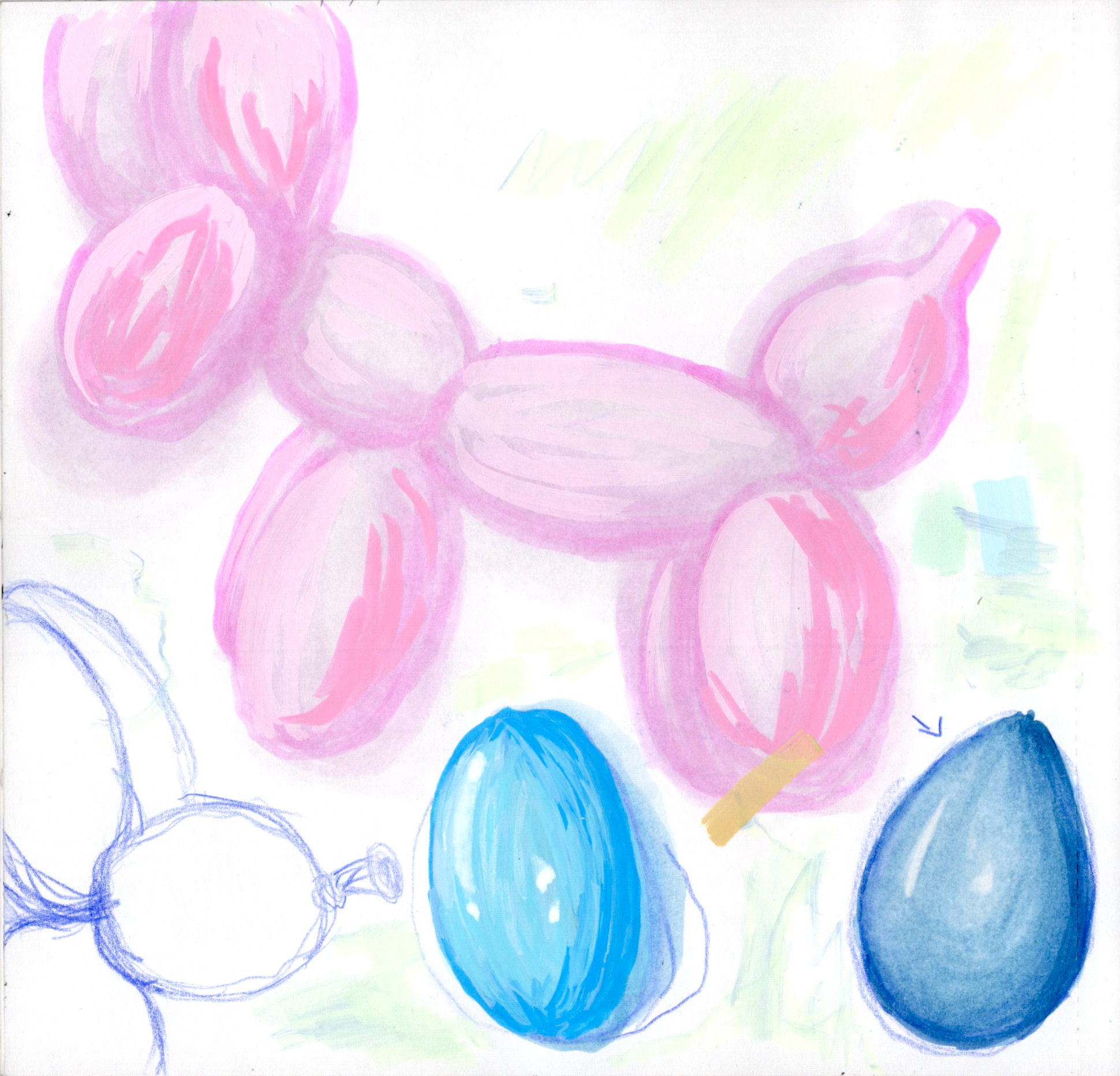
Practicing shading with Grabie Acrylic Markers and ARTISTRO Acrylic Paint Markers.
P. 17
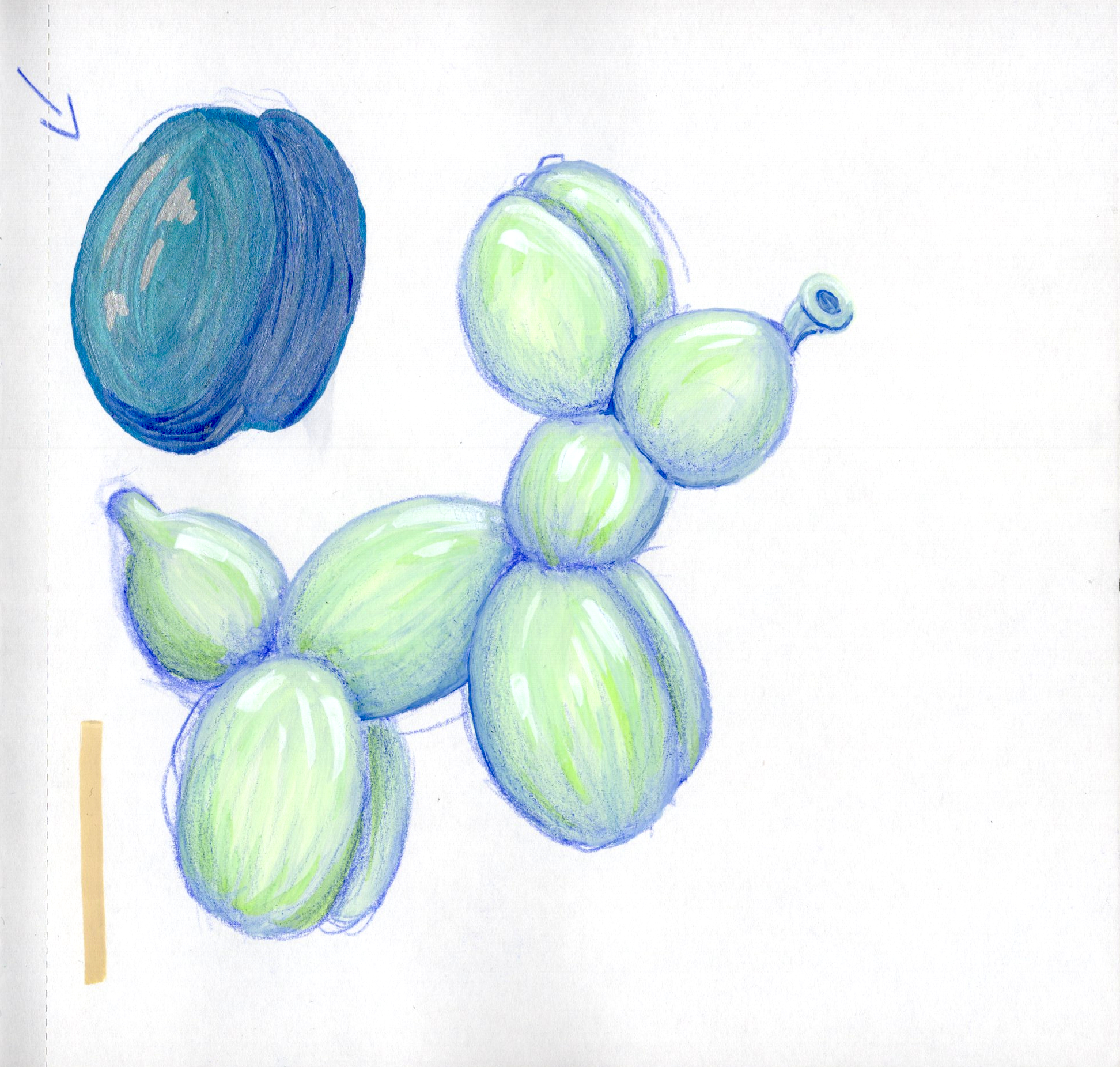
Final result of what I had in my head…came out looking less like airy balloons and instead looked solid. It’s like a plastic version of a balloon animal.
P. 18
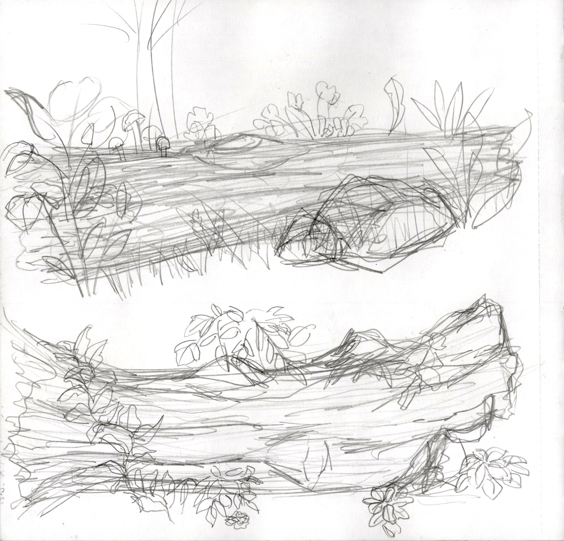
My scribbly sketches used to look completely unrecognizable. An improvement in my artistic skills meant also improving my scribble sketch skills and I reall like that. Even tho these two logs are sketchy, I really like them.
P. 19
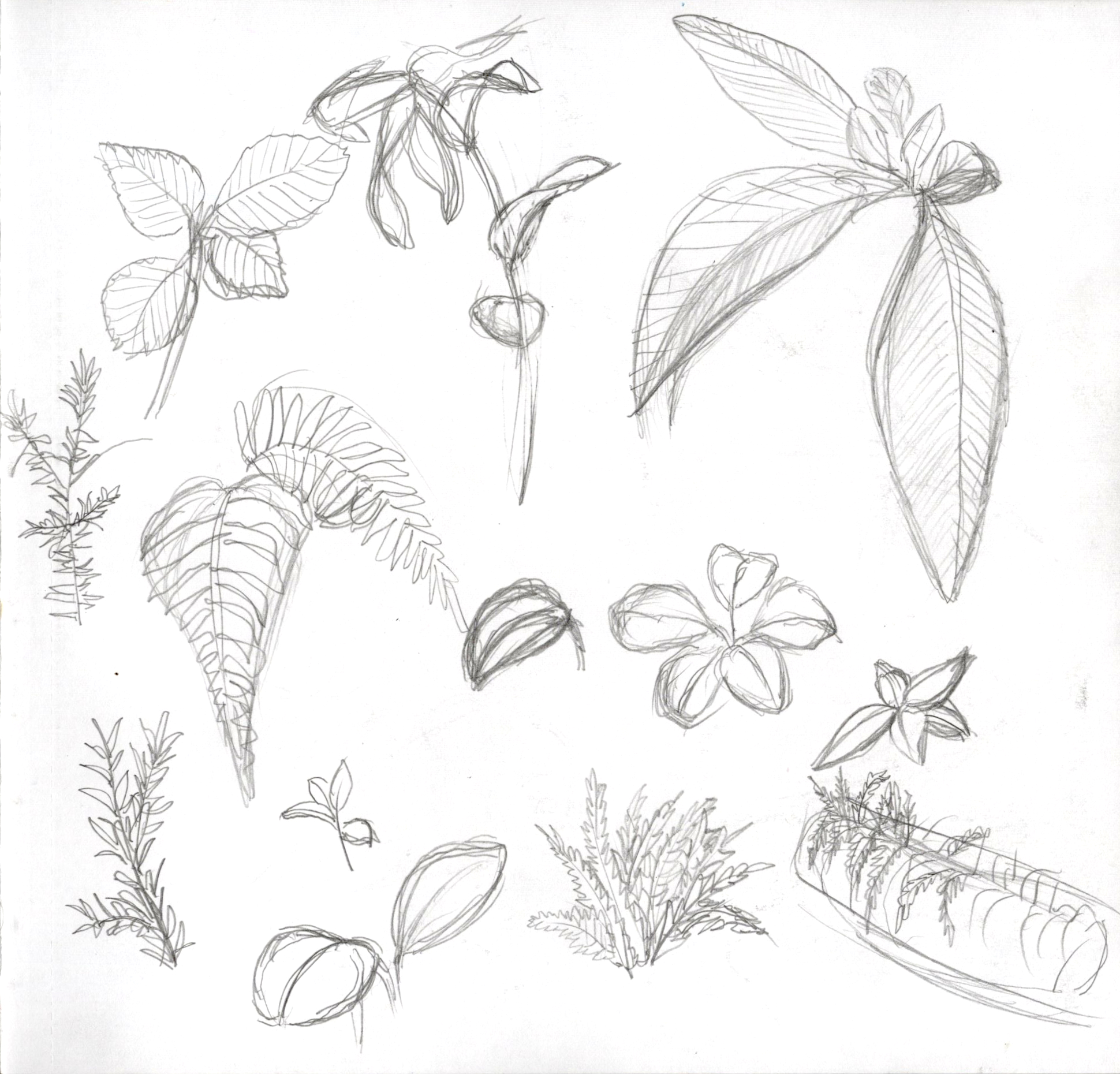
Trying to practice different types of leaves since I always default to specific kinds.
Pp. 20-21
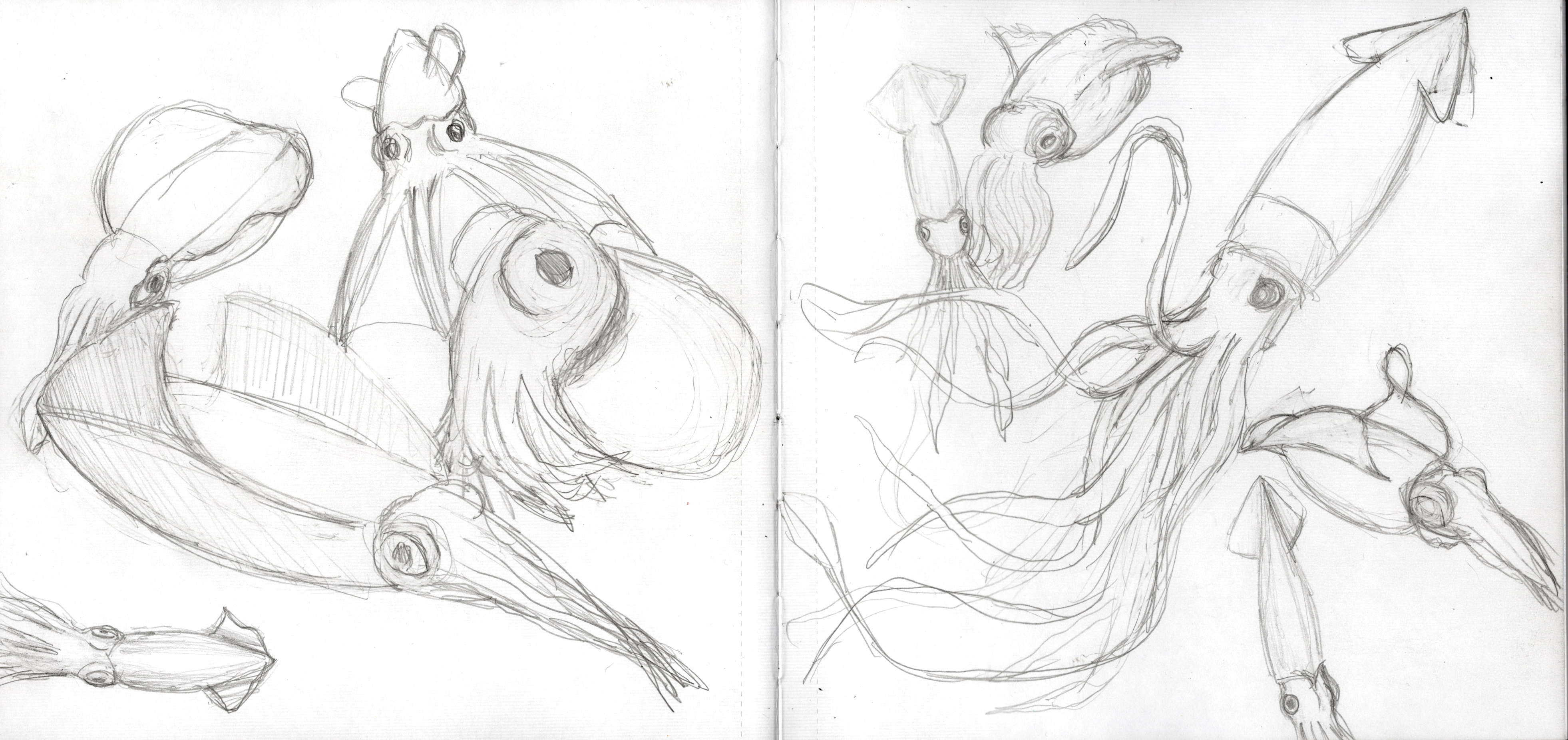
I loved drawing squids. They’re so interesting. I drew different kinds and want to draw more in the future. It was also this spread that got me to realize that I just really enjoy drawing sea creatures.
Pp. 22-23
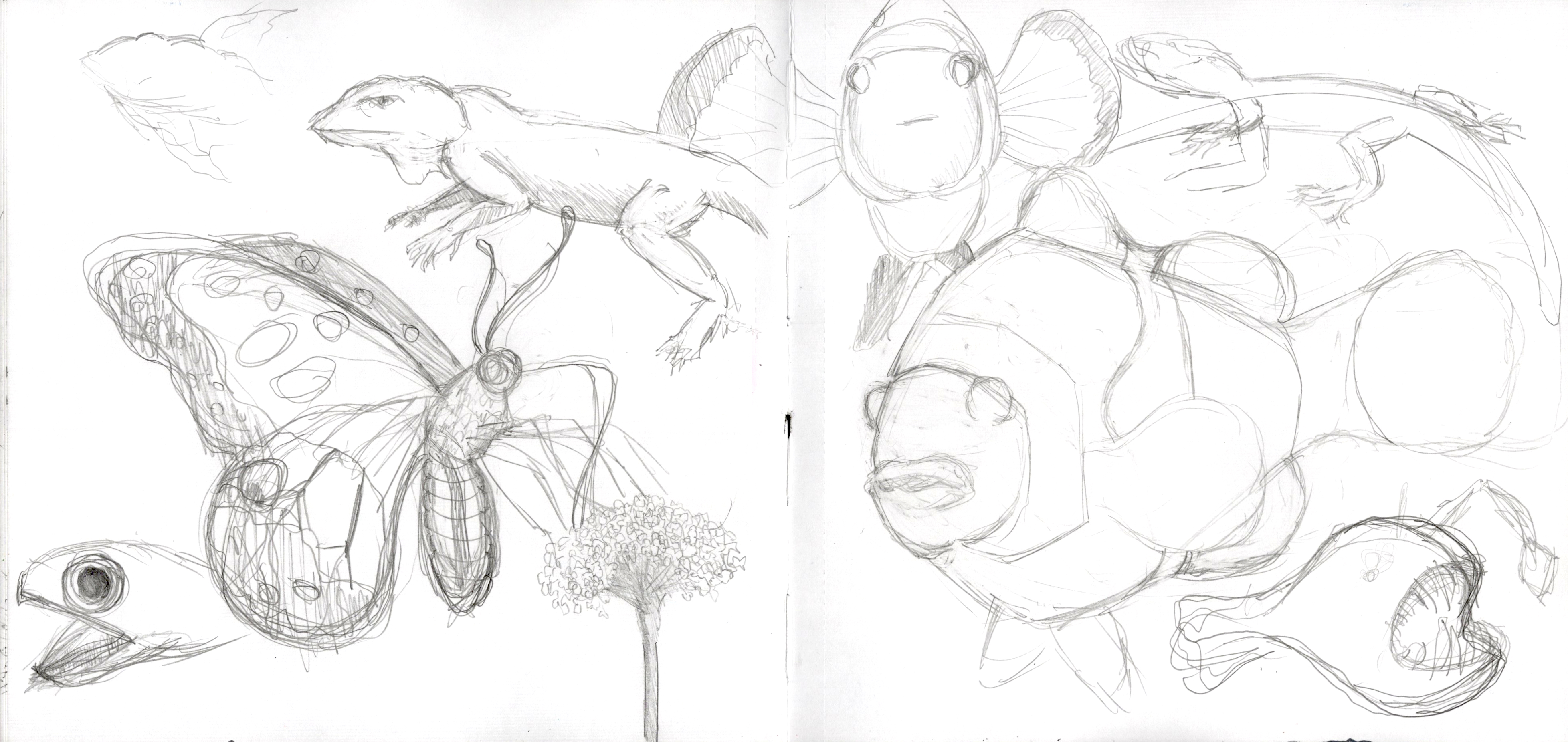
After drawing the squid, I wanted to test my terrestrial animal skills and as you can see, ended up just drawing see life anyway. Tho I really love that side-eyeing lizard.
P. 27
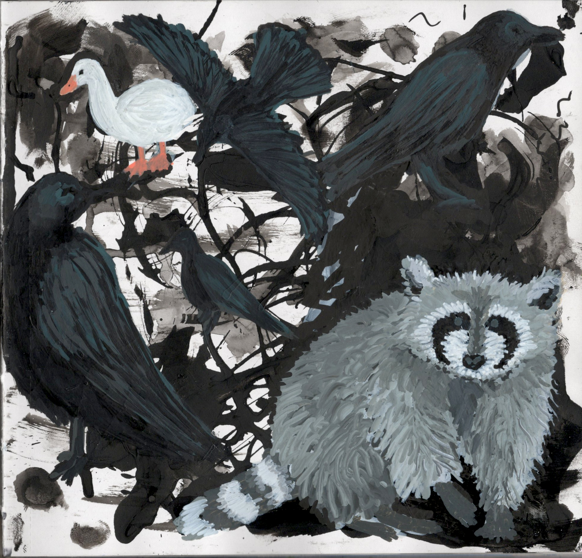
I wanted to test ink in on Ohuhu Double-Sided Marker Paper so used India ink in black, filled the dropper the bottle comes with, and used the dropped to scribble, drop ink, cause splatters, and make random marks (the Ink Dropper technique). I used an air blower for more effects. Then I painted what I saw in the scribbles…crows, a raccoon, and for some reason, the Aflac duck. I used Grabie Acrylic Markers and ARTISTRO Acrylic Paint Markers to make the animals.
That raccoon is actually version 2. Is created a really cool looking raccoon but never finished it. When I attempted to finish it like two weeks later, I completely messed up the initial vision. So I covered it in black acrylic paint markers and then painted on top. This is actually why I love paint markers, they are so forgiving and easily hides all mistakes.
Pp. 28-29
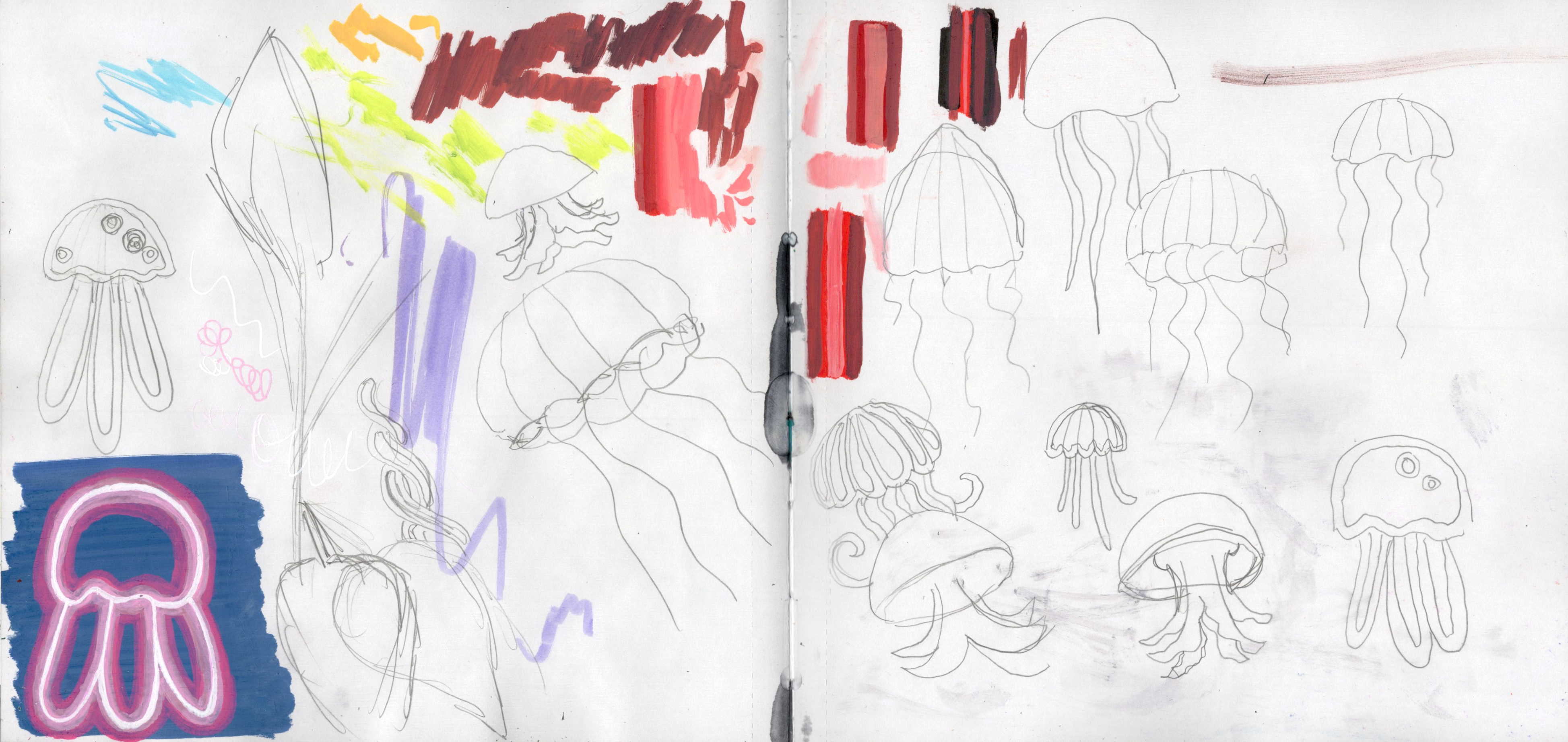
I had this random idea to make jellyfish out of neon lights. SO I practiced some simple jellyfish to see what design I wanted for the neon. That jellyfish in the corner is the first neon jellyfish I made (note, the colors for a lot of these neon jellyfish are off due to scanners not being able to easily pick up fluorescence).
P. 30
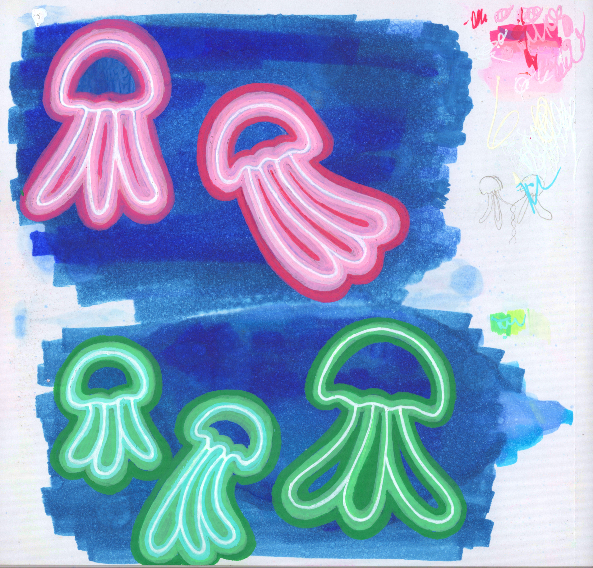
First official attempt at neon jellyfish. The top left pink one is first and I think you can tell as you go through the jellyfish that as I practiced. Some colors are off due to a lack of my scanner picking up the fluorescence. I also added Grabie Acrylic Paint Pens for detailing.
Side note, this was the first attempt at alcohol background to see how they would look with acrylic marker on top.
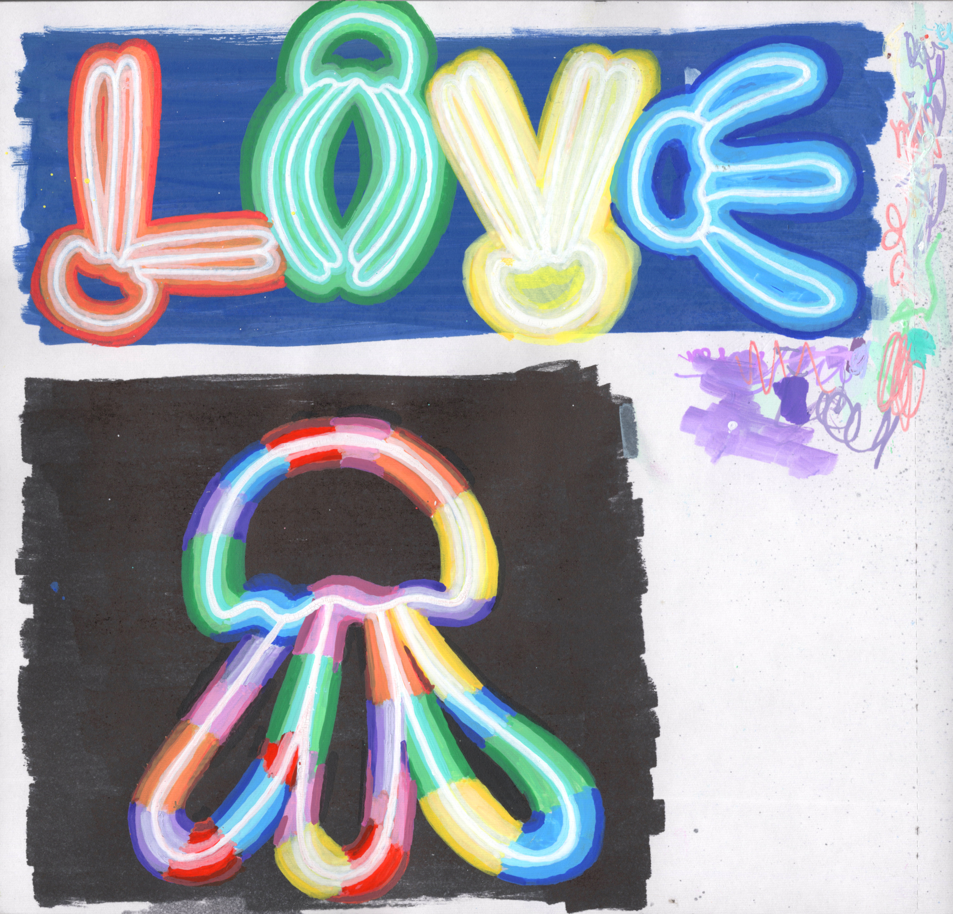
P. 31
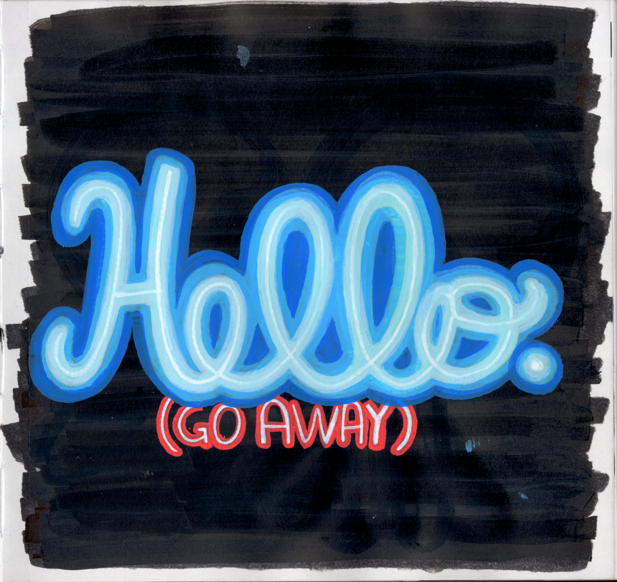
I don’t remember what was on here initially, but whatever it was apparently sucked so I covered it in acrylic paint and then drew the neon words on top. This is inspired by all the introverts in my life.
P. 32
Just gettin’ funky with it now.
P. 33
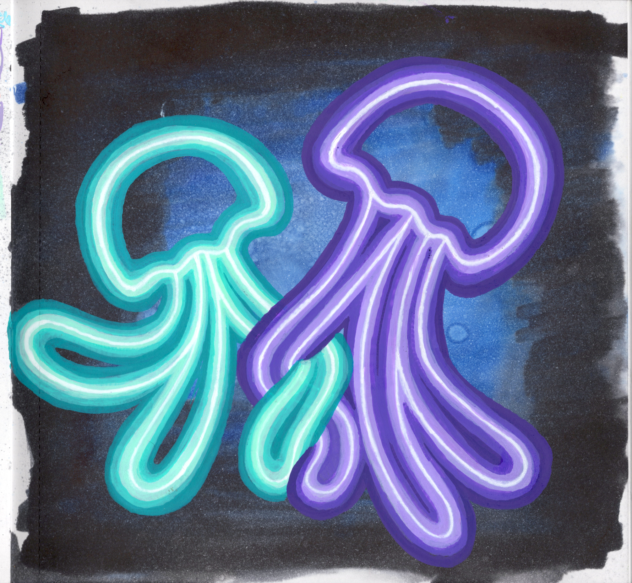
This was the goal of all that neon jellyfish practice. I used Ohuhu Honolulu Alcohol Markers for the background, along with alcohol spray (my first true use of the Alcoholic Reactions technique). Then painted on top with Grabie Acrylic Markers and ARTISTRO Acrylic Paint Markers (a common combo). The jellyfish in this picture are me and my husband.
By the end, the main thing I learned about creating the neon effect is that the colored light being emitted needs to be soft. My jellyfish all had hard edges, but the light should be soft. Something to think about for future pieces.
Pp. 34-35
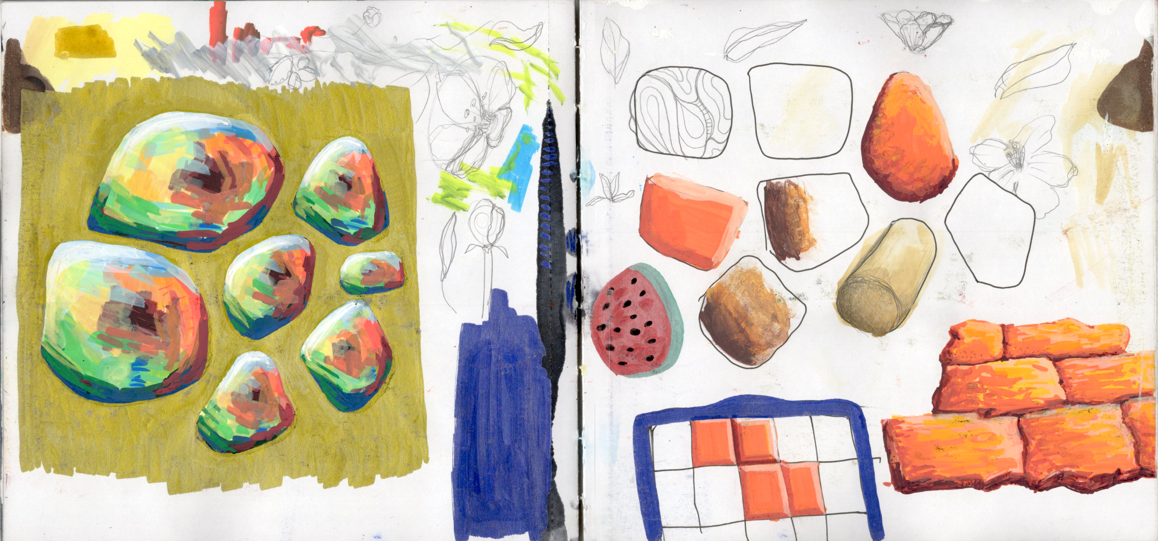
Just a random spread where I practiced shading 3D objects and played with texture. Chaotic page, but an interesting one.
P. 37
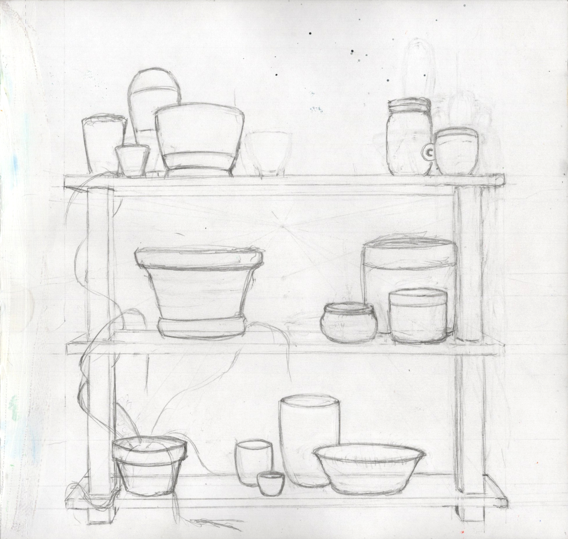
This was my first attempt at potted plants on a shelf. I was going to color it and everything but I abandoned it when I realized I gave myself not much room for plants in the way I wanted. Maybe I’ll finish it one day.
P. 38
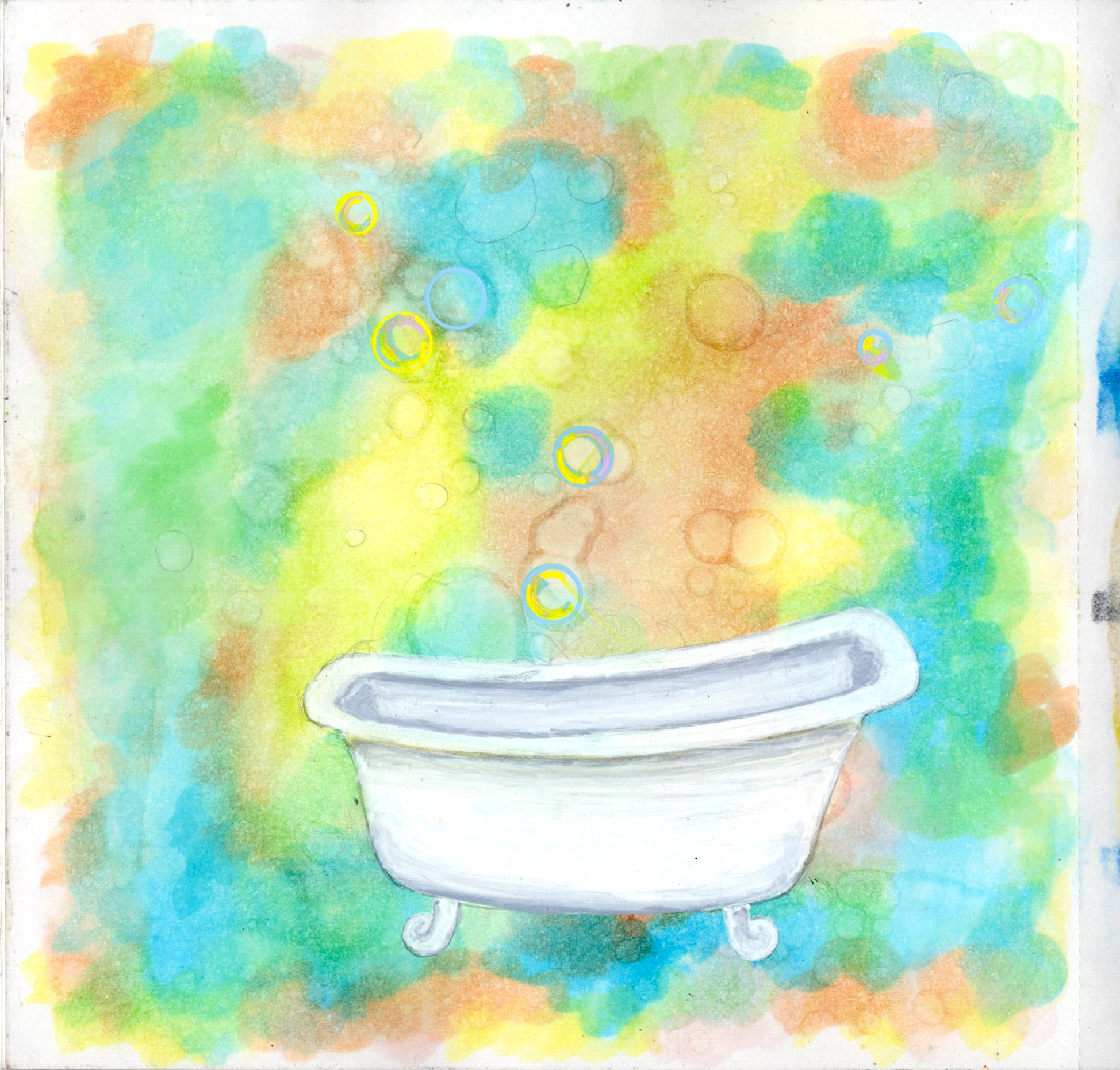
This was going to be a whole thing. Random bathtub overflowing with glittering bubbles and surrounded by funkadelic color. I just couldn’t get the bubbles to work so I abandoned it.
Background was more practice with the Alcoholic Reactions technique.
Pp. 40-41
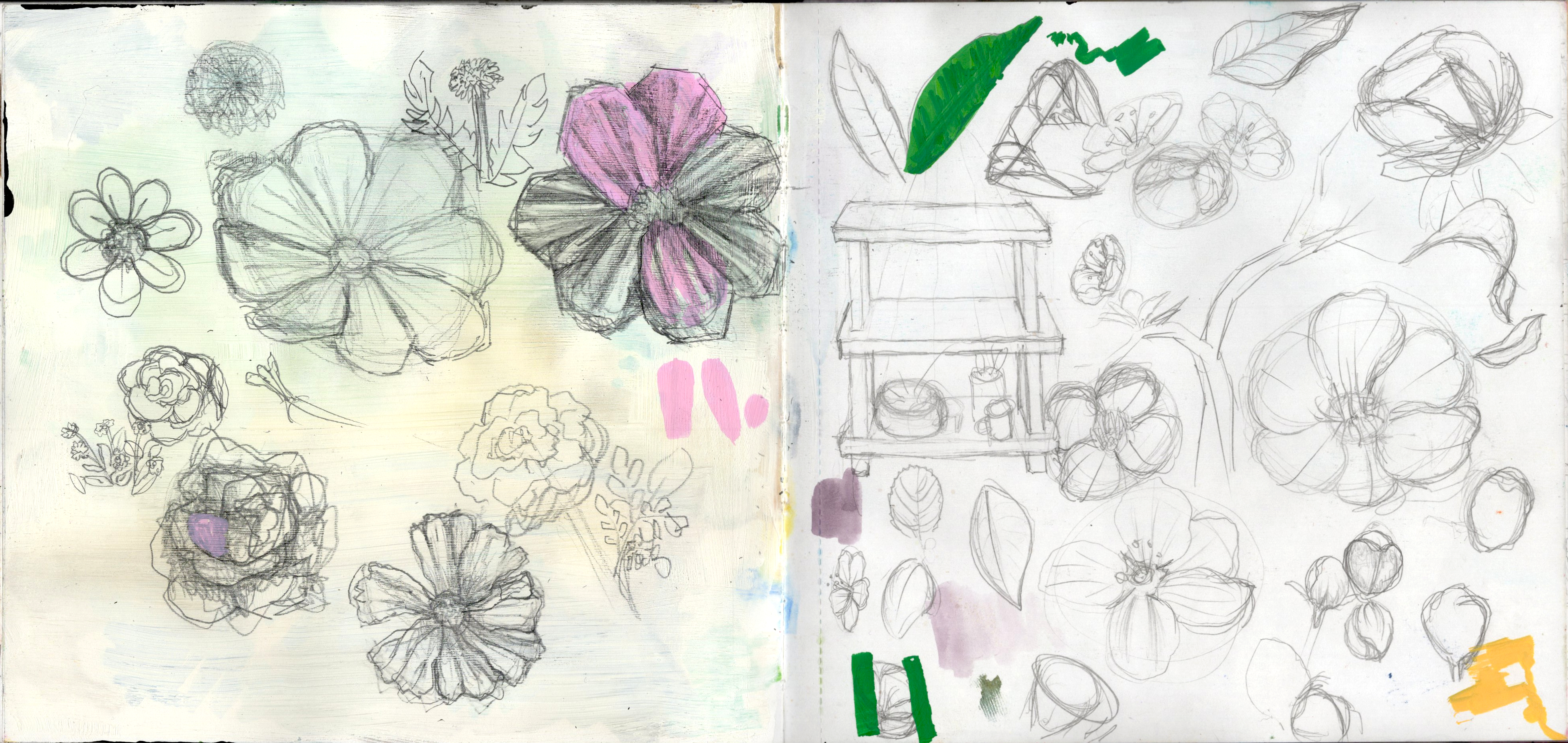
Just practicing plants and flowers and perspective.
P. 42
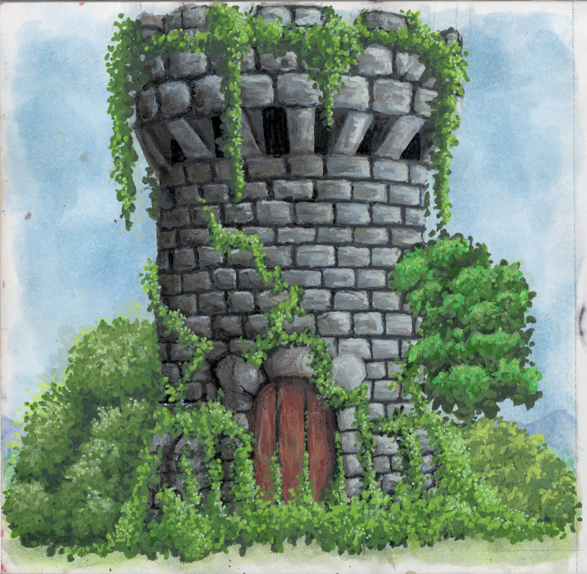
This was the first in a set of paintings I wanted to try that took up the whole page and really put my composition, perspective, and realism skills to the test. The background in Ohuhu Honolulu Alcohol Markers using the Alcoholic Reactions technique, the foreground is my common mix of Grabie Acrylic Markers and ARTISTRO Acrylic Paint Markers. This was really complex and frustrating to complete but I enjoyed a lot of it and it came out looking pretty good. I really like the subtle mountains in the background. And the vines were the funnest part.
One thing I’ll say is I spent a ton of time on these pillars at the bottom of the tower, only to completely cover them in vines. That was a downer, but also a lesson.
P. 43
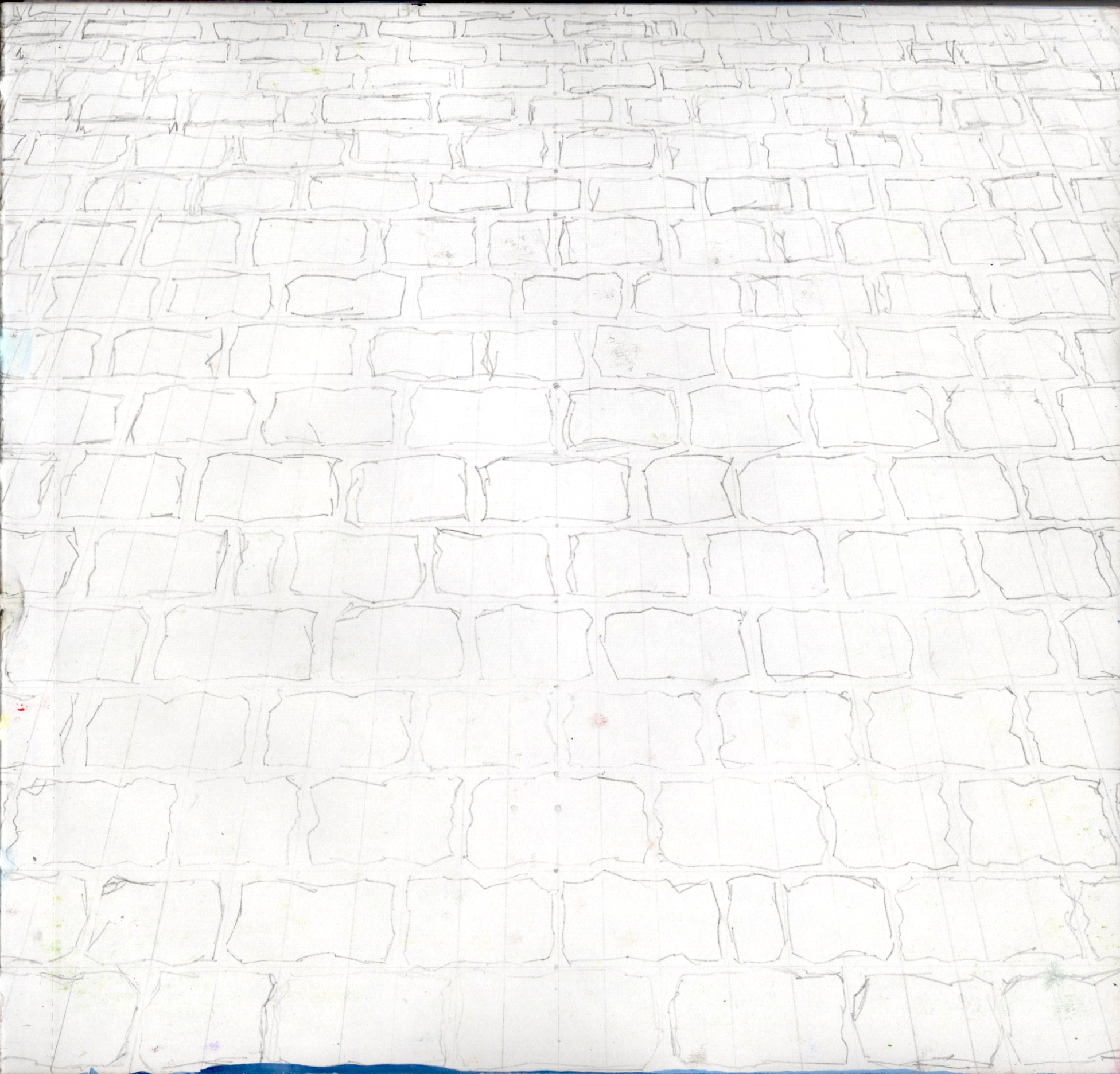
I wanted to try perspective on a brick sidewalk. I spent a lot of time drawing out guide lines and then the bricks themselves. I even practiced how to paint the brick on page 35, but ultimately, I just never got back to it and eventually abandoned it. Maybe I’ll finish it at a later time.
P. 45
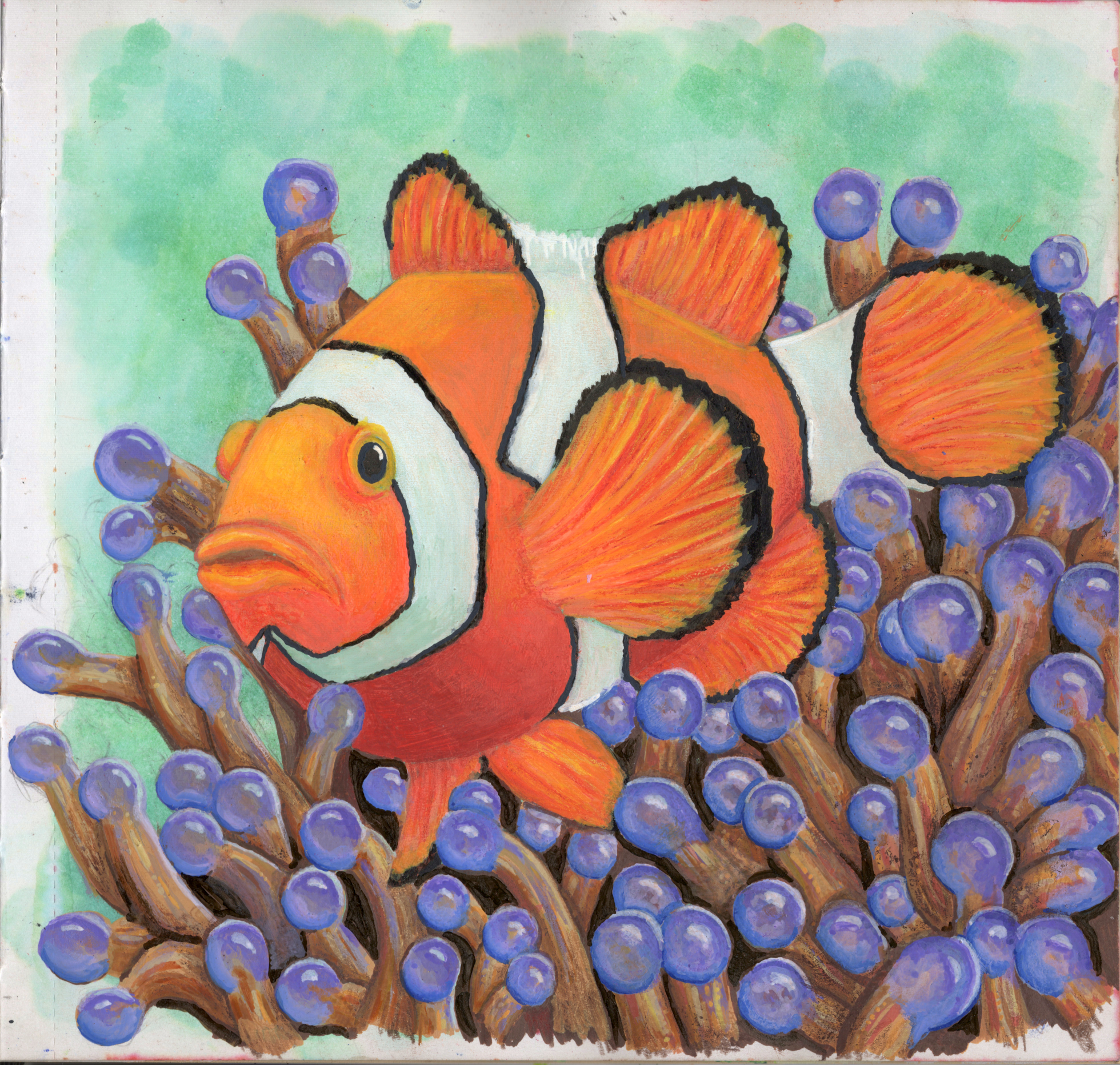
This piece was the project I was thinking about when I drew all those clownfish. That practice was to create this piece. While I think my alcohol marker clownfish from page 19 looks more stunning, this piece came out very nice. The clownfish looks real, the anemone is interesting, the background is soft. It all came together well.
Just like the castle, the background in Ohuhu Honolulu Alcohol Markers using the Alcoholic Reactions technique, the foreground is a mix of Grabie Acrylic Markers and ARTISTRO Acrylic Paint Markers.
P. 46
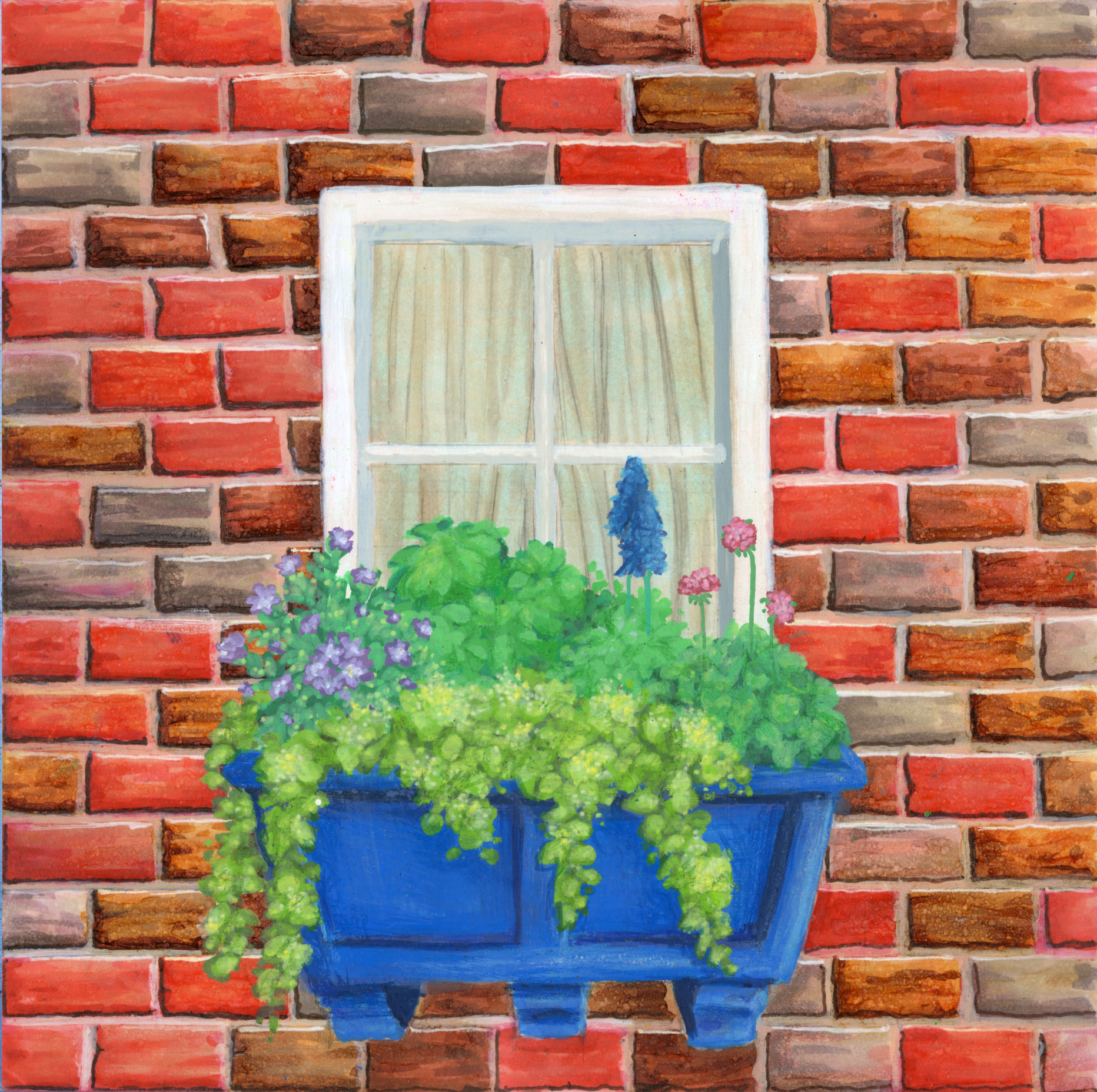
This was actually the first page I finished of the set of whole page pieces. The background is completely alcohol marker with some white gel-pen highlights. The window and box of plants are acrylic markers. I like the aesthetic of contrast and of things like stone walls covered in plants.
I feel like the plants are a little too undefined but it all ended up looking cool anyway. I also added Prismacolor Premier colored pencil to give a little more depth to shading in the window box.
P. 47
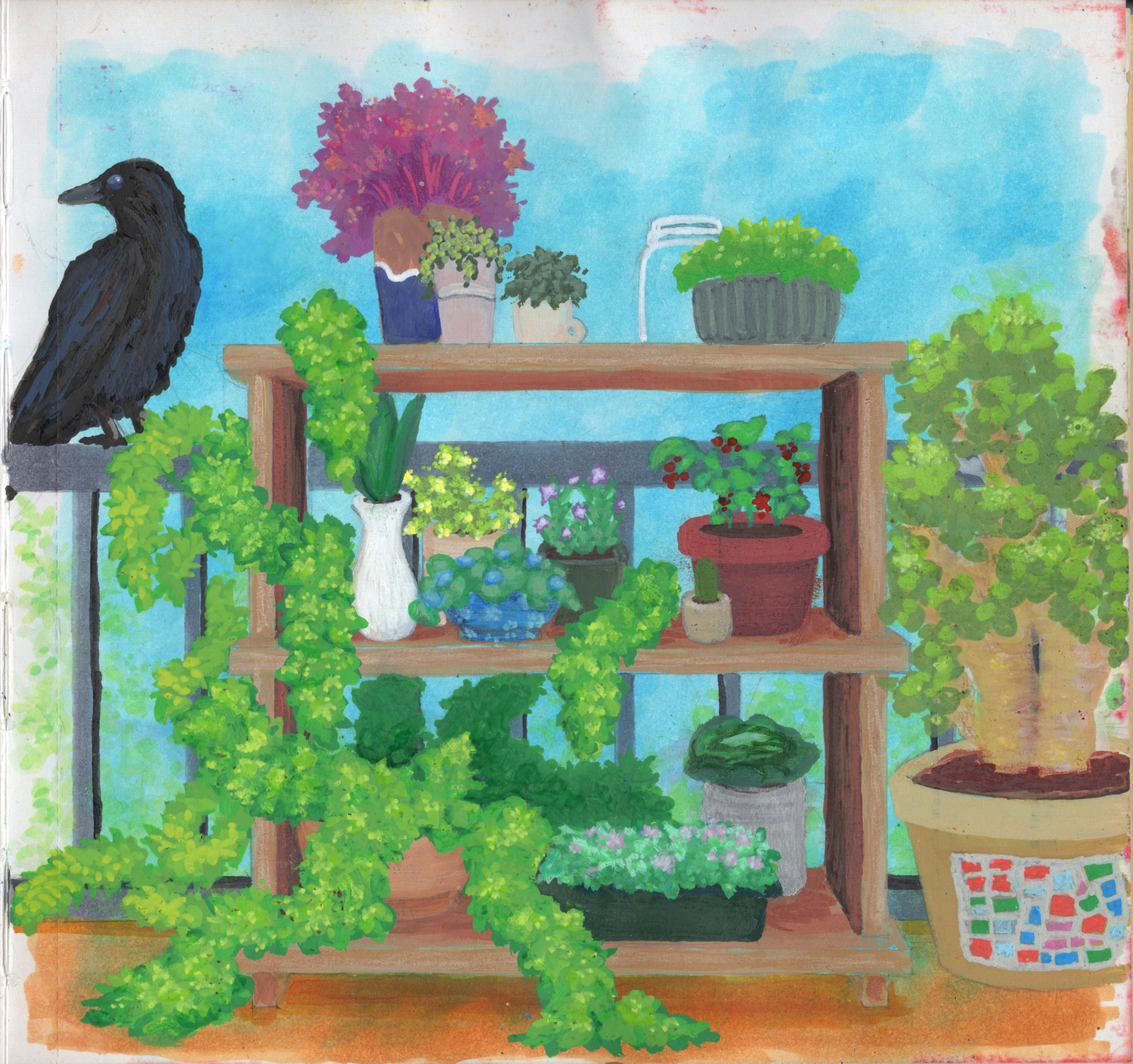
This was the second version of that potted plants sketch I made on page 37. I made the shelves smaller so that I could fit more around it. I made the deck, fence, and background out of Ohuhu Honolulu Alcohol Markers using the Alcoholic Reactions technique, and the foreground with my due of Grabie Acrylic Markers and ARTISTRO Acrylic Paint Markers.
I like the composition, though I really hated the big vine that took over the lower left of the page. IT looks like a green boa. But I finished it and like the other plants a lot. I really like the jade plant in the ceramic pot, that came out nice. And then the crow in the background was just a random inclusion at the end to give contrast to the brightness in the rest of the piece.
P. 48
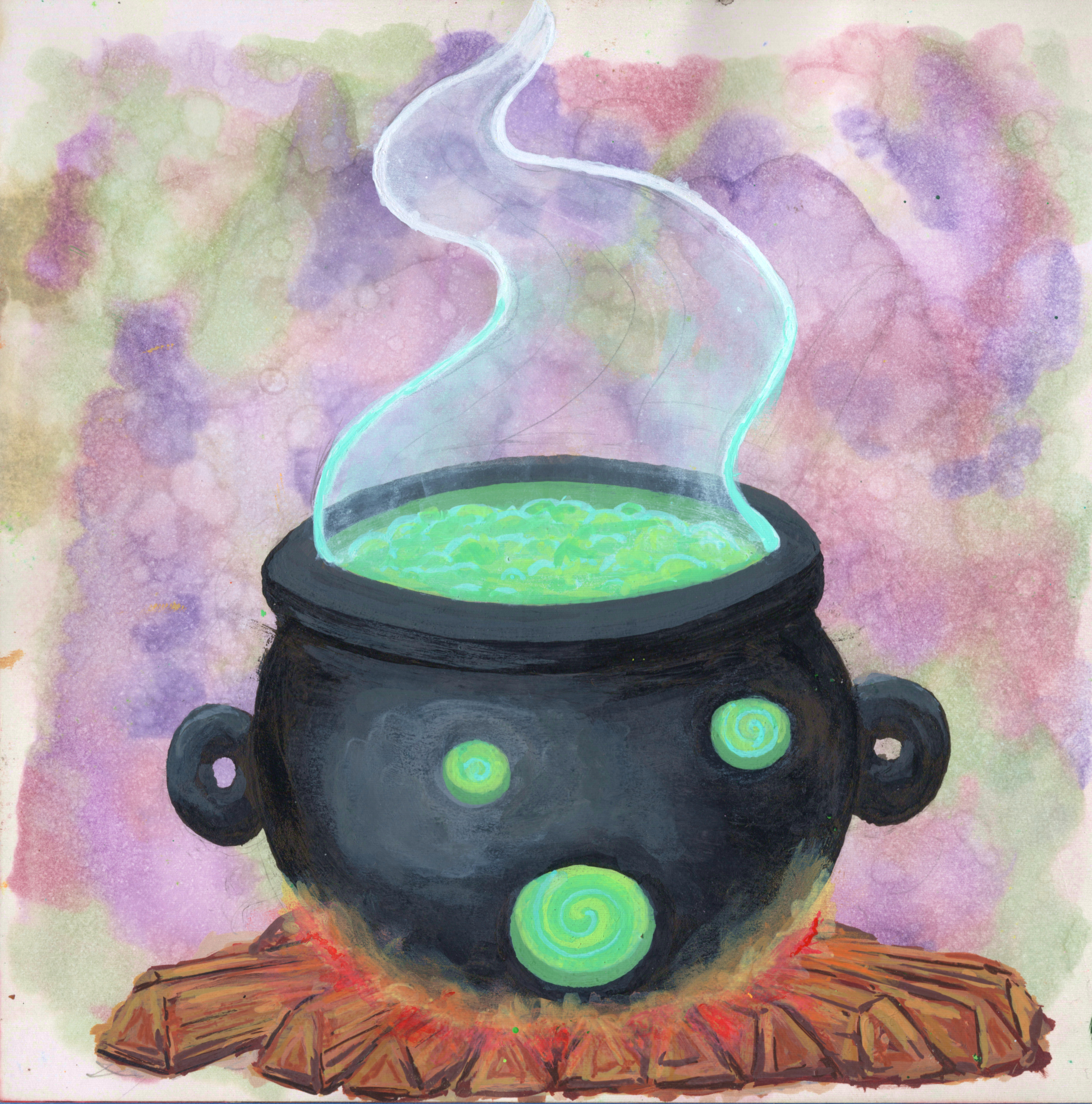
Using the Alcoholic Reactions technique, the alcohol marker background was really fun to make. I wanted something that looked “witchy” and sprayed alcohol over the page then added the markers. I also sprayed a lot after the marker dried in order to make it look bubbly.
So initially, this cauldron wasn’t supposed to have a face, but the alcohol spray I did before adding the acrylic markers made bubbles that my husband saw as a face (the green holes in the front of the cauldron) and he said I should leave “the face,” especially since the handles look like ears. That’s how we got the expression on the cauldron and it looks very cool. The fire is also really nice and ethereal, but I had the wood. It came out looking like Toblerones. But that’s ok, overall a nice piece.
P. 49
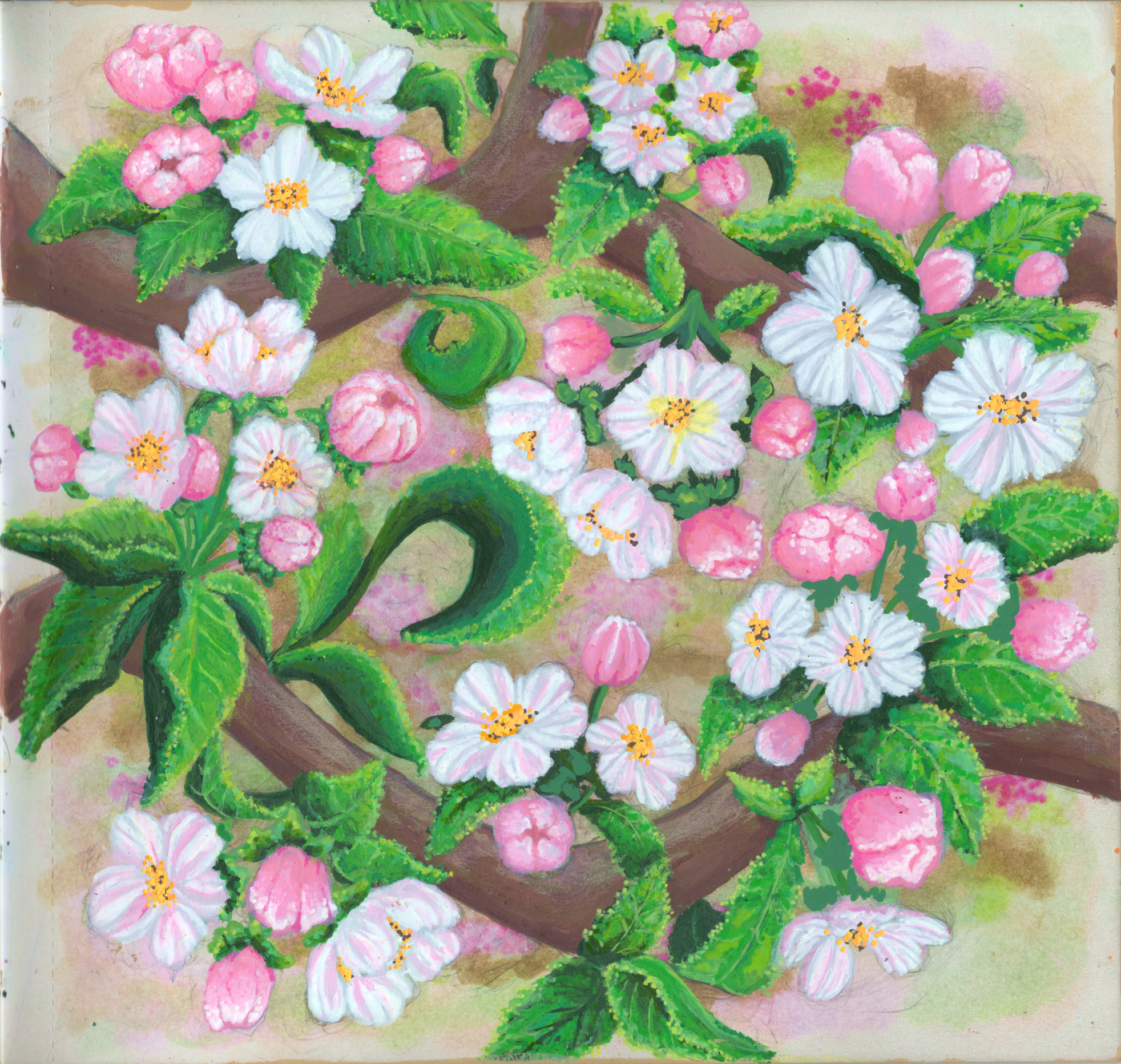
I really love apple blossoms, so I decided to make some. I also implemented some new techniques. The branches, for example, were only painted where there weren’t any leaves of flowers. Up to this point, I’d sketched out a piece, then painted the entire branch, even if there were leaves of flowers there, with the intention of painting the leaves and flowers over the branch. That’s an advantage of acrylic markers. But in reality, not only do I lose the sketch to the point I can’t see it anymore, but acrylic markers aren’t always fully opaque, and sometimes the background shows through or it darkens the final result. So this time, I only painted branch if there were no leaves and flowers in order to keep the leaves and flowers bright. It worked.
The one thing I hate is the background. My initial thought was to keep it light and pastel, but I added some browns and dark pinks to give it the impression of trees. I think the background ended up looking really muddy and I almost abandoned this piece. Instead, I figured the apple blossoms would cover most of it and I was right. Still not my favorite background but it all worked out in the end.
P. 50
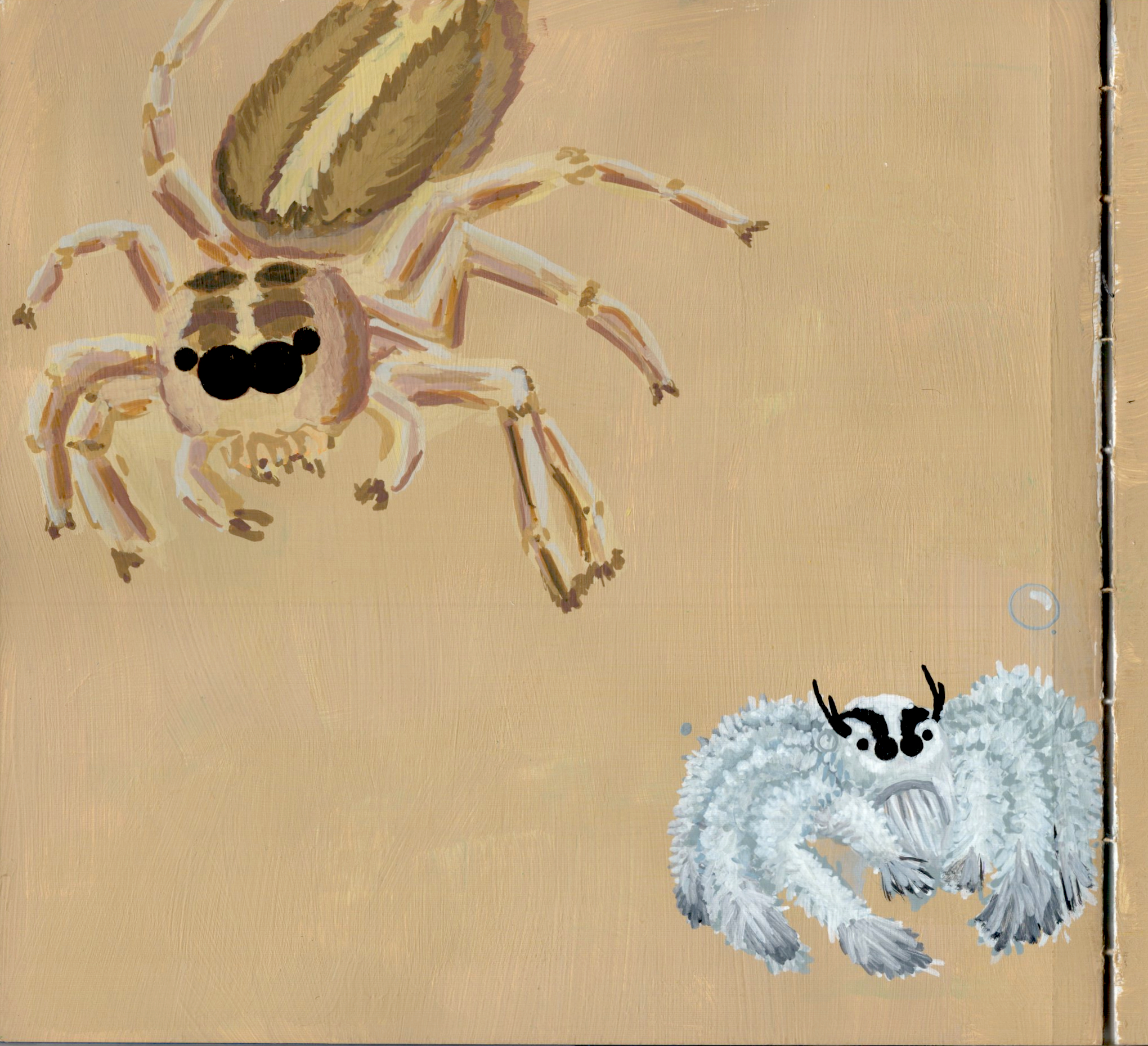
Random tan background I mixed from Liquitex White Gesso and some sort of craft paint. The upper left jumping spider was one I actually found on my patio screen and wanted to draw. The bottom right was a random reference on Google. I intended to draw more spiders but just never got to it. Spiders are complex and I think I need more practice because these didn’t turn out great. But I like them.
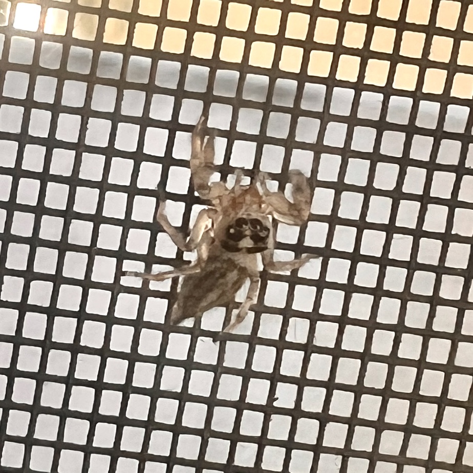
The spider on my patio screen…what was uncanny was she would stop what she was doing and look up at me whenever I grabbed my camera to take a pic:
Pp. 52-53
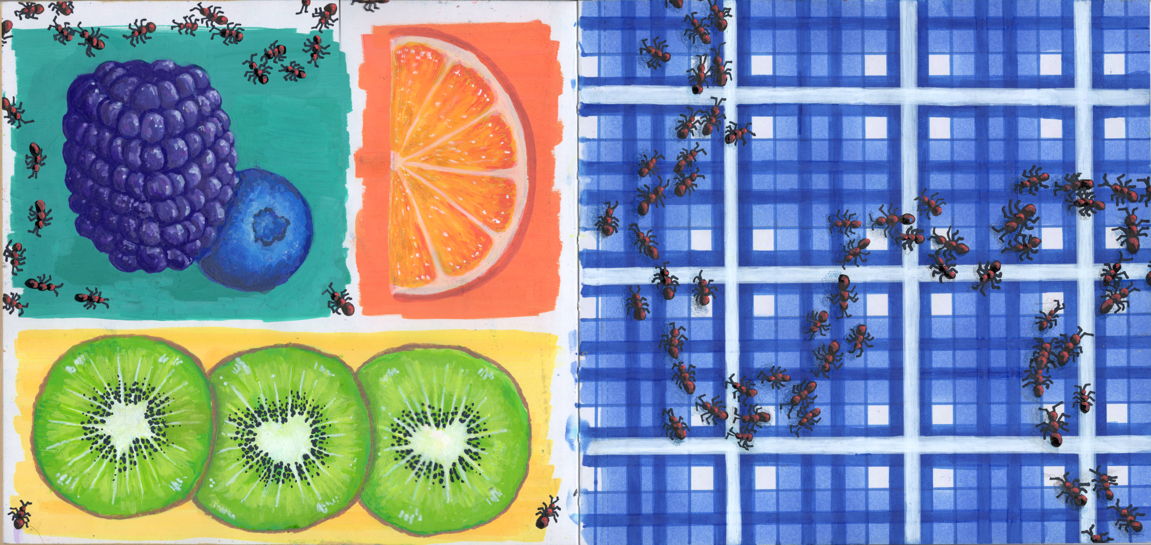
One of my favorite spreads! The fruit came out really nice (though blackberries are very annoying to figure out) and then the blanket on the right page is made from alcohol markers with a white acrylic marker for the white stripes on top. Ants are made with acrylic markers, acrylic pens, and colored pencils.
Pp. 54-55
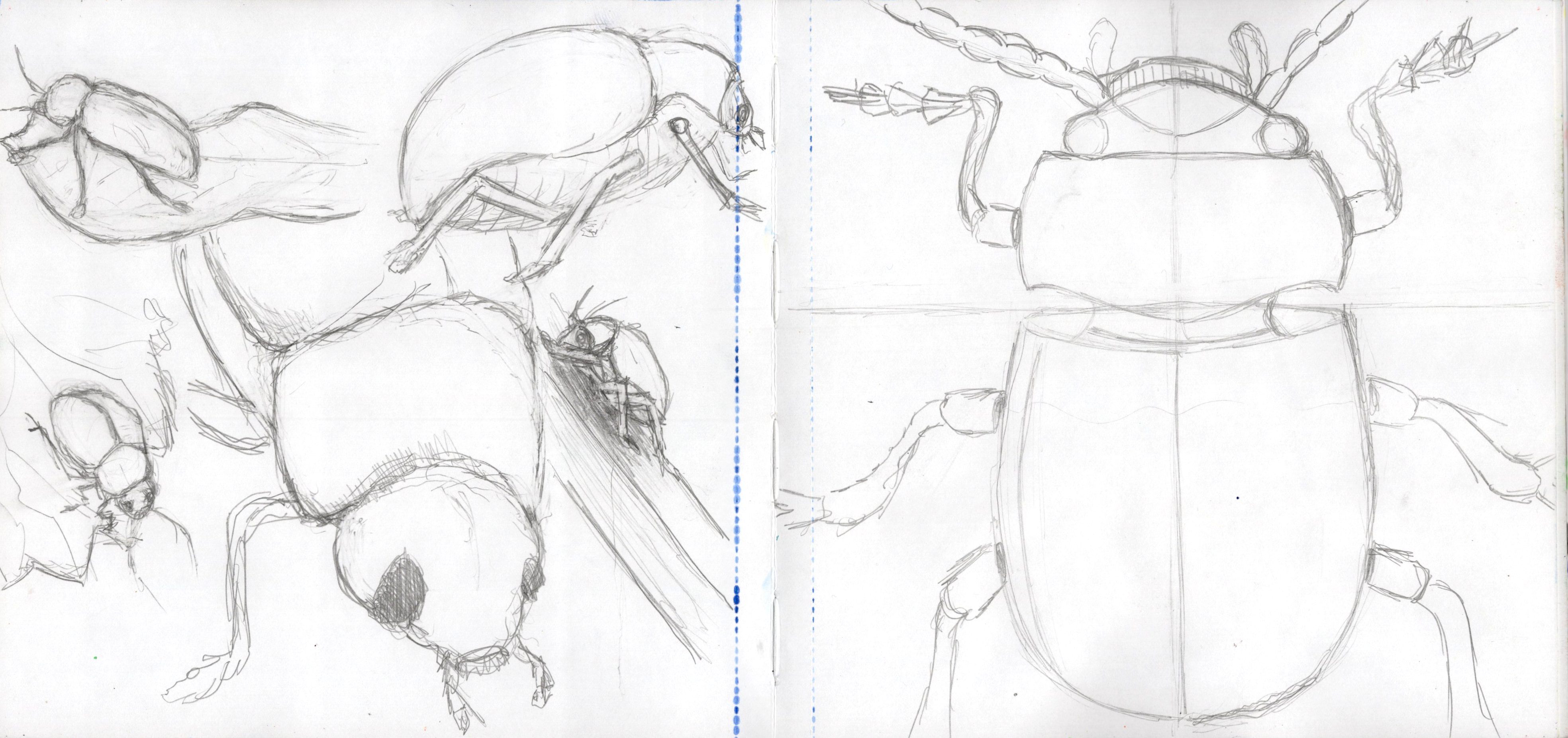
Practiced beetles here cuz I had an idea. The left page is the practice, the right page was the first attempt. However, I have this problem where I scale things too big for the page or draw them in awkward positions, so I decided to try again.
P. 56
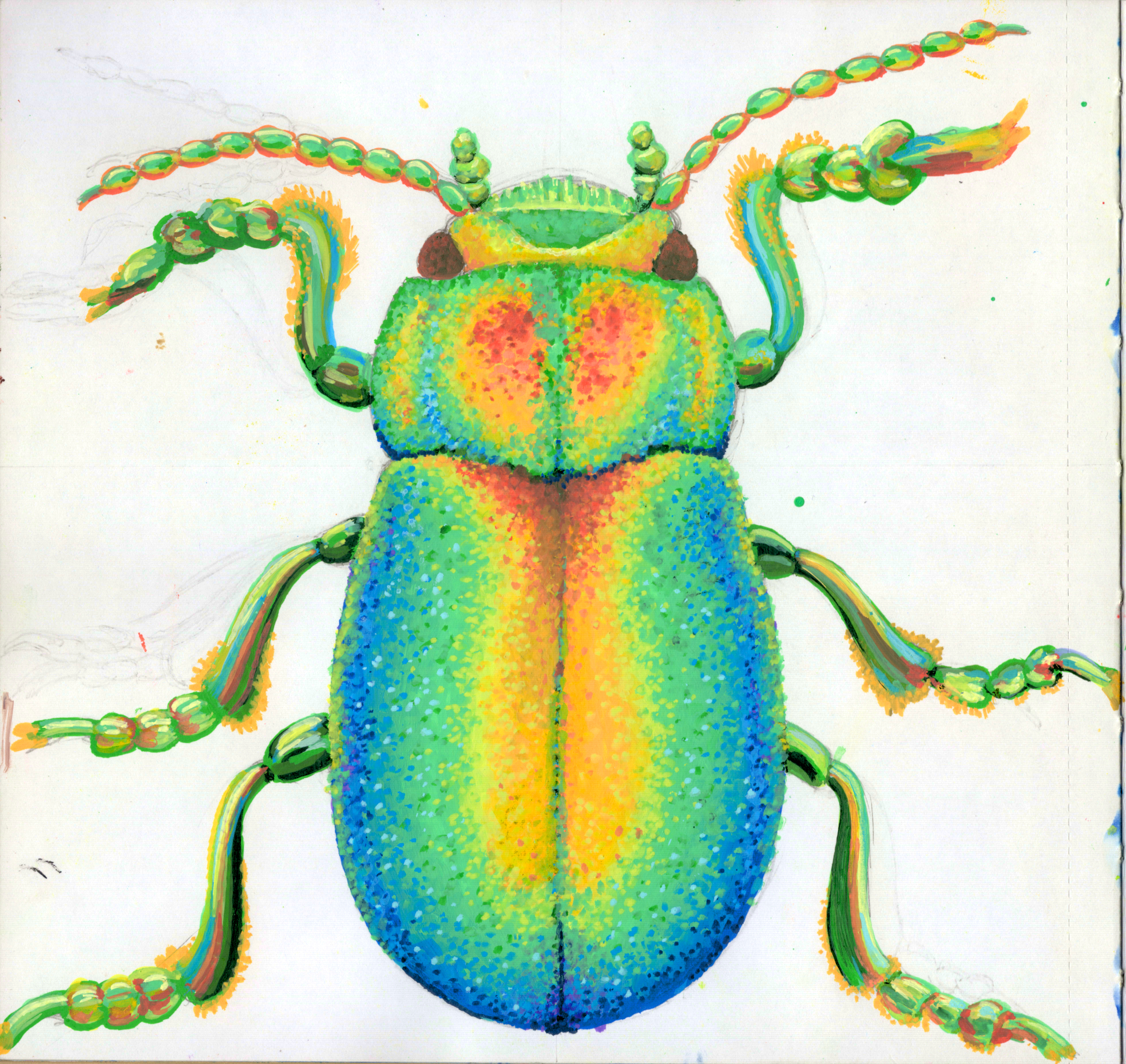
This was the result of the beetle practice. I was using a random Google image as reference and made a thermal looking beetle. It was supposed to be metallic looking but I made it too thermal. Either way, it looks cool.
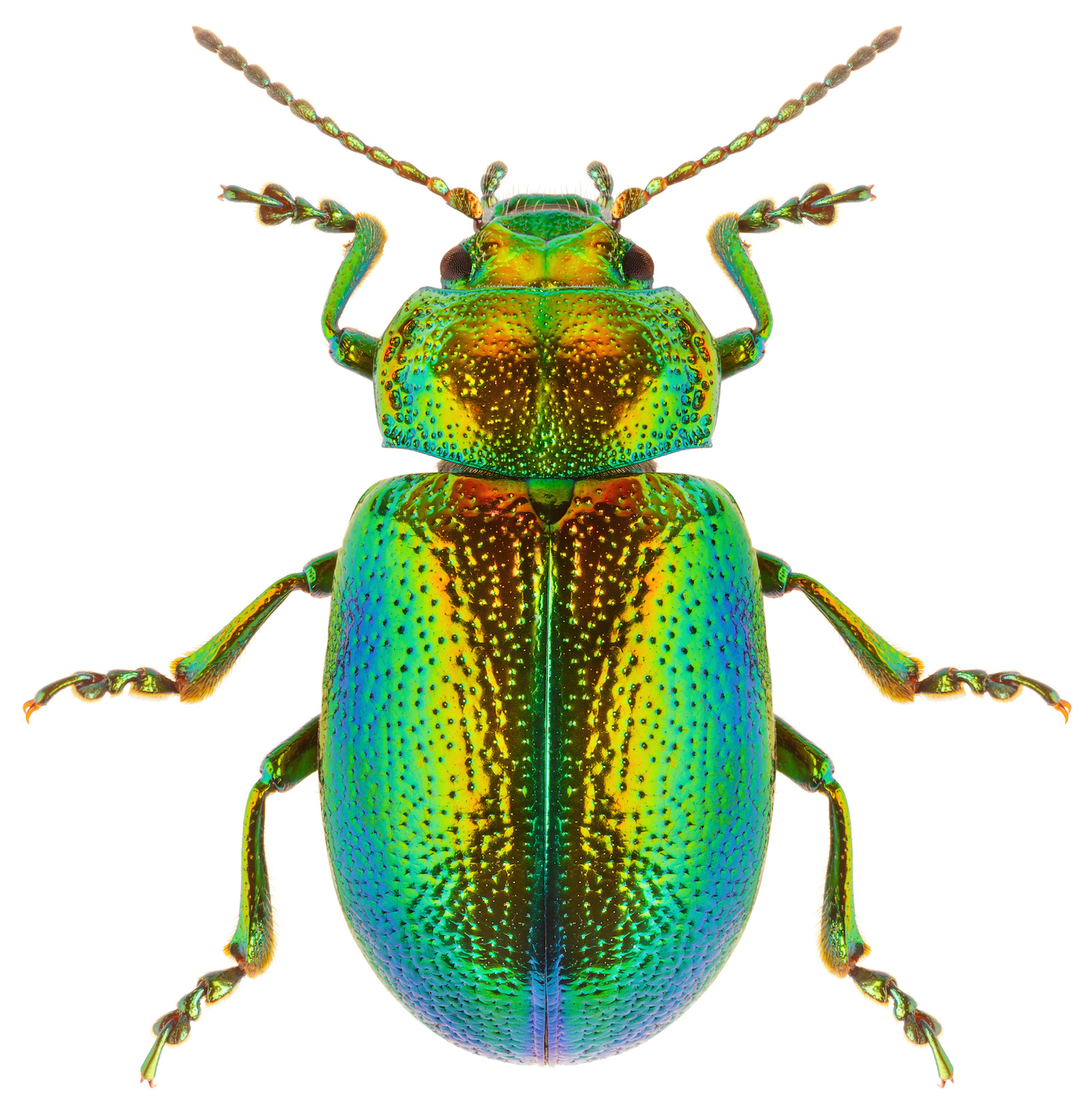
Reference image from https://www.color-meanings.com/colorful-beetles/
#31 - Tansy Beetle:
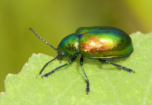
P. 57
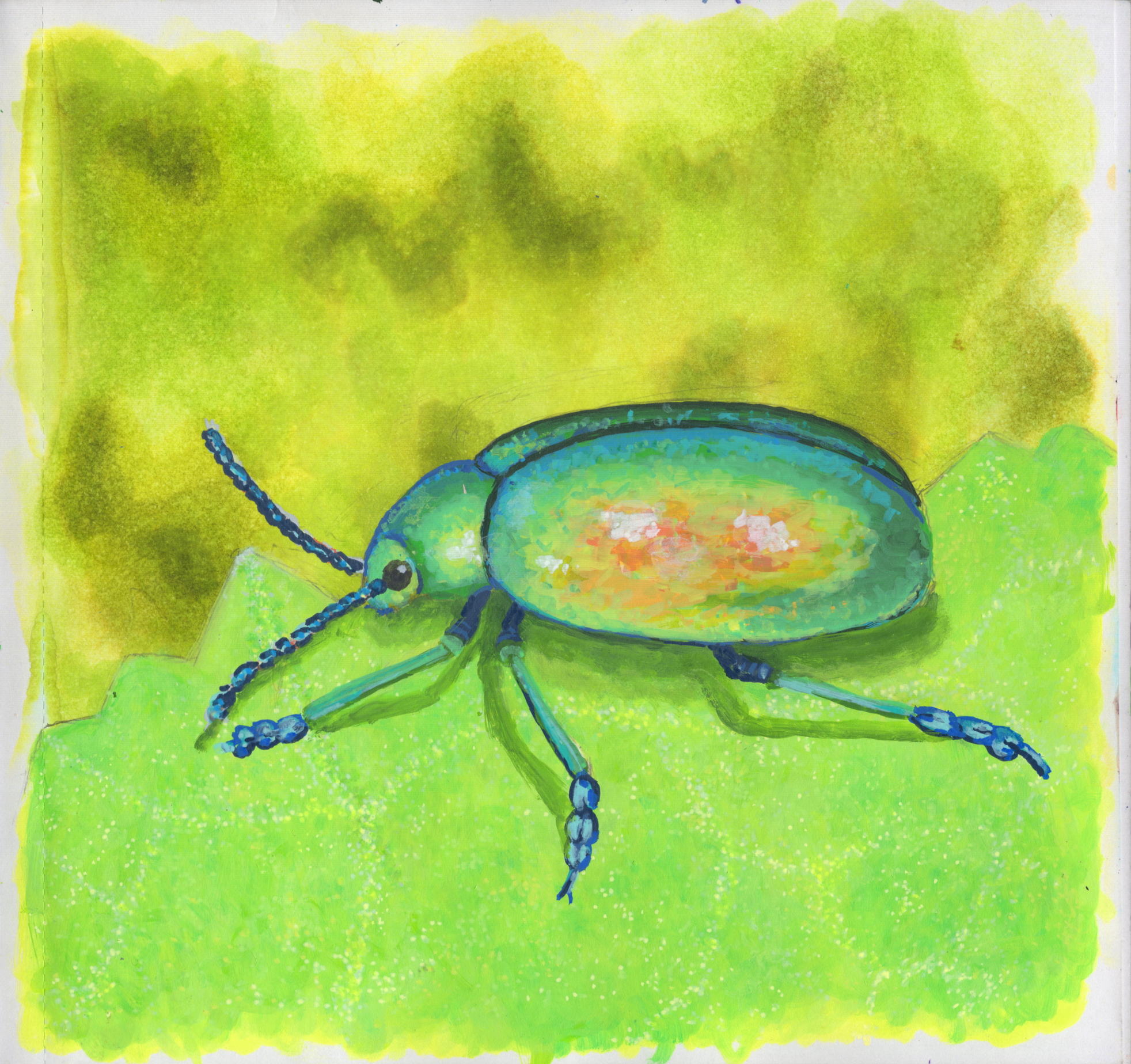
Second painted beetle attempt from a reference. I like this one a lot, it came out great. I used the same Alcoholic Reactions technique as the other whole page pieces and used acrylic markers for the foreground.
Reference image from https://faculty.ucr.edu/~chappell/INW/arthropods/leafbeetle.shtml:
Dogbane Leaf Beetle
P. 58
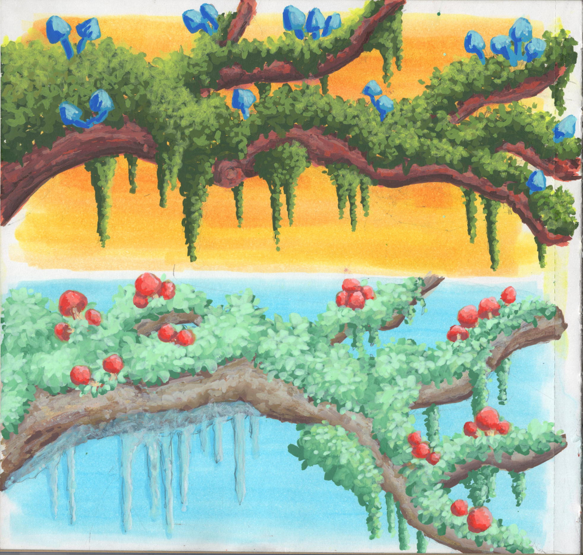
I love painting plants and trees and flowers. I wanted to see what cool colors vs warm colors would look like next to each other. The idea was that the tree and leaves would be cool or warm, and the mushrooms would be opposite.
Background uses the Alcoholic Reactions technique, then I painted the trunks, then leaves on top. The bottom cooler version was supposed to be all leaves and moss, but my husband saw icicles in my initial sketch so I added them to the final piece.
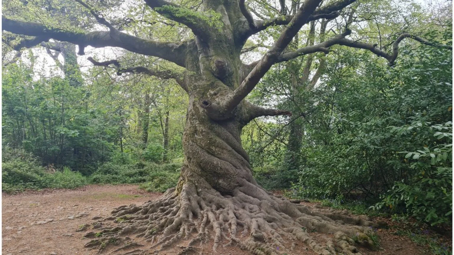
P. 59
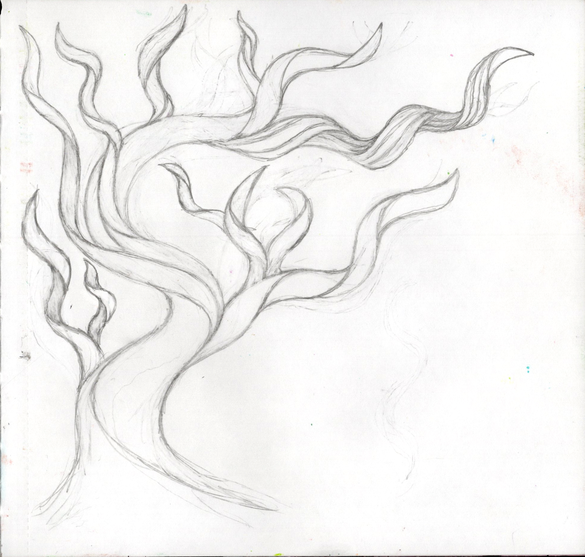
I saw a really interesting picture of a tree and decided to try work out how to do bends and twists. It was difficult at first but I got the hang of it. I also had a lot of fun making things look twisted.
Image from https://www.bbc.com/news/uk-england-cornwall-61330832:
Pp. 60-61
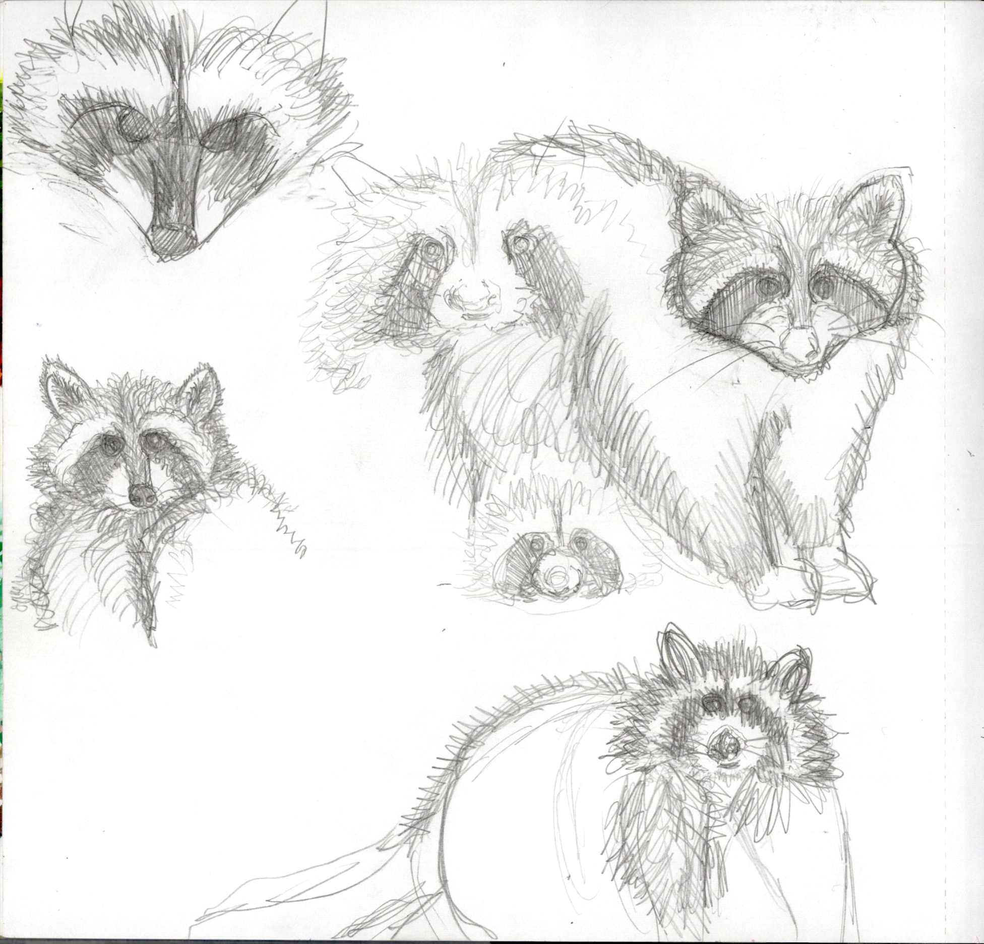
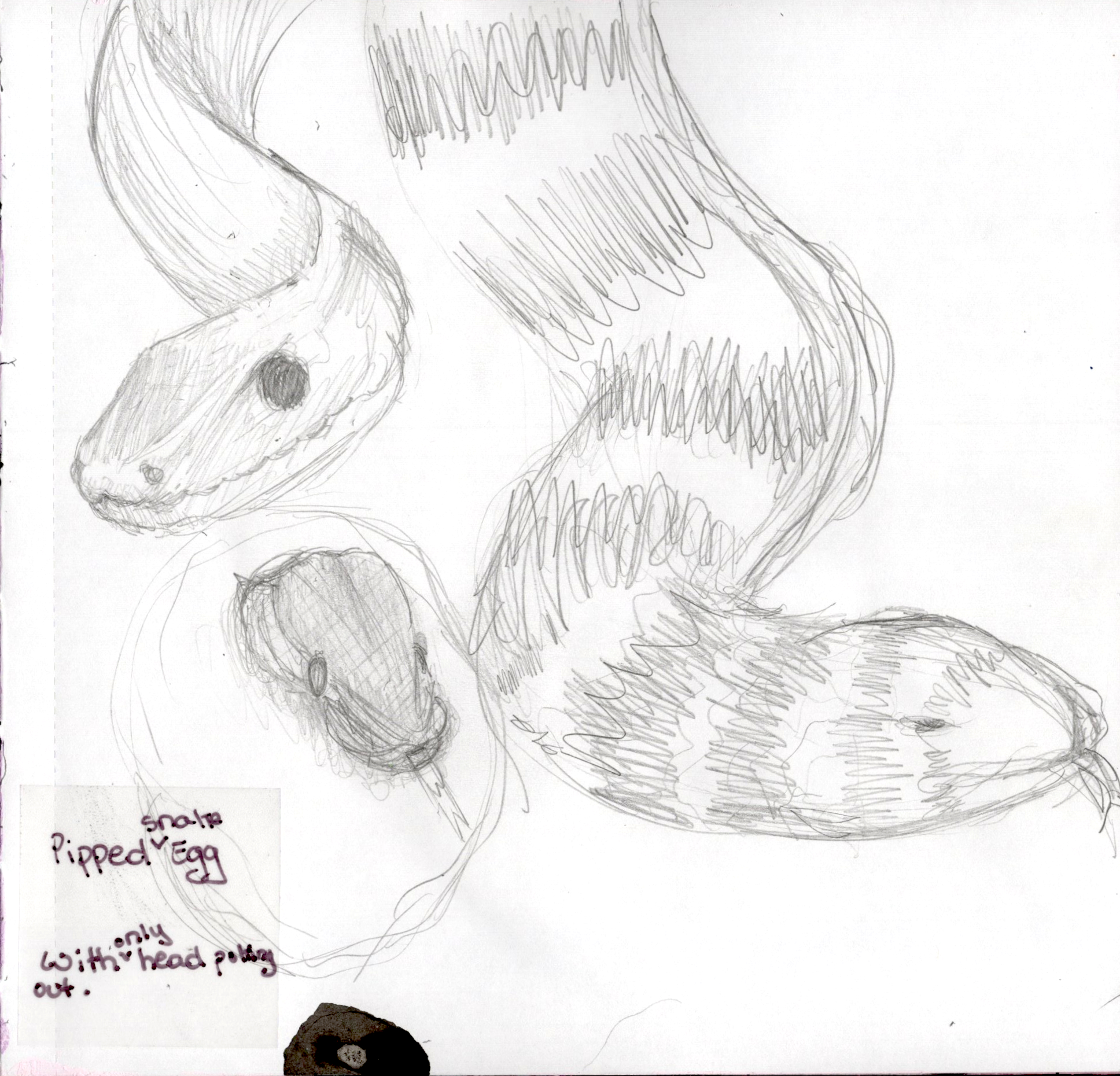
These raccoons are practice for the earlier piece with the raccoon and crows (page 27). That bottom raccoon was the first and I went from there. The snakes on the right were just me watching snake videos online and then wanting to draw snakes.
Pp. 62-63
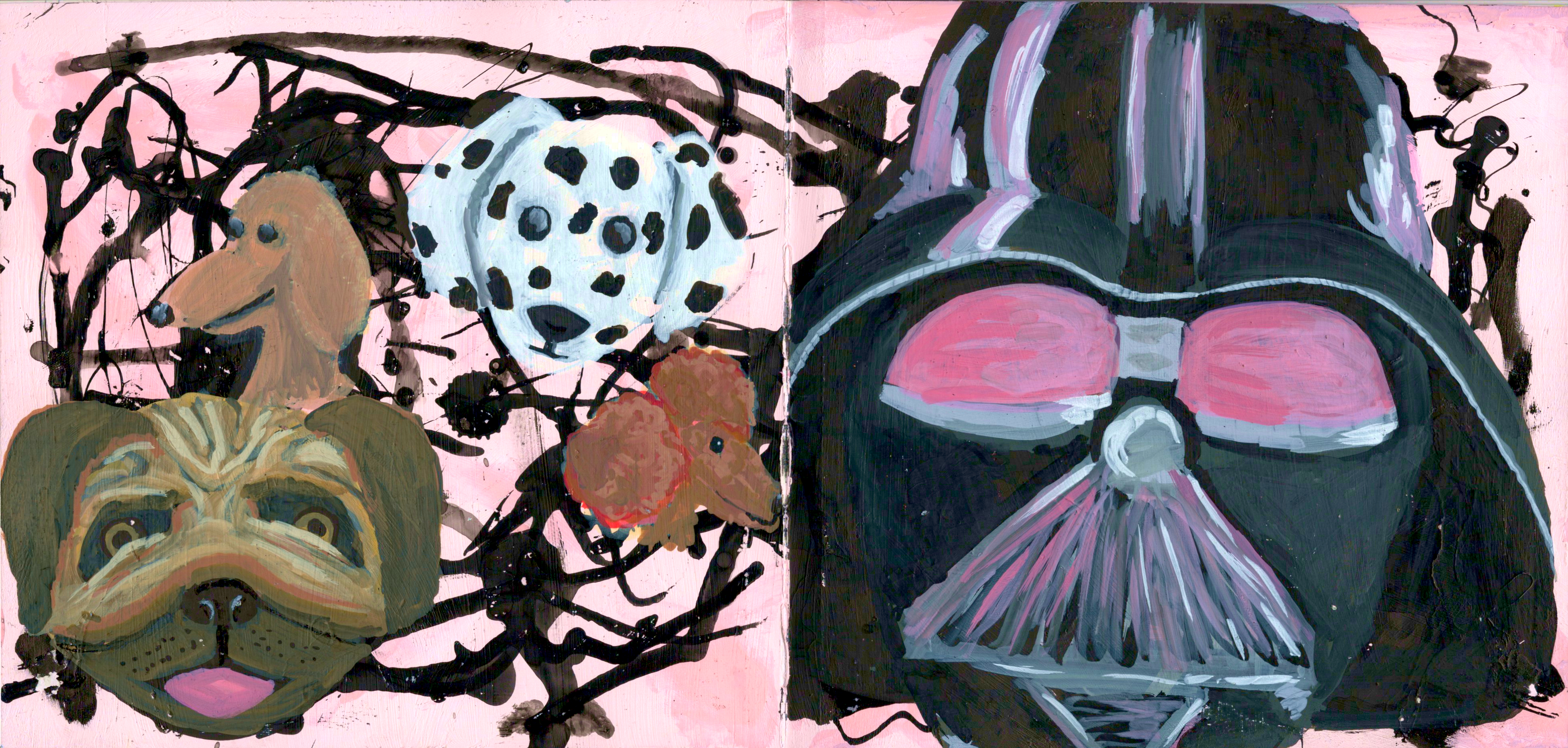
I painted the background a neon pink (doesn’t show up well here) and then scribbled Bombay India Inks on top using the Ink Dropper technique. What I sa were a bunch of dogs on the left and then Darth Harvey on the right.
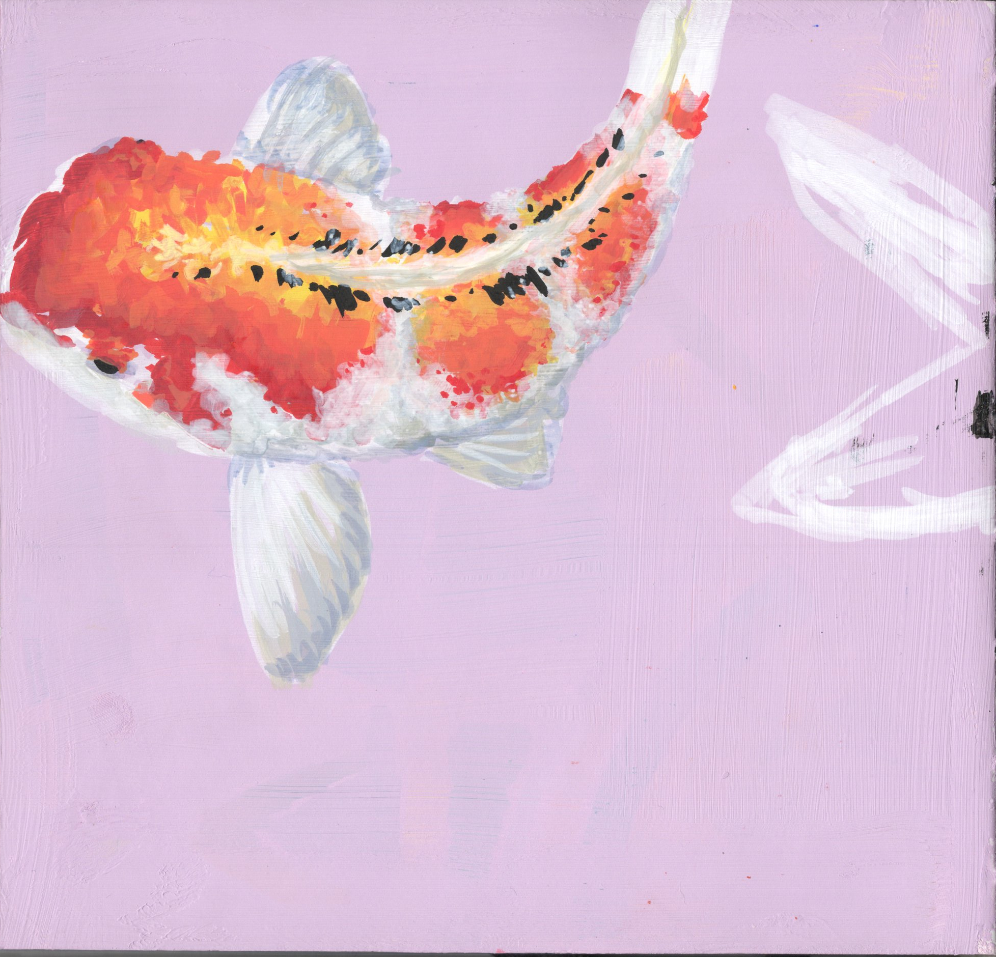
P. 64
Just a simple koi. I like it a lot although the face is a little short.
P. 67
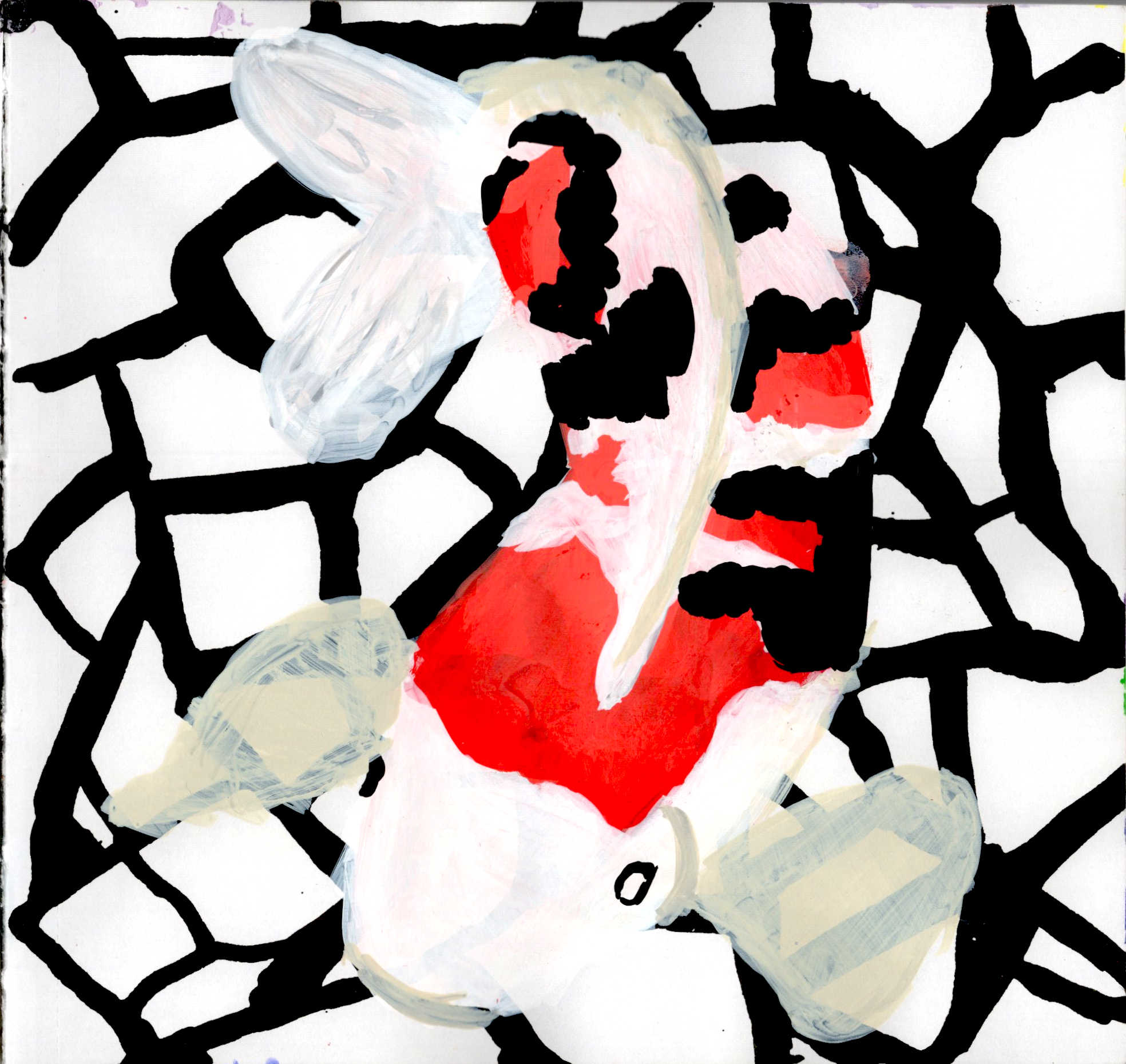
I don’t like this koi as much. This became an abandoned piece because Iit just wasn’t working for me.
P. 68
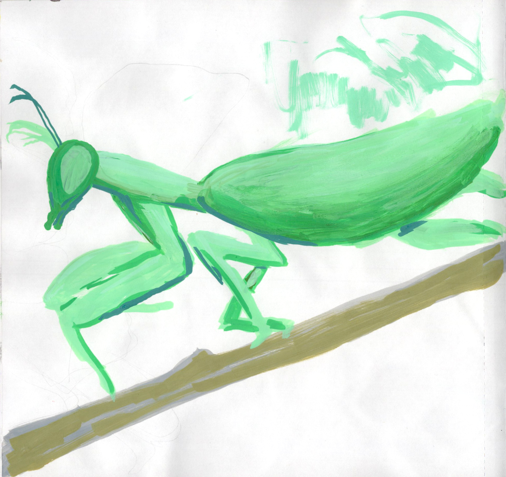
Created a random mantis. Just sketching around.
P. 70
At this point I was doodling, just messing around and making leaf marks. I actually really liked how this came out and I wanted to make more.
P. 71
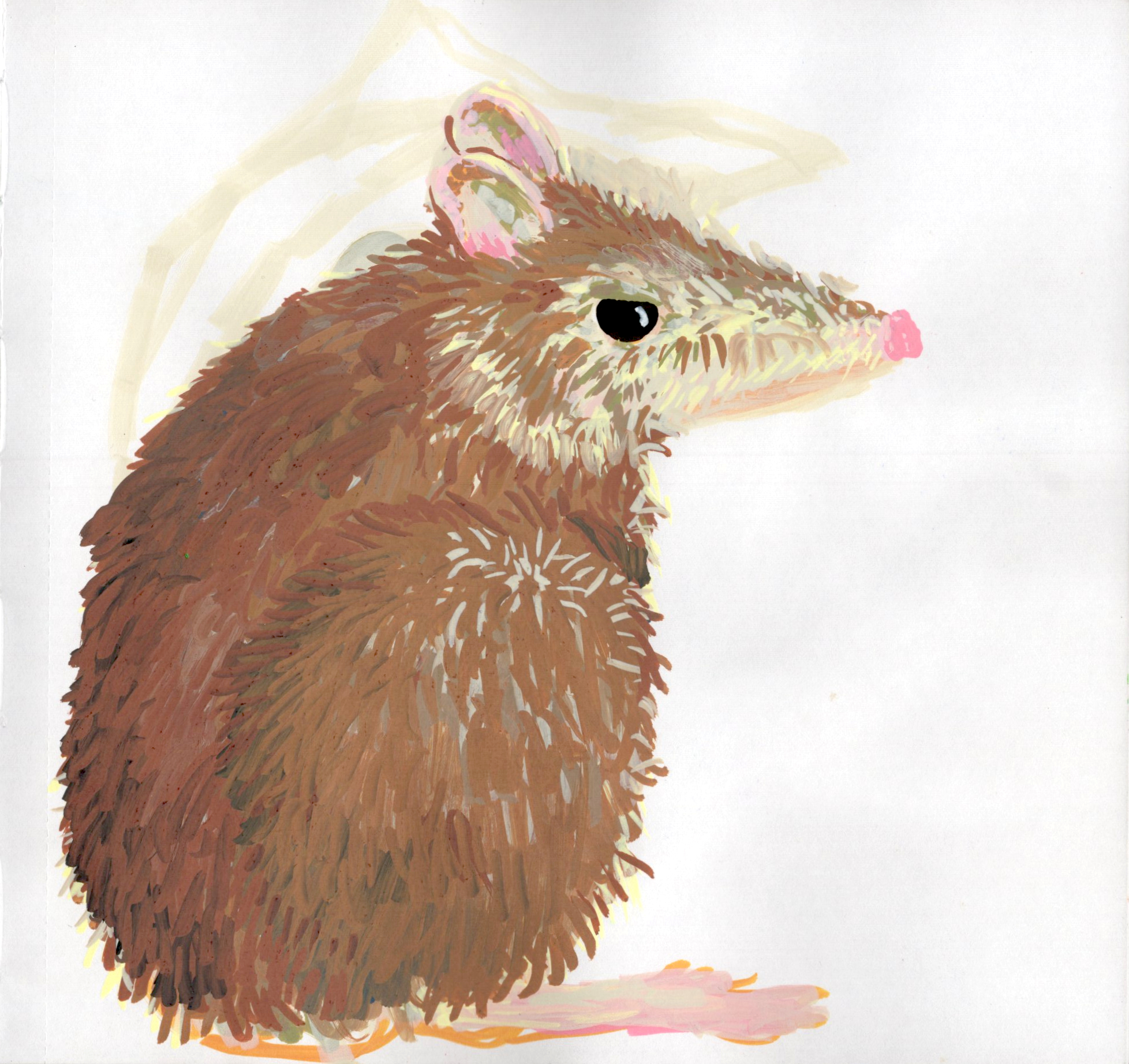
My brother said I should make a bandicoot so I made a bandicoot.
P. 72
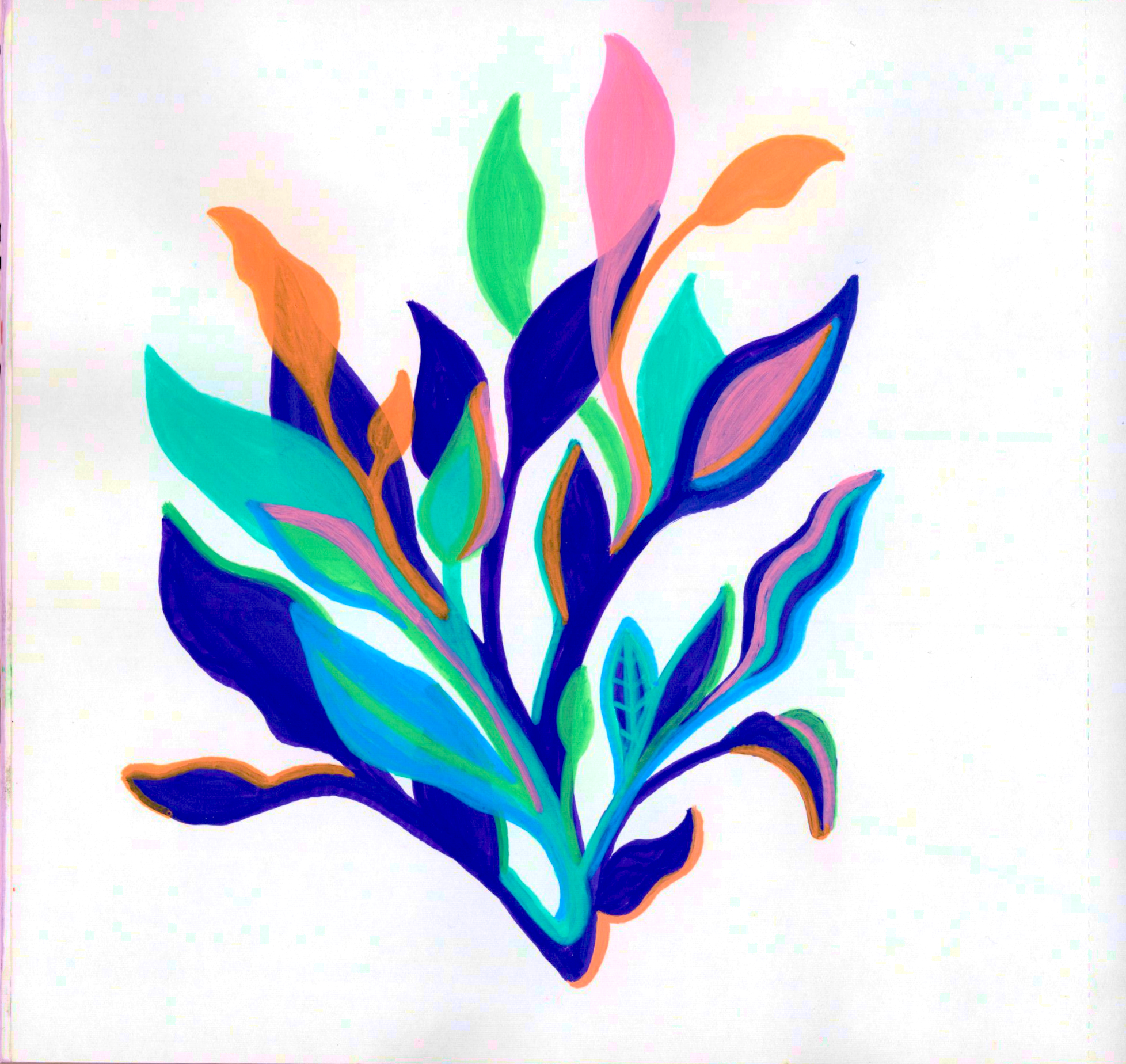
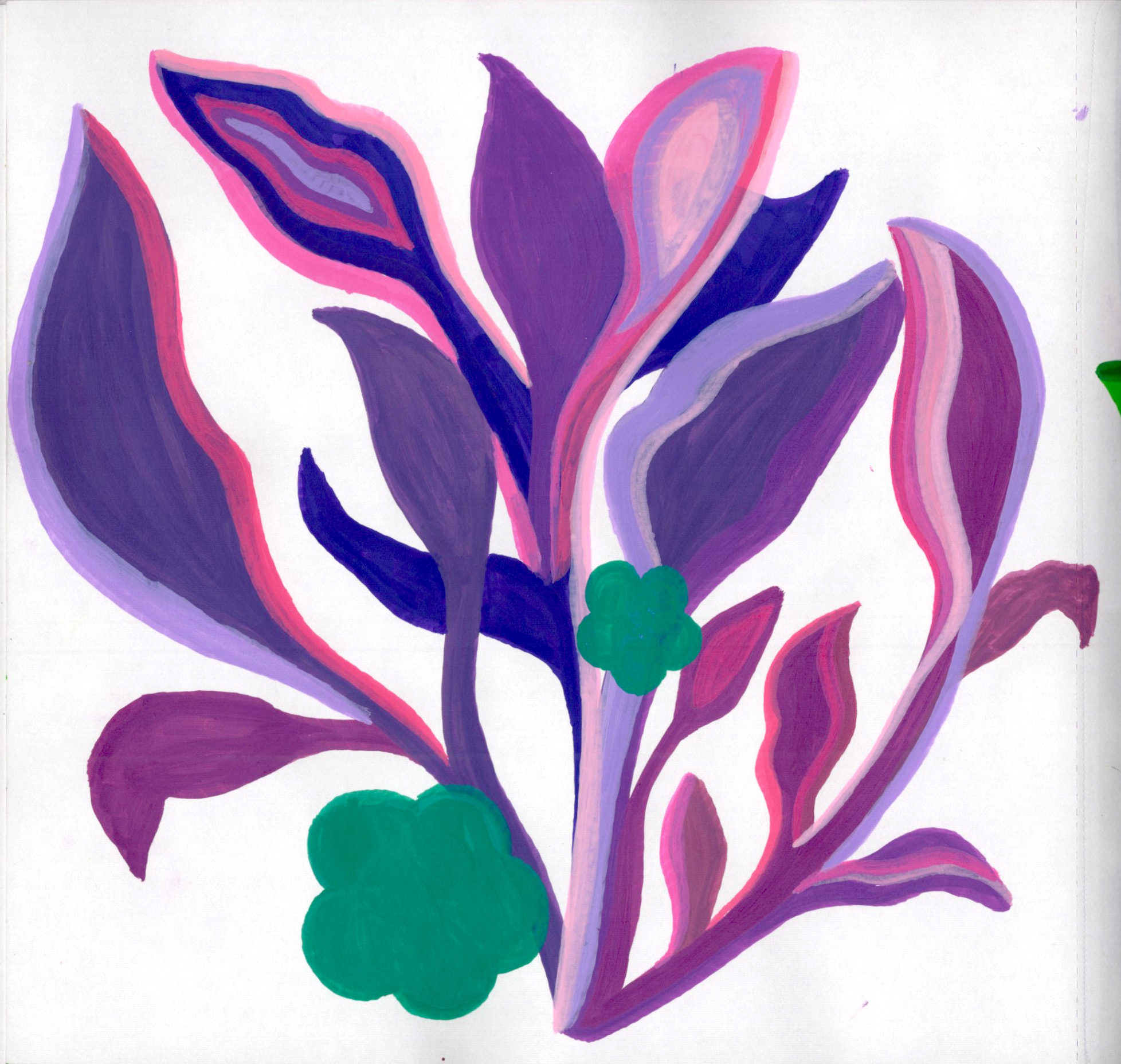
Second attempt at this leaves. At this point I become obsessed with this style.
P. 73
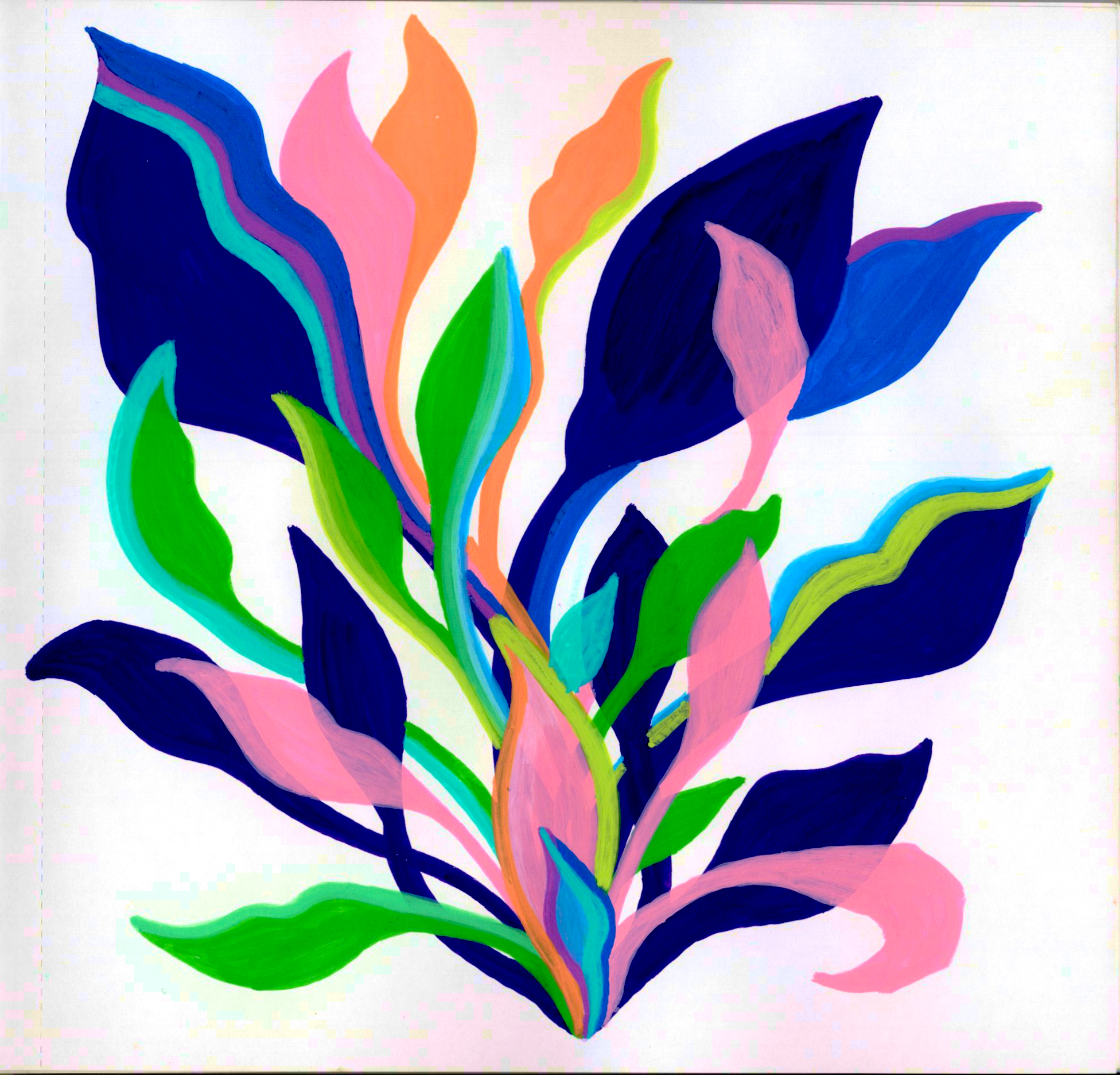
Trying them with bigger leaves as the last piece was too small but I don’t like how manys stems there are and I dont’ like that they all start from the center.
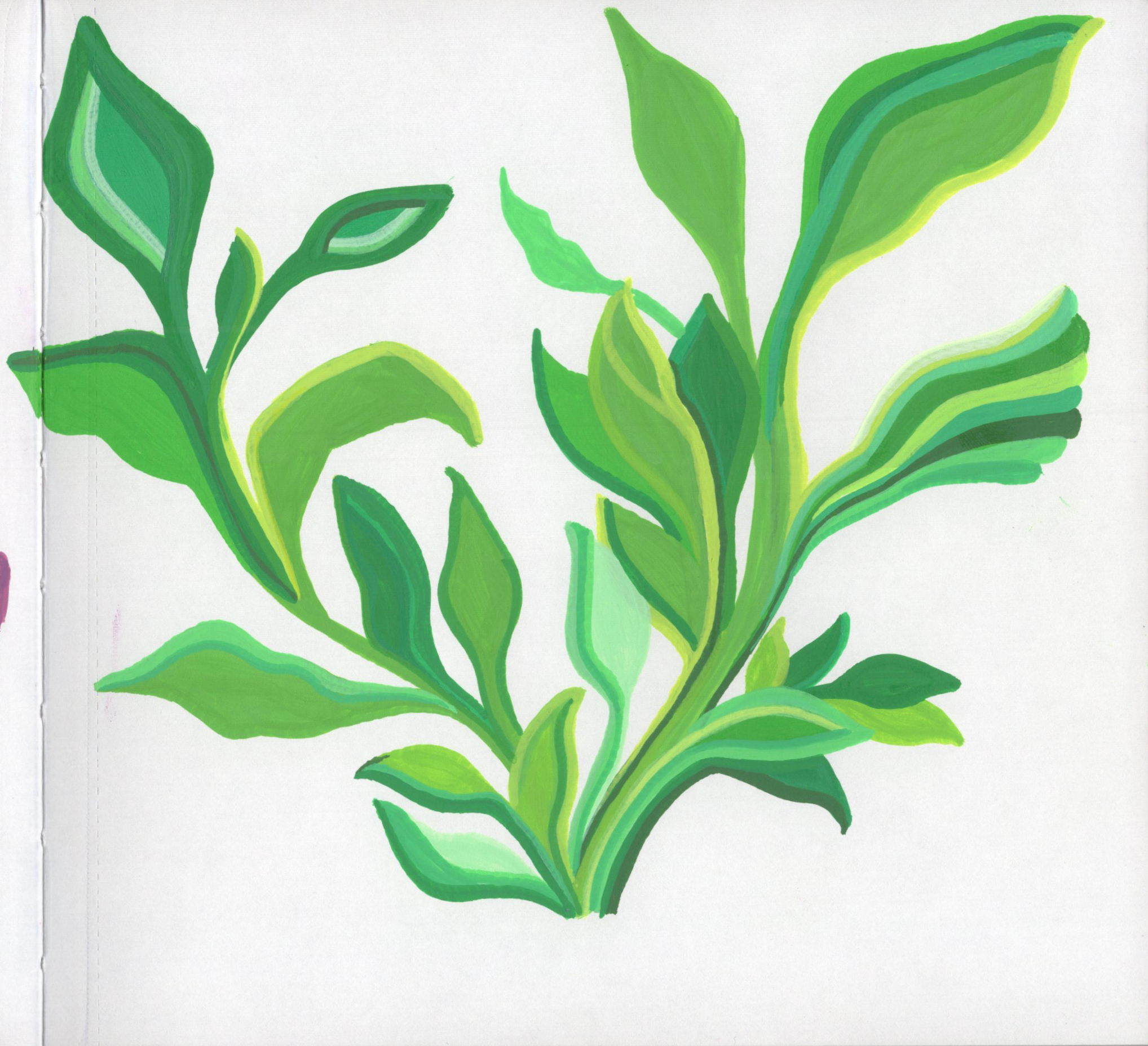
P. 74
Much better. I actually really like this, though I want more overlap.
P. 75
What is happening? Abandoned.
P. 76
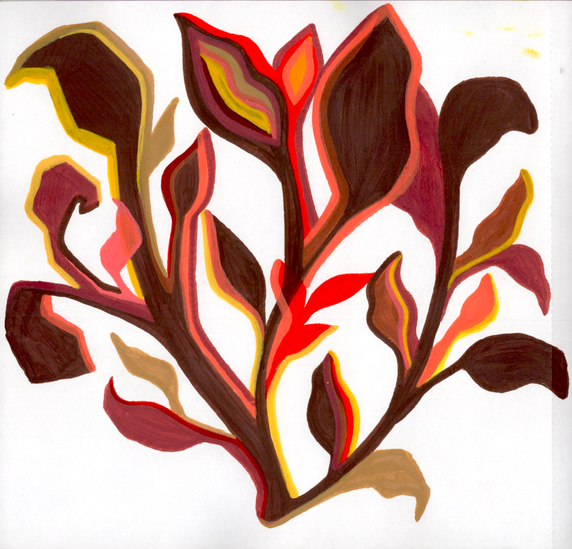
Trying some new bright colors. I’m liking the clumping but overall it seems off.
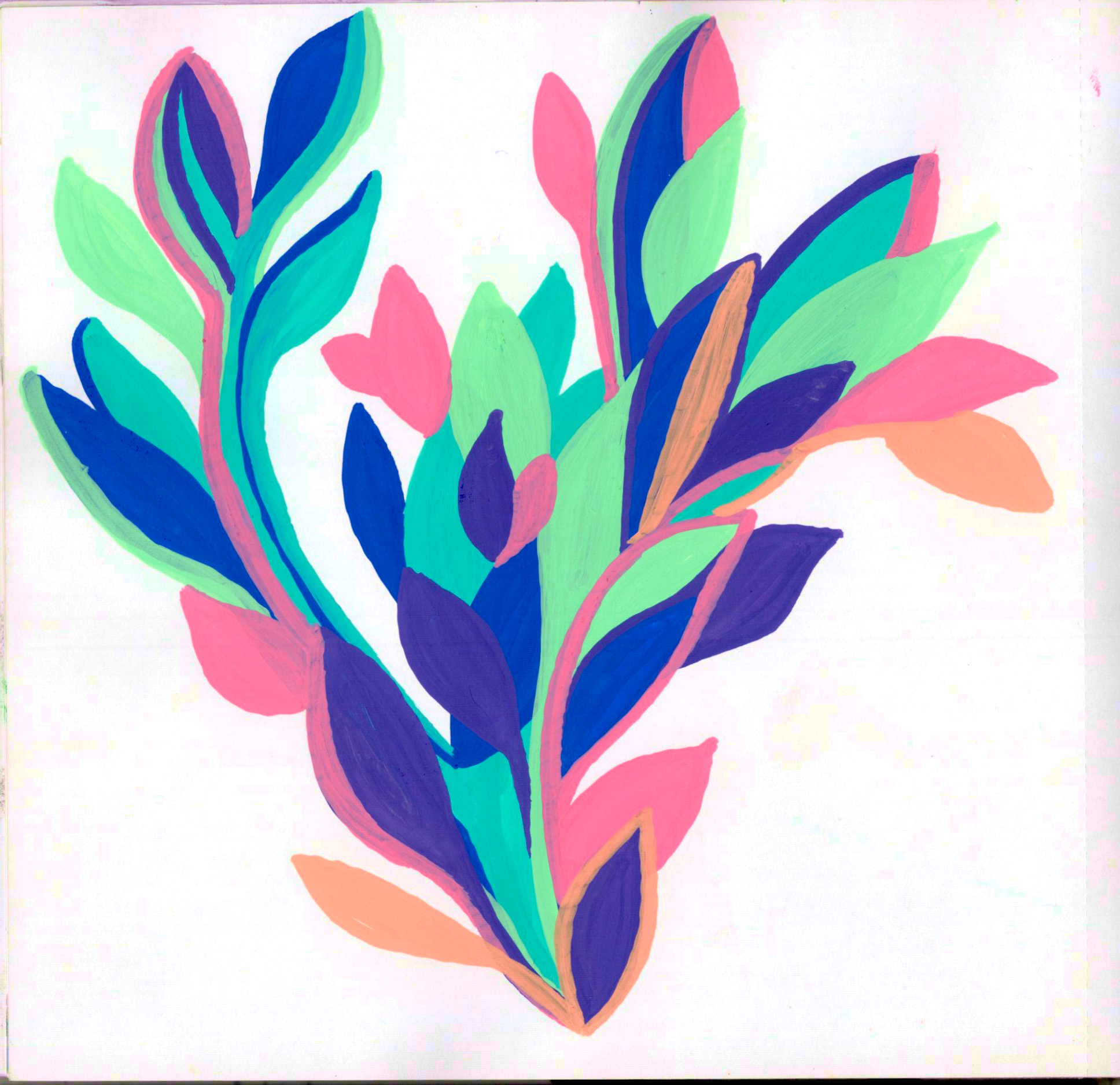
P. 77
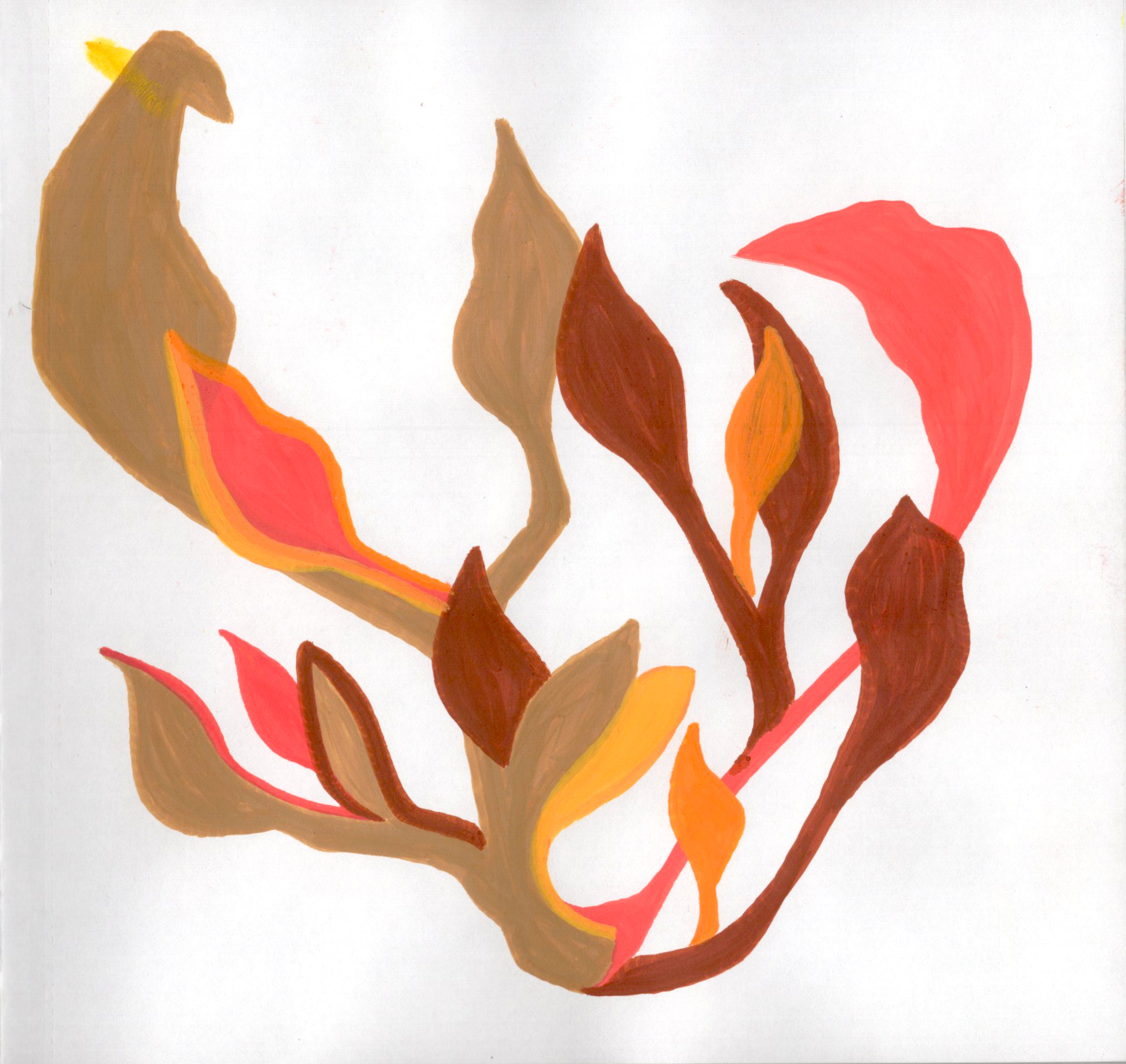
Ah, there it is. Perfect. This came out the best of them all and reminds me of weeds on the sidewalk.