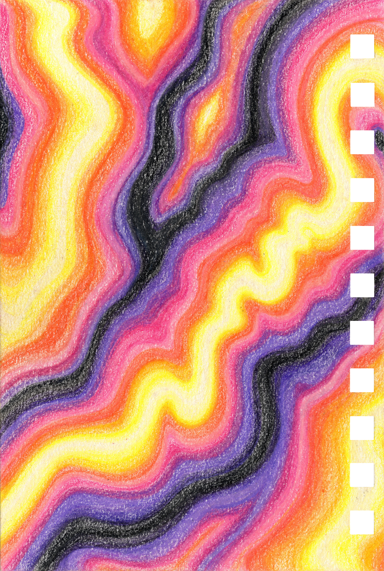
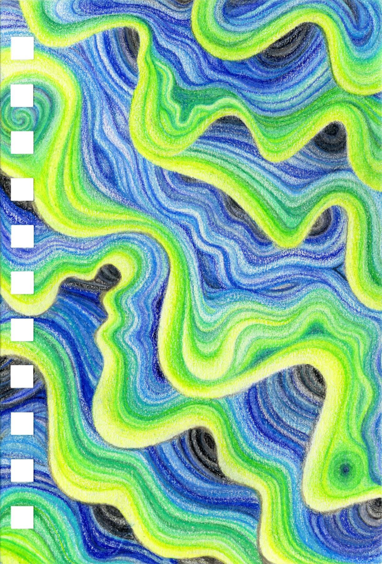
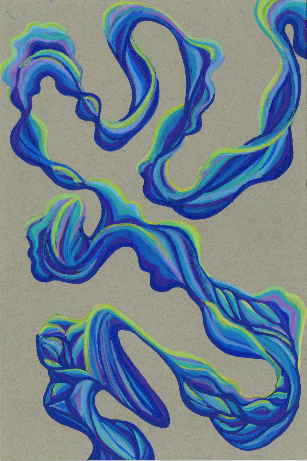
Stratified Layering
Stratified Layering
Best For: Creating entire compositions, abstract trees/branches, interwoven textures.
Skill Level: Intermediate to advanced.
Supplies: Colored pencils, textured paper, and fine tip eraser.
Processes
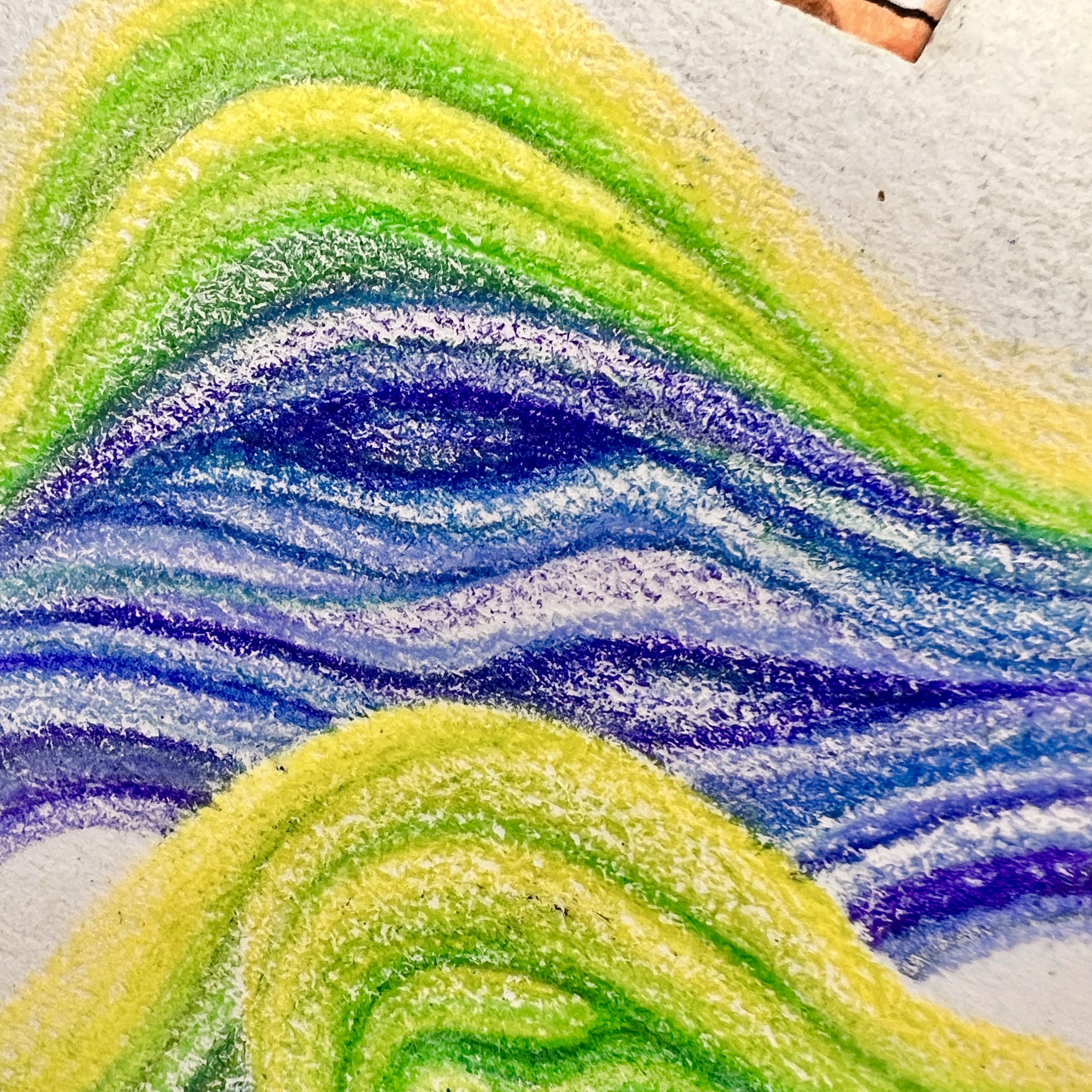
Colored-Pencils
Step 1: Blocking. Use a very light-colored pencil to lay down wavy guide lines, establishing the overall flow and composition.
Step 2: Foundation. Starting from a guide line, lightly draw your lightest color to the preferred thickness and length. Block in several of these light lines to begin building the form.
Step 3: Layering & Shading. With increasing saturation, layer on subsequent colors. Use the darker shades to outline, create borders, and add depth, working in gradients.
Step 4: Filling. Continue the process, following the established flow, until the space is filled to your preference.
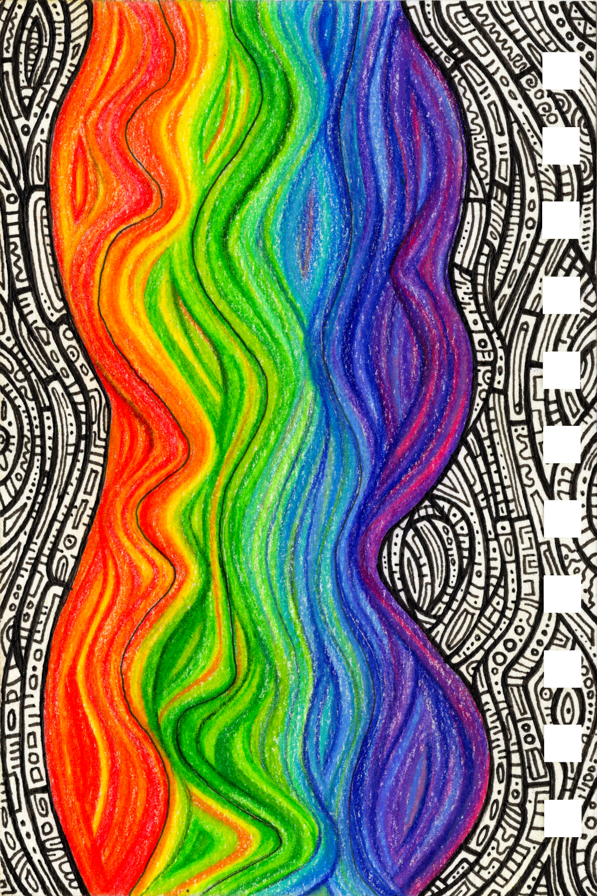
Gallery
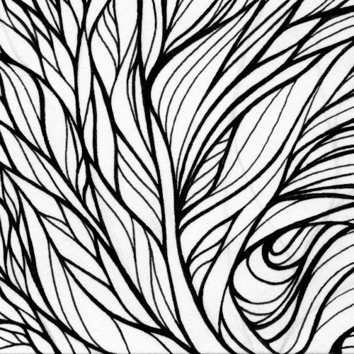
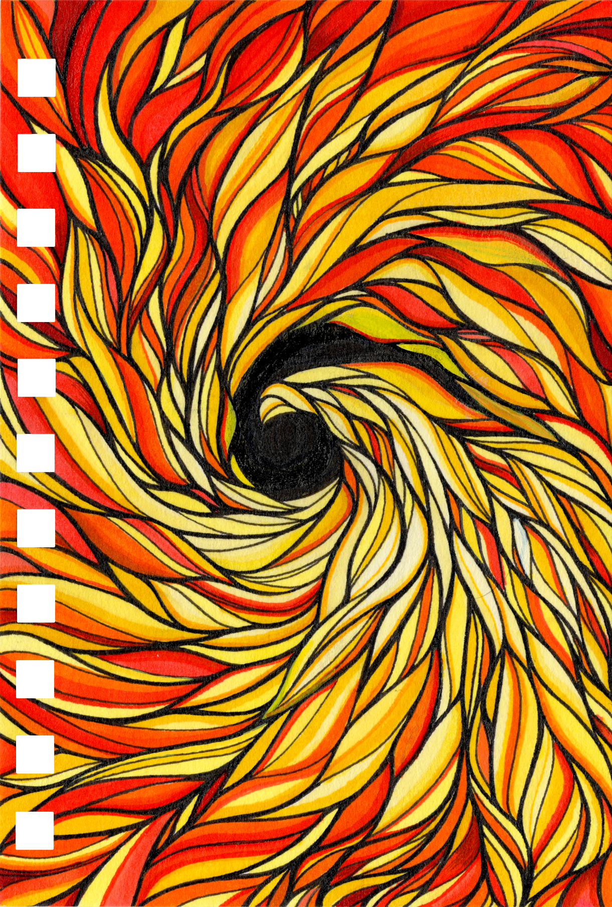
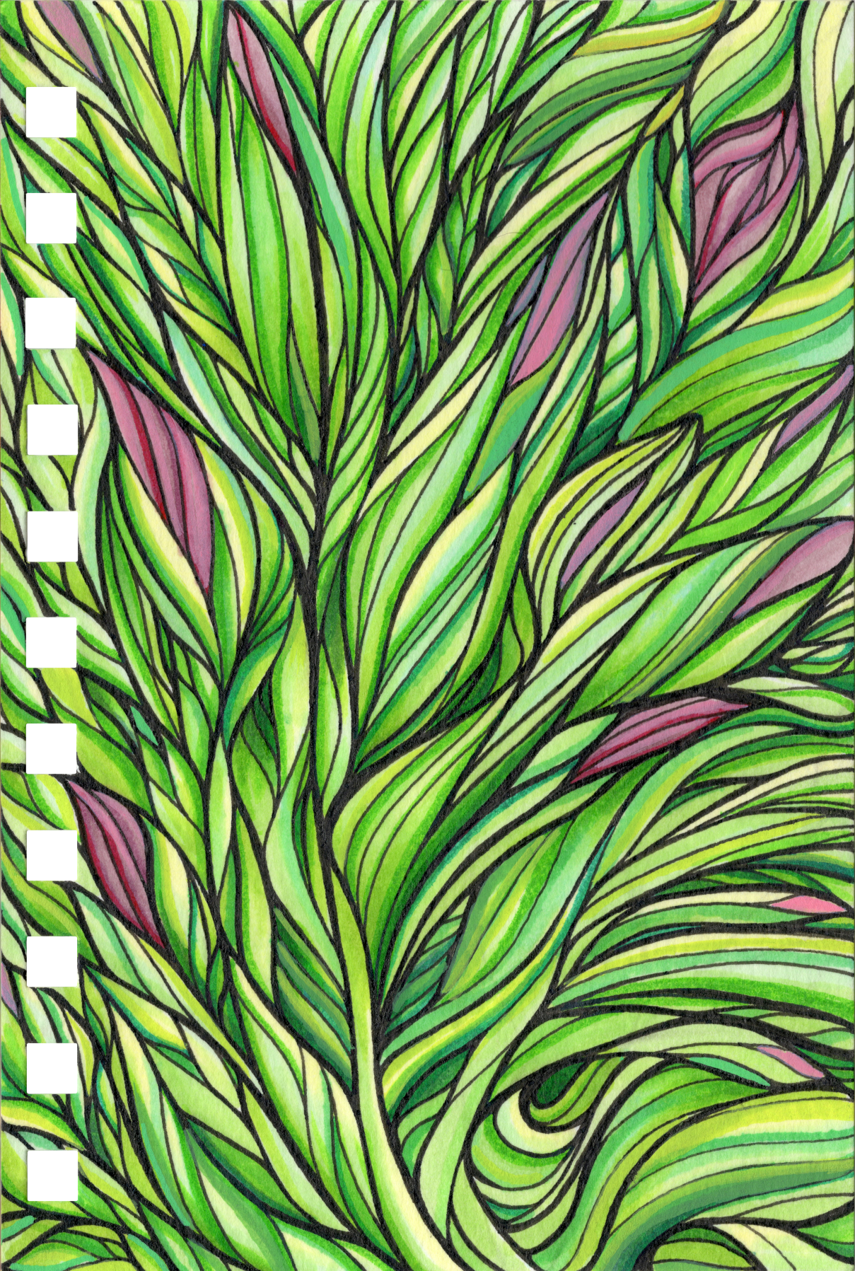
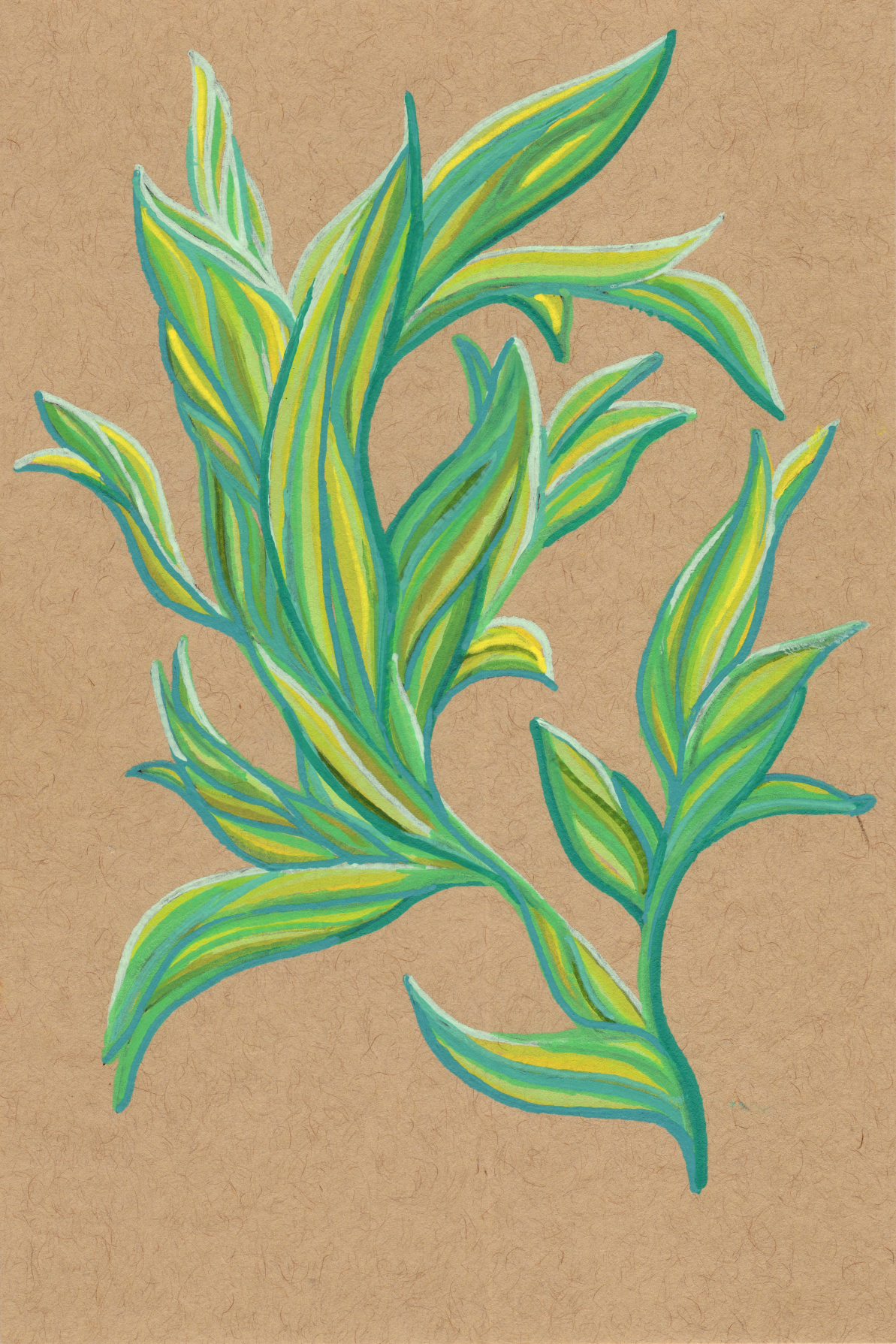
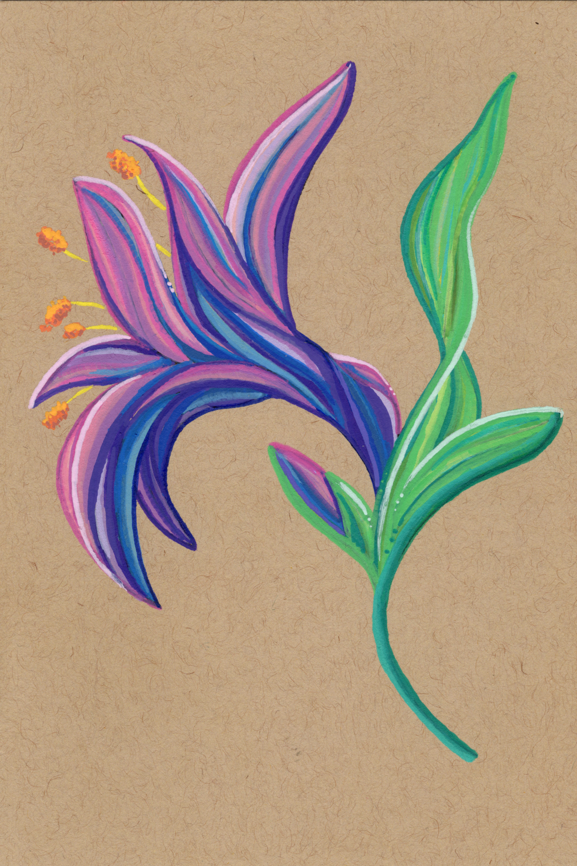
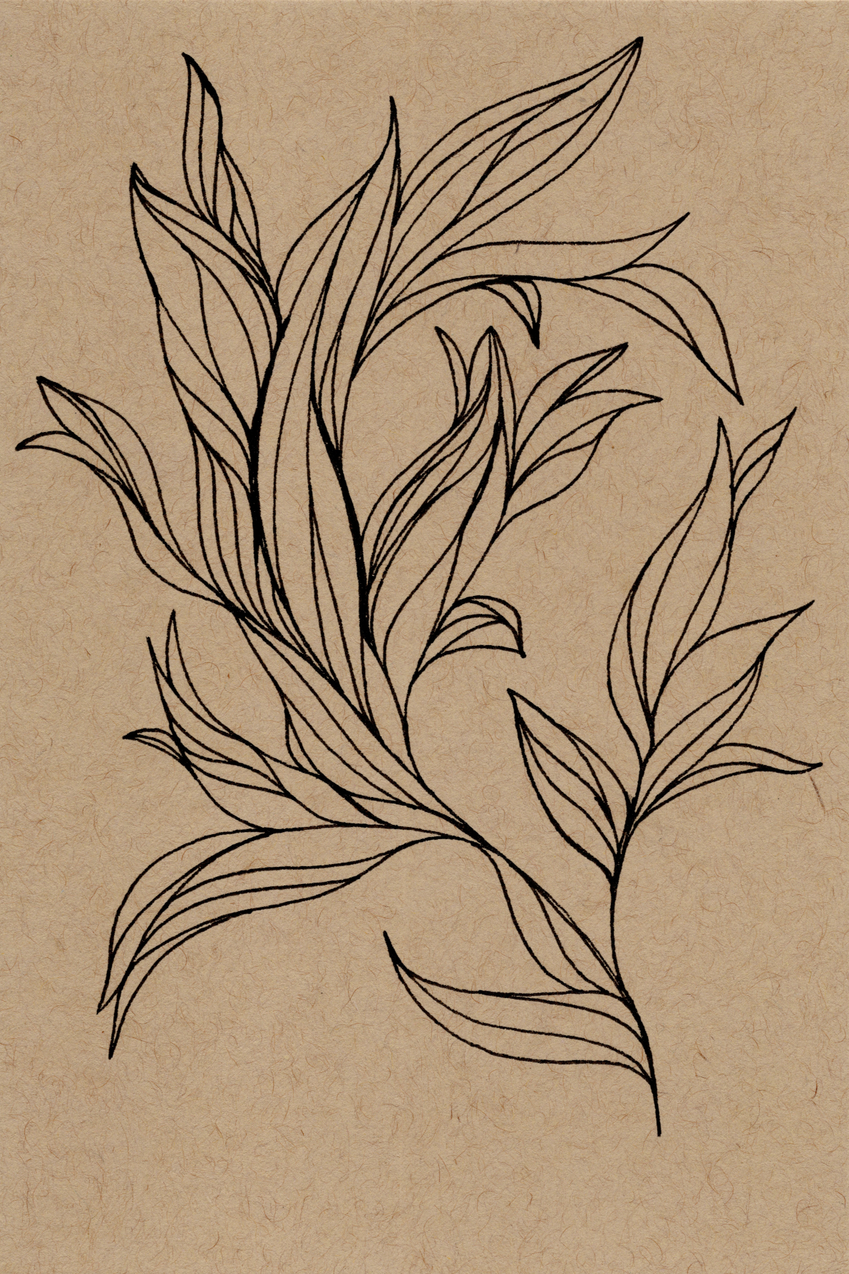
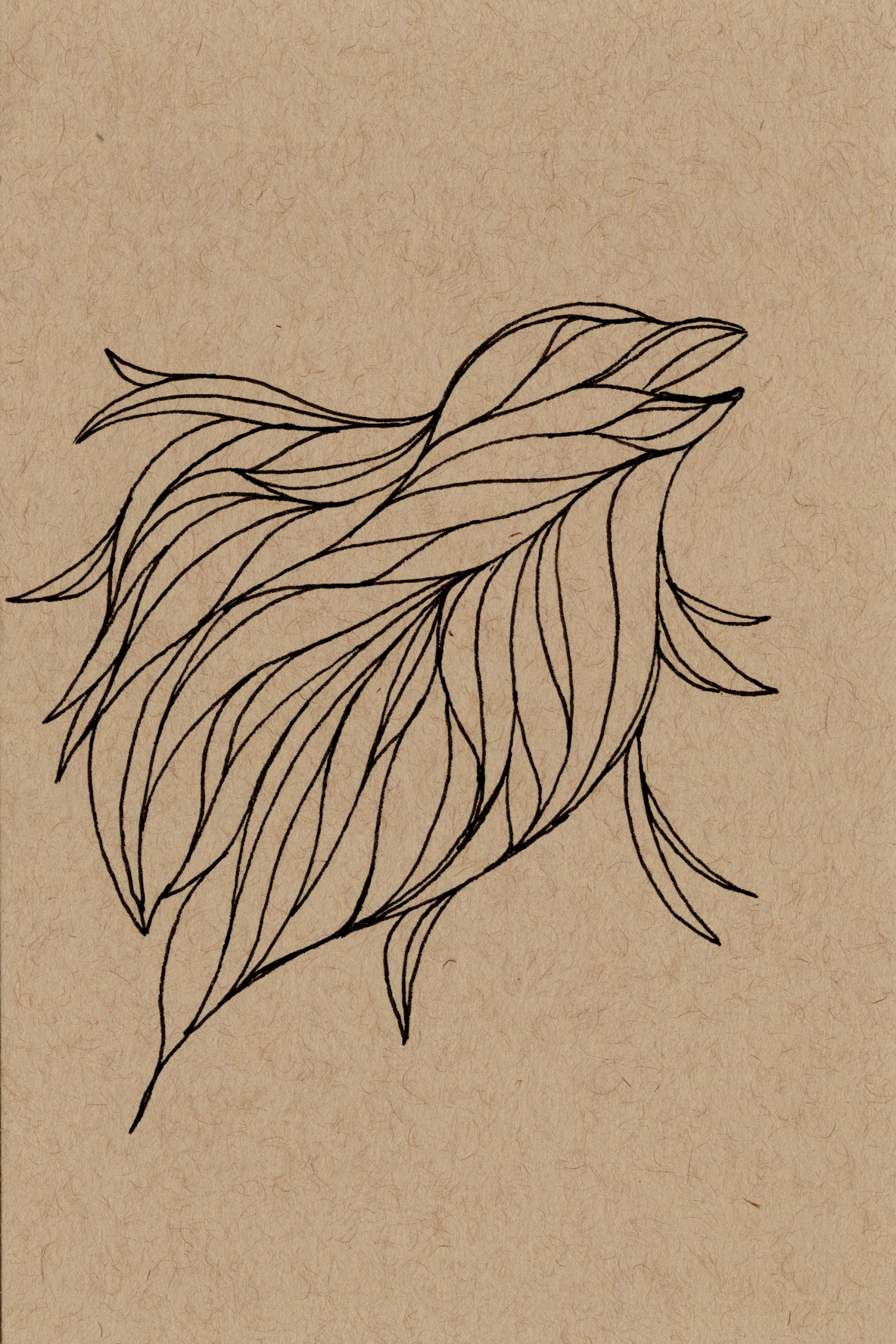
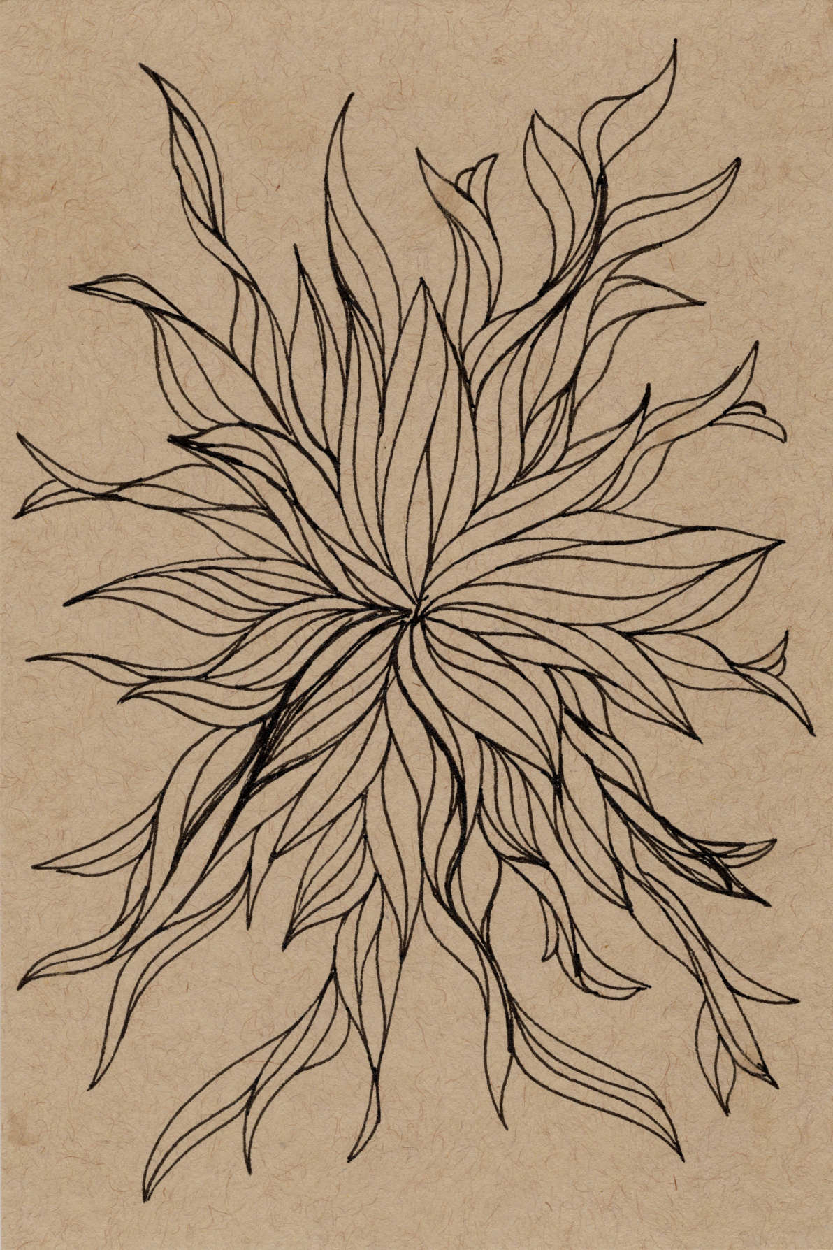
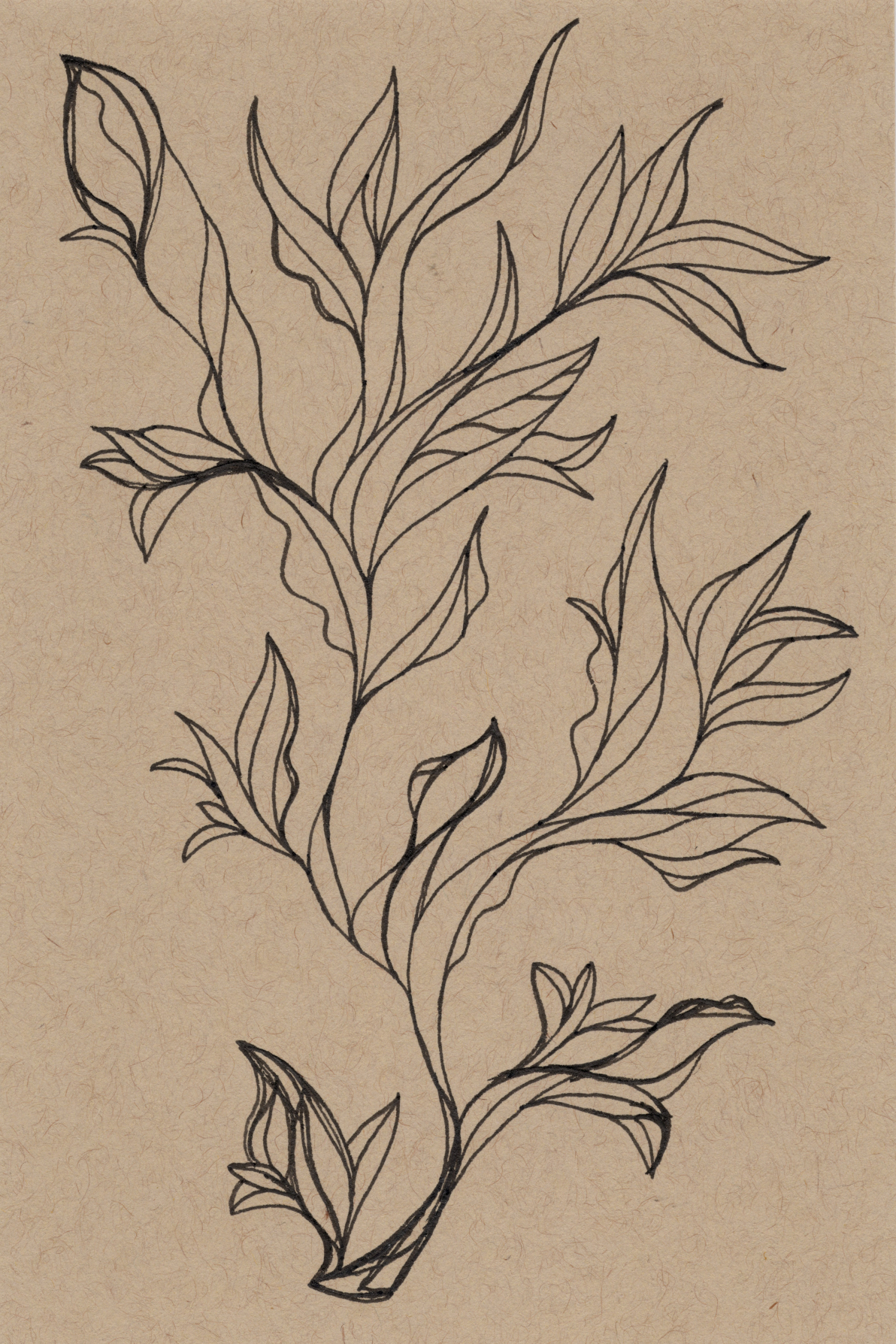
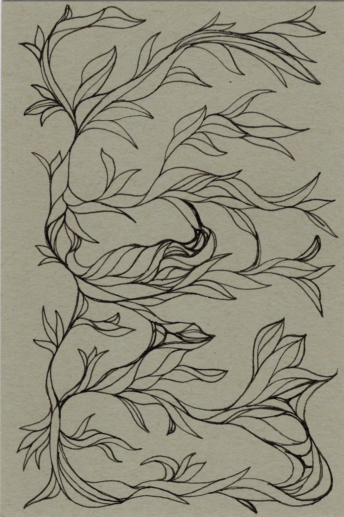
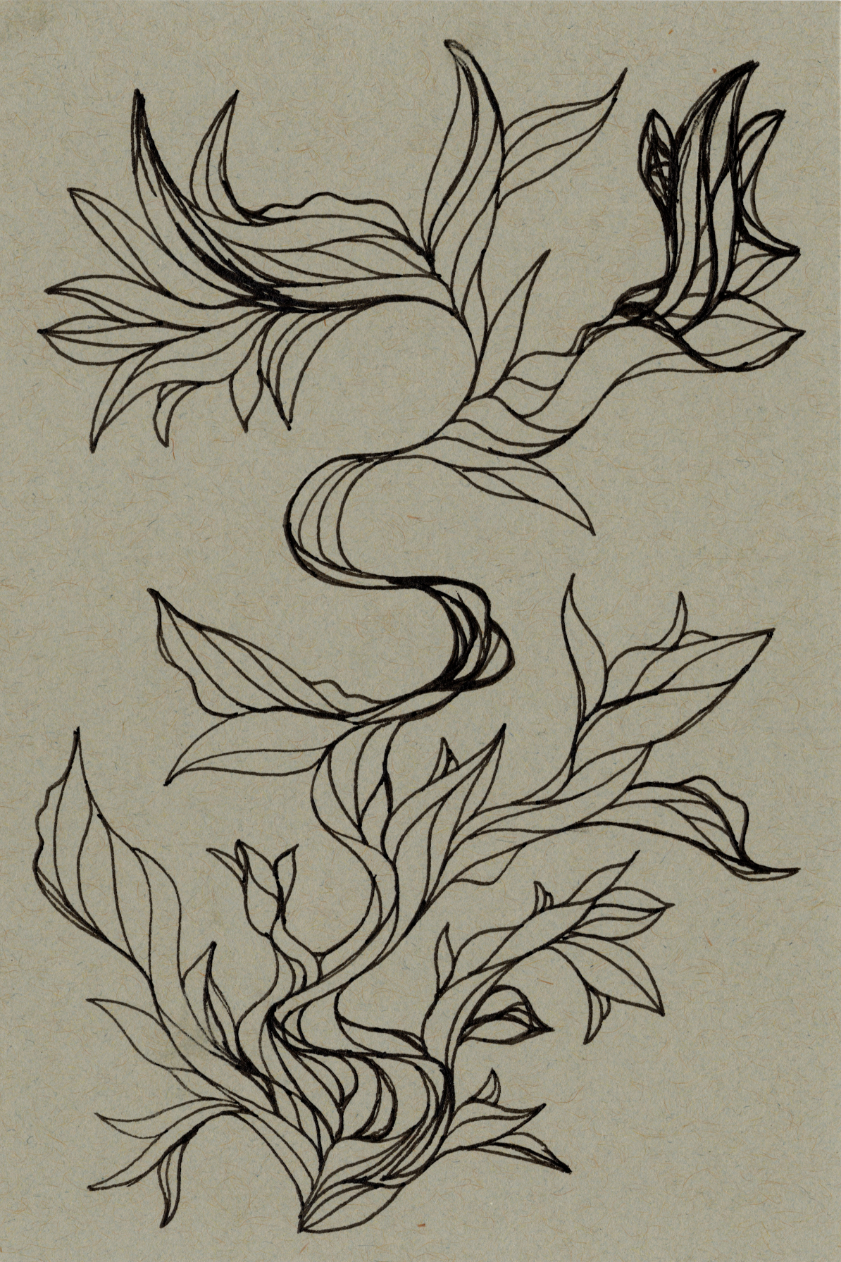
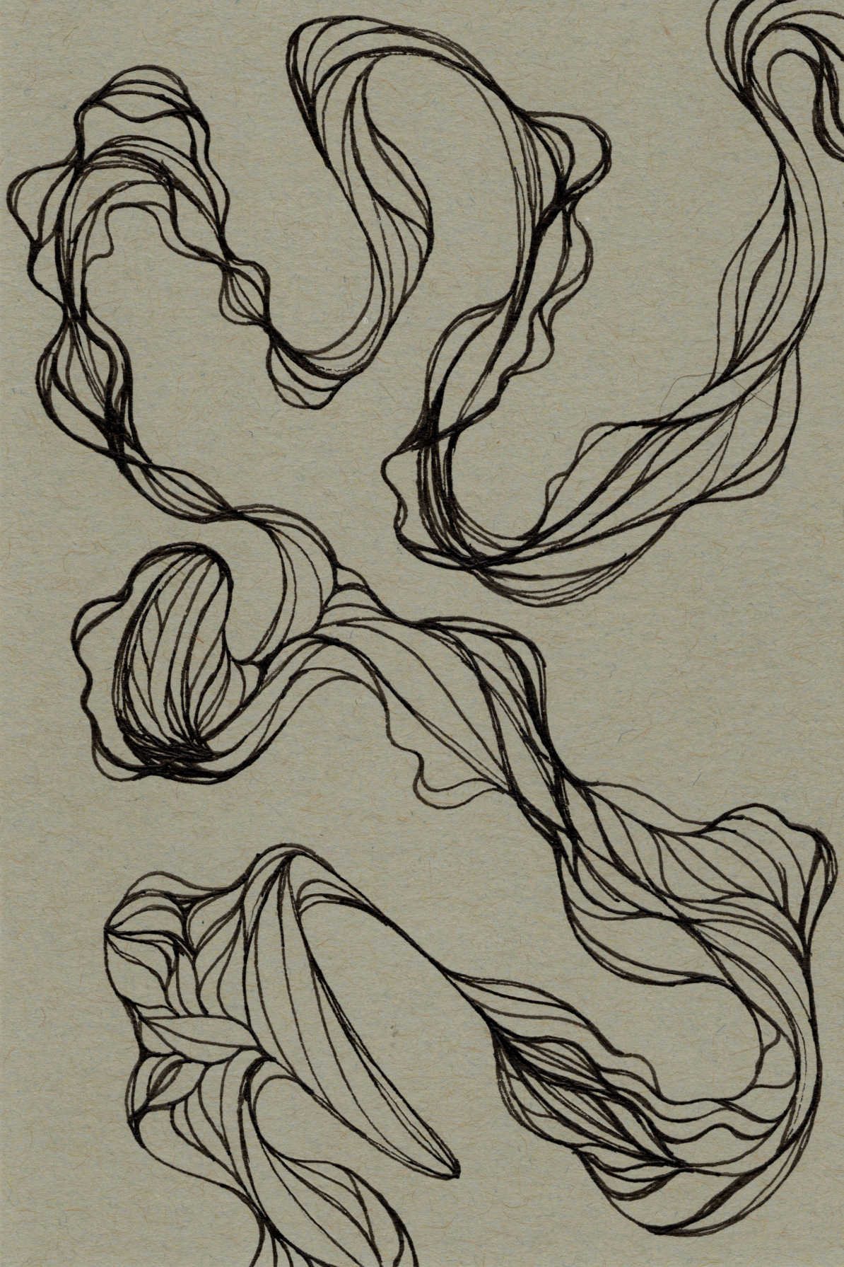
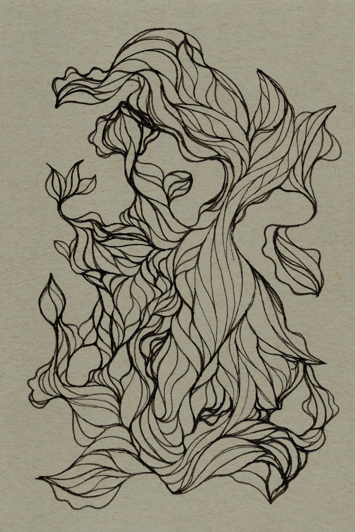
Wet Media (Ink, Paint, Marker)
Step 1: Establish the Flow. Start with a light, swooping line, imagining the path of a heavy brush being dragged.
Step 2: Define the Form. Draw a parallel line that follows the first, tapering at both ends to create the "outline" of a tapered stroke.
Step 3: Weave the Network. Draw more of these implied strokes, ensuring their ends touch and connect to others at the base, building an interwoven pattern.
Step 4: Embrace Unpredictability. Intentionally vary the curves and directions to create a sense of dynamic, organic movement.
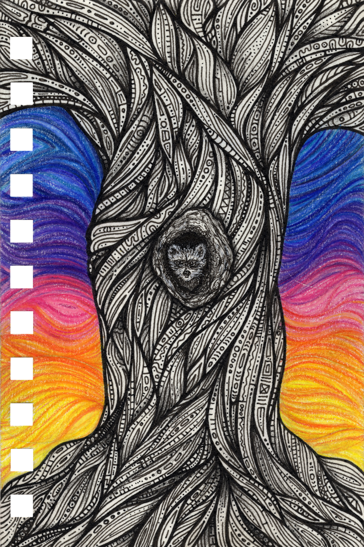
Gallery
Alcohol Markers
Paint Markers
Thoughts & Insights
Thoughts
Dry Media Supply Synergy: Using both oil-based (Polychromos) and wax-based (Prismacolor Premier) together has been a game-changer. The Polychromos provide sharp, crisp lines for detail, and less saturation for when I need things darker or shaded, while the Prismacolor offer rich saturation and bright colors that are easily blendable. They complement each other perfectly. and give me a massive range of control.
Wet Media (Lack Of) Blending: I find that I really like that I don’t need to to blend or work quick or use water with any of the wet media. I Just don’t blend, but the layering is the effect I want so the lack of blending works really well. I find this to be the case for all the wet media supplies (besides watercolor, which is untested).
Insights
💭 Journal Thoughts…
10/14/2025 - The evolution of this technique has been a hard learning process. I have done it three times and each time has been different. The first time was just me messing around with jumbo muli-colored pencils. The second time I actually tried to replicate the first, but using my Prismacolor Premier and Polychromos. It came out way different and I didn’t understand how. After examining the two pieces side by side, I realized that I was using thin pencils in the second piece and thick in the first. Of course that will change how it looks (ref. “Underwater Currents” creative workbook). So I decided to instead build “lines” that essentially look like tubes or ripples in shells or agate. And that has led the aesthetics within Underwater Currents. The technique takes a long time and hopefully it will help solidify this version of the technique from this point on.
11/2/2025 - The technique continues to change for each piece. Though the results are coming out great.
12/5/2025 - The wet media version of this technique is turning out really interesting. The technique has evolved from just some basic lines to lots of varying sizes and even some more shapes and humps. The wet media version is changing how I’ll do the dry version in the future. It’ll be interesting to see how this evolution will look in colored-pencil.
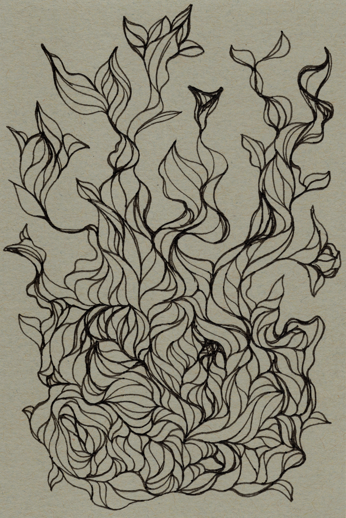
Another evolution is that I’m creating specific things and actually planning them out ahead of time. I was originally creating random designs with no real end goal. The first two pieces (Trumpet Flower and Leafy, pre-color) were totally accidental but came out so nice that it made me fall in love with toned paper and this version of the stratified layering technique. I also created the Joy Sparrow piece at the same time, but the sparrow was intentional.
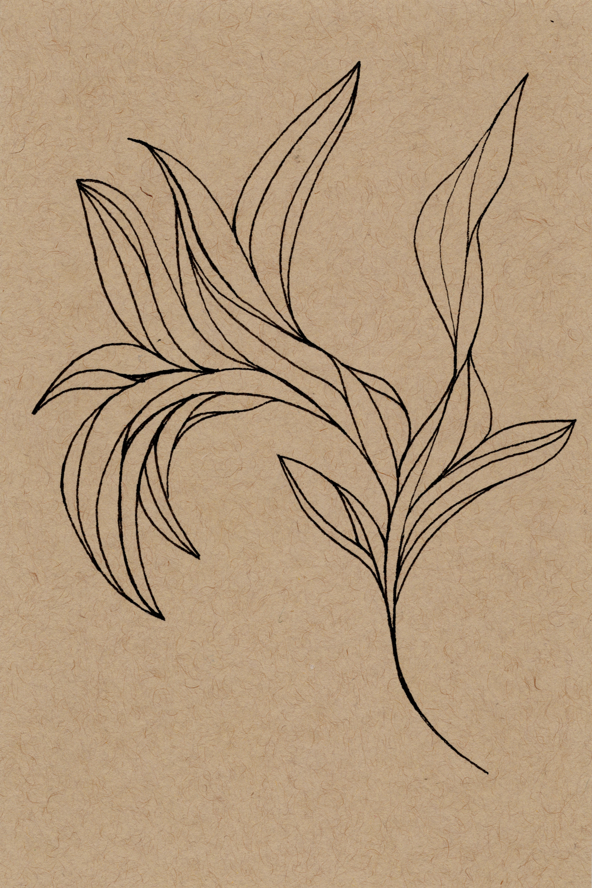
I decided to go random again, and pushed what things looked like. I evolved my form to include different thicknesses and different lengths to make the piece look more interesting and less uniform. Since it’s covered by acrylic paint, I am able to go over mistakes with the ink as it’ll be covered later.
There there were the next set of intentional pieces where I had an end goal in mind. The sparrow happened earlier and so didn’t have the sketchiness as the others. I found shaping to be really difficult freehand.
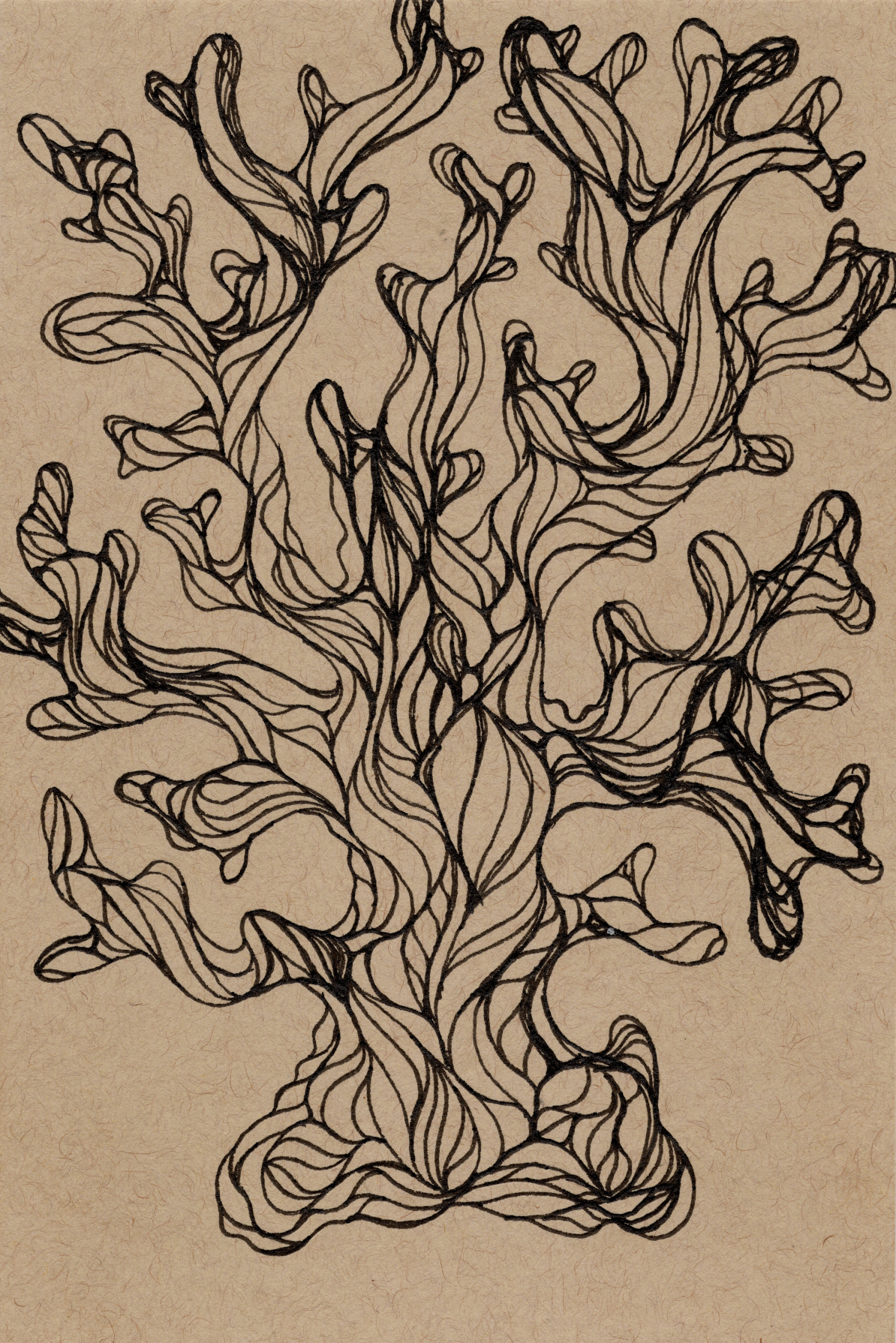
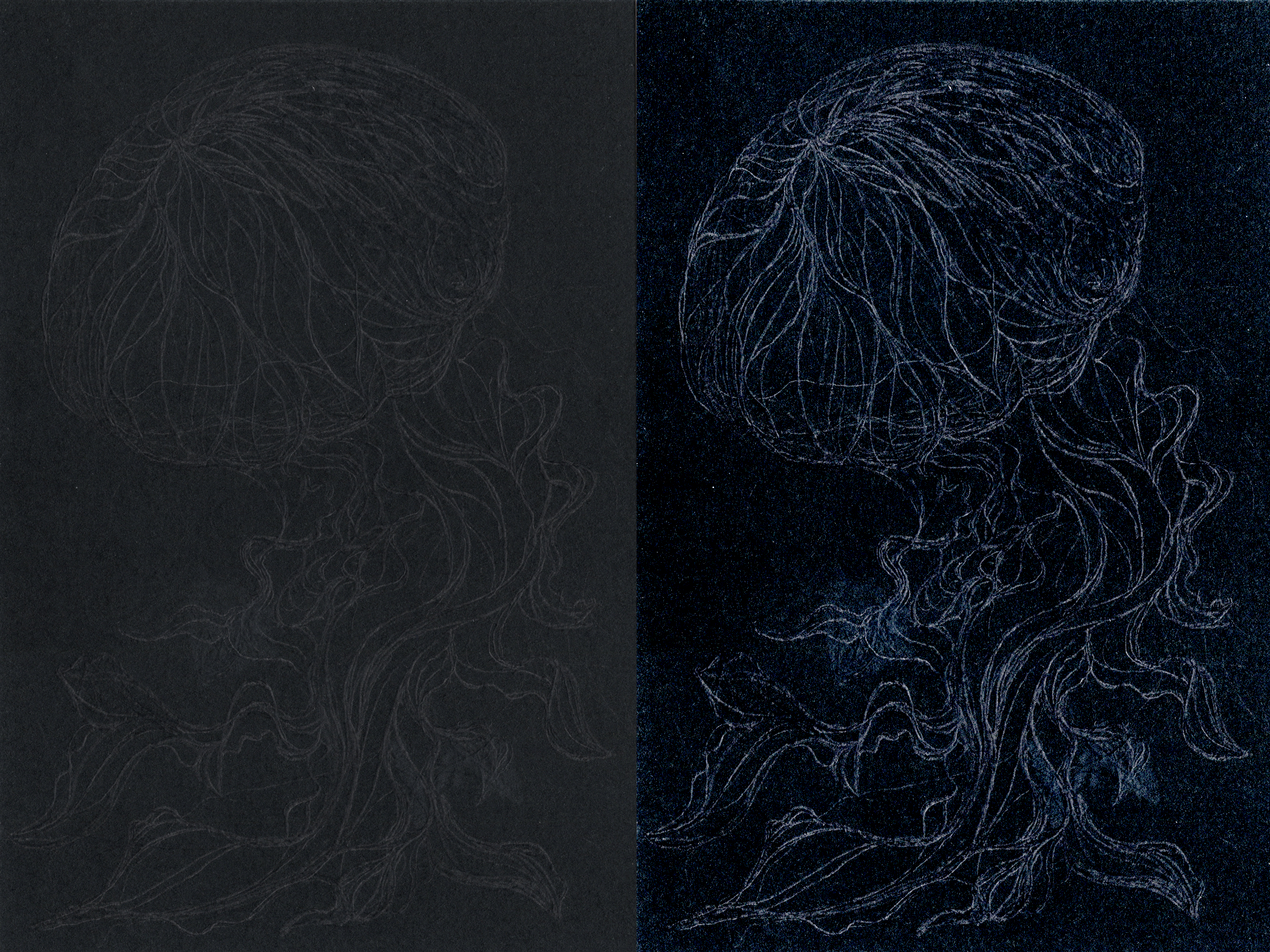
After many failed attempts at freehand drawing coral, I decided to sketch it out and line it after. Doing this made the coral look so much better. The jellyfish is sketched on Strathmore Black Mixed Media Paper, and the fish on Strathmore Black Mixed Media Paper.
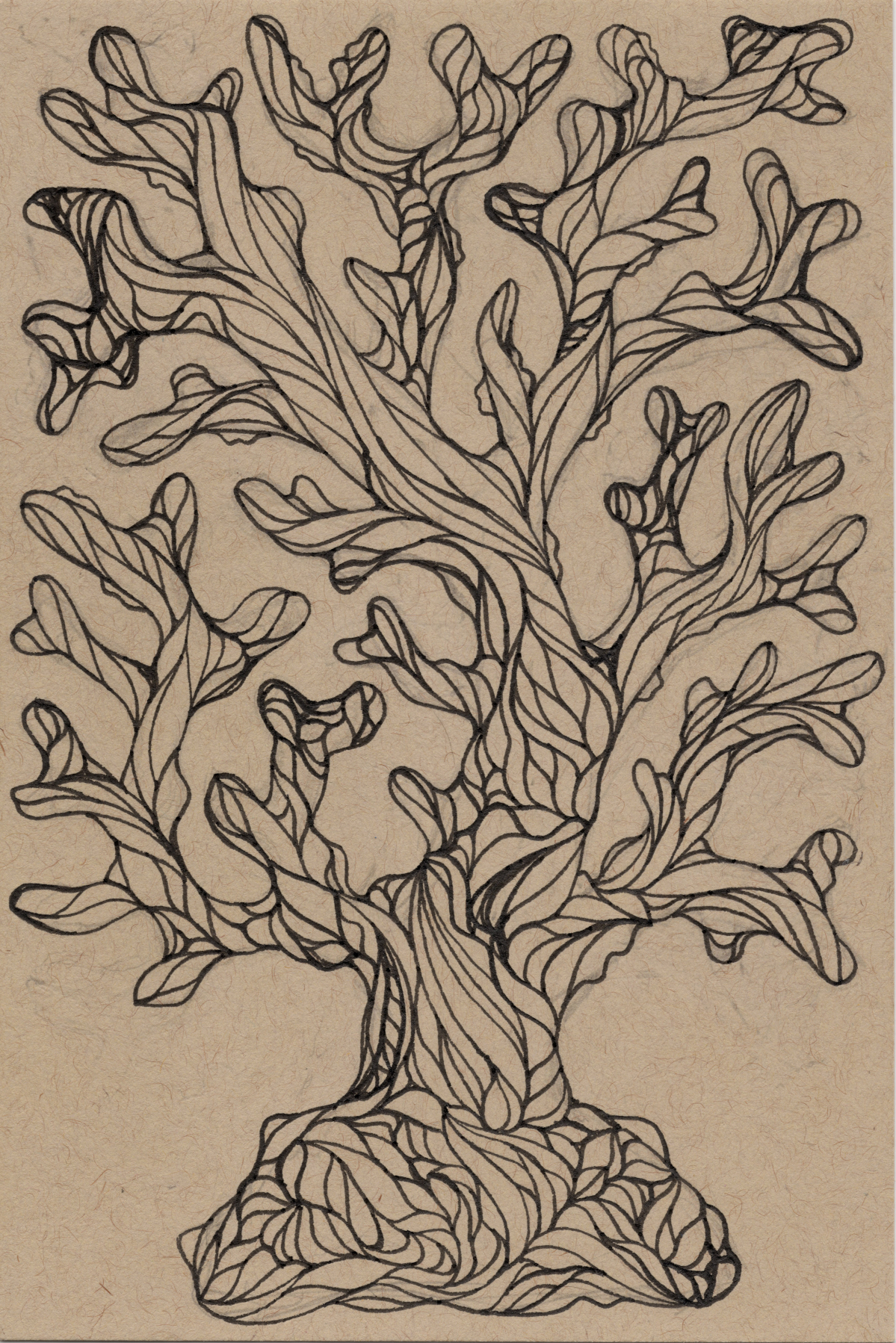
Planning out the pieces works much better, and I am preferring the planned pieces to the freehand pieces I made.