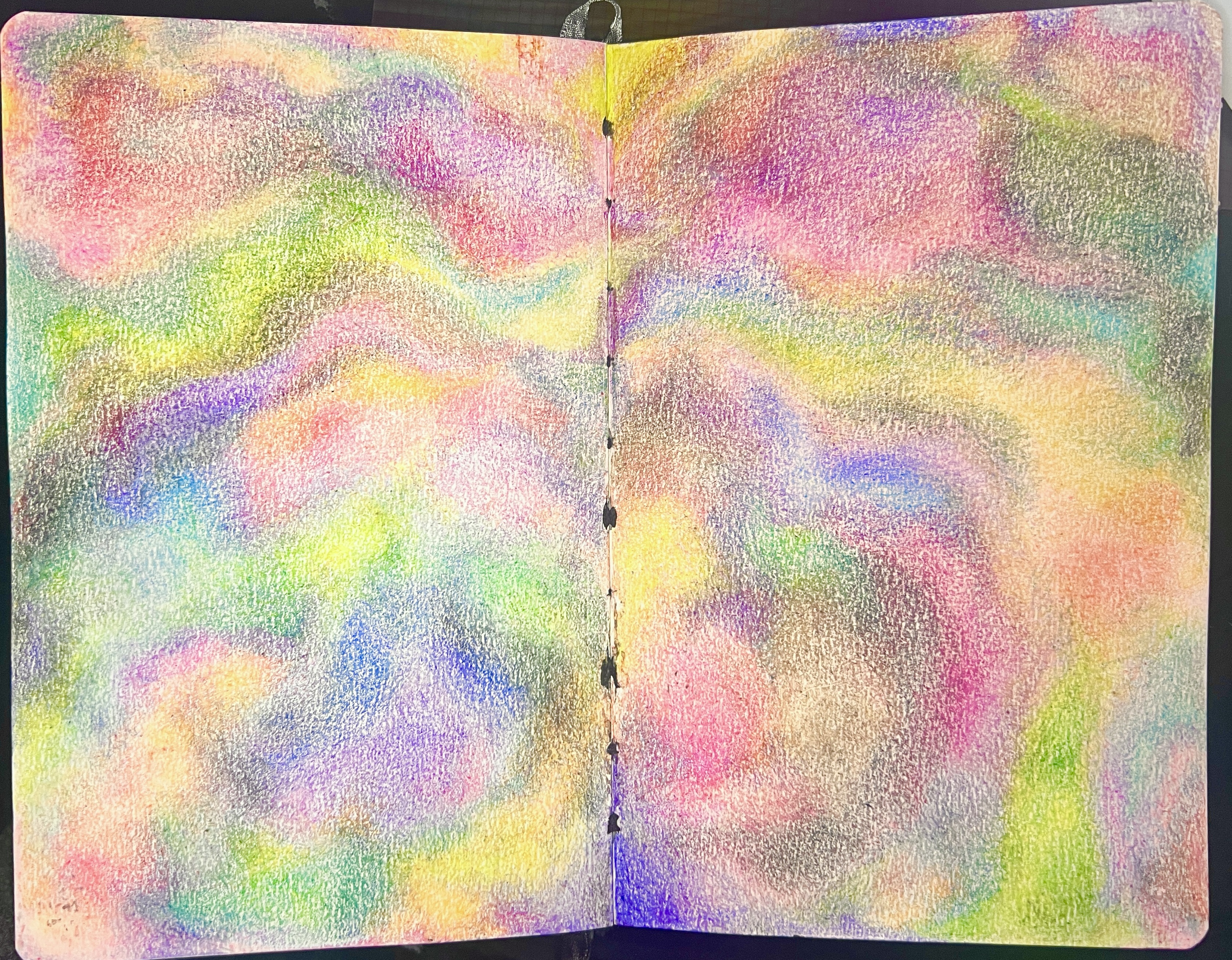
Spectrum
Spread 7, Pp. 14-15
Art Thoughts
Meaning: Life is a spectrum. Borders are blurry and we’re all a unique make-up of our experiences.
The dawn always overtakes the shadow.
My intention was to have more black and other darker colors throughout, but that didn’t happen very much. I definitely tend to prefer bright, saturated colors most of the time. That unintentionally got through here.
Creative Workbook
Description
Size: A4 (A5 spread)
Started: 4/4/26
Finished: 4/4/26
Started: 4/4/26
Finished: 4/4/26
Planning Notes
-
Gonna do a version of that one crayon test piece I made in the Media Tester Sketchbook.
-
I want to make the crayon overlap softer and make it all look very blended.
-
I also want to overlap colors that probably wouldn’t blend well to see how the texture makes it look.
Progress Notes
- Everything is blending very well! The smell of the crayon is awesome.
Completion Notes
- It looks like a blurry image and it makes me want to do something that looks like a blurry image of something.
- Trippy looking, I really like it, but the crayon is smudging. Clear gesso helped.
Supplies
| Category | Materials | Notes |
|---|---|---|
| Surface | Canson Graduate Mixed Media Sketchbook | Great tooth for crayon. |
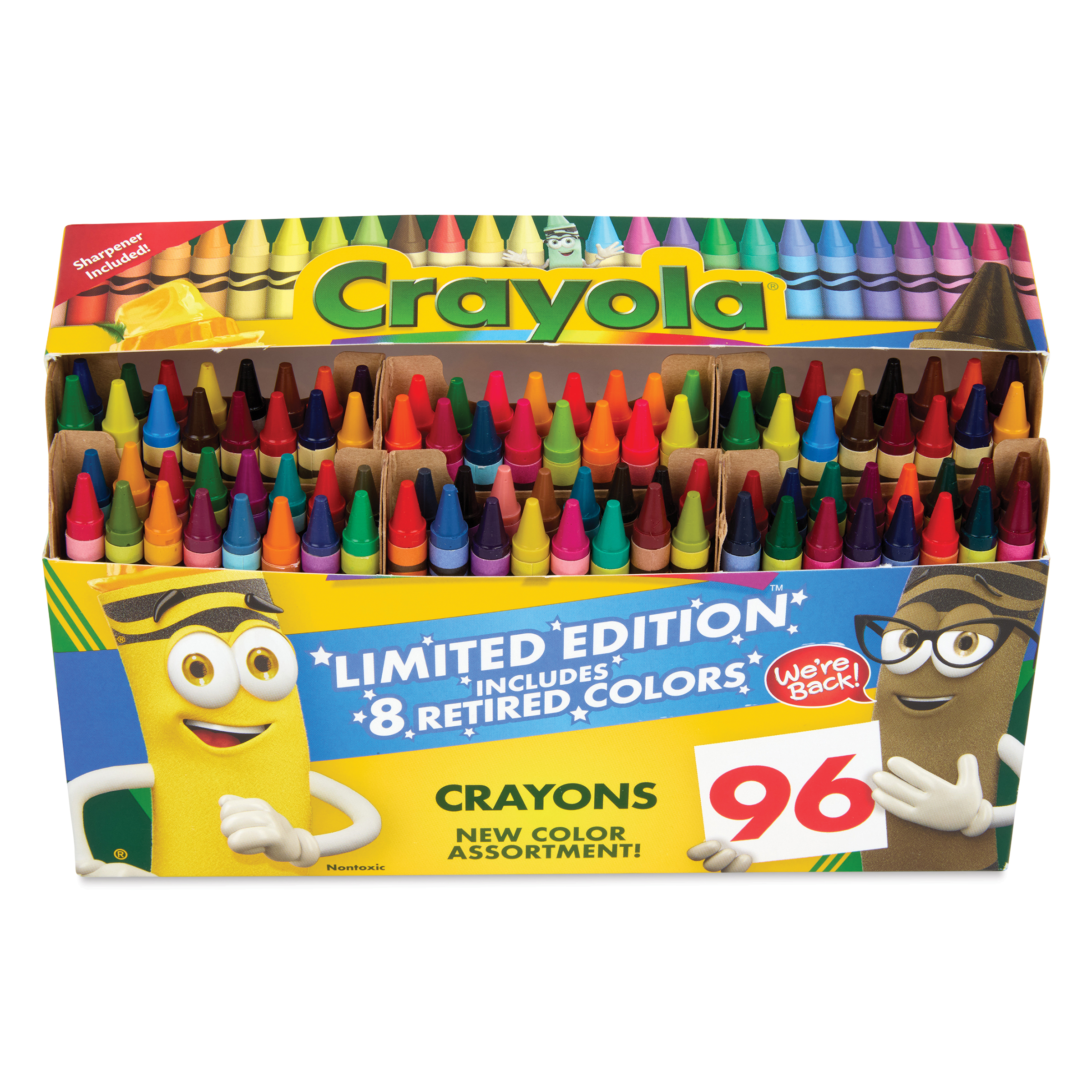
| Medium | Crayola Crayons | The crayon worked really well in the sketchbook. The tooth was great and I was able to keep the crayon very soft. Also able to layer well. |
| Sealer | TWC Clear Gesso | Worked to seal crayon but kind of sticks together. Maybe think about sanding? |
Color Palette
I tried to use every crayon in the 96 set box.